10,000 search results
(0.04 seconds)
- Teenage Garde by Teenage Foundry,
$19.00 Introducing by Teenage Foundry! Teenage Garde is a bold and neat display typeface font that exudes confidence and modernity. With its strong, clean lines and sharp edges, this font is designed to make a bold statement. Teenage Garde boldness gives it a commanding presence, making it ideal for designs that require attention-grabbing headlines or strong brand identities. Despite its simplicity, the font still manages to maintain a sense of elegance and sophistication. This makes Teenage Garde a versatile choice for a wide range of design projects, including advertising materials, logos, posters, and website headers. There are 2 styles, Regular & Extrude. Features: Uppercase, Lowercase, Numeral, Punctuation & Multilingual. Multilingual contained: Afrikaans, Albanian, Asu, Basque, Bemba, Bena, Breton, Catalan, Chiga, Cornish, Danish, Dutch, English, Estonian, Filipino, Finnish, French, Friulian, Galician, German, Gusii, Indonesian, Irish, Italian, Kabuverdianu, Kalenjin, Kinyarwanda, Luo, Luxembourgish, Luyia, Machame, Makhuwa-Meetto, Makonde, Malagasy, Manx, Morisyen, North Ndebele, Norwegian Bokmål, Norwegian Nynorsk, Nyankole, Oromo, Portuguese, Quechua, Romansh, Rombo, Rundi, Rwa, Samburu, Sango, Sangu, Scottish Gaelic, Sena, Shambala, Shona, Soga, Somali, Spanish, Swahili, Swedish, Swiss German, Taita, Teso, Uzbek (Latin), Volapük, Vunjo, Zulu. For any questions please contact me 🙂 Thanks!
 - Octava by ParaType,
$30.00 PT Octava™ was designed at ParaType in 2001 by Vladimir Yefimov. The first (Cyrillic only) version named Scriptura Russica (1996) consisting of three styles (book, italic, bold) was commissioned by the Russian Bible Society. Lately the Latin letters and bold italic were added. Inspired by Lectura, 1969, by Dick Dooijes and Stone Print, 1991, by Sumner Stone. In spite of large x-height the typeface is both space saving and quite legible at small sizes. Expert fonts including small caps (book) and old style figures are available.
 - Alathena by Studio Sun,
$20.00 Alathena was inspired by the French art decade between art nouveau to art deco, comes with 2 style, Alternative swash and Modern deco, with some modified ligatures. Available with 6 Weights, Thin, Extra Light, Light, Regular, Bold, Extra Bold with support 75+ language (Latin Pro), and contains OpenType features. - Matching small caps for all weights. - Old Style Figure. - Full "f" Ligature set. - 20+ Optional (discretionary) ligatures. - Over 400+ Swash Characters. - Automatic Fractions. - Automatic Ordinals. - Extended language support for most Latin-based Western and Central European languages, including all the swash and alternate characters.
 - Claremont by Red Rooster Collection,
$45.00Claremont is a serif font family designed by Les Usherwood (Typsettra). Usherwood originally created four weights – a light, extra bold, light italic, and extra bold italic. Paul Hickson (P&P Hickson) and Steve Jackaman (ITF) digitized the family and created eight new weights, and it was released exclusively for the Red Rooster Collection in 1993. Claremont shares similarities to Bookman Old Style, but also shares properties with slab serif Egyptian-style typefaces. Like all Usherwood typefaces, the family was engineered with great care for maximum legibility and aesthetics. ©1993. International TypeFounders, Inc. - Nelson by Laura Worthington,
$25.00 Evocative of paint on weathered wood, Nelson’s engraved capital letters are as rustic and confident as the Old West. Combine the engraved face with bold and rough versions to create handsome wordmarks, or use Nelson to captivate customers of food packaging, restaurant menus, and roadside attractions. See what’s included! Engraved • Ornaments • Rugged • Bold *NOTE* Basic versions DO NOT include swashes, alternates or ornaments These fonts have been specially coded for access of all the swashes, alternates and ornaments without the need for professional design software! Info and instructions here: http://lauraworthingtontype.com/faqs/
 - Silvercrush by IKIIKOWRK,
$17.00 Introducing SILVERCRUSH Typeface, created by ikiiko. A rough letters with expressive strokes and have a strong character for street art typeface. Silvercrush typeface is perfect for an poster event, urban brand, hipster magazine, fashion stuff, quotes, and all the design elements that require a street vibes. What's included? Uppercase & Lowercase Number & Punctuation Bonus Alternates Multilingual Support Enjoy our font and if you have any questions, you can contact us by email : ikiikowrk@gmail.com
 - Morelife by Ronny Studio,
$17.00 Morlife is a solid & solid typeface with a unique form of the 90s era. This typeface is perfect for event posters, magazine covers, hipster fashion brands, t-shirts, totes, quotes, or stylish text overlays onto any background image. Files include: TrueType (.ttf) Open type (.otf) Features : Lowercase & Uppercase numbers and punctuation multilingual alternates PUA encoded Please contact us if you have any questions. Enjoy Crafting and thanks for supporting us! :) Thank you
 - Kahlo by Latinotype,
$25.00 Kahlo is a latin-style hipster type family. It's a formal and elegant option for designers. The family has four weights and italics, initial capital letters, and some alternate characters. This typeface is most suitable for magazine headlines, posters, logos, cosmetics packaging, advertising etc. Photography by Damien Vignaux (www.elroy.fr) Languages include: Basic Latin, Western European, Euro, Catalan, Baltic, Turkish, Central European, Romanian and Pan Africa Latin. Kahlo is a renaming of Frida.
 - Strippy by Just Font You,
$18.00 Inspired from the bold and loud visual statements from the 90s poster and graphic design trend, makes Strippy can’t hold itself to be born in this universe. A clean, square, and bold form of body, makes Strippy is the simple way to go to shot your statement louder and wider.
 - Golden Opportunity JNL by Jeff Levine,
$29.00 The cover of vintage sheet music for "With Plenty of Money and You (The Gold Diggers' Lullaby)" from the Warner Brothers musical "Gold Diggers of 1937" had the movie title hand-lettered in a classic Art Deco style. Bold, brash and totally fun, this became the model for Golden Opportunity JNL.
 - Boriel by Olivetype,
$18.00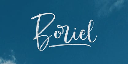 Boriel is a chic, refined script font that emanates sophistication and elegance. Its stylish alternates and ligatures make this font the perfect match for any project Features : Basic Latin A-Z & a-z. Numbers, symbols, and punctuations Swashes & Ligatures Boriel is supporting 66 Languages: from Afrikaans Albanian Catalan Danish to Dutch English Spanish Swedish Zulu. Accented Characters : ÀÁÂÃÄÅÆÇÈÉÊËÌÍÎÏÑÒÓÔÕÖØŒŠÙÚÛÜŸÝŽàáâãäåæçèéêëìíîïñòóôõöøœšùúûüýÿžß Thank you
 - Docklan by Gustav & Brun,
$10.00 The display font Docklan arose from experiments of candle-grease and black ink. Book covers, music festivals, wedding invitations or just an essay in school – Docklan will allow you to make a statement in any setting! The lowercases are miniatures of the upper-ones and it comes with a set of basic English/Latin letters and some west European diacritics.
 - Ye-As-Ta by Grummedia,
$20.00Ye-As-Ta is a unique interpretation of traditional brush drawn oriental calligraphy. A caps only font, the characters type English style left to right but appear laid on their side. When the text box is rotated 90 degrees clockwise the text reads top right to bottom left, oriental style. A fun typeface, though reading can require a little practice! - Sub Train by Olivetype,
$18.00 Inspired by the punk and metal scene in the ’80s, this one-of-a-kind brush typeface is suitable for apparel, YouTube thumbnails, movies, album cover and so much more. Features : Basic Latin A-Z, a-z, numbers, symbols, and punctuations Sub Train is supporting 66 Languages: from Afrikaans Albanian Catalan Danish to Dutch English Spanish Swedish Zulu. Accented Characters : ÀÁÂÃÄÅÆÇÈÉÊËÌÍÎÏÑÒÓÔÕÖØŒŠÙÚÛÜŸÝŽàáâãäåæçèéêëìíîïñòóôõöøœšùúûüýÿžß Thank you
 - Chewing Gum by Gleb Guralnyk,
$14.00 Hello! Introducing a decorative font named Chewing Gum. It's an abstract shape smooth typeface with curly elements. For the English alphabet, there are alternative characters included. It basically simplified letters that are more readable in small sizes (You can access these letters by activating a "Stylistic Alternates" on your OpenType panel). Twelve fancy ligatures will make your lettering more organic and natural.
 - Archangelisia by Hikhcreative,
$19.00 Archangelisia is a beauty and modist script font. It offers support for all characters of the English languange. Standard punctuation glyphs are included. Archangelisia is perfectly suited for signature style, your logo, communicating your branding, inspirational wall poster, title, label or your wedding invitation. Great for crafters and grapich artist alike. Compatible with tools such as Photoshop or Illustrator, etc.
 - Dee by Chantra,
$18.00The Dee font family started from letter "d" and "e" followed by the rest of the letters. "Dee" is Thai word mean "Good" in English that is the source of this font name. The Dee XTS style has alternate stroke ends relative to the Dee XT style. It is included as a bonus style in the Dee Regular Set and Dee Complete packages. - Pure Ginger by Olivetype,
$18.00 Pure Ginger is a cool and simple brush textured display font. Casual and a little bit quirky, this font will look outstanding in any context, whether it’s being used on busy backgrounds or as a standalone headline! This font is supporting Multi-Languages, which includes: Afrikaans Albanian Catalan Danish Dutch English Estonian Finnish French German Italian Norwegian Portuguese Spanish Swedish Zulu. Thank You.
 - GaoYah Display by Stones Design Lab,
$20.00 GaoYah Display Thin is a type in very thin line, GaoYah means Elegance in Mandarin, some characters build in unique shapes can make a good memory. This font is suitable for huge titles display, in which way the line and detail shows elegance. It will make good performance in dark background as well. Including Basic English and Western Europe languages.
 - Foreign Film JNL by Jeff Levine,
$29.00 The Art Deco hand lettered opening credits for the 1936 French drama “La Belle Équipe” [English title: “They Were Five”] provided the inspiration for Foreign Film JNL, which is available in both regular and oblique versions. According to Wikipedia, the film “…tells the story of five unemployed workers who win the jackpot in the national lottery but their solidarity then proves fragile.”
 - Alma Sans by Great Scott,
$22.00 Alma Sans is a low contrast sans-serif based on simple geographic shapes. It has friendly demeanor with rounded edges and curved ears & spurs. Alma Sans is available in 5 weights. Supports 28 languages: Afrikaans, Albanian, Catalan, Croatian, Czech, Danish, Dutch, English, Estonian, Finnish, French, German, Hungarian, Icelandic, Italian, Latvian, Lithuanian, Maltese, Norwegian, Polish, Portugese, Romanian, Slovak, Slovenian, Spanish, Swedish, Turkish, Zulu.
 - Geiny by CoastalType,
$15.00 Geiny, is a modern display typeface with flared serif and horizontal emphasis as its characteristics. alternative styles with curved crossbar, curved tails, and catchwords when you activate Discretionary Ligatures to create interesting typography composition. Features 296 glyphs Stylistic Alternate & Discretionary Ligatures Accented characters Multiple Languages Supported : Afrikaans, Albanian, Catalan, Danish, Dutch, English, Estonian, Finnish, French, German, Icelandic, Italian, Norwegian, Portugese, Spanisch, Swedish, Zulu
 - Crash Demons by Gian Studio,
$10.00 About Product Crash Demons, Display Typography is an elegant modern variable font. It's basically Sans with a touch of serif to each letter. A Simplicity yet very legible with various widths and weights that you can explore, combine, create and help you design things. Language Support: English, French, German, Indonesian, Irish, Italian, Low German, Norwegian, Portuguese, Swedish, Swiss German. Thank you.
 - Is This The End by Intellecta Design,
$19.90 Is This the End has three different ornamental endpieces ready to use in end chapters, final pages in books, magazines and several artistic representations. Each endpiece may be used in different languages like German, Bulgarian, Croatian, Danish, Spanish, Finnish, French, Dutch, Italian, Norwegian, Polish, English and Portuguese. Intellecta Design researched these endpieces from the very rare Richard Gans type catalogue from 1882.
 - Nerd Maze by Gleb Guralnyk,
$14.00 Hello! Introducing a trendy geometric typeface - Nerd Maze. It's an original modern and simultaneously simple font. Several letters variations, using OpenType feature (contextual alternates) automatically creates a seamless words shape. Note: Make sure that “Contextual Alternates” feature is supported & enabled in your software. Please consider that this feature is available only for English alphabet. Thank you and wish you a peaceful sky!
 - Chantilly Lace NF by Nick's Fonts,
$10.00This little charmer combines an uppercase designed by American lettering artist J. M. Bergling with a lowercase designed by English architect Roland W. Paul. The result has a wiggle in its walk and a giggle in its talk: oh, baby, that’s what I like! Both versions of the font include 1252 Latin, 1250 CE (with localization for Romanian and Moldovan). - Gilmore Fahrenheit by Red Rooster Collection,
$45.00 Gilmore Fahrenheit is a glyphic, sans serif typeface that was inspired from early designs by the renowned English typographer Eric Gill. It was designed in 1992 by A. Pat Hickson (P&P Hickson) and Steve Jackaman (ITF) exclusively for the Red Rooster Collection. It was designed with true small caps, has an italicized geometric look, and possesses legibility reminiscent of Swiss typefaces.
 - Chili Chips by Epiclinez,
$18.00 Chili Chips is a playful handwritten font. Looks great on a children's craft, teaching material, quotes, or any other design that needs a splash of cuteness! This font is supporting 66 languages, from English to Zulu. It is also PUA encoded and has open-type features such as ligatures to help you create that authentic handwritten look. Thanks, hope you enjoy our fonts.
 - Gayeng by Twinletter,
$12.00 What’s Included : File font Web Fonts Standard glyphs Ligature Works on PC & Mac Simple installations Accessible in Adobe Illustrator, Adobe Photoshop, Adobe InDesign, even work on Microsoft Word. PUA Encoded Characters – Fully accessible without additional design software. Fonts include multilingual support for; Afrikaans, Albanian, Croatian, Czech, Danish, Dutch, English, Estonian, Finnish, French, German, Hungarian, Italian, Norwegian, Polish, Portuguese, Slovak, Slovenian, Spanish, Swedish
 - Hand Scribble Sketch Times by TypoGraphicDesign,
$19.00 CHARACTERISTICS A state-of-the-art OpenType-Feature (like Contextual Alternates (calt) and Stylistic Alternates (salt)) of “Hand Scribble Sketch Times” is, that each uppercase and each lowercase letter has automatically alternated two variations to bring humanly-random characteristics of handwriting to life. The character of the rough, ruggend and raw handwritten classic serif typeface is a very unique warmly atmosphere. An pro-version of the font “Hand TIMES”. APPLICATION AREA warmth, love, handmade. For support of human warmth. Of cooking recipes, menus in the restaurant across party flyer, music cover Art to logo (word marks), headings in magazines and websites. TECHNICAL SPECIFICATIONS ? Font Name: Hand Scribble Sketch Times ? Font Weights: Regular, Rough, Invert ? Font Category: Grunge Serif Display for Headline Size ? Font Format: OTF (OpenType Font for Mac + Win) ? Glyph coverage: 601 ? Language Support: Basic Latin/English letters, Central Europe, West European diacritics, Baltic, Romanian, Turkish ? Specials: Alternative letters, Standard & Discretionary Ligatures, extras like symbols, dingbats, Old-style Digits, Lining Figures, accents & €, incl. OpenType-Features like Contextual Alternates (calt), Glyph Composition/Decomposition (ccmp), Discretionary Ligatures (dlig), Kerning (kern), Standard Ligatures (liga), Numerators (onum), Ordinals (ordn), Stylistic Alternates (salt), Stylistic Set 01 (ss01), Stylistic Set 02 (ss02), Stylistic Set 03 (ss03), Slashed Zero (zero), Lining Figures (lnum), Tabular Figures (tnum), Old Style Figures (onum), Proportional Figures (pnum) ? Design Date: 2013 ? Type Designer: Manuel Viergutz
 - OldStyle 1 - Unknown license

- GhostTown - Unknown license

- Kandidat by Fontroll,
$30.00 Imagine being printer in the early nineteenth century, your stock isn’t the finest, your lead characters are worn out: Voilá Kandidat Rough. But wait, Kandidat isn’t the usual scan-an-old-book,-put-the-glyphs-in-a-font-and-you’re-done-font. Kandidat Rough has a variety of whopping 14 alternates for most characters. Our algorithm changes the letters automatically. All you have to do is turn on Contextual Alternates in your layout app. The algorithm is the best we’ve seen so far, and it’s so good that even same words appear in different forms. And should by coincidence words have the same glyphs, just assign a different Style Set to the first letter, and all other letters in the word will change as well (well, it depends a bit on your software). The mechanism isn’t perfect and maybe we stretched OpenType capabilities a bit over the top, but we yet haven’t seen any better routine for switching letters on the fly. Is it worth to mention that Kandidat Rough not only speaks English, but also German, French, Spanish, Dutch, Danish, Norwegian, Swedish, Croatian, Turkish and most likely some other languages? Maybe. To be sure whether your language is supported, this is the typeset of all letters: ABCDEFGHIJKLMNOPQRSTUVWXYZÀÁÂÃÄÅÆÇÈÉÊËÌÍÎÏÑÒÓÔÕÖØÙÚÛÜÝĆČĐĞ݌ފŸŽ abcdefghijklmnopqrstuvwxyzàáâãäåæçèéêëìíîïñòóôõöøùúûüýÿćčđğıœşšž Apart from that we also included the following punctuation and currency symbols: !"#$%&'()*+,-./:;?@[\]_{|}¡©«®°±¶·»¿×–—‘’‚“”„†•…‹›⁄≠☞ €¢$£¥ This sums up to nearly 3000 glyphs per font, and we have three of them: Regular, Italic and Bold. All neatly kerned. All in all a great repertoire for even the most demanding book or advert jobs with a look of old times. And now imagine you are sick of the rugged print experience Kandidat Rough delivers: go for Kandidat. This is our Scotch-ish ancestor the Rough version was made from. A sturdy, friendly, round, warm friend from the beginning of the nineteenth century. A bit dark, maybe. You will like it. Kandidat has the aforementioned type set plus complete Baltics, Eastern Europe and Cyrillic. Plus a couple of gimmicks like fleurons, stars, circled numbers, arrows, and, and, and… Kandidat Regular additionally has small caps for Latin based scripts (not Cyrillic). The spick and span Kandidat font set also consists of Regular, Italic and Bold cuts. The bold cut is on the very bold side and can nicely be used for headings, whereas Italic is a great companion for Regular. It took us some time and trouble to finish this project, but after all we are very proud of our little feat and hope you will enjoy Kandidat as much as we do. Enjoy!
 - Ballet Mechanique by Characters Font Foundry,
$25.00 Ballet Mechanique is a custom designed font for musician Jeroen Borrenbergs, aka Ballet Mechanique. For his upcoming record releases Jeroen asked me to create a special font for him. As co-founder and graphic designer at Stoere Binken Design he creates his own artwork and therefor had very specific wishes. The font should be warm, soft and have soul. He gave me some sketches for his logo that I should use as a starting point. The result is a very narrow, kind of techno, monocased font called "Ballet Mechanique" (what else). After having served his purpose, Jeroen Borrenbergs allowed his font to be sold publicly. Jeroen Borrenberg’s debut work, in 1996, received hugely praising reviews. Muzik Magazine made Evolutionary Entities techno single of the month, Laurent Garnier and Mister C constantly played it in their sets and Morgan Geist just said “I won’t do a review here - let me just encourage all of y’all to listen to and/or pick up the new Eevolute 12″. Beautiful stuff - complex, melodic, soaked in just enough reverb to take it to another room. Check or regret.”
 - Hackensack by Typodermic,
$11.95 Introducing Hackensack—a rugged and reliable typeface that embodies the spirit of the past with its vintage charm and commanding presence. This Clarendon-inspired narrow slab serif design is perfect for anyone looking to make a bold statement with their typography. With Hackensack, your message will be delivered with a sure-footed confidence that demands attention. This compact display typeface has an old-fashioned feel that hearkens back to a bygone era, giving your design a touch of timeless elegance. But don’t let its vintage charm fool you—Hackensack is as rugged and durable as they come. Its strong, sturdy lines and slab serifs make it perfect for headlines, logos, and other display uses where you need your message to stand out. And if you’re looking for even more vintage flair, Hackensack includes old-style numerals which can be accessed in applications that support OpenType features. So whether you’re creating a vintage-inspired poster, a classic logo, or any other design that requires a touch of old-world charm, Hackensack is the font you need. Most Latin-based European, Vietnamese, and some Cyrillic-based writing systems are supported, including the following languages. Afaan Oromo, Afar, Afrikaans, Albanian, Alsatian, Aromanian, Aymara, Bashkir (Latin), Basque, Belarusian (Latin), Bemba, Bikol, Bosnian, Breton, Bulgarian, Cape Verdean, Creole, Catalan, Cebuano, Chamorro, Chavacano, Chichewa, Crimean Tatar (Latin), Croatian, Czech, Danish, Dawan, Dholuo, Dutch, English, Estonian, Faroese, Fijian, Filipino, Finnish, French, Frisian, Friulian, Gagauz (Latin), Galician, Ganda, Genoese, German, Greenlandic, Guadeloupean Creole, Haitian Creole, Hawaiian, Hiligaynon, Hungarian, Icelandic, Ilocano, Indonesian, Irish, Italian, Jamaican, Kaqchikel, Karakalpak (Latin), Kashubian, Kikongo, Kinyarwanda, Kirundi, Komi-Permyak, Kurdish (Latin), Latvian, Lithuanian, Lombard, Low Saxon, Luxembourgish, Maasai, Macedonian, Makhuwa, Malay, Maltese, Māori, Moldovan, Montenegrin, Ndebele, Neapolitan, Norwegian, Novial, Occitan, Ossetian, Ossetian (Latin), Papiamento, Piedmontese, Polish, Portuguese, Quechua, Rarotongan, Romanian, Romansh, Russian, Sami, Sango, Saramaccan, Sardinian, Scottish Gaelic, Serbian, Serbian (Latin), Shona, Sicilian, Silesian, Slovak, Slovenian, Somali, Sorbian, Sotho, Spanish, Swahili, Swazi, Swedish, Tagalog, Tahitian, Tetum, Tongan, Tshiluba, Tsonga, Tswana, Tumbuka, Turkish, Turkmen (Latin), Tuvaluan, Uzbek (Latin), Venetian, Vepsian, Vietnamese, Võro, Walloon, Waray-Waray, Wayuu, Welsh, Wolof, Xhosa, Yapese, Zapotec Zulu and Zuni.
 - CA Negroni by Cape Arcona Type Foundry,
$29.00 A dinner is not complete without a fine appetizer. Whatever you dinner will be, CA Negroni is the perfect introduction. Delivered in three flavors, Normal (Light + Black + Fill), Inline and Round. Versatility is proved by the extensive language support, covering whole Central Europe. CA Negroni is the well aged and improved version of a typographic classic: in the beginning of the 20th century, type in advertising was mostly drawn by hand. A master of this art and pioneer in logo-design was Wilhelm Deffke (1187–1950). CA Negroni is inspired by his kind of bold and solid letterings, picking up some of the charming details while leaving away other that might have a disturbing effect on the general look. Two stylistic sets let you choose between a more serious or a more playful look.
 - Rothwood by Type-Ø-Tones,
$60.00 In 2011, while tutoring an exercise on Slab Serifs, Josema discovered Robert Thorne’s work for Thorowgood. Specifically, he was fascinated by the extraordinary density of the 6-line Egyptian Pica from 1820-21. As a simple exercise, he wanted to test the limits of readability within the context of a contemporary alphabet. Rothwood Ultra is the result of this experiment. As a way of developing the series, he found it interesting to go to the opposite end of the spectrum and discover how to evolve the extra-black Ultra’s DNA into a super lightweight model. The Hairline and Thin styles are her slim sisters. The third challenge has been the creation of the text version. Light, Book, DemiBold and Bold, including italics and Small Caps close the Rothwood cycle for editorial use.
 - Sabon by Linotype,
$45.99 In the early 1960s, the German Master Printers’ Association requested that a new typeface be designed and produced in identical form on both Linotype and Monotype machines so that text and technical composition would match. Walter Cunz at Stempel responded by commissioning Jan Tschichold to design a new version of Claude Garamond’s serene and classical Roman. Its bold, and particularly its italic styles are limited by the requirements of Linotype casting machines, forcing the character widths of a given letter to match between styles, giving the italic its characteristic narrow f. The family’s name is taken from Jacques Sabon, who introduced Garamond’s Romans to Frankfurt. Sabon has long been a favorite of typographers for setting book text, due to its smooth texture, and in large part because Tschichold’s book typography remains world famous.
 - AJSHA by Fontex,
$49.00 AJSHA font, even though being our newest font, is inspired by ancient Japanese and Chinese culture, eastern style of life of about 5000 years before present day, when honor and a good sword were respected. Japanese special sword Katana is known to be handcrafted to be extremely sharp and deadly. Therefore, the shapes of the AJSHA font accompanies the moves of a Katana master when he uses the power of his sword. The font comes in two styles, light and medium. Medium is a bit bolder style while the exact bold or strong version lacks due to the fact that the font's lines needed to be sharp as a swordsman's cuts. We expect this font to be a great asset tool for top-notch designer companies that put quality before everything else.
 - Climora Duo by XdCreative,
$29.00 Introducing Climora Duo CLIMORA SERIF is a typeface with a feminine taste, with a touch of old style paired with an elegant Climora Script its a perfect combination for your various design needs. CLIMORA Serif has 14 style and 7 weights, - from Thin to Bold and Matching oblique. and 1 Elegant Climora Script that supports multiple languages. Hope you enjoy with Climora Family Thank you

