10,000 search results
(0.021 seconds)
- Minnie - Unknown license
- Mickey - Unknown license
- Blockhead - Unknown license
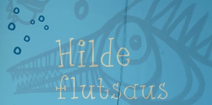
- flutSaus by JOEBOB graphics,
$- - 112 Hours by Device,
$9.00Rian Hughes’ 15th collection of fonts, “112 Hours”, is entirely dedicated to numbers. Culled from a myriad of sources – clock faces, tickets, watches house numbers – it is an eclectic and wide-ranging set. Each font contains only numerals and related punctuation – no letters. A new book has been designed by Hughes to show the collection, and includes sample settings, complete character sets, source material and an introduction. This is available print-to-order on Blurb in paperback and hardback: http://www.blurb.com/b/5539073-112-hours-hardback http://www.blurb.com/b/5539045-112-hours-paperback From the introduction: The idea for this, the fifteenth Device Fonts collection, began when I came across an online auction site dedicated to antique clocks. I was mesmerized by the inventive and bizarre numerals on their faces. Shorn of the need to extend the internal logic of a typeface through the entire alphabet, the designers of these treasures were free to explore interesting forms and shapes that would otherwise be denied them. Given this horological starting point, I decided to produce 12 fonts, each featuring just the numbers from 1 to 12 and, where appropriate, a small set of supporting characters — in most cases, the international currency symbols, a colon, full stop, hyphen, slash and the number sign. 10, 11 and 12 I opted to place in the capital A, B and C slots. Each font is shown in its entirety here. I soon passed 12, so the next logical finish line was 24. Like a typographic Jack Bauer, I soon passed that too -— the more I researched, the more I came across interesting and unique examples that insisted on digitization, or that inspired me to explore some new design direction. The sources broadened to include tickets, numbering machines, ecclesiastical brass plates and more. Though not derived from clock faces, I opted to keep the 1-12 conceit for consistency, which allowed me to design what are effectively numerical ligatures. I finally concluded one hundred fonts over my original estimate at 112. Even though it’s not strictly divisible by 12, the number has a certain symmetry, I reasoned, and was as good a place as any to round off the project. An overview reveals a broad range that nonetheless fall into several loose categories. There are fairly faithful revivals, only diverging from their source material to even out inconsistencies and regularize weighting or shape to make them more functional in a modern context; designs taken directly from the source material, preserving all the inky grit and character of the original; designs that are loosely based on a couple of numbers from the source material but diverge dramatically for reasons of improved aesthetics or mere whim; and entirely new designs with no historical precedent. As projects like this evolve (and, to be frank, get out of hand), they can take you in directions and to places you didn’t envisage when you first set out. Along the way, I corresponded with experts in railway livery, and now know about the history of cab side and smokebox plates; I travelled to the Musée de l’imprimerie in Nantes, France, to examine their numbering machines; I photographed house numbers in Paris, Florence, Venice, Amsterdam and here in the UK; I delved into my collection of tickets, passes and printed ephemera; I visited the Science Museum in London, the Royal Signals Museum in Dorset, and the Museum of London to source early adding machines, war-time telegraphs and post-war ration books. I photographed watches at Worthing Museum, weighing scales large enough to stand on in a Brick Lane pub, and digital station clocks at Baker Street tube station. I went to the London Under-ground archive at Acton Depot, where you can see all manner of vintage enamel signs and woodblock type; I photographed grocer’s stalls in East End street markets; I dug out old clocks I recalled from childhood at my parents’ place, examined old manual typewriters and cash tills, and crouched down with a torch to look at my electricity meter. I found out that Jane Fonda kicked a policeman, and unusually for someone with a lifelong aversion to sport, picked up some horse-racing jargon. I share some of that research here. In many cases I have not been slavish about staying close to the source material if I didn’t think it warranted it, so a close comparison will reveal differences. These changes could be made for aesthetic reasons, functional reasons (the originals didn’t need to be set in any combination, for example), or just reasons of personal taste. Where reference for the additional characters were not available — which was always the case with fonts derived from clock faces — I have endeavored to design them in a sympathetic style. I may even extend some of these to the full alphabet in the future. If I do, these number-only fonts could be considered as experimental design exercises: forays into form to probe interesting new graphic possibilities. - Gutenberg A by Alter Littera,
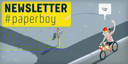
$-This is a free abridged edition of the full-featured Gutenberg B and Gutenberg C fonts. Although (as the name suggests) it was originally conceived as the first release in the B42-type series, it actually represents the colophon to this series. In addition to having a narrower scope, the font differs from its full-featured predecesors in both letter and word spacing, as well as in glyph design, using exclusively straight lines for every glyph and providing a significantly rough appearance at medium to large point sizes. The font includes the usual standard characters for typesetting modern texts, as well as a few special characters, alternates and ligatures that can be used for typesetting nearly as in Johann Gutenberg’s 42-line Bible and later incunabula. Please note that the use of this free font is subject to the same terms and conditions as those for Alter Littera’s pay fonts. Specimen, detailed character map, OpenType features, and font samples available at Alter Littera’s The Oldtype “Gutenberg A” Font Page. - Newsletter by Die Typonauten,
$19.00Monospaced but no mono space. Created from 2002 to 2007 this font family is influenced by fonts like OCR-B, DIN and the work of Erik Spiekermann. Newsletter is not a real monospaced font but has the ease of recognition these fonts have - even though these fonts are often criticized for their aesthetic qualities. Newsletter has a computer-related impression but is more legible and aesthetic than real monospaced fonts are. Since 2006 Newsletter is the corporate font of the design agency "die Typonauten". It is eminently suitable for correspondence use. After a testing period and fine tuning it is now published. - Movie Star - Unknown license
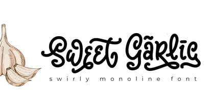
- Sweet Garlic by Abo Daniel,
$23.00Sweet Garlic is a swirly monoline font, designed for Printing and Cutting projects that need a monoline feel. It is great for quotes, branding, packaging, advertising, logo, card, and more. It comes with a lot of features : Every lowercase character have about 6 to 10 alternate Every uppercase character have 3 alternate 10 variations of an ampersand Swirly decorative typeface Multilingual Support PUA encoded Easy to Access: you only need add underscore 2 x before or after the lowercase, to get the titling or ending swash. for example ( a _ _ or _ _ a ) add underscore and number from 0 to 9, to get the alternate of an ampersand Hope You Love it Regards, Abo Daniel Studio - FF Marselis Serif by FontFont,
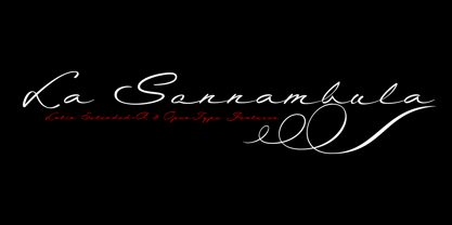
$58.99FF Marselis crossbreeds geometric and humanistic forms, creating a freshly dynamic sans serif family. All of the counters in the typeface are open; this aids readers’ eyes quickly flow across lines of text, without experiencing hang-ups. Certain superfluous strokes have been eliminated – there are no spurs on the b or q, for instance. The alphabet’s diagonals all bow outwards slightly, adding flavor to the “A”, “K”, “R”, “V”, “W”, “X”, “Y” and “Z”. - La Sonnambula by deFharo,
$18.00The Sonnambula is a handwritten and expanded font with terminal ornaments, designed to write very elegant titles or calligraphic texts. The name of this typography is dedicated to the opera La Sonnambula by Vincenzo Bellini. - Use the following characters for terminal ornaments: () [] - 380 glyphs. Latin Extended-A • OTF & TTF - OpenType Functions: Discretionary Ligatures, Kerning, All Alternates, Additional languages, Standard Ligatures, Slashed Zero, Capital Spacing, Ornaments, Ordinals, Mathematical Greek, Fractions, Localized Forms. - Bitcoin symbol: b# (ligatures) - KADinoSob - Unknown license
- Dyer - Unknown license
- CBGBFont - Unknown license
- InkaBod - Unknown license
- Burris - Unknown license
- Rhythm - Unknown license
- Bicycle - Unknown license
- brickle - Unknown license
- cain - Unknown license
- Xenowort - Unknown license
- Nosfer - Unknown license
- ChainFontBlack - Unknown license
- Albatross - Unknown license
- ZeroHour - Unknown license
- Keelhauled BB - Personal use only
- Yawnovision - Unknown license
- Rammstein Remix - Unknown license
- KAStorm - Unknown license
- Satans - 100% free
- WedDing - Unknown license
- HEATWAVE - 100% free
- UrUrMa - Unknown license
- Yadou - Unknown license
- YBandTuner - Unknown license
- Ashley - Unknown license
- IcicleCountry - Unknown license
- Zachary - Unknown license
- Bruce - Unknown license
- Depraved - Unknown license


