1,022 search results
(0.021 seconds)
- Chicago Moonshine by Roland Hüse Design,
$15.00
- Movement - Personal use only

- Vineyard - 100% free

- The Rio Lobo - Unknown license

- Leokadia Deco - 100% free

- Ordinatum Medium - Personal use only

- TAPEMAN - Unknown license

- DIVERGENT - Personal use only

- Bistecca - Personal use only

- Baltar - Unknown license

- Rocket Script - Personal use only

- Sanctuary - Unknown license

- Marathon - Unknown license

- Prussian Brew Offset - Unknown license

- Strobo - 100% free

- Font in a Red Suit - Unknown license

- Thiamine - Unknown license

- Eaglemania - Personal use only

- Thundercats - Unknown license

- Plastic No.20 - 100% free

- DancingSuperserif - 100% free

- Isfahan Demo - Unknown license

- Samarkan - Unknown license

- Deco Slice - Personal use only

- Entangled (BRK) - Unknown license

- FancyPants - Unknown license

- Black Edge by Mirco Zett,
$10.00
- Abonity by Dhan Studio,
$21.00
- Upbeat by Jeff Levine,
$29.00
- Streamwood JNL by Jeff Levine,
$29.00
- Brooky by Gatype,
$14.00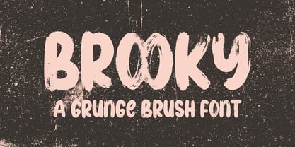
- Theater Bar JNL by Jeff Levine,
$29.00
- Eccentric Sans JNL by Jeff Levine,
$29.00
- Fancy Roman JNL by Jeff Levine,
$29.00
- Merchanto by Type Juice,
$19.00
- Wavy Rounded BT by Bitstream,
$50.99 - Duc de Berry by Linotype,
$29.99 - Lunema by S6 Foundry,
$19.00
- Deco Wide JNL by Jeff Levine,
$29.00
- French Lettering JNL by Jeff Levine,
$29.00


