10,000 search results
(0.033 seconds)
- Display Dots Four Sans by Gerald Gallo,
$20.00 Display Dots Four Sans and Serif are display fonts not intended for text use. They were designed specifically for display, headline, logotype, branding, and similar applications. Display Dots Four Sans and Serif include an uppercase alphabet, numbers, and punctuation.
 - Display Dots Two Sans by Gerald Gallo,
$20.00 Display Dots Two Sans is a display font not intended for text use. It, along with its serif counterpart were designed specifically for display, headline, logotype, branding, and similar applications. Display Dots Two Sans has an uppercase alphabet, numbers, and punctuation.
 - Nimbus Mono Antique L by URW Type Foundry,
$35.00
- Nimbus Roman No. 9 by URW Type Foundry,
$35.00
- Jotting - Unknown license

- Toit - Unknown license

- Göt - Unknown license

- Notted by HansCo,
$15.00 Notted is a beautiful and elegant display font. It is fresh, clean, and elegant. This font will look amazing in a great amount of projects, both formal and informal. Notted is the perfect font for making many original project and outstanding designs. Its casual charm makes it appear wonderfully down-to-earth, readable and, ultimately, incredibly versatile. Comes with a full uppercase, lowercase, numbers and punctuation + standard multilingual support. It’s great for branding, logo designs, lettering, logotype, craft, posters, packaging and much more. We recommend using Adobe Illustrator or Photoshop.
 - Toit by T-26,
$29.00 - Toots by ITC,
$29.99 - Tout by Eurotypo,
$28.00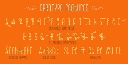
- BOT by fontkingz,
$19.00The BOT font package includes two character sets, BOT-Regular and -Stencil. The futuristic looking characters are designed to work in both large scale and small sizes; it works very well as a comfortable, readable lettering on machines of any kind as much as in print and screen publications. In addition, the BOT-Stencil letters can easily be cut out and work as a template for painting type on any surface. - Dot by T-26,
$19.00 - Motting by Zane Studio,
$15.00 INTRODUCE ! Motting script - a new modern calligraphy font, fresh, cute, eye-catching, with a joyful heart. Great for greeting cards, branding materials, business cards, quotes, posters and more! Motting script too - includes lots of alternate characters. Encoded with Unicode PUA, which allows full access to all additional characters without any special design software. Mac users can use Font Book. Windows users can use the Character Map to view and copy one of the additional characters to paste into your favorite text editor. For people with opentype-enabled software: Alternate can be accessed by turning on the "Alternate Styles" and "Ligature" buttons on Photoshop's Character panel, or through any software with a glyph panel, e.g. Adobe Illustrator, Photoshop CC, Inkscape. Files include: - Motting script. OTF - Motting script. TTF Thank you for buying!
 - Jot by Typadelic,
$19.00A playful slab-serif font. This typeface is versatile enough to be used in any type of design work, be it serious or fun. - Mots by Eurotypo,
$22.00
- Rot by MKGD,
$13.00 Rot is clunky, clumsy, and utilitarian. It comes straight from a second rate oracle’s prognostications of a not-so-distant dystopian future. A place where film noir meets twenty first century computer cards; and rainy melancholy nights meet global warming. It speaks of a world that welcomes everyone; provided that they are romantically inclined to living life at the short end of the stick. Metaphorically, Rot is a shot of hard liquor served in a dirty glass. Rot has a glyph count of 388 and supports the following languages Afrikaans, Albanian, Asu, Basque, Bemba, Bena, Bosnian, Catalan, Chiga, Colognian, Cornish, Croatian, Czech, Danish, Embu, English, Esperanto, Estonian, Faroese, Filipino, Finnish, French, Friulian, Galician, German, Gusii, Hungarian, Icelandic, Indonesian, Irish, Italian, Kabuverdianu, Kalaallisut, Kalenjin, Kamba, Kikuyu, Kinyarwanda, Latvian, Lithuanian, Low German, Lower Sorbian, Luo, Luxembourgish, Luyia, Machame, Makhuwa-Meetto, Makonde, Malagasy, Malay, Maltese, Manx, Meru, Morisyen, North Ndebele, Norwegian Bokmål, Norwegian Nynorsk, Nyankole, Oromo, Polish, Portuguese, Romanian, Romansh, Rombo, Rundi, Rwa, Samburu, Sango, Sangu, Scottish Gaelic, Sena, Shambala, Shona, Slovak, Slovenian, Soga, Somali, Spanish, Swahili, Swedish, Swiss German, Taita, Teso, Turkmen, Upper Sorbian, Vunjo, Walser, Zulu
 - Tow by Suomi,
$30.00 A headline font family, with old style numerals, ligatures and small caps.
 - Ton by Katatrad,
$22.00
- ITC Tot Spots by ITC,
$29.99The symbols in ITC TotSpots include everything from a child's life, except maybe the mess. In this font you'll find diaper pins, alphabet blocks, teddy bears, and even an inchworm-everything a digital baby would need. Polish-Canadian designer Victor Gad has specialized in editorial illustration, and also has extensive experience in poster design. These illustrations maintain his original sketchbook quality, despite being digital renderings. ITC TotSpots offers a clear, new style of symbols, which might be the perfect fit for your next project! - Too Sweet To Eat by Cuda Wianki,
$20.00 Too Sweet To Eat is a hand-drawn font that has many variations because you can choose from simple outline version, only shadow version, normal version and filling version. If You put one on another then you have a great possibility to apply different colors on different layers! That makes your letters multicolor! Great stuff for decorative writings, posters, informal stationery! SPECIFICATION: alternate characters for all numbers and letters, nearly 400 kerning pairs, multi-language coverage, ornaments.
 - Syntha Nova - Personal use only

- Nova SOLID - Personal use only

- DS Nova - Unknown license

- Aldo's Nova - Unknown license

- Optima Nova by Linotype,
$57.99 With the clear, simple elegance of its sans serif forms and the warmly human touches of its tapering stems, the Optima family has proved popular around the world. In 2002, when it was finally possible to produce digital alphabets without technical limitations and compromises, and more than fifty years after the first sketches, an expansion and redesign of the Optima family was completed and released as Optima nova. Hermann Zapf and Japanese type designer, Akira Kobayashi, collaborated on the project, which included re-working of the existing weights and the addition of several new weights: small caps, old style figures, light, heavy, and condensed. The original Optima was never manufactured with a real italic, only an oblique version of the roman. Optima nova has a complete range of beautifully designed real italics; the new italic forms, of the e, f and g are especially notable. The titling face includes capital letters with special and unusual letter combinations and ligatures, making it an excellent choice for headlines, logos and advertising purposes. Optima continues to be an all-purpose typeface; and Optima nova works for just about anything from book text to signage. Optima Nova® font field guide including best practices, font pairings and alternatives.
 - Metro Nova by Linotype,
$57.99 Metro Nova comprises seven weights, from ultra thin to extra black in regular proportions, and six weights as condensed designs. Each has an italic counterpart for a total of 26 fonts. The family is available as OpenType® Pro fonts, which provide for the ability to easily insert typographic features such as ligatures, fractions and alternate characters. Pro fonts also offer an extended character set to support most Central European and many Eastern European languages.
 - Arial Nova by Monotype,
$45.99The Arial® Nova family takes Arial back to its roots. Character spacing has been adjusted and a number of subtle modifications were made to the design to return the shapes and proportions to those of the original 1982 design created for IBM's then new high-speed laser printers. Although these first Arial fonts, called "Sonora Sans" by IBM, were low-resolution bitmaps, it was apparent that the design could also be an important high-resolution digital typeface, and Arial was redrawn for Monotype's imagesetters in the late 1980s. In the process Arial evolved from its original design loosing some of its earlier personality. The restored Arial Nova family is made up of three weights of roman design of standard proportions and three weights of condensed - all with complementary italic designs. The Arial Nova family is also compatible with the fonts that Microsoft® provides in the Windows® 10 operating system. - Aldus Nova by Linotype,
$50.99 Hermann Zapf and Akira Kobayashi redeveloped Palatino for the 21st Century, creating Palatino nova. The Palatino nova family also includes revised versions of Aldus (now called Aldus nova). A bold weight is added into the font family. The character set support is similar to Palatino nova, but Greek and Cyrillic are not available in book weight fonts.
 - Nova Caere by Eurotypo,
$39.00 Nova Caere is a typical urban calligraphy, gestural with its fast lines, with short and slightly noticeable ascender and descender traits. Condensed lower case and rounded capital letters are quite similar in height. Nova Caere has been studied for alternating upper and lower case inside the words of the text, so as to reinforce their expressive content. Stylistic variations that combine particular couples of letters have been developed, as well as some descender traits have been highlighted that can be employed to characterize words and phrases.
 - Iova Nova by profonts,
$41.99 Iova Nova is based on Jowa Script, designed by J. Wagner in 1967. The typeface has been redesigned, digitized, completed and expanded as OpenType Pro in the profonts studio. The resdesign includes the modification of the numerals which originally had capheight size. Besides, we complete the character set to cover Western and Eastern Europe including Turkey and Romania. The font contains more than 300 characters. Iova Nova is a young, fresh and casual design.
 - Rockwell Nova by Monotype,
$40.99The Rockwell® Nova family is a sturdy, optically monoweight design with blunt, straight-edged serifs and a no-nonsense attitude. It's the quintessential example of the appealing and eminently usable slab serif type style. The 13 designs of Rockwell Nova make for a robust and adaptable typeface family. Based on the original Monotype Rockwell suite of fonts, Rockwell Nova is an exceptionally durable design that suggests feelings of frank honesty when set in text composition. It is also an exceptionally versatile display design that can be used for headlines, subheads - or virtually anyplace where a strong presence is required. Rockwell Nova OpenType® Pro fonts have extended character set supporting Greek, Cyrillic, most Central European and many Eastern European languages, in addition to providing for the automatic insertion of ligatures and fractions. - Bordeaux Nova by Designova,
$9.00 BORDEAUX - A custom handmade display typeface with unique design and hybrid lettering styles. This all caps typeface has two different nature: the uppercase is purely simple & minimal but the lowercase is defined by unique alternatives having special design. This typeface is perfectly suitable for anything that needs to stand out from crowd, be it some Ultra Modern Branding, Techno or Cosmic Themed Designs, Haunted Movie Posters, Mysterious Arts and even the Minimal Stuffs. BORDEAUX could be perfect choice for logo / logotype design, branding, marketing graphics, banners, posters, signage, corporate identities as well as for editorial design that can bring uniqueness. Please see the examples shown above to get an idea about the capability of this typeface. Handcrafted and designed with powerful OpenType features in mind, each weight includes extended language support including Western European & Central European sets.
 - Albertus Nova by Monotype,
$50.99 Albertus® Nova is a faithful digital revival of Berthold Wolpe’s earlier design of Albertus and is one of the five designs in The Wolpe Collection of typefaces. This new design enlarges the typeface set from its previous two weights into a robust set of five ranging from thin to black, all with extended language support including Cyrillic and Greek. Berthold Wolpe began working on Albertus in 1932, at the encouragement of Stanley Morison. Morison saw an example of Wolpe’s engraved lettering and liked it so much that he commissioned a typeface based on the design. Since then, the original Albertus typeface has been used on book covers, in branding, on signs and in video games.
 - Lutetia Nova by RMU,
$45.00 Jan van Krimpen’s famous Lutetia, released at the late 1920s, revived by a complete fresh design. To get access to all ligatures in both styles, it is recommended to activate Discretionary Ligatures too.
 - Berling Nova by Linotype,
$29.99Swedish designer Karl-Erik Forsberg created the original Berling typeface in 1951. Owned by Verbum in Sweden, Berling was completely redesigned and released in 2004, under the name Berling Nova. Forsberg (1914–1995) is considered one of Sweden’s most masterful graphic designers, and his original Berling has come to be seen as possibly the most definitive Swedish typeface. But a redesign was necessary in order to secure that the spirit of Berling would survive in the digital age. Linotype, the distributor of the original Berling™ , provided its collection of source materials to the designers working on Berling Nova. Additionally, Akira Kobayashi — Linotype’s Type Director — lent them his advice as their project advanced. Berling Nova is available in two optical sizes: Text and Display. The original Berling was a classic Renaissance roman face, with fine terminals and sharp, beak-like serifs. If one looks at Berling’s old lead type proofs in the smaller type sizes, it is clear that these had a fuller and more readable form than in later digital versions. So, in order to help return the new Berling Nova to its original splendor, both the base forms and the serifs were softened and inflated. In the text version, the x-height has been increased a bit (by 4%), the diagonal axis is less apparent, and special glyph ranges, such as those for small caps and old style figures, have been included in the font’s character sets. The display version still has the unmistakable “Berling” character that displays Forsberg’s mastery. Berling Nova is well suited for longer text passages in books, publications, and magazines. This typeface fulfils all the demands that one can make on a legible newspaper typeface. Access to both text and display versions are important to the demanding typographer. This is the first time since the typeface was digitalized that it is possible to use it in order to create truly beautiful and functional typography in all type sizes. - Celtic Nova by Kaer,
$18.00 Hi! Celtic Nova font is available. The font is presented in regular and color versions. This is a new classic Celtic font with spirals and knots. Celtic Nova font is perfect for printing of graphic arts, posters, packaging and t-shirts. The font is given in regular and colored versions. *You can use color fonts in PS since CC 2017, AI since CC 2018, ID since CC 2019, QuarkXPress since 2018, Pixelmator, Sketch, Affinity Designer Since macOS 10.14 Mojave, Paint.NET Windows only.* *Please note that the Canva doesn't support color fonts!* You'll get: * A-Z letters * Numbers If you have any questions or issues, please contact me: kaer.pro@gmail.com Best, Roman.
 - Sina Nova by Hoftype,
$- Sina Nova is the slimmer sister of Sina. It has a slightly vertical tendency, a higher x-height which makes it more open in small text sizes. Its economical proportions allow an even more universal application. Sina comes in 12 styles and in OpenType format. All styles contain standard and discretional ligatures, small caps, proportional lining figures, tabular lining figures, proportional old style figures, lining old style figures, matching currency symbols, fraction- and scientific numerals. Sina supports Western European, Central and Eastern European languages.
 - Palatino Nova by Linotype,
$50.99 Palatino® Nova is Prof. Hermann Zapf's redesign of his own masterpiece, Palatino. The original Palatino was cut in metal by August Rosenberger at D. Stempel AG typefoundry in Frankfurt, and released in 1950. Palatino was later adapted for mechanical composition on the Linotype machine, and became one of the most-used typefaces of the 20th Century. Palatino was designed for legibility, and has open counters and carefully weighted strokes. The type was named after Giambattista Palatino, a master of calligraphy from the time of Leonardo da Vinci. Palatino is a typeface based on classical Italian Renaissance forms. A modern classic in its own right, Palatino is popular among professional graphic designers and amateurs alike, working well for both text and display typography. Hermann Zapf and Akira Kobayashi redeveloped Palatino for the 21st Century, creating Palatino Nova. Released by Linotype in 2005, the Palatino Nova family is part of Linotype's Platinum Collection. Palatino Nova includes several weights (Light, Regular, Medium, and Bold), each with companion italics. Four styles (Regular, Italic, Bold, and Bold Italic) have Greek and Cyrillic glyphs built into their character sets. The Palatino Nova family also includes revised versions of Aldus (now called Aldus Nova), as well as two titling weights. The first titling weight, Palatino Nova Titling, is based on Hermann Zapf's metal typeface Michelangelo, including Greek glyphs from Phidias Greek. The heavier titling weight, Palatino Nova Imperial, is based on Sistina. The fonts in the Palatino Nova family support all 48 Western, Central, and Eastern European languages. Additional features: ligatures and historical ligatures, Small Caps, ornaments, and a range of numerals (proportional & tabular width lining and Old style Figures, fractions, inferiors, and superiors)."
 - Banda Nova by Typedepot,
$29.00 Hold on to your hats, there’s a new orchestra in town - the Banda Nova! Banda Nova is a crowd pleaser, feeling equally at home on the retail shelf as well as on the cover of your favorite magazine. The 7 weights included in the package offer a wide variety of styles, with delicate and elegantly thin weights morphing into cute, bulbous giants sure to bring a smile to anyone’s face. This versatility makes Banda suitable for virtually any design project, including logos, headlines, covers, packaging and more. We took the time to reimagine Banda, removing traces of our youthful naivety and expanding on everything that made it so good in the first place. Our team is proud to welcome back one of our earliest typefaces in a refreshed and much-improved rendition/adaptation, now featuring full Cyrillic support and almost twice the number of original characters. Are you ready to take center stage again? Download: PDF Specimen | Trial Fonts


