10,000 search results
(0.053 seconds)
- TT Supermolot Condensed by TypeType,
$29.00 You are on the page of the old display version of the TT Supermolot Condensed font. In 2019, we released an entirely new, completely redesigned, and significantly expanded version of the typeface called TT Supermolot Neue. In addition to 54 styles, TT Supermolot Neue has stylistic alternates, ligatures, old-style figures and many other useful OpenType features. Before you buy the old display version of the font, we suggest that you pay attention to the new superfamily TT Supermolot Neue and study it in more detail. - TT Supermolot Condensed is the narrow version of the TT Supermolot font family. Thanks to its open forms, TT Supermolot Condensed fits perfectly into any contemporary technological design and navigation systems. We've already seen this font family in the sports theme (as the main font for hockey teams branding), we've seen TT Supermolot as the main font inside the gameplay of a popular 3D-shooter. Information transfer in the high-tech areas is the ideal environment for this font family, also TT Supermolot Condensed fits well into army, space, and innovation themes. We've tried to create a maximum number of convenient weights (Thin, Light, Regular, Bold, Black) for you to be able to use this family anywhere, from mobile apps and web pages to big state fairs branding.
 - Yugoslavia - Personal use only

- Promenades - Personal use only

- Barberry by FontaZY,
$35.00 Barberry is a hand-made brush script typeface equipped with some decorative OTF features, made by Zakhar Yaschin (FontaZY). Barberry font contains stylistic alternates, initial and final alternates (which is duplicated by contextual alternates in the case when ini & fina are not supported), ligatures, titling alternates, small caps and large collection of swashes (additional variants - in Stylistic Set). The Barberry font is essential for hand-made lettering and design. The Barberry family also includes Barberry Vigniette font with over 200 icons and vigniettes in it. Barberry Letters supports most of Western languages (including Central Europian, Baltic and Eastern European languages) and also Cyrillic. Each lowercase letter has three positional versions of the design – basic (if the letter is in the middle of a word), initial (if the word starts with it) and the final (in the end of the word) that makes the set look more alive and expressive. Working with Barberry Letters you can enable and disable if needed such typographic tools as swashes, ligatures, small caps, titling alternates, stylistic alternates, additional swashes and the already mentioned initial and final alternates. If your design software does not support the use of the initial and final alternatives, they can be duplicated by contextual substitutions. There are more than 20 Latin and Cyrillic ligatures in the Barberry Letters. It works by default as the standard ligatures, but you can switch it off for design reasons or to select the more appropriate typographic solution in any particular case. Ornamental font Barberry Vigniette has more than 200 pictograms and vignettes that can decorate your typographic layout. All icons are drawn with a brush in the same style as the Barberry Letters. You can use them inside the text lines, or make the ornamental decoration for text, or use separately, without any letters. OpenType extensions of the Barberry Letters significantly expand the choice of typographical tools to design a better, more expressive layout. Choosing the optimal variant of certain letters in each case, you can receive a unique composition. Whether it is lettering for packaging or magazine headline, logotype or the name in the invitation – just one Barberry font-family gives you the very wide typographic possibilities.
 - Norseman 2 by Alphabet Agency,
$21.00 Forged to be as imposing as a Norse horde ready to stampede into battle, Works great in all caps which it was initially designed to. I designed the lowercase characters to match really well with each other and the uppercase, so it works well in title case. Designed by Jon Swinn.
 - Hollyweird by ITC,
$29.00Hollyweird is another original, funky work of California designer Jill Bell, a bold display script with intentionally shaky strokes and tightly curled flourishes. The capitals are ideal as initials and the lowercase is best used tightly set. Hollyweird is a good choice for any work requiring a casual chic appearance. - Ornate Blackboards by Intellecta Design,
$16.90Ornate Blackboards is a beautiful collection of ornaments from Intellecta Design, excellent for use in works of art and editorial publications, like book covers, headpieces to sections of books, magazines, packaging works, and many other solutions. Good to use with roman versals, chiseled fonts and many other different kinds of typefaces. - Wigwag by Parkinson,
$15.00 WigWag Bold and Wigwag Deluxe are bold, informal lettering styles inspired by mid-20th century Showcard Lettering. Especially by the work of Speedball lettering artist Ross George, and also the work of Cecil Wade and Samuel Welo. Designed around 2001 by Jim Parkinson, Wigwag has recently been refreshed and re-released.
 - Placard by Monotype,
$29.99The Placard Condensed font family is based on drawings received from Germany. These narrow, heavy, sans serif typefaces were made for use in headlines and advertising display work. Placard Condensed has a large x-height, short ascenders and descenders and is capable of packing very tightly to produce forceful publicity work. - Choc by Linotype,
$29.99Choc is the work of French designer Roger Excoffon, based on the traditions of Japanese brush calligraphy, thick yet graceful. Choc light was designed by Phil Grimshaw, who had to redraw many times in different weights before finding one that worked as a text face and remained true to the original. - Churchward Alien by BluHead Studio,
$25.00 Churchward Alien is the latest OpenType font family released by BluHead Studio, LLC. from the exciting and unique typeface library of Joseph Churchward. The quirky chopped-top motif gives this four weight family a unique presence suitable for display work, but the lighter weights work equally well for short text runs.
 - Dry Billow S by Tadiar,
$13.00 DryBillows Font is unusual decorative font carefully designed and well looking with Latin Extended character set. It is good for Text and Headers with lowercase and uppercase letters both! DryBillows ideally works in luxury, fashion, cosmetics, wine and food areas. Please see the large preview images to see how it works.
 - ITC Out of the Fridge by ITC,
$29.99ITC Out of the Fridge is the work of German designer Jochen Schuss. Its forms look as though they were scratched on rough paper with a pen. ITC Out of the Fridge is, in the designer's own words, fresh and cool", and works well where something modern yet "proper" is desired." - Nutcake CatchWords by Andinistas,
$49.00 INSPIRED BY THE LOVERS OF LETTERS AND ANCIENT ANIMATED DRAWINGS: We present one of our most desired typographical tools of 2019: NUTCAKE CATCH-WORDS! Designed and produced by #carlosfabiancg and #a_freitez at different times and places in Venezuela and Colombia. Each word design was like “travel to the old school of hand lettering of 1930” due to the number of options and alternatives we discarded to solidify meticulous researches and Bezier drawings, based on analysis and synthesis of empty and full calligraphy, first done with a round brush and then perfected with pencil and paper. For this reason, each NUTCAKE CATCH-WORDS design contains a high dose of cursive expressiveness, apparently handwritten, and that is why our customers can take advantage of more than 160 words compiled in a single OTF file. NOTE: if you need any new word with the NUTCAKE CATCH-WORDS style, please write us and we will gladly design it to include it in your file. Below the list of 160 catch words: and, An, All, As, After, Ante, Avec, Break, Bright, Big, Back, Both, Best, Body, Butter, Breakfast, By, Bajo, Coffe, Café, Closet, Can, Cocktail, Cookies, Custom, Cabe, Con, Contra, Could, Crisp, Candy, City, Chocolate, Chocolat, Come, Del, Don't, Deliver, Desde, Di, Durante, Enjoy, Eat, Example, El, En, Entre, Front, Fire, Free, Fashion, For, Fresh, Friday, Family, Going, Great, Go, Heres, Here, Hand, Hacia, Hasta, Have, I'm, It’s, Imagine, It, Join, Just, Jam, Kitchen, Kiss, Know, Keep, Like, Life, Lady, La, Las, Les, Los, Le, Love, Money, More, Master, My, Mediante, Now, now, New, new, next, nuevo, nueva, Off, out, ofertas, oferta, offer, offers, Please, Para, Per, Page, Quality, Queen, Question, Valley, Queso, Right, Road, Save, See, Show, Something, So, Según, Sin, So, Sobre, Sale, Shop, Style, Styles, Sweet, Special, To, the, The, Theres, There, To, This, Three, They, That, Tras, Think, Time, Take, Transfer, Until, Vacation, Value, Vote, What, Hats, With, Welcome, Which, You, Y, You're, you, Zip, Zoom, Zombie.
 - Eskapade by TypeTogether,
$53.50 The Eskapade font family is the result of Alisa Nowak’s research into Roman and German blackletter forms, mainly Fraktur letters. The idea was to adapt these broken forms into a contemporary family instead of creating a faithful revival of a historical typeface. On one hand, the ten normal Eskapade styles are conceived for continuous text in books and magazines with good legibility in smaller sizes. On the other hand, the six angled Eskapade Fraktur styles capture the reader’s attention in headlines with its mixture of round and straight forms as seen in ‘e’, ‘g’, and ‘o’. Eskapade works exceptionally well for branding, logotypes, and visual identities, for editorials like magazines, fanzines, or posters, and for packaging. Eskapade roman adopts a humanist structure, but is more condensed than other oldstyle serifs. The reason behind this stems from the goal of closely resembling the Fraktur style to create harmony in mixed text settings. Legibility is enhanced by its low contrast between thick and thin strokes and its tall x-height. Eskapade offers an airy and light typographic colour with its smooth design. Eskapade italic is based on the Cancellaresca script and shows some particularities in its condensed and round forms. This structure also provided the base for Eskapade Fraktur italic. Eskapade Fraktur is more contrasted and slightly bolder than the usual darkness of a regular weight. The innovative Eskapade Fraktur italic, equally based on the Cancellaresca script previously mentioned, is secondarily influenced by the Sütterlin forms — an unique script practiced in Germany in the vanishingly short period between 1915 and 1941. The new ornaments are also hybrid Sütterlin forms to fit with the smooth roman styles. Although there are many Fraktur-style typefaces available today, they usually lack italics, and their italics are usually slanted uprights rather than proper italics. This motivated extensive experimentation with the italic Fraktur shapes and resulted in Eskapade Fraktur’s unusual and interesting solutions. In addition to standard capitals, it offers a second set of more decorative capitals with double-stroke lines to intensify creative application and encourage experimental use. The Thin and Black Fraktur styles are meant for display sizes (headlines, posters, branding, and signage). A typeface with this much tension needs to keep a good harmony between strokes and counters, so Eskapade Black has amplified inktraps and a more dynamic structure seen in the contrast between straight and round forms. These qualities make the family bolder and more enticing, especially with the included uppercase alternates. The Fraktur’s black weights are strident, refusing to let the white of the paper win the tug-of-war. It also won’t give away its secrets: Is it modern or historic, edgy or amicable, beguiling ornamentation or brutish presentation? That all depends on how the radically expanded Eskapade family is used, but its 16 fonts certainly aren’t tame.
 - Ultraworld - Unknown license

- Animated Gothic by BA Graphics,
$45.00 A great animated fun design. Works really well for kid's stuff and children's books.
 - Alons Antique by BA Graphics,
$45.00Created as a Headline Face Alons Antique works amazingly well as a text face. - Fuller Sans DT by DTP Types,
$49.00An original design by Malcolm Wooden inspired by the works of Morris Fuller Benton. - Summer Nights by BA Graphics,
$45.00 A very readable script, simple yet elegant. Works great in a multitude of applications.
 - Birac DT by DTP Types,
$49.00This design is based on custom design work by DTP Types Limited in 1990. - Atsuka Montreal by Grezline Studio,
$17.00 Atsuka Montreal is a display font family with elegance and luxury aesthetic. It's a perfect use for any fashion design project. This font is accompanied by signature script to make your creation be more appealing and beautiful. Atsuka Montreal font is also usable in a wide range of works such as logos, covers, posters, quotes, product packaging, merchandise, social media and much more! Feature : - A lot of Alternates - Multilingual Language - Works on PC & Mac - Simple installations - Accessible in the Adobe Illustrator, Adobe Photoshop, Adobe InDesign, even works on Microsoft Word.
 - Tanesha by Keristyper Studio,
$14.00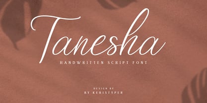 Tanesha is a handwritten script font. Work great for any design needs: logo, branding, modern advertising design, logos, poster quote, book/cover Title, editorial design, website/blog, card, custom mug, pillow, t-shirts, and any hand-lettered needs. Tanesha Font multilingual support: Afrikaans, Albanian, Catalan, Danish, Dutch, English, Estonian, French, Finnish, German, Icelandic, Indonesian, Italian, Malay, Norwegian, Portuguese, Spanish, Swedish, Zulu, and many more. What’s Included : Standard & Multilingual glyphs Ligature Works on PC & Mac Simple installations Accessible in Adobe Illustrator, Adobe Photoshop, Adobe InDesign, and even work on Microsoft Word. Hope you enjoy our font!
 - Green Home by DLetters Studio,
$18.00 Hello, This GREEN HOME Sans Serif font, has a Skinny, Stylish, and elegant Shape is perfect for your design ideas with the theme of Home Decorating, Home Idea, and is also very suitable as a complementary font for any of your photography and creative works. What’s Included : – Web Fonts – Ligature – Works on Win, Mac – Simple installations – Accessible in Adobe Illustrator, Adobe Photoshop, Adobe InDesign, even work on Microsoft Word. – PUA Encoded Characters – Fully accessible without additional design software. Hope you enjoy it with GREEN HOME font! Contact me if you have questions
 - Dream Script by Lián Types,
$49.00 One of my dreams as a type-designer was making a good looking chancery cursive. Full of life, like some of the best calligraphers around the world do on their artworks. With Julian Waters, John Stevens and Denis Brown (just to name a few of them) (1) chancery, or italic script, was transformed into a new, exciting and very fresh style of calligraphy mainly at the end of 20th Century. Dream Script may be that dream named above made true. I have been practicing chancery in the way I learnt from those calligraphers for many years now. Making a font out of my ink-sketches was a tough work, since they were closer of -being art- than of -being type-. However, this font rescues many aspects of handmade calligraphy: You have to look at it really close to notice it is actually a font, and that was one of my goals. The secret of a good looking chancery is on its subtle details: pen angle is constantly changing, even on the strokes which seem straight. Capitals and swashes have to be done a little faster than lowercase letters. The rhythm has to be even, in spite of its playful look. The fact that makes Dream look alive is that it has many alternates per glyph. This makes each word look unique like it happens in calligraphy: you will find alternates for the beginning/ending of a word/phrase, some for the middle of it, some interchangeable. Also, to accompany the script, you will find Dream Caps, which was inspired in the eternally beautiful trajan capitals. Place them like I did on the posters and you will have great results for sure. The font works great in small, middle and big sizes and can be a great selection for magazines, wedding invitations, perfumes, and posters. Close your eyes, and Dream with me... TECHNICAL Dream Script Pro is the most complete style, it contains all the alternates and ligatures (OT programmed, better if you use Adobe applications) If you plan to use the font for text, be sure to activate the less decorative capitals, which are placed in the “salt” group of alternates. Dream Script Standard has less glyphs than the Pro one, it contains just some ligatures for a better legibility. (OT programmed, better if you use Adobe applications) NOTES (1) Not only are they great artists, but also good people, who are always willing to share with their students all what they know. I would also like to thank Ricardo Rousselot, whose work inspired me this time to make “The Dream Script” exlibris; and to Alisara Tareekes, a very talented friend which international calligraphy conferences gave me: She kindly helped me with some tips to make this font better.
 - Prosaic Std by Typofonderie,
$59.00 A Postmodern vernacular sanserif in 8 fonts Prosaic designed by Aurélien Vret is a Postmodern typographic tribute to the french vernacular signs created by local producers in order to directly market their products visible along the roads. These signs drawn with a brush on artisanal billboards do not respect any typographic rules. The construction of these letterforms is hybrid and does not respect any ductus. Nevertheless the use of certain tools provokes a certain mechanism in the development of letter shapes. It’s after many experiments with a flat brush, that’s these letterforms have been reconstructed and perfected by Aurélien Vret. This is the starting point for the development of an easily reproducible sanserif with different contemporary writing tools. From non-typographical references of Prosaic towards readability innovation The influence of the tool is revealed in the letterforms: angular counterforms contrasting to the smoothed external shapes. This formal contrast gives to Prosaic a good legibility in small sizes. These internal angles indirectly influenced by the tool, open the counterforms. In the past, to deal with phototype limitations in typeface production, some foundries modified the final design by adding ink traps. In our high resolution digital world, these ink traps — now fashionable among some designers — have little or no effect when literally added to any design. Should one see in it a tribute to the previous limitations? Difficult to say. Meanwhile, there are typeface designers such as Ladislas Mandel, Roger Excoffon, and Gerard Unger who have long tried to push the limits of readability by opening the counters of their typefaces. Whatever the technology, such design research for a large counters have a positive impact on visual perception of typefaces in a small body text. The innovative design of counter-forms of the Prosaic appears in this second approach. Itself reinforced by an exaggerated x-height as if attempting to go beyond the formal limits of the Latin typography. It is interesting to note how the analysis of a non-typographical letters process has led to the development of a new typographic concept by improving legibility in small sizes. Disconnected to typical typographic roots in its elaboration, Prosaic is somewhat unclassifiable. The formal result could easily be described as a sturdy Postmodern humanistic sanserif! Humanistic sanserif because of its open endings. Sturdy because of its monumental x-height, featuring a “finish” mixing structured endings details. The visual interplay of angles and roundness produces a design without concessions. Finally, Prosaic is Postmodern in the sense it is a skeptical interpretation of vernacular sign paintings. Starting from a reconstruction of them in order to re-structure new forms with the objective of designing a new typeface. Referring to typographic analogy, the Prosaic Black is comparable to the Antique Olive Nord, while the thinner versions can refer to Frutiger or some versions of the Ladislas Mandel typefaces intended for telephone directories. Prosaic, a Postmodern vernacular sanserif Prosaic is radical, because it comes from a long artistic reflection of its designer, Aurélien Vret, as well a multidisciplinary artist. The Prosaic is also a dual tone typeface because it helps to serve the readability in very small sizes and brings a sturdy typographic power to large sizes. Prosaic, a Postmodern vernacular sanserif
 - The New Gothic Textura typeface, designed by Elodie Mandray, is a captivating contemporary adaptation of a historic script that pays homage to the intricate and ornamental style of the medieval textu...
- Kick The Font - Personal use only

- Castillian by Haksen,
$20.00 Castillian is the family of modern serif style with Uppercase and Lowercase feel nice balanced. Provide alternates font in uppercase and lowercase variant style make the design letter looks incredible. Honestly it works perfectly for headlines, logos, posters, packaging, T-shirts and much more. Recommended to use in Adobe Illustrator or Adobe Photoshop with opentype feature. Ligatures feature is default setting in Adobe Illustrator or Adobe Photoshop in Uppercase character. So when you want not to use the ligatures. Open glyphs panel : In Adobe Photoshop choose tool Window Character and then please klick fi symbol In Adobe Illustrator choose tool Window Type Open Type and then please klick fi symbol How to access Alternates Character? Open glyphs panel : In Adobe Photoshop choose tool Window glyphs In Adobe Illustrator choose tool Type glyphs If you have questions, just send me a message and I’m glad to help. Have a great day, Haksen
 - Silver Queen by VP Creative Shop,
$20.00 Introducing Silver Queen - Serif Typeface Silver Queen is luxury, vintage typeface with 6 weights loaded alternate glyphs, ligatures and multilingual support. It's a very versatile font that works great in large and small sizes. Silver Queen is perfect for branding projects, home-ware designs, product packaging, magazine headers - or simply as a stylish text overlay to any background image. Uppercase, lowercase, numeral, punctuation & Symbol 6 weights Hairline Light Regular Bold Extra Bold Black Alternate glyphs Ligatures Multilingual support How to access alternate glyphs? To access alternate glyphs in Adobe InDesign or Illustrator, choose Window Type & Tables Glyphs In Photoshop, choose Window Glyphs. In the panel that opens, click the Show menu and choose Alternates for Selection. Double-click an alternate's thumbnail to swap them out. Feel free to contact me if you have any questions! Mock ups and backgrounds used are not included. Thank you! Enjoy!
 - Noceur by VP Creative Shop,
$12.00 Introducing Noceur - Elegant serif font Noceur is luxury and fragile font with multilingual support. It's a very versatile font that works great in large and small sizes. This font is perfect for branding projects, home-ware designs, product packaging, magazine headers - or simply as a stylish text overlay to any background image. FEATURES Uppercase, lowercase, numeral, punctuation & Symbol alternate glyphs regular and italic versions Multilingual support No special software is required to type out the standard characters of the Typeface. Canva friendly How to access alternate glyphs? To access alternate glyphs in Adobe InDesign or Illustrator, choose Window Type & Tables Glyphs In Photoshop, choose Window Glyphs. In the panel that opens, click the Show menu and choose Alternates for Selection. Double-click an alternate's thumbnail to swap them out. Feel free to contact me if you have any questions! Mock ups and backgrounds used are not included. Thank you! Enjoy!
 - Degdegan by Haksen,
$18.00 Degdegan is a futuristic classic bold script style with unique alternates feel nice balanced. Provide many variant ligatures style make the design letter looks incredible. Honestly it works perfectly for headlines, logos, posters, packaging, T-shirts and much more. Recommended to use in Adobe Illustrator or Adobe Photoshop with opentype feature. Ligatures feature is default setting in Adobe Illustrator or Adobe Photoshop in Uppercase character. So when you want not to use the ligatures. Open glyphs panel : In Adobe Photoshop choose tool Window Character and then please klick fi symbol In Adobe Illustrator choose tool Window Type Open Type and then please klick fi symbol How to access Alternates Character? Open glyphs panel : In Adobe Photoshop choose tool Window glyphs In Adobe Illustrator choose tool Type glyphs If you have questions, just send me a message and I’m glad to help. Have a great day, Haksen
 - Mr Lucky by Hipopotam Studio,
$22.00 Mr Lucky is Mr Happy's slab brother and a hand-drawn narrow typeface designed for one of our books. You can layer different styles over the background style to achieve lots of colorful effects. Use just one style to get a single color letter or set Fill over Background or Stripped Background to get a two color mode. Mr Lucky has upper and lowercase characters with up to three alternate glyphs and special alternate uppercase diacritics. Build in OpenType Contextual Alternates feature will automatically set alternate glyphs depending on frequency of appearance of the same character (even in web font but only in HTML5 browsers). The script doesn’t throw random glyphs. For example in the word “HIPPOPOTAMUS” you will automatically get three different “P” glyphs and two “O” glyphs. It really works great but of course you can always fine tune it by hand.
 - Alteron by Absonstype,
$17.00 ALTERON is the classic display serif style with uppercase and lowercase look feel nice balanced. Provide alternates and ligatures font in variant style make the design letter looks nice. Honestly it works perfectly for headlines, logos, posters, packaging, T-shirts and much more. Recommended to use in Adobe Illustrator or Adobe Photoshop with opentype feature. Ligatures feature is default setting in Adobe Illustrator or Adobe Photoshop in Uppercase character. So when you want not to use the ligatures. Open glyphs panel : In Adobe Photoshop choose tool Window Character and then please click fi symbol In Adobe Illustrator choose tool Window Type Open Type and then please click fi symbol How to access Alternates Character? Open glyphs panel : In Adobe Photoshop choose tool Window glyphs In Adobe Illustrator choose tool Type glyphs If you have questions, just send me a message and I’m glad to help. Have a great day, Absonstype
 - Beillone by Absonstype,
$18.00 Beillone is the display typeface with combine uppercase and lowercase looks and feel nice balanced. Provide with alternates and ligatures font in variant style make the design letter looks nice. Honestly it works perfectly for headlines, logos, posters, packaging, T-shirts and much more. Recommended to use in Adobe Illustrator or Adobe Photoshop with opentype feature. Ligatures feature is default setting in Adobe Illustrator or Adobe Photoshop in Uppercase character. So when you want not to use the ligatures. Open glyphs panel : In Adobe Photoshop choose tool Window Character and then please click fi symbol In Adobe Illustrator choose tool Window Type Open Type and then please click fi symbol How to access Alternates Character? Open glyphs panel : In Adobe Photoshop choose tool Window glyphs In Adobe Illustrator choose tool Type glyphs If you have questions, just send me a message and I’m glad to help. Have a great day, Absonstype
 - Frontage Condensed by Juri Zaech,
$25.00 Frontage Condensed is a layered type system inspired by eye-catching and colorful facade signage. Its main aspect is — like many typographic installations on storefronts — three dimensional. The narrow, generously spaced letterforms lend the typeface a bold and eminent voice. The more ornamental layers like Bulb or Neon bring nostalgia to the family, while the Shadow layer maximizes the spacial impression. The system’s ten layers can be used alone or combined making the family a versatile toolkit. The use of color reveals Frontage Condensed’s full potential, yet for stark applications it works great in black and white too. Check the specimen PDF for examples. Frontage Condensed features 52 catchwords. They can be simply activated through OpenType’s Discretionary Ligatures and are an easy way to enrich the typographic texture. Other features include fractions, numerators and denominators. Frontage Condensed’s 339-character set covers over 190 latin languages.
 - Pearloop by Haksen,
$18.00 PEARLOOP is a elegant classic serif style with unique alternates feel nice balanced. Provide many variant ligatures style make the design letter looks incredible. Honestly it works perfectly for headlines, logos, posters, packaging, T-shirts and much more. Recommended to use in Adobe Illustrator or Adobe Photoshop with opentype feature. Ligatures feature is default setting in Adobe Illustrator or Adobe Photoshop in Uppercase character. So when you want not to use the ligatures. Open glyphs panel : In Adobe Photoshop choose tool Window Character and then please klick fi symbol In Adobe Illustrator choose tool Window Type Open Type and then please klick fi symbol How to access Alternates Character? Open glyphs panel : In Adobe Photoshop choose tool Window glyphs In Adobe Illustrator choose tool Type glyphs If you have questions, just send me a message and I'm glad to help. Have a great day, Haksen
 - Adorable Moggie by RagamKata,
$16.00 Adorable Moggie is a type of elegant display font that features large, bold lettering with unique decorative details on each character. The font gives off an elegant and classic feel, while still appearing modern and in line with current design trends. Adorable Moggie is well-suited for a variety of projects that require a high-end, eye-catching look, such as wedding invitations, luxury product packaging design, or promotional materials for brands looking to convey an exclusive and luxurious image. This serif font is also suitable for logo design or website design that aims to showcase a creative and elegant look, while still maintaining a professional and classic appearance." Features : - Ligatures & Alternates - Letters, numbers, symbols, and punctuation - No special software is required to use this typeface even work in Canva - Multilingual Support Please contact us if you have any questions. Enjoy crafting and thanks for supporting us! Thank you.
 - Absolute Funboldies by Haksen,
$17.00 Absolute Funboldies is a fun display sans serif style with unique alternates feel nice balanced. Provide many variant ligatures style make the design letter looks incredible. Honestly it works perfectly for headlines, logos, posters, packaging, T-shirts and much more. Recommended to use in Adobe Illustrator or Adobe Photoshop with opentype feature. Ligatures feature is default setting in Adobe Illustrator or Adobe Photoshop in Uppercase character. So when you want not to use the ligatures. Open glyphs panel : In Adobe Photoshop choose tool Window Character and then please klick fi symbol In Adobe Illustrator choose tool Window Type Open Type and then please klick fi symbol How to access Alternates Character? Open glyphs panel : In Adobe Photoshop choose tool Window glyphs In Adobe Illustrator choose tool Type glyphs If you have questions, just send me a message and I'm glad to help. Have a great day, Haksen
 - Zebardon by Haksen,
$17.00 Zebardon is a modern sans serif style with unique ligatures lowercase feel nice balanced. Provide many variant ligatures style make the design letter looks incredible. Honestly it works perfectly for headlines, logos, posters, packaging, T-shirts and much more. Recommended to use in Adobe Illustrator or Adobe Photoshop with opentype feature. Ligatures feature is default setting in Adobe Illustrator or Adobe Photoshop in Uppercase character. So when you want not to use the ligatures. Open glyphs panel : In Adobe Photoshop choose tool Window Character and then please klick fi symbol In Adobe Illustrator choose tool Window Type Open Type and then please klick fi symbol How to access Alternates Character? Open glyphs panel : In Adobe Photoshop choose tool Window glyphs In Adobe Illustrator choose tool Type glyphs If you have questions, just send me a message and I'm glad to help. Have a great day, Haksen


