10,000 search results
(0.08 seconds)
- Cruell by VP Creative Shop,
$20.00 Introducing Cruell Serif Typeface - 5 fonts Cruell is clean, luxury typeface with 5 fonts loaded with ligature glyphs, alternates and multilingual support to enchant your next project. Very versatile fonts that works great in large and small sizes. Cruell is perfect for branding projects, home-ware designs, product packaging, magazine headers - or simply as a stylish text overlay to any background image. Uppercase, numeral, punctuation & Symbol Light Regular Medium Bold Black ligature glyphs alternates Multilingual support How to access alternate glyphs? To access alternate glyphs in Adobe InDesign or Illustrator, choose Window Type & Tables Glyphs In Photoshop, choose Window Glyphs. In the panel that opens, click the Show menu and choose Alternates for Selection. Double-click an alternate's thumbnail to swap them out. Feel free to contact me if you have any questions! Mock ups and backgrounds used are not included. Thank you! Enjoy!
 - Circus of Letters by Redy Studio,
$21.00 Circus of Letters – Fancy Typeface Take a trip to the circus, exploring the colorful and playful world of our Circus of Letters Fancy Typeface. Inspired by vintage poster art, this set contains upper and lowercase letters, numbers, and tons of alternative characters, swashes, and multilingual characters. Circus of Letters is super versatile – it works great with simple designs or mixed with other fancy typefaces on more complex projects! If you’re looking for a cool, decorative font to add personality to your designs, look no further because you’ve found it! Circus of Letters features: A full set of upper & lowercase characters Numbers & punctuation Ligatures A ton of stylistic alternatives Swashes Multilingual symbols PUA Encoded Characters – Fully accessible without additional design software. Feel free to give me a message if you have a problem or question. Thank you so much for taking the time to look at one of our products.
 - Magoa by VP Creative Shop,
$20.00 Introducing Magoa Serif Ligature Typeface - 3 fonts Magoa is feminine, vintage typeface with 3 fonts loaded with ligature glyphs, alternates and multilingual support to enchant your next project. Very versatile fonts that works great in large and small sizes. Magoa is perfect for branding projects, home-ware designs, product packaging, magazine headers - or simply as a stylish text overlay to any background image. Uppercase, lowercase, numeral, punctuation & Symbol Light Regular Bold ligature glyphs alternates Multilingual support How to access alternate glyphs? To access alternate glyphs in Adobe InDesign or Illustrator, choose Window Type & Tables Glyphs In Photoshop, choose Window Glyphs. In the panel that opens, click the Show menu and choose Alternates for Selection. Double-click an alternate's thumbnail to swap them out. Feel free to contact me if you have any questions! Mock ups and backgrounds used are not included. Thank you! Enjoy!
 - Hyper Bleach by IKIIKOWRK,
$15.00 Proudly present Hyper Bleach - Liquid Type, created by ikiiko. Hyper Bleach is a flowing and expressive hand-drawn font that perfectly encapsulates the urban culture and modern style. This font gives a feeling of movement and fluidity. Urban and trendy fashion brands love the distinctive and edgy aesthetic offered by flowing font designs. When placed over the image, the letters stand out as they appear dry dripping in wavy lines. For a fashion-forward company looking to establish a distinctive visual identity, this font style is perfect. Its fluid design adds a dynamic and eye-catching touch to logos, titles, and headlines. This type is very suitable for making a streetwear brand, poster or magazine layout, fashion design, urban style, quotes, or simply as a stylish text overlay to any background image. What's Included? 2 Weight: Regular & Rglossy Uppercase & Lowercase Numbers & Punctuation Multilingual Support Works on PC & Mac Enjoy our font.
 - Kagestone by Absonstype,
$16.00 Kagestone is the classic display serif style with Uppercase and Lowercase feel nice balanced. Provide alternates font in lowercase variant style make the design letter looks nice. Honestly it works perfectly for headlines, logos, posters, packaging, T-shirts and much more. Recommended to use in Adobe Illustrator or Adobe Photoshop with opentype feature. Ligatures feature is default setting in Adobe Illustrator or Adobe Photoshop in Uppercase character. So when you want not to use the ligatures. Open glyphs panel : In Adobe Photoshop choose tool Window Character and then please click fi symbol In Adobe Illustrator choose tool Window Type Open Type and then please click fi symbol How to access Alternates Character? Open glyphs panel : In Adobe Photoshop choose tool Window glyphs In Adobe Illustrator choose tool Type glyphs If you have questions, just send me a message and I’m glad to help. Have a great day, Absonstype
 - Aerith by Krafted,
$10.00 Introducing Aerith - A Signature Font An elegant, graceful, yet simplistic cursive font. Inspire your audience, clients, or guests with this stylish, handwritten font that can be used for almost every platform such as websites, social media, pinterest, printed cards and many more! Aesthetically pleasing handwritten cursive font, just for beautiful you! What you’ll get: Multilingual & Ligature Support Full sets of Punctuation and Numerals Compatible with: Adobe Suite Microsoft Office KeyNote Pages Software Requirements: The fonts that you’ll receive in the pack are widely supported by most software. In order to get the full functionality of the selection of standard ligatures (custom created letters) in the script font, any software that can read OpenType fonts will work. We hope you enjoy this font and that it makes your branding sparkle! Feel free to reach out to us if you’d like more information or if you have any concerns.
 - Slang by VP Creative Shop,
$20.00 Meet Slang, a Ligature Font in Regular and Outline. Slang is a bold, clean font with a regular and an outline version, loaded with alternate and ligature glyphs. It's a very versatile font that works great in large and small sizes. Slang is perfect for branding projects, home-ware designs, product packaging, magazine headers - or simply as a stylish text overlay to any background image. Uppercase, lowercase, numeral, punctuation and Symbols, Alternate glyphs, Ligature glyphs and has Multi-lingual support. How to access alternate glyphs? To access alternate glyphs in Adobe InDesign or Illustrator, choose Window Type & Tables Glyphs. In Photoshop, choose Window Glyphs. In the panel that opens, click the Show menu and choose Alternates for Selection. Double-click an alternate's thumbnail to swap them out. Feel free to contact me if you have any questions. Mock ups and backgrounds used are not included. Thank you and enjoy.
 - Alliette by Krafted,
$10.00 Introducing Alliette - A Handwritten Font One of the most elegant,exquisite yet strong font, can be used for loads of different projects, advertisements and promotions. Go ahead and use it on your website, for your social media branding, Pinterest banners, printed invitations, and more! Inspire your audience, clients, or guests with this stylish, handwritten font. What you’ll get: Multilingual & Ligature Support Full sets of Punctuation and Numerals Compatible with: Adobe Suite Microsoft Office KeyNote Pages Software Requirements: The fonts that you’ll receive in the pack are widely supported by most software. In order to get the full functionality of the selection of standard ligatures (custom created letters) in the script font, any software that can read OpenType fonts will work. We hope you enjoy this font and that it makes your branding sparkle! Feel free to reach out to us if you’d like more information or if you have any concerns.
 - Teritone by Absonstype,
$16.00 TERITONE is the sporty sans serif style with uppercase and lowercase looks and feel nice balanced. Provide alternates and ligatures variant style make the design letter looks nice. Honestly it works perfectly for headlines, logos, posters, packaging, T-shirts and much more. Recommended to use in Adobe Illustrator or Adobe Photoshop with opentype feature. How to access Alternates Character? Open glyphs panel : In Adobe Photoshop choose tool Window glyphs In Adobe Illustrator choose tool Type glyphs Ligatures feature is default setting in Adobe Illustrator or Adobe Photoshop in Uppercase character. So when you want not to use the ligatures. Open glyphs panel : In Adobe Photoshop choose tool Window Character and then please click fi symbol In Adobe Illustrator choose tool Window Type Open Type and then please click fi symbol If you have questions, just send me a message and I’m glad to help. Have a great day, Absonstype
 - Demora by Absonstype,
$15.00 DEMORA is the sporty sans serif style with uppercase and lowercase looks and feel nice balanced. Provide alternates and ligatures variant style make the design letter looks nice. Honestly it works perfectly for headlines, logos, posters, packaging, T-shirts and much more. Recommended to use in Adobe Illustrator or Adobe Photoshop with opentype feature. How to access Alternates Character? Open glyphs panel : In Adobe Photoshop choose tool Window glyphs In Adobe Illustrator choose tool Type glyphs Ligatures feature is default setting in Adobe Illustrator or Adobe Photoshop in Uppercase character. So when you want not to use the ligatures. Open glyphs panel : In Adobe Photoshop choose tool Window Character and then please klick fi symbol In Adobe Illustrator choose tool Window Type Open Type and then please klick fi symbol If you have questions, just send me a message and I’m glad to help. Have a great day, Absonstype
 - Determine by Haksen,
$18.00 DETERMINE is a strong modern sans style with upper and lowercase feel nice balanced. Its wide range of uppercase with alternates and ligatures allow versatile design options and works perfectly for headlines, logos, posters, packaging, T-shirts and much more. Font Features : Regular and Italic version Character set A-Z Ligatures in Uppercase Alternates in Uppercase Numerals & Punctuation Accented Characters Multiple Languages Supported Recommended to use in Adobe Illustrator or Adobe Photoshop with opentype feature. Ligatures feature is default setting in Adobe Illustrator or Adobe Photoshop in Uppercase character. So when you want not to use the ligatures. Open glyphs panel : In Adobe Photoshop choose tool Window Character and then please klick fi symbol In Adobe Illustrator choose tool Window Type Open Type and then please klick fi symbol If you have questions, just send me a message and I'm glad to help. Have a great day, Haksen
 - Kaoly by Creativemedialab,
$18.00 Kaoly Regular A unique bold serif with lots of beautiful alternate characters that you can combine to get an attractive final lettering with nice and dynamic shapes just in seconds! Thanks for the unique alternates! This font is suitable for use in many design form, for example Magazines, postcards, logos, Wedding projects and many more. We recommend using Adobe Illustrator or photoshop. Kaoly Lite This is the lite version of Kaoly Regular, recommend to use as a web font. For this style, changes only on uppercase, we also removed the alternative letters to reduce the file size. It will load your website faster when you're using this font for website heading text, products title or using applications that do not support OpenType features. It's very easy to make beautiful words just by typing and tada... you're done. Kaoly will make your work easy and fun.
 - Palmas by Viswell,
$19.00 Palmas is a striking display typeface that exudes a sense of boldness and vintage charm. Its thick and heavy letterforms make a statement, demanding attention from viewers. With its retro psychedelic style, Palmas is perfect for designs that require a touch of nostalgia or a hint of the 70s-90s era. The letters of Palmas are intricately crafted, with subtle curves and serifs that add character to each glyph. The font's weight gives it a commanding presence, making it ideal for headlines and titles. It's easy to imagine Palmas being used for album covers, movie posters, and other designs that require a bold and unique typeface. Despite its retro inspiration, Palmas remains versatile and adaptable. Its bold style works equally well in modern designs, lending a touch of personality and character to any project. Whether used in print or digital media, Palmas is sure to leave a lasting impression on viewers.
 - Avemone by Absonstype,
$16.00AVEMON is the elegant classic serif style with uppercase and lowercase feel nice balanced. Provide alternates and ligatures font in variant style make the design letter looks nice. Honestly it works perfectly for headlines, logos, posters, packaging, T-shirts and much more. Recommended to use in Adobe Illustrator or Adobe Photoshop with opentype feature. Ligatures feature is default setting in Adobe Illustrator or Adobe Photoshop in Uppercase character. So when you want not to use the ligatures. Open glyphs panel : In Adobe Photoshop choose tool Window Character and then please click fi symbol In Adobe Illustrator choose tool Window Type Open Type and then please click fi symbol How to access Alternates Character? Open glyphs panel : In Adobe Photoshop choose tool Window glyphs In Adobe Illustrator choose tool Type glyphs If you have questions, just send me a message and I’m glad to help. Have a great day, Absonstype - Rottering by Absonstype,
$20.00 Rottering is the elegant modern serif style with uppercase and lowercase feel nice balanced. Provide alternates and ligatures font in variant style make the design letter looks nice. Honestly it works perfectly for headlines, logos, posters, packaging, T-shirts and much more. Recommended to use in Adobe Illustrator or Adobe Photoshop with Open Type feature. Ligatures feature is default setting in Adobe Illustrator or Adobe Photoshop in Uppercase character. So when you want not to use the ligatures. Open glyphs panel : In Adobe Photoshop choose tool Window Character and then please click fi symbol In Adobe Illustrator choose tool Window Type Open Type and then please click fi symbol How to access Alternates Character? Open glyphs panel : In Adobe Photoshop choose tool Window glyphs In Adobe Illustrator choose tool Type glyphs If you have questions, just send me a message and I’m glad to help. Have a great day, Absonstype
 - Rectoba by Absonstype,
$16.00 Rectoba is the sporty sans style with uppercase and lowercase looks and feel nice balanced. Provide alternates and ligatures font in variant style make the design letter looks nice. Honestly it works perfectly for headlines, logos, posters, packaging, T-shirts and much more. Recommended to use in Adobe Illustrator or Adobe Photoshop with Open Type feature. Ligatures feature is default setting in Adobe Illustrator or Adobe Photoshop in Uppercase character. So when you want not to use the ligatures. Open glyphs panel : In Adobe Photoshop choose tool Window Character and then please click fi symbol In Adobe Illustrator choose tool Window Type Open Type and then please click fi symbol How to access Alternates Character? Open glyphs panel : In Adobe Photoshop choose tool Window glyphs In Adobe Illustrator choose tool Type glyphs If you have questions, just send me a message and I’m glad to help. Have a great day, Absonstype
 - Fika VP by VP Creative Shop,
$20.00 Introducing Fika Display Typeface Fika is bold, fun typeface that contains 4 fonts to enchant your next project. They are loaded alternate glyphs, ligatures and multilingual support. Very versatile fonts that works great in large and small sizes. Fika is perfect for branding projects, home-ware designs, product packaging, magazine headers - or simply as a stylish text overlay to any background image. Uppercase, lowercase, numeral, punctuation & Symbol Regular Outline Lines Rough Alternate glyphs Ligatures Multilingual support How to access alternate glyphs? To access alternate glyphs in Adobe InDesign or Illustrator, choose Window Type & Tables Glyphs In Photoshop, choose Window Glyphs. In the panel that opens, click the Show menu and choose Alternates for Selection. Double-click an alternate's thumbnail to swap them out. Feel free to contact me if you have any questions! Mock ups and backgrounds used are not included. Thank you! Enjoy!
 - Style Script by TypeSETit,
$79.00 No word describes this font better than STYLE... TypeSetIt has taken things just a step further. It takes the look and simplicity of 1950s and 60s advertising and combines it with up to date design characteristics. With three main styles, Plain, Script and Formal, StylePro transforms the Retro look into a versatile, and powerful font that can be used for nostalgic work, or 21st Century design. Style Script is a beautiful upright script with looks that vary from Casual to Formal in appearance. If you're a professional graphic designer, use Adobe Illustrator®, or InDesign®, to access Style Script Pro’s Opentype features. With over 1275 Glyphs, the OTF programming gives a powerful solution to the needs of design professionals. Special thanks to Maximiliano Sproviero (my good friend) for his keen eye and design suggestions, and a note of appreciation to Mark Simonson for helping with technical issues. :)
 - Combative by Create Big Supply,
$17.00 Combative is perfect for logos and various formal applications such as invitations, labels, magazines, books, greeting cards, packaging, fashion, stationery, novels, and advertising purposes. Combative's unique style and versatility make it suitable for a wide range of design projects. Whether you're looking to create a bold and impactful logo or add a touch of sophistication to your formal designs, Combative has you covered. With its uppercase and lowercase letterforms, Combative offers flexibility and creative freedom. The font also includes numbers, punctuation marks, and supports multiple languages, ensuring that you have all the necessary elements to express your ideas effectively. Combative features PUA Encoding, allowing easy access to additional characters and glyphs, further enhancing your design possibilities. Make a statement with Combative's elegant and eye-catching style. Whether you're working on branding, invitations, magazines, or any formal design project, this font will elevate your creations and leave a lasting impression.
 - Monday Boulevard by VP Creative Shop,
$20.00 Introducing Monday Boulevard - Art Deco Typeface - 4 weights Monday Boulevard is retro, Art Deco typeface with 4 weights, ligature glyphs, alternates and multilingual support. It's a very versatile font that works great in large and small sizes. Monday Boulevard is perfect for branding projects, home-ware designs, product packaging, magazine headers - or simply as a stylish text overlay to any background image. Uppercase, lowercase, numeral, punctuation & Symbol Light Regular Bold Black Alternate glyphs Ligatures Multilingual support How to access alternate glyphs? To access alternate glyphs in Adobe InDesign or Illustrator, choose Window Type & Tables Glyphs In Photoshop, choose Window Glyphs. In the panel that opens, click the Show menu and choose Alternates for Selection. Double-click an alternate's thumbnail to swap them out. Feel free to contact me if you have any questions! Mock ups and backgrounds used are not included. Thank you! Enjoy!
 - French VP by VP Creative Shop,
$20.00 Introducing French Serif Typeface - 4 weights French is luxury, clean typeface with 4 fonts to enchant your next project. They are loaded alternate glyphs, ligatures and multilingual support. Very versatile fonts that works great in large and small sizes. French is perfect for branding projects, home-ware designs, product packaging, magazine headers - or simply as a stylish text overlay to any background image. Uppercase numeral, punctuation & Symbol Light Regular Bold Black Alternate glyphs Ligatures Multilingual support How to access alternate glyphs? To access alternate glyphs in Adobe InDesign or Illustrator, choose Window Type & Tables Glyphs In Photoshop, choose Window Glyphs. In the panel that opens, click the Show menu and choose Alternates for Selection. Double-click an alternate's thumbnail to swap them out. Feel free to contact me if you have any questions! Mock ups and backgrounds used are not included. Thank you! Enjoy!
 - Haigrast Serif by Mans Greback,
$59.00 Haigrast Serif is a font that combines classic and modern design elements to create a look that is both tasteful and fashion-forward. This serif font is regular but with a very modern feel, making it the perfect choice for designers looking to add a touch of sophistication to their work. The sharp, crisp lines and swash alternates in addition to the decorative letterings add a unique touch, making Haigrast Serif a versatile font that can be used in a variety of projects. Whether you're creating a stylish magazine layout, a cool fashion logo, or a balanced design piece, Haigrast Serif is the perfect font to make your work stand out. Designed by Mans Greback in 2023, this font is the perfect choice for designers who want to make a bold statement in their design work. The Haigrast Script family consists of six high-quality fonts: Regular, Italic, Bold, Bold Italic, Black and Black Italic The font is built with advanced OpenType functionality and has a guaranteed top-notch quality, containing stylistic and contextual alternates, ligatures and more features; all to give you full control and customizability. It has extensive lingual support, covering all Latin-based languages, from Northern Europe to South Africa, from America to South-East Asia. It contains all characters and symbols you'll ever need, including all punctuation and numbers.
 - Ciseaux Matisse by Harald Geisler,
$65.74 Ciseaux Matisse was inspired by the exhibition Drawing With Scissors, which I visited at the Kunsthalle Schirn in my hometown of Frankfurt am Main in 2003 and the book Jazz published in 1947 by Henri Matisse. Admittedly, before that time I wasn’t a fan of Matisse’s work, neither his late nor the early work. That definitely changed after the exhibition. While his motifs have been overused on postcards and mouspads, in front of the originals you forget those tiny pictures. Some of the works were massive—larger than 24ft. By cutting directly into the color Matisse created shapes with strong dynamics. Years later, in 2007, I used that inspiration to cut an exclusive font for a newspaper that I designed at that time (see Gallery Pictures). Later I developed that font into the four styles featured here. The cut-out style is a paper cutout; boxed is the paper background. Both linear and boxed linear have no curved outlines, so they are more aggressive. As drawing with scissors implies, all characters are cut by hand. With only uppercase letters, this font is designed for editorial use: headlines, slogans in ads, or musical usage in posters and flyers that need the little touch of the jazz scissors. In special cases the lowercase letters contain alternate shapes to the uppercase forms.
 - Burgues Script by Sudtipos,
$99.00 Burgues Script is an ode to the late 19th century American calligrapher Louis Madarasz, whose legendary pen has inspired schools of penmanship for over 100 years. His talent has caused some people to call him “the most skillful penman the world has ever known.” I use the word ‘ode’ in a colloquially ambitious manner. If I was an actual poet, my words would be about things I desire but cannot attain, objects of utter beauty that make me wallow in humility, or people of enormous talent who look down at me from the clouds of genius. But I don’t write poems. My work consists of letters drawn to fit together, that become an element of someone’s visual poetry. I am the poet’s assistant, so to speak. Once in a while, the assistant persists on what the subject of the poem will be. And occasionally, the poet gives in to the persistence. I hope you, visual poet, find my persistence justified in this case. The two main sources for Burgues were the calligraphy examples shown in Zaner Bloser’s The Secret of the Skill of Madarasz: His Philosophy and Penmanship Masterpieces, and C. W. Jones’s Lessons in Advanced Engraver’s Script Penmanship by L. Madarasz. These two references were the cornerstone for the concept I was trying to work with. I did have to change many of the letters in order to be able to produce digital calligraphy that can flow flexibly and offered the user a variety of options, while maintaining its attractive appearance. To this end, many ligatures and swashes were made, as well as full flourished sets of letters for use at the beginnings or endings of words and sentences. All of this has been tied together with OpenType and tested thoroughly within today’s standard design and desktop publishing software. After working with digital scripts for so long, at one point I thought that Burgues Script would become a bit of a chore to complete. I also thought that, like with most other scripts, the process would regularize itself after a while and be reduced to a mechanical habit. Surprisingly, and fortunately for me, this did not happen. The past holds as many surprises as the future. Madarasz’s method of penmanship was fascinating and challenging to translate into the strict, mathematically oriented language of the computer. It seems that the extremely high contrast of the forms, coupled with the required flow and connectivity of such lettering, will always be hard work for any visual artist to produce, even with the aide of a powerful machine. I can only imagine what steady nerves and discipline Madarasz must have had to be able to produce fully flourished and sublimely connected words and sentences on a whim. When I think of Madarasz producing a flourished calligraphic logotype in a few seconds, and try to reconcile that with the timelines of my or my colleagues’ work in identity and packaging design, the mind reels. Such blinding talent from over a hundred years ago. Burgues is the Spanish word for Bourgeois. In the end, I hope Burgues Script will serve you well when a flourished word or sentence is required for a design project. One of the wonders of the computer age is the ability to visually conjure up the past, serving both the present and the future. With Burgues, you have a piece of “the most skillful penman the world has ever known,” at your service. Burgues received important awards such as a Certificate of Excellence TDC2 2008 and a Certificate of Excellence at the Bienal Tipos Latinos 2008.
 - Combine by Andinistas,
$49.00 Combine, designed by Carlos Fabian Camargo G, is powerful and attractive, multi-layered chromatic type family that consists of 12 fonts, typographically grouped in two logics: “Script and Caps”, so that they could be colored separately or in group. Both designed with contrasting optical techniques and combinable at the same time. The unforgettable central idea of Combine was inspired by unique types of speedball letters designed by ancient artists in Canadian posters of shows and fairs in 1930. This is why its Typographical tools work independently or in group, resulting in highly polished designs that need fonts with coupled effusiveness. Their combined resources offer guaranteed distinguishing letters with shadow effects and worn, in order to help enhance their expressiveness. Combine is excellent in any project on paper or screen as it has more than 2100 glyphs and features of OpenType distributed strategically in fonts easy to use. SEE BELOW THE MAIN ADVANTAGES: • Combine Script & Shadow: It offers incredible case sensitive fluency and eloquence drawn with vertical cursive letters with ornamental non-stop excitement and complementation. It also has a variety of significant upward and downward, alternative strokes combined with its vintage ties that also give authenticity to their designs. • Combine Caps 1,2,3 & Shadow1,2: Guarantees you a colorful horizontal area of narrow case with 2 types of shadows, sound and other shade with diagonal stripes. Its geometric uniformity gives a friendly, open and subtle character by Typographic and special resources and visual properties coloring layers separately or in groups. In addition, its 2 layers of skeletal illuminations, adding internal lines and simultaneously contributing to play perfect confrontation and contrast with their geometric ideas and aesthetics for special attention. • Combine Words & Shadow: It can be used to design a perfect tone in each one of the 50 slogans written diagonally, making a brilliant feeling suggestive seductive style. Compatibility and flexibility works by monoline thin cursive strokes ideal for featured items with and without shade. Combine was selected at the Bienal Tipos Latinos 2016
 - Picture Yourself by Linotype,
$29.99Create your own world with the Picture Yourself collection! Picture Yourself is a graphic image collection, which functions a font family instead of hundreds of EPS files. The family is made up of 24 different symbol typefaces. Designed by the collaborative effort of Karin and Peter Huschka, both living in Germany, Picture Yourself was a winner in the 2003 International Type Design Contest, sponsored by Linotype GmbH. The symbol library found in Picture Yourself offers an astounding array of high-contrast, simple forms, which may be used happily either separately or together in your layouts. Just as the fonts themselves stem from two designers working in collaboration, the imagery of the collection itself stems from two different influences. In large part, the font family was inspired by work displayed in the Frankfurt-based German Architecture Museum's 2003 Oscar Niemeyer exhibition. The photographs and sketches that were displays there inspired the first ideas for the Picture Yourself world of images. More of the typeface's design, as well as its name, were inspired by the underlying philosophy of the Beatles' music, especially the classic song from Lennon and McCartney, "Lucy In The Sky With Diamonds." In comparison with other large pictographic type collections, all of the characters in Picture Yourself fonts share the same horizon. The glyphs themselves are also drawn so that many of them can be combined with one another, creating tall or wide decorative compositions. Additionally, the proportions of the forms of the pictographs are aligned with various industry standards, in order to harmonize workflow. Picture Yourself Portraits (3:4), Landscapes (6:4), Cinema (9:4), and Panorama (12:4) each adhere to one of several photo or video formats. The Picture Yourself family of fonts can best be used with graphics applications like Adobe Photoshop or Illustrator, where different characters may be assigned to different layers, each with their own color. - Avenir Next Thai by Linotype,
$79.00 Avenir Next Pro is a new take on a classic face—it’s the result of a project whose goal was to take a beautifully designed sans and update it so that its technical standards surpass the status quo, leaving us with a truly superior sans family. This family is not only an update though; in fact it is the expansion of the original concept that takes the Avenir Next design to the next level. In addition to the standard styles ranging from ultralight to heavy, this 32-font collection offers condensed faces that rival any other sans on the market in on and off—screen readability at any size alongside heavy weights that would make excellent display faces in their own right and have the ability to pair well with so many contemporary serif body types. Overall, the family’s design is clean, straightforward and works brilliantly for blocks of copy and headlines alike. Akira Kobayashi worked alongside Avenir’s esteemed creator Adrian Frutiger to bring Avenir Next Pro to life. It was Akira’s ability to bring his own finesse and ideas for expansion into the project while remaining true to Frutiger’s original intent, that makes this not just a modern typeface, but one ahead of its time. Avenir Next Variables are font files which are featuring two axis, weight and width. They have a preset instance from UltraLight to Heavy and Condensed to Roman width. The preset instances are: Condensed UltraLight, Condensed UltraLight Italic, Condensed Thin, Condensed Thin Italic, Condensed Light, Condensed Light Italic, Condensed, Condensed Italic, Condensed Demi, Condensed Demi Italic, Condensed Medium, Condensed Medium Italic, Condensed Bold, Condensed Bold Italic, Condensed Heavy, Condensed Heavy Italic, UltraLight, UltraLight Italic, Thin, Thin Italic, Light, Light Italic, Regular, Italic, Demi, Demi Italic, Medium, Medium Italic, Bold, Bold Italic, Heavy, Heavy Italic.
 - Avenir Next Rounded by Linotype,
$42.99Avenir Next Pro is a new take on a classic face—it’s the result of a project whose goal was to take a beautifully designed sans and update it so that its technical standards surpass the status quo, leaving us with a truly superior sans family. This family is not only an update though; in fact it is the expansion of the original concept that takes the Avenir Next design to the next level. In addition to the standard styles ranging from ultralight to heavy, this 32-font collection offers condensed faces that rival any other sans on the market in on and off—screen readability at any size alongside heavy weights that would make excellent display faces in their own right and have the ability to pair well with so many contemporary serif body types. Overall, the family’s design is clean, straightforward and works brilliantly for blocks of copy and headlines alike. Akira Kobayashi worked alongside Avenir’s esteemed creator Adrian Frutiger to bring Avenir Next Pro to life. It was Akira’s ability to bring his own finesse and ideas for expansion into the project while remaining true to Frutiger’s original intent, that makes this not just a modern typeface, but one ahead of its time. Avenir Next Variables are font files which are featuring two axis, weight and width. They have a preset instance from UltraLight to Heavy and Condensed to Roman width. The preset instances are: Condensed UltraLight, Condensed UltraLight Italic, Condensed Thin, Condensed Thin Italic, Condensed Light, Condensed Light Italic, Condensed, Condensed Italic, Condensed Demi, Condensed Demi Italic, Condensed Medium, Condensed Medium Italic, Condensed Bold, Condensed Bold Italic, Condensed Heavy, Condensed Heavy Italic, UltraLight, UltraLight Italic, Thin, Thin Italic, Light, Light Italic, Regular, Italic, Demi, Demi Italic, Medium, Medium Italic, Bold, Bold Italic, Heavy, Heavy Italic. - Givens Antiqua by Monotype,
$29.99Drawn by George Ryan and named after Robert Givens, the co-founder and first president of Monotype Imaging, the Givens Antiqua™ typeface speaks with elegance and subtle authority. The design's open proportions, generous x-height and soft serifs lend Givens Antiqua a gracious quality that invites reading. I didn't work from any single design model," Ryan recalls. "The face grew out of my experimenting with several characters from a hand-lettered headline in a magazine. I worked on the shapes and forms for some time before I put the drawings in a drawer." At that point Ryan had finished the basic alphabet in two weights, but had not yet tackled the italics. A new project came along that demanded his full attention, and it was two years before he revisited the drawings. He liked what he saw and decided to finish the job. "The italics were the most problematic designs in the family," says Ryan, "but once I had their basic shapes and proportions, the rest was basically a production project." Another year of sketching, testing, editing and reworking characters ensued before Givens Antiqua was ready for release. The result is a four-weight family of roman designs and small caps, with complementary italics for the lightest three weights and a suite of swash caps for the italic designs. Givens Antiqua and Givens Antiqua Light show a modest stroke weight stress and a light, even text color. Givens Antiqua Bold is an effective emphasizer for text copy and an authoritative communicator at display sizes. The Black weight performs best at large sizes and makes a powerful statement without shouting, while the italic swash capitals possess enough vitality to serve as standalone initial letters." - Atocha by Sudtipos,
$49.00 It was expected that Joluvian’s third type font would be inspired by the city where he currently resides: Madrid, Spain. His previous creations had originated in Venezuela (Zulia) and The Philippines (Salamat), both, places where he had once lived. Joluvian believes “now is the time to pay tribute and show gratitude towards a city that has bestowed me with so many fortunes.” He considers that Madrid’s people, streets, scents, flavor and sounds are gift enough to awaken the creative urgency in any artist. This time around, it is being expressed through the crafts of the Typographic industry. Since his arrival in Spain, Joluvian has been attached to the city’s central area, specifically to the renowned Atocha Street and its railroad station. It was precisely on that street that Joluvian and Mauco Sosa, his friend and partner, decided to establish the Patera Studio: a charming creative space that birthed the concept for this new font which they proudly named Atocha Script. The artists where still in the final phases of their previous script, Salamat, when the idea for Atocha came about. This dynamic is actually very typical of the artistic process, in which every finished product spawns the need to create its next level offspring. “Working on Atocha and Atocha Caps has been a very pleasant journey. We have given our best efforts, for we wanted to offer a typeface that was both versatile and user-friendly on a number of applications, showing a wide scope of alternatives in our glyphs,” says the artist. The illustrations were created by Mauco, to ensure visual integration that would showcase the work of both members of the Patera Studio and their complementing aesthetic voices. Atocha, as Salamat and Zulia before, was digitized by Alejandro Paul.
 - Classica Pro by URW Type Foundry,
$35.99 Classica Pro by Bernd Möllenstädt A real alternative for letterpress printing A masterpiece It was only after many years, shortly before the end of his life, Bernd Möllenstädt brought out these early drafts of his Classica Light and Light Italic from his drawer, and asked me to produce for him on the computer a Bold and Bold Italic, from which we later wanted to interpolate further cuts like Regular and so on. The boldening of letters with an oblique axis and with hairlines which should not grow to the same extent as the general line widths, is hard to cope with perfectly, even for the smartest computer program, and even more so, when it concerns an as complicated set of data as those conceived by Bernd. The automatically generated result could therefore only be a first step that had to be improved manually later. This was about the stage that we had reached when Bernd died in March 2013, leaving me behind with comprehensive corrections on proofs of this automatically generated Bold. Although I was aware that it would mean a lot of work to complete the project, I did not want to leave it unfinished and decided to finalize and publish the Classica, also in Bernd‘s honor. In the course of the two years that I worked on this font family it somewhat naturally became also my own. New details were added and some of the existing changed. A book typeface requires the supreme and forgives rarely, it represents a true masterpiece. My intention and my ambition were to create a real alternative for letterpress printing, with a font family that contains all the typographic options for an excellent typesetting, and is better readable and has a better appearance than other existing typefaces. Whether this was achieved, the reader may decide. Volker Schnebel, Hamburg, december 2014
 - Calingham by Dierstudio,
$16.00 Introducing Calingham is a brush font with a which gives a vintage and retro style but still with elegant and classy touch to your projects. Features: - ligature - 7 Stylistic set - Works on PC & Mac - Simple installations - Accessible in the Adobe Illustrator, Adobe Photoshop, Adobe InDesign, even works on Microsoft Word. - Multilingual Support
 - Noelle by Jen Wagner Co.,
$15.00 Noelle is a classic, minimalist serif and script duo that functions beautifully in modern design work. Noelle serif features geometric, clean lines; modern serifs, and just a touch of vintage while Noelle script brings in femininity and delicateness. Noelle looks gorgeous in logo work as well as web headings and printed materials.
 - Pablo by ITC,
$29.99 Pablo is the work of British designer Trevor Pettit, who based this dramatic typeface on the signature of Pablo Picasso. The chunky lowercase reflects the very essence of Picasso's influence and the initial capitals can also be used on their own. Pablo is excellent for work requiring a vivid, cutting edge appearance.
 - ITC Forkbeard by ITC,
$29.99ITC Forkbeard is the work of British designer Michael Gills and named after a famous Viking warrior. Gills was inspired by the work of Victor Hammer as well as a lesser known uncial style called Andromaque. Distinguishing characteristics of ITC Forkbeard are its geometric overtones and its distinct capital and lower case letterforms. - Choc by ITC,
$29.99 Choc font is the work of French designer Roger Excoffon, based on the traditions of Japanese brush calligraphy, thick yet graceful. Choc light font was designed by Phil Grimshaw, who had to redraw many times in different weights before finding one that worked as a text face and remained true to the original.
 - Doohickey by Comicraft,
$19.00So your widget’s stuck between the framistat and the whatchamacallit, there’s a spanner in the works and your avengers just won't assemble. Hey, if you want to get any more work done, you know you're gonna have to hook the hoojamajigger up to the doohickey! See the families related to Doohickey: Doohickey Lower. - Frank Reaction by Will Stewart,
$40.00 A high quality hand rendered pencil script that includes a variety of contextual alternates to ensure the best handwritten look. Frank Reaction works brilliantly when used for both display and body copy and it is available for both print and web application. Use Frank Reaction to give your work personality and life.
 - Filmtone by Olivetype,
$18.00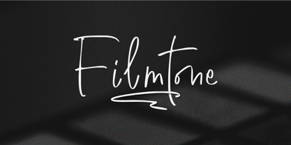 Create beautiful work with Filmtone, the perfect typeface for adding a touch of personality to your designs. With its casual style, Filmtone is perfect for headlines, invitations, posters, and more. So what’s included : Basic Latin Uppercase and Lowercase Numbers, symbols, and punctuations Multilingual Support. Simple Installations works on PC & Mac Thank You.
 - Labyrinthus Rounded by Cerri Antonio,
$30.00 Labyrinthus Rounded is a multiline decorative font that works very well for identity logos, posters and 3D-works. It continues the tradition of the precedent Labyrinthus but with a softer rounded impact. It's interesting to note that with it it's possible to play with the multiline concept to create endless overlapping geometric creations.