10,000 search results
(0.131 seconds)
- Headlines Core Edition by TypeThis!Studio,
$45.00Headlines font family was designed for optimised headline settings. The condensed letters are designed for clear and straight headlines and also allow longer words and headlines to find the space they need for a well-composed headline. Typeface Features 265 Characters 8 Styles, including Italics Western European Language Support Numbers Symbols Punctuation www.typethis.studio Thank you for checking out Headlines Font Family. If you have any questions, please send an email to hello@typethis.studio - Goversy by Maulana Creative,
$15.00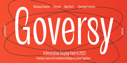 Goversy is a Decorative Condensed Display font. With Regular stroke, fun character with a bit of ligatures. To give you an extra creative work. Goversy font support multilingual more than 100+ language. This font is good for logo design, Social media, Movie Titles, Books Titles, a short text even a long text letter and good for your secondary text font with handwriting and script font. Make a stunning work with Goversy font. Cheers, Maulana Creative
 - Stovepipe Stencil JNL by Jeff Levine,
$29.00 Stovepipe Stencil JNL was not directly designed from a vintage source, but it does draw its influences from classic sans serif lettering of the past. Even its name borrows (somewhat gratuitously) from the "stovepipe" lettering so popular with sign painters. True stovepipe letters tend to be squarer with rounded corners, but the name has also been loosely associated with some tall, condensed type styles. The typeface is available in both regular and oblique versions.
 - MTC Quinnie by Martype co,
$15.00 MTC Quinnie a condensed serif typeface with many alternates and ligature features good choice for designers and editorials. The use of many alternates and ligatures in these fonts adds visual interest and variety, allowing designers to create unique and customized typography. One notable aspect of these fonts is the smoothness of their serifs. The serifs, or small decorative flourishes at the ends of letter strokes, are an essential part of serif typefaces.
 - FP Dancer Tango by Fontpartners,
$29.00 FP Dancer Tango is a humanist-influenced techno-like font, designed 2012-14 by Morten Rostgaard Olsen & Ole Søndergaard. FP Dancer Tango will be a useful tool, helping you to create wonderful headlines and text-columns in magazines and so. The font is surprisingly readable, even in small point sizes. Among other things as a result of the smooth transitions between the angular shapes. In addition, the condensed shapes saves a lot of space.
 - Vincenzo by CastleType,
$29.00 Vincenzo is based on a beautiful condensed typeface from the 1920s or earlier; original designer unknown. This is a "Modern" style with fine slab serifs, vertical stress between thick and thins, and high contrast. What is unique about this design is that the triangular serifs (e.g., E, F, L, T, etc.) do not gradually taper as they join the rest of the letter, as would be the case in Bodoni and similar designs. Uppercase only.
 - Amberlayton by Maulana Creative,
$14.00 Amberlayton Signature Font, with monoline stroke, condensed and fun characters. It has Opentype features of ligatures, makes it a perfect choice for branding and digital designs. Use this font for logos, social media, websites, blogs, instagram, social media, business cards, branding, and more! Amberlayton font support multilingual more than 100+ language. and good pair for your secondary text font with sans or serif. Make a stunning work with Amberlayton signature font. Cheers, MaulanaCreative
 - Zuume Edge by Adam Ladd,
$25.00 Zuume Edge is a condensed, display sans serif ideal for eye-catching headlines, branding, packaging, logos, sports, and entertainment, and anywhere else you need maximum impact. The wide weight range offers versatility — the lighter weights bring a sharp, technical feel while the heavier weights pack a visual punch. The notched and extended ink traps add function and visual interest and the Cut styles have sliced horizontal strokes for more movement, aggression, and speed.
 - Pratt Nova by Shinntype,
$39.00 Shaped by constraint to accommodate a large character count, Pratt Nova has massive form: semi-condensed, large x-height, short descenders and capitals. And yet it transcends its restrictive origins in abundance, expressing a spirit of visual and semantic opulence, equipping the typographer with a comprehensive array of harmonized fonts, all rigorously drawn, superbly fitted iterations of a single, profoundly original design. The set of Text styles contain additional glyphs and OpenType features.
 - Quan Slim by Typesketchbook,
$40.00 The typeface of Quan Slim is based on the successful Quan font family by font foundry Typesketchbook. Font designer Chatnarong Jingsuphatada created Quan Slim as a condensed version to Quan. Both type families consist of eight weights plus obliques and additional rounded versions. Quan Slim’s typeface has a clean and modern sans serif appearance. This modern geometric font is very legible and can be used for headlines as well as small and long text.
 - Foundry Form Sans by The Foundry,
$90.00 Foundry Form Sans and Serif were drawn concurrently with matching proportions for harmonious use. Although designed to complement each other both families function independently. The Foundry Form Sans characters have a strong horizontal emphasis for readability; open counters to improve legibility at small sizes; and slightly condensed proportions to ensure economic use of space. Foundry Form Sans has a simplicity of design approach balanced with just enough character to achieve a unique, timeless look.
 - Chairdrobe by XTOPH,
$25.00 Chairdrobe is minimalistic typeface with a contemporary, urban style. It feels pure, raw and a bit dirty. You can use it as display type as well as in longer text. Try to space it up. It looks super tight with a lot of spacing! Chairdrobe is a sans-serif, condensed typeface. Available in 3 different variations – Normal, Rounded and Grunge. It features upper and lowercase letters and up to 7 Weights and Italics.
 - ITC Stoclet by ITC,
$29.99ITC Stoclet is the work of British designer Phill Grimshaw, an offshoot of the research and experimentation which led to the development of ITC Rennie Mackintosh. It is a condensed, angular typeface, and its sharp angles, swooping curves and long forms are reminiscent of Art Nouveau. The font includes a number of alternative characters which enhance its flexibility. ITC Stoclet is ideal for large, ornamental designs as well as short blocks of text. - Otoiwo Grotesk by Pepper Type,
$39.00 Otoiwo Grotesk is an extremely versatile sans-serif typeface with a closed aperture. It features whopping 126 styles over 7 widths, each containing 9 weights with corresponding italics. The mood of the family ranges from fairy neutral in Normal and Condensed widths to very flavorful Compressed and Ultra Wide. Rich language support, which includes Cyrillic and spans 131 language ovarall, makes Otoiwo Grotesk a worthy choice for brands that strive to reach international audience.
 - Caliente by Imprimatvr,
$28.00 This font is shaped to exhibit a very compact and characterized design, clearly distinguishable from the mainstream condensed sans-serif fonts. That is why Caliente has a conspicuous modulation and a medium-to-high contrast. Both features are seldom observed among ordinary fonts of its kind. However, Caliente is designed to suit perfectly well in a number of applications—from advertising to business letters—while accurately preserving its strong personality even in very small sizes.
 - MC Bastler by Maulana Creative,
$14.00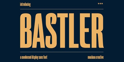 Bastler is a Condensed Display Sans font. Regular stroke, fun character with a bit of ligatures and alternates. To give you an extra creative work. Bastler font support multilingual more than 100+ language. This font is good for logo design, Social media, Movie Titles, Books Titles, a short text even a long text letter and good for your secondary text font with script or serif. Make a stunning work with Bastler font. Cheers, Maulana Creative
 - Monthly Adventures JNL by Jeff Levine,
$29.00 The cover lettering of a 1940s issue of a romance comic spotted in an auction online was the inspiration for Monthly Adventures JNL. Classic in its Art Deco look, this condensed outline font is evocative of the hand-lettered titles used during the Golden Age of the comic book. Available in both the original outline version and a thick, solid version with the outline removed, as well as oblique variations of both.
 - Spektra by Type Salon,
$35.00 Spektra is a multi-script type family that combines 5 scripts: Latin, Cyrillic, Arabic, Greek and Hebrew. It is a variable font - ranging from backslant to italic axis. Its condensed and black shapes are combining the same style concept throughout every script. Progressive shapes contribute to expressing statements on bigger mediums. Spektra combines different locations, cultures and ideas as statements around the world and celebrates the differences among them. Awards • Modern Cyrillic 2021
 - Quintaras Signature Script by Maulana Creative,
$14.00 Quintaras is a complete script and sans font duo. With expressive signature mono-line stroke and condensed sans solid and outline stroke, fun character with some of ligatures. To give you an extra creative work. Quintaras font support multilingual more than 100+ language. This font is good for logo design, Social media, Movie Titles, Books Titles, a short text even a long text letter. Make a stunning work with Quintaras font. Cheers, MaulanaCreative
 - Fabuleuse Slab by Nuno Dias,
$18.00 Fabuleuse Slab is a one-style font that features a thin, condensed and high cap height and x-height. This gives the font a distinct retro look & bohemian feeling that is great for logos & branding, packaging, titles, magazines, posters, signs, shirts, scrap-booking, … This display font comes in Capital letters as well as Lowercase. It also comes equipped with Ligatures, Numbers, Punctuation Marks, Diacritic Marks and a well stocked supply of special characters.
 - MC Marshim by Maulana Creative,
$15.00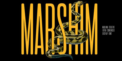 Marshim is a Condensed Display font. Regular stroke, fun character with a bit of ligatures and alternates. To give you an extra creative work. Marshim font support multilingual more than 100+ language. This font is good for logo design, Social media, Movie Titles, Books Titles, a short text even a long text letter and good for your secondary text font with script or serif. Make a stunning work with Marshim font. Cheers, Maulana Creative
 - Crunchyes by Maulana Creative,
$12.00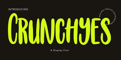 Crunchyes is a casual handwritten font. With rough stroke, Condensed and fun character with a bit of ligatures. To give you an extra creative work. Crunchyes font support multilingual more than 100+ language. This font is good for logo design, Social media, Movie Titles, Books Titles, a short text even a long text letter and good for your secondary text font with sans or serif. Make a stunning work with Crunchyes font. Cheers, MaulanaCreative
 - JHC Audemars by Jehoo Creative,
$20.00 Presenting JHC Audemars, an impeccably crafted condensed serif font exuding a resolute and refined character. Distinguished by its unique inverted letter shapes, this font embraces an avant-garde aesthetic. Boasting a comprehensive range of weights from Thin to Black, along with an elegant italic style, JHC Audemars ensures versatile application in various design contexts. Ideal for sophisticated branding and editorial endeavors, this font effortlessly merges strength with sophistication, delivering a commanding and memorable typographic presence.
 - Fazon by Tour De Force,
$30.00 Compact and condensed, Fazon font family belongs to design inspired by vintage typefaces. It is available in 7 weights – from Light to Black. Contrast in letter design gets higher as weights get thicker which assigns dose of display elements in heavier weights of Fazon. Contains 5 stylistic sets (4 for uppercase and 1 for lowercase letters) and fractions. Fazon covers extended Latin character map. Ideal usage: packages and labels, posters, titles, websites.
 - Birch Beer JNL by Jeff Levine,
$29.00Birch Beer JNL comes from lettering spotted on a European business sign found in some stock footage that was used for an old black and white film about World War II. The name is derived from a popular root beer-like soda sold by the Royal Castle Restaurants that were popular in Florida from the 1930s through the 1970s. - Carlin Script by Linotype,
$40.99The Carlin Script family, inspired by the Carolingian minuscule alphabet (ca 800 A.D.), is one of the great new families available through Linotype's Library's Take Type 5 collection. Take a closer look at these beautiful characters; with them, one can create a different, more personal feeling than commonly comes from more available script and chancery fonts. Like a monk with his writing table, German designer Hans-Jürgen Ellenberger created this new design, which includes 10 different weights, bringing scribal excellence directly to your keyboard. The Carlin Script family includes an additional Initial set-allowing the creation of medieval-flavored drop or initial caps in snap. And the critics are raving: Carlin Script was a winner in the New York-based Type Directors Club's 2003 Type Design Contest!" - Anno by Linotype,
$29.99The impulse behind André Maaßen’s design of the Anno typeface was the design of a New Year’s card for the year 2000 (Anno 2000). His desire to create the perfect printed image developed into a family with four styles: Anno 1, Anno 1 Italic, Anno 2, and Anno 2 Italic. Anno 1 and its Italic are semi-classicist typefaces, with a high degree of stroke contrast, while Anno 2 and its Italic are semi-grotesks, with less stroke contrast. Both Anno 1 and Anno 2 are sans serifs typefaces, but they each offer a new interpretation of the genre. The Anno typeface may be used in a number of applications and sizes. And it is naturally suitable for New Year’s greetings and other cards, of course! - Valimo by Fenotype,
$19.00 Valimo RMX is a destroyed hard-to-read typeface. It's suitable for creating text "textures" where you don't necessarily need any actual content.
 - Retro Signature - Personal use only

- Lekton04 - Personal use only

- Andrew Ward - 100% free

- Novin by Naghi Naghachian,
$85.00 Novin Font family is designed by Naghi Naghashian. This Font is developed on the basis of specific research and analysis on Arabic characters and definition of their structure. This innovation is a contribution to modernisation of Arabic typography, gives the font design of Arabic letters real typographic arrangement and provides more typographic flexibility. This step was necessary after more than two hundred years of relative stagnation in Arabic font design. Novin supports Arabic, Persian, and Urdu. It also includes proportional and tabular numerals for the supported languages. Novin Font is available in Light, Regular and Bold. Novin design fulfills the following needs: A Explicitly crafted for use in electronic media fulfills the demands of electronic communication. Novin is based on Aldo Novareses Eurostile Extended. B Suitability for multiple applications. Gives the widest potential acceptability. C Extreme legibility not only in small sizes, but also when the type is filtered or skewed, e.g., in Photoshop or Illustrator. Novin’s simplified forms may be artificial obliqued in InDesign or Illustrator, without any loss in quality for the effected text. D An attractive typographic image. Novin was developed for multiple languages and writing conventions. E The highest degree of geometric clarity and the necessary amount of calligraphic references. This typeface offers a fine balance between calligraphic tradition and the contemporary sans serif aesthetic now common in Latin typography.
 - Akagi Pro by Positype,
$29.00 Akagi Pro is a complete rebuild and expansion of my popular Akagi typeface. Contemporary, clean, simple and friendly continue to serve as the adjectives for an expansion that includes 250+ additional characters per weight, many new ligature options, expanded stylistic alternates, 4 sets of figures, new symbols, case-sensitive punctuation, superscripts, subscripts, ordinals, expanded language support and two new styles that provide even more flexibility within the lighter weights of the family. When I designed Akagi in 2007, I wanted this new sans serif to "smile" at you — with this new expansion, I hope you smile back. Akagi Pro is economical while keeping a distinctive, expressive personality on the page that distinguishes it from among many of the mechanical/rigid/emotionless sans out there without becoming cliché. Perfect for the page and the screen, the flexible weights available allow for pinpoint selection at whatever size. Each style of Akagi Pro has a robust character set made even more functional with expansive OpenType features. A typesetter's dream — case-sensitive punctuation, tabular and proportional variants of lining and oldstyle numerals, true italics, small caps, expansive language support, an alternate 'g' and 'y', highlight a wealth of features of the typeface. This versatility infused within Akagi Pro will allow it to assume both roles of the utilitarian workhorse and light-hearted go-to typeface — and make the user happy.
 - Lamaesa by Carlos Maeso González,
$15.90 Lamaesa is a versatile and original design sans serif typeface. Designed to be used primarily on medium and large point sizes. Designed so you do not get tired of reading it, but at the same time, so that you notice its particularity. Oriented for use in headlines and continuous text, with a solid appearance, but with a slight aroma of handwriting, which gives it an ambivalent and original character. It is perfect for magazines, company letters, websites, advertisements, restaurant menus, and any support and function where it is essential to attract attention in an elegant and non-abusive way. Basic Latin characters. It consists of 217 glyphs (ISO 8859-15): uppercase, lowercase, numbers, currency symbols, and special characters. It consists of six fonts: light, normal and bold as well as their oblique equivalents. Carlos Maeso González is the designer of the typeface “Lamaesa”.
 - Archiva by CozyFonts,
$25.00 Archiva Regular - Archiva Italic - Archiva Bold - Archiva Bold Rounded - Archiva Wide Rounded - Archiva Dropline - Archiva Stencil - Archiva Worn - Archiva Outline is the eighth font family created by American Graphic Designer Tom Nikosey. Tom specializes in lettering, typographic design & illustration for branding and trademarks. New from CozyFonts Foundry. Archiva was designed to maximize limited horizontal space reserved for text, type, or headlines, titles and label wording. The Archiva Family is perfect for Labels, headlines, ads and especially signage. The 9 members of the Archiva Font Family maintain a consistency and likeness to each other in form and dynamics but yet each member of the family has it’s own individual personality. Archiva derived from the word archival or place where records are kept. Archiva is the Greek word for Archive. The x-height and organized glyph consistency enables the user to keep files organized and clean much like an archive. Caps and numbers work extremely well together also. There are over 300 glyphs contained in each of the 9 variations of Archiva© by CozyFonts and they work in over 70 Languages. Please visit my website or Google Tom Nikosey for more info on his illustrious career. CozyFonts is Tom's intro into the world of font design.
 - Armatura by Nechit,
$25.00 Armatura — a bold, sporty font with a modern and futuristic alphabet design. Elevate your design projects to new heights with Armatura's cutting-edge typography, perfect for branding, headings, technology, digital media, movie titles, invitations, signatures, logos, labels, and much more! This modernist capital font is tailor-made for eye-catching headlines and captivating titles. Armatura boasts an extensive character set, including Latin, Cyrillic, and Arabic numerals, making it versatile and adaptable for diverse linguistic and cultural contexts. Key Features: Sporting Boldness: Armatura exudes energy and daring style, capturing attention and infusing dynamic flair into your designs. Versatility at its Best: This font seamlessly fits various projects, from large-scale advertising banners to petite cards. Embrace Technological Edge: Armatura effortlessly integrates with modern technology, ideal for digital and interactive media ventures. Multilingual Support: With Latin and Cyrillic alphabets, plus Arabic numerals, Armatura accommodates a multitude of languages and regions. Expressive Appeal: Its geometric forms and audacious details bring character and distinctiveness to every design element. Unleash the power of Armatura to make your projects stand out, commanding attention with a contemporary touch of uniqueness. This font is a must-have for ambitious and forward-thinking designers seeking to create something exceptional and truly captivating.
 - 1791 Constitution by GLC,
$42.00 In the year 1791, the 20th of June, the king of France Louis XVI attempted to flight from Paris to the Luxembourg. He was intercepted on the road and taked to Paris again on the 21st. A few month later, in September, the first French democratic constitution was promulgated, transferring the sovereignty from the king to the French people. This font was created inspired from the steady hand of a lawyer writing a farm renting contract a few days after the advent of the new French regime. It is a "Pro" font containing Western (including Celtic) and Northern European, Icelandic, Baltic, Eastern, Central European and Turquish diacritics. The numerous alternates and ligatures allow to made the font looking as closely as possible to a real hand. Using an OTF software, the features allow to vary the characters without anything to do but to select contextual alternates and standard ligatures and/or stylistic alternates options.
 - Core Sans AR by S-Core,
$19.00 Core Sans AR Family is a rounded version of Core Sans A that is clean, simple and highly readable. It is a part of the Core Sans Series such as Core Sans N, Core Sans M, Core Sans E, Core Sans A, Core Sans D, Core Sans G, Core Sans R and Core Sans B. Letters in this type family are designed with genuine neo-grotesque and neutral shapes without any decorative distractions. The spaces between individual letter forms are precisely adjusted to create the perfect typesetting. Core Sans AR family consists of 8 weights (Thin, Extra Light, Light, Regular, Medium, Bold, Extra Bold, Heavy) with their corresponding italics. Core Sans AR contains complete Basic Latin, Cyrillic, Central European, Turkish, Baltic character sets. Each font includes proportional figures, tabular figures, numerators, denominators, superscript, scientific inferiors, subscript, fractions and case features. We highly recommend it for use in books, web pages, screen displays, and so on.
 - Churchward Newstype by BluHead Studio,
$20.00 Originally released in 2008, Churchward Newstype is a workhorse text family, designed by the late Joseph Churchward back in the early 2000’s. If you’re familiar with Churchward’s typefaces, you might know that he always brought a little something quirky to his designs. Churchward Newstype doesn’t disappoint. The exaggerated concave serifs make a statement that is subtle, yet gives the typeface a unique flavor. The proportions and scale of the letters lend themselves to very good legibility in text applications, and the Bold weights are strong enough for headlines. Churchward Newstype is good for text copy, and headlines, and at giant point sizes, great for adding emphasis to posters! The Churchward Newstype family has four weights, Light to Bold, with 13 degree slanted italics. Each font has a second set of tabular figures. In this updated release, each weight now has an extended character set that supports most Western and Eastern European languages.
 - Italiko by Luca Bolognese,
$11.00 Italiko is a calligraphic font. The letters have been hand-drawn individually to extract the common strokes. The strokes have then been re-composed to give the font a more unified appearance. It comes in Black, Bold, Regular, and Thin. The Thin version is different as the extreme contrast in the font makes the thinner lines disappear. It is likely best used as a display font. There are ligatures for the combination of letters that can be written more quickly by using a single stroke and letters that are slightly different from the ‘Italic canon.’ You can select which one to use in your application (i.e., Word) using combinations of italic/bold: No selection -> Regular Bold -> Bold Italic -> Thin Bold Italic -> Black If you end up using the font, get in touch at https://github.com/lucabol/Italiko. Feel free to suggest improvements or let me know if you encounter problems.


