10,000 search results
(0.081 seconds)
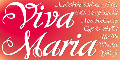
- Viva Maria by Autographis,
$39.50 - Bim - Personal use only
- Ovnis - Personal use only
- Cable - Personal use only
- Crakos - Personal use only
- Ameba - Personal use only
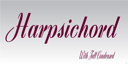
- Harpsichord by Jonahfonts,
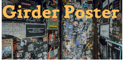
$35.00Harpsichord (as I have named it) is from the late 1940s and was designed at Lucian Bernhard Studios in New York for Bernhard's Magnetype Collection. It was originally published as 'Community Low' along with 'Community Condensed'. Many of his Magnetype Fonts have been dormant which I hope to revive in the near future. - Girder Poster by GroupType,
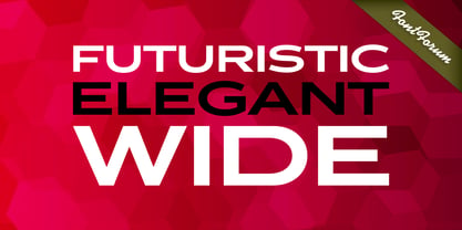
$15.00Girder Poster, also named Spurred Gothic, was inspired by showcard lettering samples featured in the book, Commercial Art Of Show Card Lettering, published in 1945. Although similar to Cooper Bold, Girder Poster's serifs are spurred and the design's inception came out of theatrical poster studios of the mid 1900's in New York. - LP Horizont Caps by URW Type Foundry,
$19.99LP Horizont Caps is another new font creation from German designer Peter Langpeter (lp-design.de). LP has been running his own design studio since 1995, working as a typeface and logo designer, as a calligrapher, cartographer and illustrator. During this time LP created a large number of excellent new typeface designs. LP Horizont Caps is a very futuristic looking, sharp and elegant sans serif. - Rabanera - Personal use only
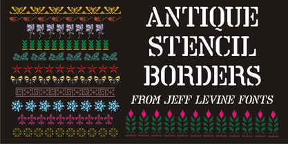
- Antique Stencil Borders JNL by Jeff Levine,
$29.00Antique Stencil Borders JNL collects twenty-six vintage border designs from various sources for complementing copy set in stencil lettering or in stand-alone decorative projects. NOTE: The purchase of this font does NOT include license to replicate the designs as commercial products for resale. To do so, a Derivative Products License must be obtained by contacting Jeff Levine. Contact information is found within the End User License Agreement. - Genica Pro by Ndiscover,
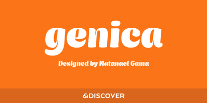
$35.00This is the design that was always on the drawer. I designed it when I was bored of designing other typefaces, there was no briefing, I just wildly played with the bezier tool. It was something to relax from more serious work, so it feels like a very funny and smiling design. Genica mixes various styles creating a display type with lots of personality. - Poster Hand by HouseOfBurvo,
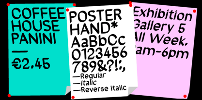
$9.99Poster Hand is an informal, casual script that echoes the hand lettering of those ubiquitous signs found all around us. From market stalls to menu boards, we are surrounded by the work of the unknown sign writer. The font comes in three styles, Regular, Italic and Reverse Italic and contains OpenType ligatures and kerning. Latin Extended A supports all western and eastern european latin languages. - Meticula by KushJain,
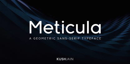
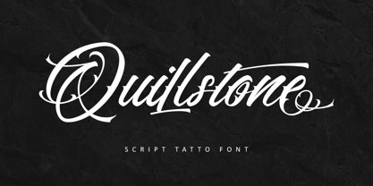
$-Meticula is a sans-serif font family meticulously crafted with geometric shapes and inspired by modern sans typefaces. Comes with 8 uprights and an outline font with italic counterparts. It’s aesthetic, minimal design and diverse font styles cater to all kinds of typography and graphic design work. Supports major Latin based languages, advanced open type features, full set of ligatures, punctuation and major currency symbols. - Quillstone by Letterara,
$26.00calligraphy with a rebellious edge. Its meticulously crafted bold lines exude modern sophistication while ensuring effortless readability, making it ideal for tattoos or diverse design projects. With its PUA encoding, Quillstone offers a plethora of intricate glyphs and swashes, unlocking endless creative possibilities. Make a statement and adorn your work with the timeless charm of Quillstone Typeface, where versatile design meets the allure of tattoo-inspired script. - Role Model by Ef Studio,
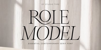
$10.00Role Model is basic contemporary serif that have clean edges to reach modern feel. Designed to be versatile, this font seamlessly fits into diverse design applications, from digital platforms to print materials. It works harmoniously for both body text and headings, making it a versatile choice for modern design projects. Role Model font has a rich ligatures and created in Regular and Oblique styles. - Yanone Tagesschrift - Unknown license
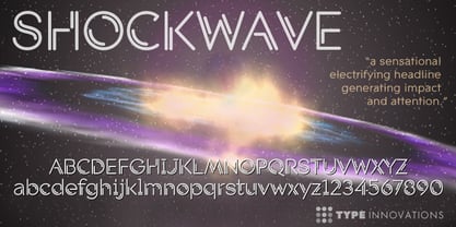
- Shockwave by Type Innovations,
$39.00I'm always experimenting with new ideas for display fonts. I took the inside counter of a capital 'O', divided it into quarters, and applied an outline stroke to all the elements. By removing two quarters of the inside counter I had the beginnings for an interesting new design. Of course, the hard part was getting all the other letters in the alphabet to work well together using this approach. It's often a labor of love trying to shape an idea into a new typeface. I find the entire process stimulating and rewarding. - Suisside by MendozaVergara,
$19.00 - LoganFive by The Northern Block,
$16.70 - Auster Slab by Resistenza,
$39.00 - Cocktail Bubbly - Personal use only
- Scriptina Pro - 100% free
- Too Much by Comicraft,
$19.00If you've had too much coffee but not enough of Too Much Coffee Man you can now indulge in an excess of characters created by the hand of Too Much Coffee Man's creator, Mister Shannon Wheeler. Don't worry, in our efforts to ensure clean and confident lettering samples, we kept Shannon on decaf until he was done. Dip this font in your system folder and your hard drive will get a caffeine and sugar rush guaranteed to increase its memory partition and bring the images on your monitor into sharper focus. - TGL 31034-1 - Unknown license
- TGL 31034-2 - 100% free
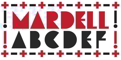
- HWT Mardell by Hamilton Wood Type Collection,
$24.95The Hamilton Wood Type & Printing Museum staff is honored to partner with New York-based graphic designer Louise Fili on her first font release project. The new font, “Mardell,” is named for Hamilton retiree and wood type cutter Mardell Doubek. This is the fourth font to be cut for the museum as part of the Wood Type Legacy Project. "The bold, lively angularity of Italian futurist letterforms made it a natural choice for wood type.” says Fili. This digital version presents Fili’s wood type design for use in web and print applications. - Road Repair JNL by Jeff Levine,
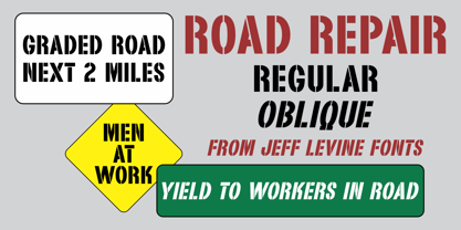
$29.00 - Clown Alley JNL by Jeff Levine,
$29.00In the beginning of his typographic design work, Jeff Levine produced a large number of freeware dingbat fonts utilizing very rudimentary font creation software. Although popular in the world of home crafts, there were many issues inherent with those early font files. Jeff has chosen to clean up and update some of these fonts and make them commercially available. PLEASE NOTE: Refer to the license agreement regarding use of Jeff Levine's art-based fonts. Logos and derivative works made from these fonts are not allowed. - Floor Tiles JNL by Jeff Levine,
$29.00In the beginning of his typographic design work, Jeff Levine produced a large number of freeware dingbat fonts utilizing very rudimentary font creation software. Although popular in the world of home crafts, there were many issues inherent with those early font files. Jeff has chosen to clean up and update some of these fonts and make them commercially available. PLEASE NOTE: Refer to the license agreement regarding use of Jeff Levine's art-based fonts. Logos and derivative works made from these fonts are not allowed. - Dingits JNL by Jeff Levine,
$29.00In the beginning of his typographic design work, Jeff Levine produced a large number of freeware dingbat fonts utilizing very rudimentary font creation software. Although popular in the world of home crafts, there were many issues inherent with those early font files. Jeff has chosen to clean up and update some of these fonts and make them commercially available. PLEASE NOTE: Refer to the license agreement regarding use of Jeff Levine's art-based fonts. Logos and derivative works made from these fonts are not allowed. - Conflict by Typomancer,
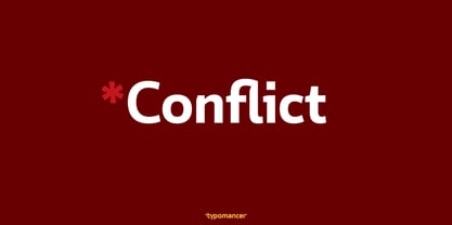
$20.00 - Boomshell by Dhan Studio,
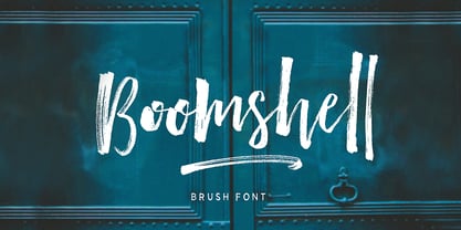
$15.00 - Charm by Typomancer,
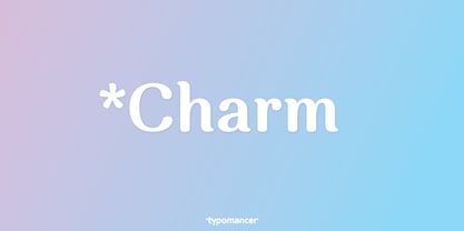
$20.00 - Control spirit by Sulthan Studio,
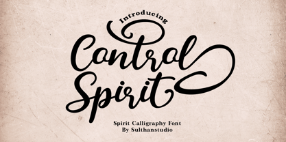
$12.00 - Green by ITC,
$29.99Green is the work of British designer Timothy Donaldson, known for his experimentation with letter forms. This typeface features a sharp stroke contrast and eccentric lower case letters, giving it a vital, clean-cut style. Green is perfect in both large display sizes and small text sizes and gives any work a fresh, new look. - Gladifilthefte - 100% free
- Melonday Demo - Personal use only
- Brewsky - 100% free
- effortless - 100% free
