10,000 search results
(0.032 seconds)
- LudwigHohlwein - 100% free

- Eurocine by Monotype,
$31.99 Eurocine is an expansive display typeface – a square sans serif that’s perfect for titling, headlines, logotype and branding. This 36-font family is packed with features to make it supremely versatile. This typeface attempts to capture the mood of movie credits from European Cinema in the 1970s, with a focus on Giallo films in particular. In terms of style, Eurocine sits somewhere between Walter Baum and Konrad Friedrich Bauer’s Folio, and Aldo Novarese’s Eurostile. With Eurocine you get a more versatile typeface by way of its small caps and additional stylistic sets giving you extended caps, extended small caps, and petite caps, as well as upper and lowercase unicase. Creating typographic masterpieces of your own will be so much easier! Key features: • 6 Weights in Roman and Oblique • 3 Widths – Narrow, Regular, Wide • Extended Caps • Small Caps • Extended Small Caps • Petite Caps • Unicase • Old Style Figures • European Language Support (Latin) • 1,200 glyphs per font.
 - Portsilk by Maulana Creative,
$12.00 Portsilk is wide clean round sans display font, inspired by legendary Eurostile. Bold stroke, fun character with a bit of ligatures and alternates. To give you an extra creative work. Portsilk font support multilingual more than 100+ language. This font is good for logo design, Social media, Movie Titles, Books Titles, a short text even a long text letter and good for your secondary text font with script or serif. Make a stunning work with Portsilk font. Cheers, Maulana Creative
 - Taca by Rúben R Dias,
$42.00 Taca is a typeface built around a shape that Portuguese designer Rúben R Dias calls a “squircle” — neither square nor circle. We usually associate the rounded, convex box with the television screens of the 1960s and Aldo Novarese’s classic typeface, Eurostile. But whereas Eurostile is cold and machined, Taca is warm and rugged, as if it was molded from clay or carved from stone. Taca’s organic nature is also derived from another unique feature: rounded crotches at the right angles where perpendicular strokes meet. This subtle finish, along with blunt stroke endings, softens the otherwise rigid skeleton. With such a strong conceptual vision, Taca could be relegated to the bin of experimental designs, severely limited in their application. But that fate is usually born of a less experienced maker. As a teacher, designer, and letterpress printer, Dias is a type user, keenly aware of the functional requirements of good type. Taca is therefore not a slave to its concept, but a working font family, effective in various sizes and environments. Its lettershapes break away from the base shape whenever it makes sense for legibility, while still maintaining the flavor of the design as a whole. That said, a set of squircle-shaped alternates give the user the flexibility to get more stylized if the situation calls for it. Fitting to its functional aims, Taca has many of the features one expects of a proper text font: upper and lowercase figures, case-sensitive punctuation, and Extended Latin language support. The simplicity, openness, and squareness of Taca’s forms also make it an ideal design for the pixel grid of screen displays.
 - Bodybag - Unknown license

- Pawl by The Ampersand Forest,
$20.00 Meet Pawl, an affordable 48-font squarish sans family with a little grotesque in him! Oh, you may think you’ve got him pegged at first glance, but he’ll surprise you with his versatility. AND he's just been totally refurbished from top to bottom and boy, did he need it! Pawl lives in the same visual landscape as fantastic modular superfamilies like Eurostile, Agency, Geogrotesque, Barlow, and even the great American Gothics. Unlike those faces, though, he's nimble enough to switch between looks effortlessly. Pawl is energetic, aggressive, strident, and structural. Depending on how you use him, his voice can be retro, futuristic, industrial, or sleek. He can be sober or splashy, techy or oldschool. Use his alternate characters and stylistic sets to create looks ranging from Streamline Moderne to Futurism to Brutalism to Swiss. He works from small paragraphs all the way up to monumental signage. This guy is smart and useful, with a lotta looks! How many times have you needed multiple weights, styles, and widths for your hierarchy, but standard type families were either shockingly expensive or couldn't deliver? Pawl delivers. Give him a shot!
 - Magistral by ParaType,
$30.00The first three weights of the family were designed at ParaType (ParaGraph) in 1997 by Dmitry Kirsanov . They were based on the artworks of Moscow graphic designer Andrey Kryukov (1923-1997). The original version was developed by Kryukov at the end of the sixties for Russian railways. The proportions and elements of construction were inspired by Eurostile (1962) by Aldo Novarese. It is intended for use in advertising and display typography. In 2009, Dmitry added the new styles, corrected the old ones, and enhanced them with extended character sets. - Geom Graphic by Dharma Type,
$19.99 Inspired by Japanese robot animations in 80s such like Gundam and Ideon, Geom Graphic is a square geometric sans serif for wide range of usage. The family give an impression similar to Eurostile but is more squared and geometric. The letterforms of Geom Graphic are designed slightly rounded to appear natural, warm and retro. This family consisting of 4 weights with matching Italics. The wide range of languages is designed targeting use for futuristic product of game, movie, logo and so on. We released 4 big Sci-Fi families in 2013. Check it out! Clonoid Controller Geom Graphic Space Colony
 - ArchiType by Archiness,
$10.00 With the famous and much used Eurostile and Bank Gothic in my mind I wanted to design a mono-line font as simple and legible as possible. A square with rounded corners, i.e., the letter ‘o’ as its basis. From there on back to basics, so straights remained simple straights with 90° endings, whatever the angle. Numbers are monospaced. The result seems to be a pleasantly balanced and neutral font. Excellent for display purposes and surprisingly legible in even small sizes. This perhaps typical approach by an architect led to the name of the font: ArchiType.
 - The End. - Unknown license

- Novin by Naghi Naghachian,
$85.00 Novin Font family is designed by Naghi Naghashian. This Font is developed on the basis of specific research and analysis on Arabic characters and definition of their structure. This innovation is a contribution to modernisation of Arabic typography, gives the font design of Arabic letters real typographic arrangement and provides more typographic flexibility. This step was necessary after more than two hundred years of relative stagnation in Arabic font design. Novin supports Arabic, Persian, and Urdu. It also includes proportional and tabular numerals for the supported languages. Novin Font is available in Light, Regular and Bold. Novin design fulfills the following needs: A Explicitly crafted for use in electronic media fulfills the demands of electronic communication. Novin is based on Aldo Novareses Eurostile Extended. B Suitability for multiple applications. Gives the widest potential acceptability. C Extreme legibility not only in small sizes, but also when the type is filtered or skewed, e.g., in Photoshop or Illustrator. Novin’s simplified forms may be artificial obliqued in InDesign or Illustrator, without any loss in quality for the effected text. D An attractive typographic image. Novin was developed for multiple languages and writing conventions. E The highest degree of geometric clarity and the necessary amount of calligraphic references. This typeface offers a fine balance between calligraphic tradition and the contemporary sans serif aesthetic now common in Latin typography.
 - Thicker by Zetafonts,
$39.00 Thicker is a type-family designed for Zetafonts by Francesco Canovaro with Andrea Tartarelli. A geometric sans typeface on steroids, it was first designed in the muscular Extrablack weight with the aesthetics of high-power dynamic typefaces used in sports communication, and then developed in the lighter weights where the shapes show some vintage-inspired proportions and the slightly squared look that nods to Novarese famous Eurostile, eponymous with retro-futurism. With these diverse influences the typeface allows for both impressive display use and effective logo design as well as more fine-tuned editorial use in body text - with a natural inclination for effective and powerful advertising. Sports typography usually uses italics to add dynamism and impact, and Thicker complies with this by offering a choice of three alternate italic forms with different slant, made even more customizable by the inclusion of variable font technology that allows fine tuning of the weight range as well as precise choice of typeface slant. In each of the 44 weights of the typeface family (as well as in the all-in-one variable type solution) Thicker offers a extended charset of over 900 latin, Cyrillic and Greek glyphs, covering over two hundred languages and including useful Open Type features (Alternate forms, Positional Numerals, Small Caps and Case Sensitive Forms) for flawless typesetting.
 - Rolhausen by Patria Ari,
$12.00 Rolhausen is a Sans Serif Typeface which is suitable for you who needs a typeface for headline, logotype, apparel, invitation, branding, packaging, advertising etc.
 - Magnitudes Variable by DuoType,
$90.00 Magnitude is a font inspired by classics like Eurostyle and Bank Gothic, with geometric characteristics and dynamics style. Designed to be used in a wide variety of applications such as advertising, corporate projects, branding and retail product design. The font is well-suited for headings, display use and short text. The Magnitudes family is available in 36 weights, ranging from light to heavy, to condensed and expanded with matching italics. The font contains a character set of 401 characters supporting 206 different languages.
 - Avalanche by Borges Lettering,
$25.00 Avalanche is a fun casual typeface great for when a bold caption is needed.
 - Allumi Std by Typofonderie,
$59.00 Technology in mind in 12 fonts Allumi is a different font. Different from anything Jean François Porchez has designed in the past. Allumi is a sleek typeface designed with technology in mind. It’s a perfect font family for any communication concerning design, robotics, or functionality. Pushed to its extreme limits, the Allumi shapes are neither perfectly round or geometrically square. It’s a human design with a high tech touch. Allumi can be described as the Eurostyle (designed by Aldo Novarese in 1964) of the new century, mixed with Frutiger. Allumi is a serious typeface because of the unique design and sturdy form. The pure shapes can create a global presence today with an eye on the world of tomorrow. Two widths The Allumi family has been built around two series of widths, standard and extended. Italics have been carefully designed as slanted roman with all necessary optical and human corrections to create a perfect and neat italic. I Love Typography 2009
 - Neela by Bykineks,
$10.00 Neela is an Art Nouveau serif typeface designed for a variety of design needs. With 27 font families consisting of thin, extralight, light, regular, medium, semibold, bold, extrabold, and black, as well as condensed and expanded types, Neela can be used for various sizes and design needs. Neela is characterized by sleek and elegant letters, with typical Art Nouveau elements, such as subtle and elegant decorative flourishes. This font is suitable for various design needs, such as: Book covers, wine labels, wedding invitations, exhibitions, packaging, merchandise, event billboards, posters and many others. Neela also supports 65 Latin alphabet languages, so it can be used for various design needs throughout the world. Characteristics The letters are sleek and elegant Distinctive Art Nouveau elements Suitable for a variety of design needs Neela is the perfect typeface for designers looking for an elegant and versatile Art Nouveau serif typeface. This font can be used for various design needs, from book design, labels, invitations, to graphic design.
 - Dimentia by The Type Fetish,
$10.00 Dimentia is a twisted, hand drawn, dimensional, layered sans serif typeface. What more do you need?
 - Calligraphy - Unknown license

- Commuter - Unknown license

- Magnitudes by DuoType,
$29.00 Magnitude is a font inspired by classics like Eurostyle and Bank Gothic, with geometric characteristics and dynamics style. Designed to be used in a wide variety of applications such as advertising, corporate projects, branding and retail product design. The font is well-suited for headings, display use and short text. The Magnitudes family is available in 36 weights, ranging from Extra light to heavy, to condensed and expanded with matching italics . The font contains a character set of 401 characters supporting 206 different languages.
 - Modern Elvish by Typelove Fontworks,
$9.00 Modern Elvish is a humanist sans serif typeface created for the Tengwar “English” mode as popularized in the Lord of the Rings books and films. I imagined the famous elves of this lore living in contemporary times and needing a no nonsense modern typeface for their branding, communications and UX design. Use this typeface for your RPG, LARPing or Cosplay needs. This typeface uses advanced font features such as ligatures and contextual alternates to convert any English text. I would recommend typing in English first, then converting to a font of this typeface.
 - MM Zaftig by MM Fonts,
$19.00 MM Zaftig is a display typeface for setting text in posters and headlines where big impact is needed.
 - Hands on Albrecht by URW Type Foundry,
$39.99 This typeface is based on Albrecht Dürer’s work “Die Underweysung der Messung” (Institutiones Geometricae, Instruction in Measurement). Please note that this font needs special treatment when typesetting text. If you need black text, you need to type just capital letters separated by spaces. If you need coloured text, type both lower case and upper case (with the lower case character first), and then assign a colour to the lowercase letters only.
 - Hard Shadow by Kate Brankin,
$27.00 Hard Shadow, the perfect typeface for headlines, logos, posters, and anything else that needs to call attention to itself.
 - Linotype Pine by Linotype,
$40.99A self made bamboo or reed stick nicely cut down to a broad edged nib must have been the tool with which the designer Andrew Weed wrote his letters for the typeface Pine.Its irregular outline is the result of the flowing of the ink. Ideal for a headline or a poster which reflects the personal touch of the tool. - Lustra Text by Grype,
$16.00 The Lustra Text family is the next evolution of our Lustra Family, which finds its origin of inspiration in the HYUNDAI automotive company logo, and from there expands to an 8 font family of weights. Lustra Text still nods its head to the techno display styling of the inspiration logotype, but evolves its brand inspired origin from a display to a text font family that pulls on modern and historical styles like Eurostyle and Bank Gothic. This text family inherits a sturdy yet approachable geometric style with its uniform stroke forms and curves, and includes a lowercase with a Stylistic Alternate for the lowercase "a", a numerals set, and a comprehensive range of weights. This is a straightforward, powerful, and uncompromising collection of typefaces that lend a solid foundation and a broad range of expression for designers.
 - Taurus Retro by Rachel McBride Creative,
$9.00 Taurus Retro is an AWESOME swash typeface with its swashes built in as character alternates, instead of being a pesky, separate typeface. This typeface is great for any project that needs both boldness and femininity. It comes with eight font styles. Great for any projects needing a retro or throwback feel, restaurant menus, along with book, movie, and album covers. It has a feminine and juvenile feel simultaneously, and is layerable for cool effects. It has 480+ glyphs, supporting a variety of languages!
 - Ancherr by Tama Putra,
$12.00 Ancherr is a horror brush typeface. It is suitable for any design needs, branding, art quote, cover title, t-shirts, posters and more. The Ancherr typeface includes multi-lingual and currency support, numerals, and punctuations.
 - SuperBlack by Scannerlicker,
$22.00 SuperBlack is a saucy counterless typeface, ideal for display purposes. Whenever you need impact with a playful feel, SuperBlack will pop out.
 - SG Briscy by Studio Gulden,
$20.00 SG - BRISCY is a display typeface. It's bold, fun, and playful. Perfect for you who need a pop style in your design.
 - Ethem by Ixipcalli,
$32.00 Ethem is a semi-geometric typeface, ideal for posters and flyers. Provides three weights: light, regular, and bold without leaving out the italics of each. The Ethem font family provides six typefaces. If you need a strong, prominent or dominant typeface in your project, Ethem font is the ideal typeface.
 - Gibrael by TRF,
$20.00 Gibrael is tattoo script style font. Truly a perfect script for any project that's need delicate typeface such as custom name, greeting card, create logos, etc. A handy font for tattoo designer and artsy creative people! It's a beautiful, elegant, clean and unique typeface you need to have! Contains over 590+ glyphs, it has many alternate characters so you can make a beautiful decorative type easily and multiple language support.
 - Gluster by Maulana Creative,
$14.00 Gluster Serif Display Font Typeface is a single weight black serif, modern casual typeface perfect use for headline, logo, magazine, and any editorial design needs also readable body text. I hope you like it, keep awesome!
 - Tascinorm by Abdullah Tasci,
$40.00 Specially designed to improve legibility in long texts, Tascinorm is a unique, modern typeface which will meet the needs of a vast audience.
 - Valimo by Fenotype,
$19.00 Valimo RMX is a destroyed hard-to-read typeface. It's suitable for creating text "textures" where you don't necessarily need any actual content.
 - Rascals by Letterhend,
$14.00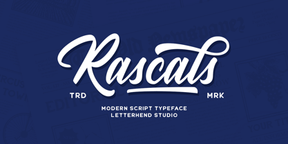 Rascals is a script typeface with vintage and rustic look! It works perfectly for those who need a typeface for headlines, logotype, apparel, invitation, branding, packaging, advertising etc. This typeface is comes in uppercase, lowercase, punctuation, symbols, numerals, stylistic set alternate, ligatures, and also contains multilingual characters.
 - Srikaya by HandletterYean,
$10.00 Srikaya is a display typeface with a cheerful vibe and autumn nuance. Use it for any creative project in need of a whimsical vibe.
 - Aspire Narrow SmallCaps by Grype,
$18.00 While the Aspire SmallCaps family finds its roots of inspiration in the ACURA automotive company logo, with its wider base, the Aspire Narrow SmallCaps family condenses those styles into something more suitable for larger bodies of text in a more standardized width. Aspire Narrow SmallCaps is perhaps the most true to form tribute to the original all capitals inspiration logotype. It maintains all capital forms (whether standard or smallcaps) and yet is still strikingly powerful in its presence and readability including numerals, and a comprehensive range of weights, creating a straightforward, uncompromising collection of typefaces that lend a solid foundation and a broad range of expression for designers. Here's what's included with the Aspire Narrow SmallCaps Family bundle: - 430 glyphs per style - including Capitals, Small Caps, Numerals, Punctuation and an extensive character set that covers multilingual support of latin based languages. (see the 6th graphic for a preview of the characters included) - Stylistic Alternates - alternate characters that remove the angled stencil cuts for a more standardized text look. - 3 weights in the family: Light, Regular, & Black. - 3 obliques in the family, one for each weight: Light, Regular, & Black. - Fonts are provided in TTF & OTF formats. The TTF format is the standard go to for most users, although the OTF and TTF function exactly the same. Here's why the Aspire Narrow SmallCaps Family is for you: - You're in need of automotive sans font family with a range of weights and obliques - You're love that ACURA letter styling, and want to design anything within that genre - You're looking for an alternative to Eurostile with more stylized letterforms. - You're looking for a battle-tech typeface for your futuristic war chest labelling. - You just like to collect quality fonts to add to your design arsenal
 - Aspire Narrow by Grype,
$18.00 While the Aspire family finds its roots of inspiration in the ACURA automotive company logo, with its wider base, the Aspire Narrow family condenses those styles into something more suitable for larger bodies of text in a more standardized width. Aspire pays homage the techno display styling of the inspiration logotype, further evolving beyond its brand inspired origin to give birth to a font family that pulls on modern and historical styles. It adopts a sturdy yet approachable style with its uniform stroke forms and curves, and goes on to include a lowercase, numerals, and a comprehensive range of weights, creating a straightforward, uncompromising collection of typefaces that lend a solid foundation and a broad range of expression for designers. Here’s what’s included with the Aspire Narrow Family bundle: 477 glyphs per style - including Capitals, Lowercase, Numerals, Punctuation and an extensive character set that covers multilingual support of latin based languages. (see the 6th graphic for a preview of the characters included) Stylistic Alternates - alternate characters that remove the angled stencil cuts for a more standardized text look. 3 weights in the family: Light, Regular, & Black. 3 obliques in the family, one for each weight: Light, Regular, & Black. Fonts are available in TTF & OTF formats. The TTF format is the standard go to for most users, although the OTF and TTF function exactly the same. Here’s why the Aspire Narrow Family is for you: - You’re in need of a narrow automotive sans font family with a range of weights and obliques. - You’re love that ACURA letter styling, and want to design with a narrow font within that genre. - You’re looking for an alternative to Eurostile with more stylized letterforms. - You’re looking for a clean techno typeface for your starship console labelling. - You just like to collect quality fonts to add to your design arsenal.


