10,000 search results
(0.146 seconds)
- ITC Quay Sans by ITC,
$41.99 London-based designer David Quay designed ITC Quay Sans in 1990. One of the precursors to the long run of functionalist European sans serif faces that has been a dominating force in type design since the 1990s, ITC Quay sans is based on the proportions of 19th Century Grotesk faces. Grotesk, the German word for sans serif, defines an entire branch of the sans serif movement, which culminated in the 1950s with the design of Helvetica. ITC Quay Sans is made up of very simple, legible letters. The weights of the strokes throughout the alphabet vary very little. Microscopic flares on the ends of each terminal add a bit of dimension to the design. This helps prevent the onset of the monotony, a danger when one repeats countless near mono-weight stroked letters throughout a large body of text. ITC Quay Sans is a very readable face; it works equally well in all sizes. Six fonts of the ITC Quay Sans typeface are available: Book, Book Italic, Medium, Medium Italic, Black, and Black Italic. ITC Quay Sans is similar to Hans Eduard Meier's Syntax, and Tim Ahrens' Linotype Aroma."
 - Mellow Sans by ParaType,
$30.00 Mellow Sans is a soft and friendly rounded sans serif. Its bold styles are great for packages of something tasty, while light and regular ones work well in rather long texts, from a children's book to a reading app, or a family restaurant menu. The typeface was created by Natalya Vasilyeva, an expert in designing text and calligraphic typefaces. Mellow Sans’s forms are based on humanist sans serifs. The nobility and liveliness of Renaissance calligraphy reads beneath its curves and makes the typeface even friendlier, while helping the eye to move along the line. The typeface supports extended Latin, extended Cyrillic (all major languages of the Russia’s peoples) and Greek. It also has old style figures, arrows and non-alphabetic signs. With Mellow Sans as a heading typeface (in that case bold styles fit the best), calm open sans serifs, f.e. Vast or Fact, are its optimal text companions on the screen. Calm serifs, f. e., Octava, Scientia or Aelita, will work as its companions on paper. And to create expressive typography, for example, in packaging, you can match Mellow Sans with quirky rounded serifs — Cooper or Epice.
 - Martini at Joe's by steve mehallo,
$19.56 Googie Architecture, also known as "Midcentury Coffee Shop Modern," was born in California during the Atomic Age. Martini at Joe's is based on lettering from several historic Googie sources - many of which no longer exist. The futuristic Martini at Joe's collection was named for Northern California's famous Italian-themed "Joe's" restaurants, some of which are still serving up large portions of charbroiled beef steak, canned buttered veggies and pretty decent martinis. Martini at Joe's contains many fabulous typographic extras – and is available in single font packages or as a 15 font interchangeable Megaset (with "italic-esque" obliques and "retro obliques"). Martini at Joe's is perfect for use as commercial signage, on the menu for your coffee shop, supper club, tiki bar, fish grotto, smorgy, space port or destination casino. It also holds its own in any vintage store, on greeting cards, t-shirts, hi-brow gallery announcements, product skins, your 'zine masthead, on the faceplate of your futuristic microwave oven, tv dinner packaging, at millionaire's conferences or even embellishing the fuselage of your latest jet airline venture. Martini at Joe's: there's no better way to say, "Hold the olive, I'm having a moment."
 - Billund by Elster Fonts,
$24.00 Have you ever played with Lego™ and built letters? With Billund Side and Billund Top you can do it again and create colourful headlines on your Mac or PC. Billund is a font-system consisting of the two base-fonts Billund Side Outline and Billund Top Outline, extended by layer-fonts for one or five colours. Use the Outline-fonts alone to get »transparent« letters in one colour, use it with the Fill-fonts to fill the whole letter with one colour, or use the five Colour-fonts to get colourful letters in every colour you want. Billund contains cyrillic and greek glyphs and can be used for nearly a hundred languages. To expand the typographic possibilities, small caps, old style figures, numerals for small caps (c2sc), three stylistic sets, different symbols, forms, standard- and discretionary ligatures have been added, furthermore contextual alternates to avoid colliding letters. Each Billund-font contains 870 glyphs and more than 1600 kerning-pairs. Billund is named after the city of Billund (Denmark), where Lego™ was invented, the Lego™-headquarter still resides and the first Legoland™ theme park was opened in 1968 and still exists today.
 - Nsai by AukimVisuel,
$15.00 Nsai is a modern sans serif font family with a geometric twist, created in 2021 by a Congolese type designer, Audry Kitoko Makelele. It is available in two versions (normal and extended) making a total of 36 fonts. There are 9 weights with their true italics. Over 600 glyphs per font provide a wide range of language support, from Latin to Cyrillic, as well as powerful Opentype features such as professional kerning, stylistic variations, very special ligatures, old-fashioned tabular figures, Fractions, denominators, exponents, unlimited indices, arrows and more to satisfy the most demanding professionals. On the one hand, it features rounded curves with very open terminals that make this font family elegant, user-friendly and contemporary and on the other hand very useful for writing titles on any medium. Perfectly suited for graphic design and any display use. It could easily work for web, signage, corporate as well as editorial design. It’s a wonderful, bold and elegant font. This font is guaranteed to make your design stand out from the crowd and leave a lasting impression, as it has the potential to enhance any creation.
 - Wicked Hearts by Set Sail Studios,
$26.00 Wicked Hearts Is a chunky Serif font with an edge - it's a cool modern take on a retro classic, and it's ready to make a lasting impression on your merchandise, quote designs, header text, logos & branding, advertisements and much more. It's packed with plenty of alternates and ligatures to really bring it to life, and give you a wide range of customisation options. FAQs; Accessing Alternate Characters • Many letters of this font have multiple alternate versions (see image). In order to access each one, simply make sure 'Standard Ligatures' are enabled, and follow your letter with a number. For example, typing 'A1, A2, A3, A4' will generate the 4 alternate versions for capital A. Accessing Ligatures • There are 12 lowercase ligatures (double letters) included. In order to access these, simply make sure 'Standard Ligatures' are enabled, and the ligatures will automatically generate as you type. Standard Ligatures are supported by most desktop graphics & text software (not just the fancy ones!), including Photoshop, Illustrator, InDesign, Word, Pages & Keynote. Language Support • Wicked Hearts supports the following languages; English, French, Italian, Spanish, Portuguese, German, Swedish, Norwegian, Danish, Dutch, Finnish, Indonesian, Malay, Hungarian, Polish, Croatian, Turkish, Romanian, Czech, Latvian, Lithuanian, Slovak, Slovenian
 - Argo Supernova by Eliezer Grawe,
$9.00 Argo Supernova is a sans serif font, inspired by science fiction titles. Delicate on the thinest weights, strong on the thickest ones, it is perfect for modern branding and logo design, editorial design, web design, packaging and various other projects. Argo Supernova has a geometric and open structure, with shapes that create a solid texture on the page. Its large x-height produces good reading in long texts and its peculiarities, such as curved bars and endings, generate a strong presence in titles. The Argo Supernova family consists of 8 weights with matching italics, with Extended Latin character set. The italics makes use of more curves and smoothness, creating an interesting variation in design. • 16 styles: 8 weights + 8 italics; • 602 glyphs in each weight; • Special SS02 feature: "bend" alternates for majority of caps characters with curved details; • OpenType features: Access All Alternates, Stylistic Alternates, Standard Ligatures, Discretionary Ligatures, Numerators, Denominators, Fractions, Superior and Inferior Numbers, Kerning, Localized Forms, Lining Figures, Oldstyle Figures, Proportional Figures, Tabular Figures, Slashed Zero, Stylistic Set 1 to 6. • Supporting 219 latin based languages, which are spoken in different 212 countries.
 - Romp by Positype,
$30.00 With all ego aside, Romp was designed and influenced by my daughter, Angel. For some time now, she has wanted me to design a font based on her handwriting. But each time I sit down to do it, I run into more that she needs to do and redo. On a recent attempt, I ran into the same situation again. Instead of moving on to something else, I decided to whip out a sumi brush and start making letters...for me, type design is something a little ‘serious’ and never a time to just have fun. This typeface proved that notion wrong—it really was fun. As a result, each letter encouraged another and the design grew...and grew! The happy result spawned 3 separate sets of letters & numerals (small caps and some ligatures too!). Using the beauty of OpenType, these 3 sets have been fused into one, randomly generating font set. If you are using any type of OpenType enabled application, then the Romp Pro typeface is the way to go. They include everything found in the 3 separate variants for each style as well as entirely expanding offering of additional small cap and ligature sets.
 - Hellschreiber by Jörg Schmitt,
$35.00 The birth of the monospaced types dates back to the past. There was a need for the creation of typesets for typewriters. The difficulty was to align the different glyphs in the same width. This led to particular problems with letters like “M” and “l”; the former seemed to be squeezed into the same width of all letters and the second one appeared way too streched. Despite – or perhaps because of – the impression of the typewriter is still popular with Graphic Designers. Nowadays there are even monospaced versions of primarily proportional types; for example the the Sans Mono designed by Lucas de Groot or the DIN Mono. Then again, why not the other way round?! In the first half of the Nineties, Erik Spiekermann developed a proportional type named ITC Officina based on the Letter Gothic. According to a survey on the 100 best fonts of all time conducted by FontShop, ITC Officina is in an eighth place, far ahead of its forerunner. This was the reason for me to create a wider design with a Serif and a Sans Serif based on the queen of all monospaced types – the Courier.
 - Dreaming Outloud by My Creative Land,
$15.00 Say hello to a casual handwritten font family - Dreaming OutLoud. 8 handwritten typefaces made to complement each other in the best possible way. They are easy to use and perfect for expressing your thoughts, posting quotes and simple daily updates on social media. The font package is complemented by more than a 100 transparent background marker lines (easy to change color!) - to emphasise what you are saying :) - and dingbats & doodles font. Two sub-packages included: Elementary package. Use this one if you primarily work in Canva/Cricut and similar applications and don’t want to deal with OpenType features of the PRO fonts. To access alternates - simply change the font to it’s ALT version. Voilà. You can use these fonts on your iPad in Procreate app! Charged package. You need this one if you feel comfortable with OpenType features, if you work in Adobe Suite and similar applications that have OpenType panel to access OT features. You can use these fonts in Canva-like applications as well - they are fully unicode mapped. Contact me with your MyFonts order # to get a free bonus - more than a 100 "Marker selection lines" in png and psd
 - Rolfter by AlienValley,
$13.00 Introducing Rolfter, a classic serif typeface with many features including ligatures, tons of alternates and multilingual support. All the ligatures and alternates can be accessed by installing just one font file. LIGATURES & CONTEXTUAL ALTERNATES We recommend that you turn on both ligatures and contextual alternates for best results. You can do this in either Photoshop or Illustrator. Photoshop: Open the "Character" panel via Window - Character and check the standard ligatures and contextual alternates icons at the bottom left corner of the panel. Illustrator: Open the "OpenType" panel via Window - Type - OpenType and also check the standard ligatures and contextual alternates at the bottom of the panel. OPTIONAL ALTERNATES These are optional alternates that can be used depending on your current design. We recommend moderate use of these for optimal results as using too many can easily make the font unreadable. To access these you need to open the following panels depending on your software: Photoshop: Window - Glyphs (Note that this panel may not be available in earlier PS versions) Illustrator: Type - Glyphs You will then have access to all the glyphs inside the font file to use them as you like.
 - Lunanic by Ingrimayne Type,
$9.00 Lunanic is a geometric novelty typeface family with a touch of graffiti. The letters are formed from a circle with a notch or nick taken out, a shape that reminds me of a partial lunar eclipse. Half of the family have the nick on the left and half on the right. The faces are monospaced and so tightly spaced that there is no space between most of the letters so the filled styles cannot be used alone without tweaking. There are several ways to tweak them to make them readable: adjacent letters can be colored differently, the characters spacing can be increased, or an outlined style can be layered on top of the filled letters. The family does not have a true lower case. Most of the characters in the lower-case slots are alternates for those on the upper-case keys and they can be mixed in whatever way the user finds best. The family has twelve members: two orientations with three weights each and each of these six has an outline style to go with it. Lunanic is fun, bizarre, weird, and obviously a decorative display font.
 - Persian Grunge by Si47ash Fonts,
$19.00 The only Persian Arabic font featured on Behance [Graphic Design / Typography] Published in multiple books including New Illustration With Type and DesignAndDesign Vol. II Carefully and meticulously designed by selecting, choosing, vectorizing and editing so many different Persian and Arabic calligraphic scripts and old typefaces glyphs forms to create this one of a type [pun intended!] font. And if it's not enough, it's got patterns, textures, artistic elements, ornaments, in a grunge and dirty style. But it not over yet! Persian Grunge [Dirty] font has two styles: Dirty and Neat. Not only the Neat style is cleaner, but also a lot of same glyphs are different from the Dirty style. This Arabic grunge font is a great choice for all graphic designers, typographers and visual artists. Your posters, banners, artistic typographic projects are gonna be awesome with these fonts! Shahab Siavash, the designer has done more than 30 fonts and got featured on Behance, Microsoft, McGill University research website, Hackernoon, Fontself, FontsInUse,... Astaneh text and headline font which is one of his latest designs, already got professional typographers, lay-out and book designers' attention as well as some of the most recognizable publications in Arabic/Persian communities.
 - P22 Glaser Kitchen by P22 Type Foundry,
$24.95 Milton Glaser’s Kitchen Typeface from the mid 1970s exemplifies the bold 3-D art deco revival genre that was a trademark of the Glaser style. This typeface resulted from his involvement in the design of the The Big Kitchen in the World Trade Center’s concourse in New York City. The new P22 Glaser Kitchen takes on the technical challenge of overlapping 3-D shadows by offering two styles. P22 Glaser Kitchen Regular is spaced out so that the shadows do not overlap the white spaces of the neighboring letters. Whereas the P22 Glaser Kitchen 3D Fill and 3D Shadow can be used layered on top of one another to achieve the tight spacing intended by Glaser. P22 Glaser Kitchen was based on original drawings and phototype proofs from the Milton Glaser Studios archives. Typographic punctuation and sorts were imagined by James Grieshaber to work with Glaser’s design, as well as diacritics to accommodate most European languages. Over the years there have been many typefaces that borrowed heavily from the Glaser designs, but these are the only official fonts approved by Milton Glaser Studio and the Estate of Milton Glaser.
 - Coffee and Danish JNL by Jeff Levine,
$29.00 In the collection of vintage and historic images available online from the Library of Congress is one of the exterior of the Town Talk Diner in Minneapolis, Minnesota. Regrettably, on May 28, 2020, the Town Talk Diner was damaged by vandalism, and subsequently destroyed by a fire that engulfed the building early on the morning of May 29th due to civil unrest following the death of George Floyd. The restaurant first opened in 1946, closed in 2011 and subsequently re-opened under new ownership in 2014 with French cuisine, then from 2016 until its demise as an American bistro. While this was not known at the time of selecting the image for a typographic model, subsequent research on the diner turned up these facts. The large vintage sign above the entrance was in big, bold Art Deco letters with rows and rows of bulbs for illuminating the name at night. Coffee and Danish JNL, modeled from the image of that sign, is available in both regular and oblique versions. Perhaps, in a way, the type design will serve as a bit of historic recognition for a popular eating spot.
 - Desyrel - Unknown license

- Lovesick AOE - Unknown license

- Lansbury - 100% free

- Slalom - Unknown license

- AlphaMack AOE - Unknown license

- Tagalog Doctrina 1593 - Unknown license

- Shamen Remix - Unknown license

- Steed by Device,
$29.00 A condensed and bold obround sans inspired by 60s condensed inserat faces, with a more pronounced thick/thin stress as seen on the titles of the Avengers TV show.
 - Gothico Antiqua by MADType,
$21.00 Gothico Antiqua is the result of grunging up one of my early sans-serif type designs. It strangely works very well and looks authentic at small to medium settings.
 - Digi Grotesk by Linotype,
$29.99DigiGrotesk is one of the earliest digital fonts ever created. It is intended for use in longer texts set in smaller point sizes, including dictionaries and newspaper classified ads. - Bordeaux by Solotype,
$19.95This font was inspired by the lettering on a shop sign along a very classy shopping street in Bordeaux, France. There were similar styles among mid-nineteenth century types. - Viralles Script by Letterniz,
$20.00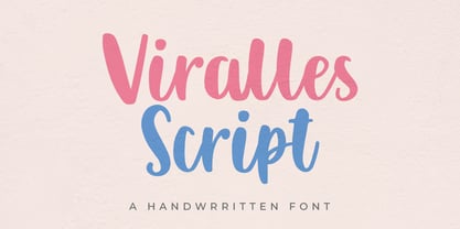 Viralles is a handwritten script font. Looks stunning on wedding invitations, thank you cards, quotes, greeting cards, logos, business cards and any other design that requires a handwritten touch.
 - Engrace by Angele Kamp,
$26.00 Meet Engrace, a serif font family with elegant & stylish curves. She’s romantic, classy and modern all wrapped into one, and surely can not be missed in your font collection.
 - Pepino by Robert Petrick,
$19.95 Pepino is loosely based on the classic font Hobo but Pepino is a completely new and original drawing. The font is bold, fun, casual, easy to set and read.
 - Bonita by Monotype,
$40.99Bonita is a bold handlettering style based on movie poster lettering from the early 20th century. It's similar to the typeface Broadway, but much bolder and far less formal. - CG Symphony by Monotype,
$29.99CG Symphony was among the first one hundred PostScript faces released by Compugraphic in 1988. The original version of CG Symphony font is the Linotype Original font family Syntax. - Xylo Sans by PintassilgoPrints,
$19.00 Xylo Sans letterforms are based on a typeface from Miller & Richard type foundry, from circa 1911. They are presented here with a rough wood texture, in two xylographic flavors.
 - Fifty Famous Fairy Tales by Funk King,
$20.00 Fifty Famous Fairy Tales was inspired by lettering on the cover of a children’s book of the same name published by Whitman Publishers back in the 50s or 60s.
 - Stylish Marker by Pedro Teixeira,
$14.00 Stylish Marker is a font based on a casual and worn marker, just before it's unusable, thus giving rise to an irregular texture, typical of a widely used marker
 - FG Noel by YOFF,
$13.95 FG Noel works great at small and large sizes. I can imagine a kids' book with this font and it will be perfect for cute quotations on greeting cards.
 - Bobila by Rashatype,
$10.00 Bobila is a cool and casual display font. It will look stunning on any poster flyer or print. Use this font for your designs and explore its endless possibilities.
 - Fairytale Serif Oblique by Nicky Laatz,
$26.00 A whimsical little serif transporting you back in time. Based on vintage hand scribed italics, Fairytale Serif is ready to charm it's beholder with its quaint inky edged letters.
 - Skribler by Cool Fonts,
$24.00 Here’s a scratchy skribly font you can use to make something look grungy or use it reversed and it looks like it was scratched on a wall or something.
 - Borough Park JNL by Jeff Levine,
$29.00 Borough Park JNL is named for a neighborhood in the southwestern part of the borough of Brooklyn, NY and was modeled from hand lettering found on vintage sheet music.
 - Metal rocker by Letterafandi Studio,
$14.00 Metal Rocker is a natural handwritten font. It looks stunning on thank you cards, quotes, greeting cards, logos, business cards, and every other design which needs a handwritten touch.


