10,000 search results
(0.044 seconds)
- Megilona by Black Studio,
$27.00
- Rocksoldier by Timurtype,
$14.00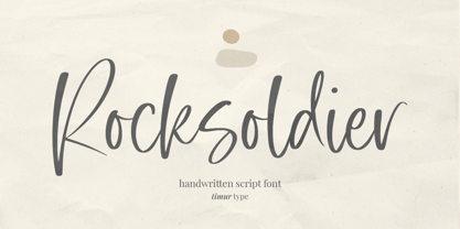
- Snowy Days by Mvmet,
$10.00
- Amateur Calligraphist by Kim Ariana Art Shop,
$5.99
- Wild Nebraska by Larin Type Co,
$10.00
- Epic Miracle by Prestige Artsy Studio,
$29.99
- Sapeca by Just in Type,
$35.00
- Warm Thanksgiving by Mvmet,
$15.00
- The font AnglosaxOblique, crafted by the renowned type designer Manfred Klein, is a distinctive and stylistically unique typeface that captures the essence of historical elegance with a modern twist....
- Alexis Italic is a unique and distinctive typeface crafted with an artistic flair by Iconian Fonts, a prolific font foundry known for creating a wide range of custom and thematic typefaces. The Alexi...
- Mathmos Original is a distinctive font created by Levi Halmos, instilling a sense of nostalgia and futuristic vibes simultaneously. Imagine a concoction of retro science fiction aesthetics married to...
- As of my last update in April 2023, "Squizzlie" isn't a widely recognized or established typeface within mainstream font libraries or among well-known designers. However, envisioning a font with such...
- Sisters by Type-Ø-Tones,
$40.00
- Maison Luxe by FontMesa,
$25.00
- High German by Grummedia,
$20.00 - ITC Stepp by ITC,
$29.99 - Market Deco - Unknown license

- Armalite Rifle - Unknown license

- St37k - 100% free

- SoldierWW2 - Unknown license

- Eldes Cordel 1 - Personal use only

- DST - Personal use only

- Corners 1 - Unknown license

- Ukiah Caps - Unknown license

- SpongeFont SquareType - Unknown license

- Terry Script - Unknown license

- Can Control - Unknown license

- Bizzy Bee - Unknown license

- Planes-S-Modern - Unknown license

- Umbrage - Unknown license

- Gadolinium Rounded - Personal use only

- AIDino - Unknown license

- Karmatic Arcade - Unknown license

- Fraulein - Unknown license

- Daisy Script - Unknown license

- Xtreme Chrome - Unknown license

- Yukarimobile - Unknown license

- Refrigeration - Unknown license

- Farquharson - Unknown license

- Ruth Script - Unknown license


