10,000 search results
(0.056 seconds)
- Equalizer by Negara Studio,
$17.00 EQUALIZER is a bold font. The capitals have a set of alternates that can be used to give more personality when needed. EQUALIZER is great for display projects such as packaging, posters and branding.
 - Ballestro by Rex Face,
$19.99 Ballestro is a playful, versatile display font. Its name is a nod to the characters being constructed using a grid-like pattern of balls. Ballestro is great for headlines, signage, logos, packaging and more.
 - Keanu by Soares,
$25.99 Keanu is a display sans serif square typeface, with a strong visual impact. Defined by its dramatic squaring with curved strokes, this typeface is perfect for headings, signage systems, interface designs, branding and more.
 - Astylooms by Maulana Creative,
$14.00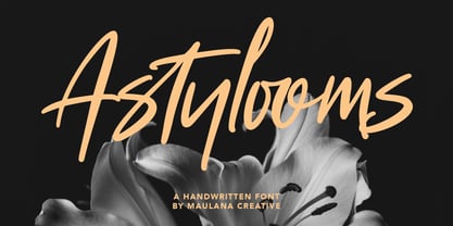 Give your designs an authentic brush handcrafted feel. "Astylooms Handwritten Brush Font" is perfectly suited to signature, stationery, logo, typography quotes, magazine or book cover, website header, flyer, clothing, branding, packaging design and more.
 - Summer Fable by Seemly Fonts,
$14.00 Summer Fable is a brand new display font. Summer Fable is perfectly suited for stationery, logos, t-shirt, paper, print design, website headers, photo frames, flyers, music covers, posters, image sliders, and much more.
 - Fringio by Rex Face,
$19.99 Fringio is a fun-loving sans-serif display font. Key characters are formed with curved, flowing lines, resulting in some pleasing word forms. Fringio is great for branding, headlines, signage, social media and more.
 - Sunday Mood by DRM Works,
$9.99 Sunday Mood is a beautiful new modern monoline script font that suits for watermark, branding, logo, invitations, stationery, wedding designs, social media posts, advertisements, product packaging, product designs, labels, photography, special events, and more.
 - Aahill by Khurasan,
$10.00 Introducing Aahill Typeface - a font that is very fresh and unique style handmade. Aahill Signature Typeface is perfectly suited to logo, stationery, poster, apparel, branding, wedding invitation, card, tagline, layout design, and much more !!
 - Shine Glitter by Skinny Type,
$15.00 Shine Glitter is a handwritten font with a modern calligraphy feel. Shine Glitter is perfect for modern projects, titles, blogs, logos, branding, invitations and more! Accent characters are included at this time. Thank you!
 - Tralee by Tanincreate,
$12.00 Tralee Font family consist of 2 styles, regular with outline and bold filled with background colour. Originally designed for packaging typography, also would be suitable for titles, headlines, greeting cards, adverts, books and more.
 - As of my last update in early 2023, the font "Amable" designed by Alberto Rodriguez stands as a delightful testament to the fusion of creativity and typography. This distinctive typeface embodies a f...
- KG Turning Tables - Personal use only

- Sweet Talk - Personal use only

- Tradizione - Unknown license

- As of my last update in April 2023, "Bizzy Bee" is not a widely recognized or extensively documented font within the design community or among the commonly used typographic resources. However, let me...
- Embracing the cosmos’ boundless beauty, Stargazers is a font that transcends traditional design to capture the essence of midnight dreams and the sparkle of distant stars. It is not just a typeface b...
- Brasley by Nicolas Deslé,
$6.00 Here's Brasley, a geometric sans. Brasley is available in six weights - bold, semibold, medium, regular, light and thin - each with matching italics. It also includes contextual alternates, ligatures, fractions, arrows and shapes.
 - Gillray Pro by RMU,
$40.00 Based upon H. Broedel's Hogarth Script, Gillray Pro, an RMU design, comes with two weights: Light and Medium. This formal script font is ideal for invitations, diplomas, certificates, book titles, ads etc.
 - Firefly by Canada Type,
$24.95 Firefly was designed by Miranda Hopper during her time in Patrick Griffin's type design class of 2010 at Humber. It is a light, narrow alphabet that works well in casual, leisurely design.
 - Yanson by Younestype,
$99.00 This Arabic typeface family was created by Younes Alaboudi. Yanson proudly incorporates a timeless geometric style with humanistic nuances. Featuring three weights from Light to Bold, Yanson supports OpenType features for Arabic.
 - LDJ Friend Font by Illustration Ink,
$3.00Download this cool font when you've got friendship on your mind. Its thick wavy lines and slightly uneven character are perfect for light-hearted scrapbook pages, journaling, greeting cards, and other publications. - Banana and Sun by Justyna Sokolowska,
$15.00 Banana and Sun is light handwritten font. It’s very suitable for the fashion industry and culinary. This font is crazy but readable, so it can be used for large amounts of text.
 - Striptease JNL by Jeff Levine,
$29.00 Striptease JNL is the bold, brash, "your-name-in-lights" companion to Showgirl JNL, and was inspired by a scene in an old television show depicting a burlesque house of the 1930s.
 - Profiterole by CounterPoint Type Studio,
$29.99 A light handwritten script font that is feminine and informal. Will lend a casual yet elegant feel to any design. Contains language support for both Latin-based and most Eastern European languages.
 - Albeit Grotesk Caps by Cloud9 Type Dept,
$40.00 Albeit Grotesk Caps is a graphic geometric all caps display font family of four weights (Light, Regular, Medium and Bold) with slightly exaggarated diacritics for better readability making it ideal for headlines.
 - "Push" isn't a widely recognized or standardized font name within the vast realm of typography as of 2023. However, when referring to a font named "Push," one might imagine characteristics that embod...
- Crypton by Type Innovations,
$39.00 Crypton is a modern geometric design by Alex Kaczun. It’s an alternate style variation based on his popular Contax Pro family of fonts. The look is clean, smart and sophisticated—the chiseled end strokes reflect the rage of the 1980s; lettering that represented something to do with electronics, computers and outer space. It’s a futuristic sans-serif exploration of shape and form. This display font is not intended for text use. It was designed specifically for display headlines, logotype, branding and similar applications. The entire font has an original look which is strong and dynamic—it can be widely used in publications and advertising. Crypton is a futuristic, techno-looking and expressive typeface with the appearance of machined-like parts—round geometric shapes and sharp edges. This attractive display comes in roman with lower case and lining figures. The large Pro font character set supports most Central European and many Eastern European languages.
 - Broomstick by Arendxstudio,
$15.00 Broomstick - Beautyful Calligraphy Font that has a distinctive character that is very thick and elegant to use Broomstick is a relaxed and flowing Handwritten Font. Incredibly versatile, this font fits a wide pool of designs, elevating them to the highest levels. Add this font to your favorite creative ideas and notice how it makes them come alive! Features : • Character Set A-Z • Numerals & Punctuations (OpenType Standard) • Accents (Multilingual characters) • Ligature Multilingual Support : Afrikaans, Albanian, Asu, Basque, Bemba, Bena, Catalan, Chiga, Cornish, Danish, English, Estonian, Faroese, Filipino, Finnish, French, Friulian, Galician, German, Gusii, Icelandic, Indonesian, Irish, Italian, Kabuverdianu, Kalenjin, Kinyarwanda, Low German, Luo, Luxembourgish, Luyia, Machame, Makhuwa-Meetto, Makonde, Malagasy, Malay, Manx, Morisyen, North Ndebele, Norwegian Bokmål, Norwegian Nynorsk, Nyankole, Oromo, Portuguese, Romansh, Rombo, Rundi, Rwa, Samburu, Sango, Sangu, Scottish Gaelic, Sena, Shambala, Shona, Soga, Somali, Spanish, Swahili, Swedish, Swiss German, Taita, Teso, Vunjo, Zulu There it is! I really hope you enjoy it
 - Corporative Sans Round Condensed by Latinotype,
$26.00 Corporative Sans Rounded Condensed is the narrowed version of Corporative Sans Rounded that offers high performance when using for text, what makes it the perfect match for Andes Rounded. The font works well at both display and small sizes. Corporative Sans Rounded Condensed is the perfect choice for logotypes, posters, signs, branding, packaging and so on! Corporative Sans Rounded Condensed comes with Latinotype’s standard set of 350 characters, making it possible to use the font in 128 different languages. Corporative Sans Rounded Condensed provides users with a wide range of characters and weights for every project. By combining different variants, designers can achieve the best results. The family consists of 32 fonts: a basic family that includes 8 weights plus italics and an alternative family of 8 weights with matching italics as well. Corporative Sans Rounded Condensed was created by Latinotype Team and developed by Elizabeth Hernández and Rodrigo Fuenzalida, under the supervision of Luciano Vergara and Daniel Hernández.
 - Varia Display by Tomtype,
$6.00 Introducing Varia Display, a font that emerged from the renowned challenge of 36 Days of Type. In the 2023's edition, I embarked on a journey to explore a wide variety of styles, leading to infinite possibilities for crafting unique letterforms. The result is a meticulously crafted variable font with a single weight axis, designed to push the boundaries of typographic aesthetics across all characters. With each letter and number embodying a distinct and innovative approach, this font offers a captivating typographic experience. With its distinctive and varied letterforms, this font is ideally suited for eye-catching main headlines and complementary typography. Whether you seek diversity or a touch of uniqueness, this font is sure to meet your creative needs. Embrace the world of possibilities it presents and elevate your designs to new heights. Key features: Meticulously designed Variable Font Single Weight Axis Multilingual support 374 glyphs Contact: If you have any doubts or questions please ask me via mail or Instagram hello@tomascastiglioni.com @tomtype
 - Quaint Gothic SG by Spiece Graphics,
$39.00 Distinctively Art Nouveau with a touch of Arts & Crafts, Quaint Gothic is a typographic gem from the late nineteenth century. Also known as Desdemona, this undulating and organic typeface is a versatile and refreshing alternative to many of the font designs on the market today. Quaint Gothic comes complete with an alternate set of caps and a new set of lowercase characters. And for your convenience, a nifty set of small caps and small figures are included in this version. You may also want to access the word-on-a-wave logotypes like “to” and “and” located in the special character slots. They’re great for constructing provocative headlines and titles. Quaint Gothic is also available as an OpenType font. It contains lining and oldstyle figures, prebuilt fractions, stylistic alternates, a wide variety of discretionary ligatures and word ornaments. These advanced features currently work in Adobe Creative Suite InDesign and Illustrator. Check for OpenType advanced feature support in other applications as it gradually becomes available with upgrades.
 - Waltowns by Variatype,
$24.00 Waltowns is a dynamic and expressive typeface that captures the essence of street art with its bold and energetic design. The letters are characterized by organic shapes, reminiscent of marker strokes on urban surfaces. The font exudes a raw and brave vibe, reflecting the spirit of graffiti culture. The font includes a diverse set of characters, allowing for creative and eye-catching compositions. Whether you’re designing posters, album covers, or any other graphic project, Waltowns inject a sense of urban attitude and artistic edge. Its versatility makes it suitable for a wide range of applications, making your designs stand out in the crowd. Waltowns is not just a font; it’s a statement. It represents expression, the vibrancy of the streets, and the bold creativity that defines graffiti art. Use Waltowns to bring a touch of urban authenticity to your design projects and let your creativity run wild on the walls of the digital world.
 - Adagio Sans by Borutta Group,
$25.00 The Adagio Family is a part of Mateusz Machalski's, Warsaw Academy of fine arts Master Degree Diploma in multimedia studio, conducted by Professor Stanisław Wieczorek and his brave PHD Jakub Wróblewski. Adagio is a modern type family. It consists of 3 main varieties: sans, serif and slab. Each one of them has it's own “true italic” set. All of the styles together have over 400 characters in 9 different thicknesses. The Adagio family was created mostly for company identities. The idea was to create a wide range of different varieties which are stylistically consistent. Adagio Sans - In its character, inspired by classical English typefaces. Sharp chamfers add a strong character. Thanks to delicate contrast and proportions of capitals, this variety has features of humanist grotesque. Thanks to large x length, and highly stretched descenders, it also works correct in longer text, while it’s strong detail is good for headlines. The Sans version is a great complement for Adagio Serif and Adagio Slab.
 - Eigerdals by insigne,
$24.99 Eigerdals is a pleasant and visually warm sans-serif type family. Eigerdahl is a soft and amiable face, perfect for when you want to convey a relaxed and pleasant feeling. Eigerdals features a smooth, brushed impression and a tall x-height. The characters are slightly top heavy in the heavier weights to give it a friendly feel. The Eigerdals family contains seven weights and their complementary italics. It contains some unique character traits that give the face a unique look, and the type family is incredibly versatile. The face is highly readable in extended text settings, and the bolder weights are perfect for display work. Eigerdals can be used in a variety of graphic settings. Eigerdals includes many useful OpenType features, including a set of upright italic swash alternates, ligatures and unicase alternates. OpenType-capable applications such as Quark or the Adobe suite can take full advantage of the automatically replacing ligatures and alternates. This family also includes the glyphs to support a wide range of languages.
 - Obsessive by Arendxstudio,
$15.00 Obsessive - Beautyful Calligraphy Font that has a distinctive character that is very thick and elegant to use Obsessive is a relaxed and flowing Handwritten Font. Incredibly versatile, this font fits a wide pool of designs, elevating them to the highest levels. Add this font to your favorite creative ideas and notice how it makes them come alive! Features : • Character Set A-Z • Numerals & Punctuations (OpenType Standard) • Accents (Multilingual characters) • Ligature Multilingual Support : Afrikaans, Albanian, Asu, Basque, Bemba, Bena, Catalan, Chiga, Cornish, Danish, English, Estonian, Faroese, Filipino, Finnish, French, Friulian, Galician, German, Gusii, Icelandic, Indonesian, Irish, Italian, Kabuverdianu, Kalenjin, Kinyarwanda, Low German, Luo, Luxembourgish, Luyia, Machame, Makhuwa-Meetto, Makonde, Malagasy, Malay, Manx, Morisyen, North Ndebele, Norwegian Bokmål, Norwegian Nynorsk, Nyankole, Oromo, Portuguese, Romansh, Rombo, Rundi, Rwa, Samburu, Sango, Sangu, Scottish Gaelic, Sena, Shambala, Shona, Soga, Somali, Spanish, Swahili, Swedish, Swiss German, Taita, Teso, Vunjo, Zulu There it is! I really hope you enjoy it
 - Adagio Slab by Borutta Group,
$25.00 The Adagio Family is a part of Mateusz Machalski’s, Warsaw Academy of fine arts Master Degree Diploma in multimedia studio, conducted by Professor Stanisław Wieczorek and his brave PhD student Jakub Wróblewski. Adagio is a modern type family. It consists of 3 main varieties: sans, serif and slab. Each has its own “true italic” set. All of the styles together have over 400 characters in 9 different thicknesses. The Adagio family was created mostly for company identities. The idea was to create a wide range of different varieties that are stylistically consistent. Adagio Slab - Slab variety combines qualities of the Sans and Serif varieties. It has the same contrast as Sans. As distinct from Serif, Adagio Slab contains strong, beamy and symmetrical serifs in the form of pillows. Thanks to large X height, and highly stretched descenders, it also works correctly in longer text, while its strong detail is good for headlines. Slab version is a great complement for Adagio Serif and Adagio Sans.
 - Civane Serif by insigne,
$35.00 Civane Serif maintains the epic grandeur of Civane with a text-friendly typeface. Inspired by the great tales of old, the grandeur of Civane is refined into a serif font with sharp serifs. Civane Serif is a contemporary sans-serif typeface with a robust character set. The Civane Serif family of typefaces supports 48 Latin-based Western, Central, and Eastern European languages, as well as the Baltic States and Turkey. Ligatures, small caps, embellishments, and a wide range of numerals are all accessible in OpenType, including proportional and tabular-width numbers, old style figures, fractions, inferiors, and superiors. Civane Serif is one of the finest choices for serif text setting. The italic or bold weights, as well as the roman set in titling caps, will impart a feeling of serene dignity on posters and webpages. Civane Serif's craftsmanship shines through with its higher contrast modern design, perfect for high-end premium goods and services.
 - Jitterbug by Arendxstudio,
$15.00 Jitterbug - Beauty Handwritten Font that has a distinctive character that is very thick and elegant to use Jitterbug is a relaxed and flowing Handwritten Font. Incredibly versatile, this font fits a wide pool of designs, elevating them to the highest levels. Add this font to your favorite creative ideas and notice how it makes them come alive! Features : • Character Set A-Z • Numerals & Punctuations (OpenType Standard) • Accents (Multilingual characters) • Ligature Multilingual Support : Afrikaans, Albanian, Asu, Basque, Bemba, Bena, Catalan, Chiga, Cornish, Danish, English, Estonian, Faroese, Filipino, Finnish, French, Friulian, Galician, German, Gusii, Icelandic, Indonesian, Irish, Italian, Kabuverdianu, Kalenjin, Kinyarwanda, Low German, Luo, Luxembourgish, Luyia, Machame, Makhuwa-Meetto, Makonde, Malagasy, Malay, Manx, Morisyen, North Ndebele, Norwegian Bokmål, Norwegian Nynorsk, Nyankole, Oromo, Portuguese, Romansh, Rombo, Rundi, Rwa, Samburu, Sango, Sangu, Scottish Gaelic, Sena, Shambala, Shona, Soga, Somali, Spanish, Swahili, Swedish, Swiss German, Taita, Teso, Vunjo, Zulu There it is! I really hope you enjoy it
 - Gojali by Sabrcreative,
$15.00 Gojali is a sleek and modern geometric sans serif font family. It offers a range of 5 weights, from Thin to Thick, combining contemporary style with its distinct softness. The design of Gojali is characterized by its minimalistic, elegant, and versatile nature, providing a unique feel and ensuring ease of reading. Gojali was specifically created to deliver an easy-to-read text display. It is suitable for both text and display purposes, making it a perfect choice for headers, titles, posters, websites, branding, apps, and a wide range of other creative designs or projects. Gojali features various OpenType functionalities, including standard ligatures and number variations such as old-style numerals, fractions, numerators, and denominators. It also offers extensive support for the Latin language. With Gojali, you can effortlessly create captivating text displays with a special touch. Its soft yet strong design makes it an ideal option for crafting extraordinary and charming designs.
 - Interlaken by ROHH,
$20.00 Interlaken™ is a modern display & branding typeface allowing to design creative logotypes, posters and headlines with ease. It is an uppercase family of six OpenType fonts and one 2-axis variable font, packed with features such as stylistic alternates and tons of original ligatures. The family’s purpose is to make the creative process of designing logotype a blast. It has a wide set of OpenType features crafted especially to make your life easier, allowing you to accomplish your projects in less time. Interlaken has a powerful and very modern character, it comes in three width variants, making it a good fit in various design scenarios. Its cutout details make it look unique and create an impression of inner shadows when set on a dark background. Interlaken is a great typographic tool for such industries as sports, fitness, modern technology, fashion and gaming. It works perfect as a pairing typeface with Rothorn, Conthey and Conthey Inline and Axalp Grotesk.


