10,000 search results (0.033 seconds)
  1. CombiNumerals - Unknown license
  2. Poltergiest - Unknown license
  3. SpacePatrol - Unknown license
  4. Letterpress Illustrations JNL by Jeff Levine, $29.00
    Letterpress Illustrations JNL is another collection of dingbats, cartoons, catch words, embellishments and ad helpers all re-drawn from vintage source material.
  5. FG April by YOFF, $14.95
    FG April works great with all caps as well emphasized by the double lines. It doesn't connect but feels like a script.
  6. Bulletin by MADType, $19.00
    A gritty and powerful all-caps face. Four styles are included so you can mix and match letters to create unique designs.
  7. Type Toys JNL by Jeff Levine, $29.00
    Type Toys JNL is another collection of letterpress dingbats, embellishments, stock cuts, cartoons and miscellany all re-drawn from vintage source material.
  8. Alexandra Script by BA Graphics, $45.00
    Alexandra Script is a beautiful Spencerian in the finest tradition. This script will lend that exquisite look to all your fine designs.
  9. Geoblox by Warnetype, $8.00
    A geometric display font contains upper & lowercase characters, all punctuation and numerals. Fun and blocky, it has a contemporary but playful feel.
  10. Seashells by Okaycat, $29.50
    Seashells is a picture font, containing all pretty sea shells. Each shell appears in outline form and also as a solid graphic.
  11. Buttheads by Buttfaces, $18.00
    Finally revenge on all those Buttheads in my life. 30+ Goofy Caricatures of some very unique people. (you know who you are.)
  12. CrappyJoe by JOEBOB graphics, $-
    CrappyJoe got its name because I wrote all characters with a felt-pen with a broken tip. It's still very readable though.
  13. DB Snowflakes by Illustration Ink, $3.00
    Let it Snow! DoodleBat Snowflakes are all unique and different to capture that snowy feel that only comes from this winter season.
  14. Feathery by kapitza, $49.00
    Feathery is a collection of 45 cute and fantastical bird illustrations. All illustrations are drawn by hand and of the highest quality.
  15. Morgy by Creativemedialab, $16.00
    Morgy is a unique font that displays a cheerful and dynamic impression, suitable for all modern design concepts from posters to branding
  16. Zero_G by fontkingz, $19.00
    Type/Usage: Technoid Display Font for spacecraft visual identification in high and low gravitation. Mixes well with all other kinds of GROTESKES.
  17. Lineatura by ABSTRKT, $20.00
    Lineatura is a simplistic sans serif caps only typeface with dynamic character width. All its styles are based around the same skeleton.
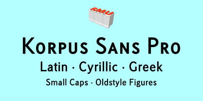
  18. Korpus Sans Pro by RMU, $50.00
    Korpus Sans Pro - a modern, versatile and multilingual sans serif font family with oldstyle numbers and small caps throughout all font styles.
  19. Merchant by Aboutype, $24.99
    A black weight decorative typeface with an engraved flare. Merchant was designed for all media and requires subjective display kerning and compensation.
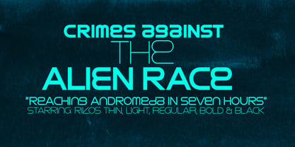
  20. Rikos by Fenotype, $19.95
    Rikos is an Alien-influenced unicase font family from the future. Use all the five members of the family for maximum impact!
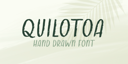
  21. Quilotoa by Rachel Kick, $8.00
    This font was originally hand drawn to include authentic brush texture. Works in all caps style and lowercase! The perfect casual font.
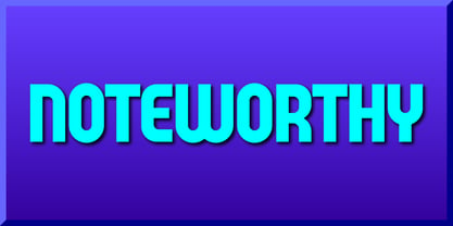
  22. Noteworthy by Gerald Gallo, $20.00
    Noteworthy is an all caps, bold, contemporary, sans serif font. It is ideal for headlines, titles, branding and small blocks of text.
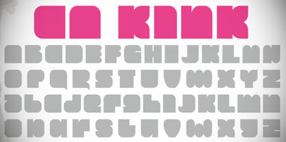
  23. CA Kink by Cape Arcona Type Foundry, $20.00
    CA Kink was originally created for a book cover. Mostly suitable as a headline font and for all kind of "space" themes.
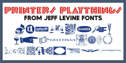
  24. Printers Playthings JNL by Jeff Levine, $29.00
    Printers Playthings JNL collects more cartoons, embellishments, ornaments and border pieces into one digital typeface; all re-drawn from vintage source material.
  25. LD Remington Portable by Illustration Ink, $3.00
    This font represents the type style created by this very famous classic typewriter. Remington was considered the father of all typewriter companies.
  26. Speed Pixel - Personal use only
  27. Bubble Shine - Personal use only
  28. FEAR Logo - Personal use only
  29. Crosshatcher - Personal use only
  30. Sure, let me paint a vivid picture of SF Big Whiskey, a font that seems to capture the essence of character and strength with its design. Imagine a font that cleverly blends the robustness of the w...
  31. Corners 2 isn't one of the mainstream fonts that you'd find popping up in your everyday text editor or design program. It's more like a hidden gem tucked away in the vast world of typography, waiting...
  32. The DIG DUG font, masterfully crafted by the enigmatic and presumably arachnid-inspired designer known as SpideRaY, is a delightful, quirky homage to the classic 1982 arcade game of the same name. Th...
  33. Letters by Fenotype is a captivating font that embodies versatility and creativity. Designed with meticulous attention to detail, this typeface offers a blend of modern flair and nostalgic charm, mak...
  34. Alright, folks, let’s dive into the whimsical world of the font named LAZYTOWN, crafted by none other than the font wizard, SpideRaY. Picture this: a font so playfully quirky, it decided to ditch the...
  35. Ah, "Derail," the font that decided to be the life of the graphic design party, where it loudly proclaims, "Who needs the straight and narrow path?". Imagine if a typeface had a rebellious teenage ph...
  36. Ah, if fonts were people, Struck Base PERSONAL USE ONLY PERSONAL USE ONLY by Måns Grebäck would be that incredibly charismatic friend who insists on making a dramatic entrance at every party, yet onl...
  37. Ah, yes, the Bionic Comic Condensed font by Iconian Fonts – it's like the superhero of the typeface world, donned in its sleek, form-fitting spandex, ready to add a punch of personality to any projec...
  38. John Sans by Storm Type Foundry, $49.00
    The idea of a brand-new grotesk is certainly rather foolish – there are already lots of these typefaces in the world and, quite simply, nothing is more beautiful than the original Gill. The sans-serif chapter of typography is now closed by hundreds of technically perfect imitations of Syntax and Frutiger, which are, however, for the most part based on the cool din-aesthetics. The only chance, when looking for inspiration, is to go very far... A grotesk does not afford such a variety as a serif typeface, it is dull and can soon tire the eye. This is why books are not set in sans serif faces. A grotesk is, however, always welcome for expressing different degrees of emphasis, for headings, marginal notes, captions, registers, in short for any service accompaniment of a book, including its titlings. We also often come across a text in which we want to distinguish the individual speaking or writing persons by the use of different typefaces. The condition is that such grotesk should blend in perfectly with the proportions, colour and above all with the expression of the basic, serif typeface. In the area of non-fiction typography, what we appreciate in sans-serif typefaces is that they are clamorous in inscriptions and economic in the setting. John Sans is to be a modest servant and at the same time an original loudspeaker; it wishes to inhabit libraries of educated persons and to shout from billboards. A year ago we completed the transcription of the typefaces of John Baskerville, whose heritage still stands out vividly in our memory. Baskerville cleverly incorporated certain constructional elements in the design of the individual letters of his typeface. These elements include above all the alternation of softand sharp stroke endings. The frequency of these endings in the text and their rhythm produce a balanced impression. The anchoring of the letters on the surface varies and they do not look monotonous when they are read. We attempted to use these tricks also in the creation of a sans-serif typeface. Except that, if we wished to create a genuine “Baroque grotesk”, all the decorativeness of the original would have to be repeated, which would result in a parody. On the contrary, to achieve a mere contrast with the soft Baskerville it is sufficient to choose any other hard grotesk and not to take a great deal of time over designing a new one. Between these two extremes, we chose a path starting with the construction of an almost monolinear skeleton, to which the elements of Baskerville were carefully attached. After many tests of the text, however, some of the flourishes had to be removed again. Anything that is superfluous or ornamental is against the substance of a grotesk typeface. The monolinear character can be impinged upon in those places where any consistency would become a burden. The fine shading and softening is for the benefit of both legibility and aesthetics. The more marked incisions of all crotches are a characteristic feature of this typeface, especially in the bold designs. The colour of the Text, Medium and Bold designs is commensurate with their serif counterparts. The White and X-Black designs already exceed the framework of book graphics and are suitable for use in advertisements and magazines. The original concept of the italics copying faithfully Baskerville’s morphology turned out to be a blind alley. This design would restrict the independent use of the grotesk typeface. We, therefore, began to model the new italics only after the completion of the upright designs. The features which these new italics and Baskerville have in common are the angle of the slope and the softened sloped strokes of the lower case letters. There are also certain reminiscences in the details (K, k). More complicated are the signs & and @, in the case of which regard is paid to distinguishing, in the design, the upright, sloped @ small caps forms. The one-storey lower-case g and the absence of a descender in the lower-case f contributes to the open and simple expression of the design. Also the inclusion of non-aligning figures in the basic designs and of aligning figures in small caps serves the purpose of harmonization of the sans-serif families with the serif families. Non-aligning figures link up better with lower-case letters in the text. If John Sans looks like many other modern typefaces, it is just as well. It certainly is not to the detriment of a Latin typeface as a means of communication, if different typographers in different places of the world arrive in different ways at a similar result.
  39. Ah, EnglishTowne-Normal, the font that transports you back to a time when feather quills were the peak of writing technology, candlelight was the latest trend in ambient lighting, and sending a messa...
  40. The New Gothic Textura typeface, designed by Elodie Mandray, is a captivating contemporary adaptation of a historic script that pays homage to the intricate and ornamental style of the medieval textu...
Looking for more fonts? Check out our New, Sans, Script, Handwriting fonts or Categories
abstract fontscontact usprivacy policyweb font generator
Processing