10,000 search results (0.035 seconds)
  1. Phoenix - Unknown license
  2. Headhunter - Unknown license
  3. Uechi - Unknown license
  4. Advert - Unknown license
  5. Art ttnorm - Unknown license
  6. Vassar - Unknown license
  7. Cinema - Unknown license
  8. Ikarus - Unknown license
  9. Logger - Unknown license
  10. After ttnorm - Unknown license
  11. Barney ttnorm - Unknown license
  12. Molecule model - Unknown license
  13. Bolide - Unknown license
  14. Butsubutsu - Unknown license
  15. EmPower42 - Unknown license
  16. Oldchristmas - Unknown license
  17. Wedgie - Unknown license
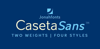
  18. Caseta Sans by Jonahfonts, $35.00
    Caseta Sans (Regular and Bold with Italics) completing a family of 3 font families with Caseta Regular and Caseta Slab.
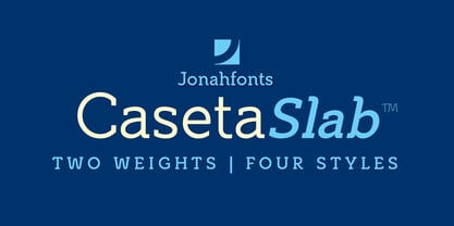
  19. Caseta Slab by Jonahfonts, $35.00
    Caseta Slab (Regular and Bold with Italics) completing a family of 3 font families with Caseta Regular and Caseta Sans.
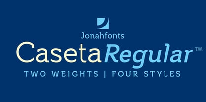
  20. Caseta by Jonahfonts, $35.00
    Caseta Regular (Regular and Bold with Italics) completing a family of 3 font families with Caseta Slab and Caseta Sans .
  21. As of my last update, the "Roman Flames" font, crafted by the artist jbensch, isn't a widely recognized typeface within mainstream typographic references. However, envisioning the essence captured by...
  22. Calico Cyrillic - Unknown license
  23. CF Anarchy - Personal use only
  24. VTC Lo-Down - Unknown license
  25. VTC ScreamItLoud - Unknown license
  26. VTCBadWhipit - Unknown license
  27. VTCBadHangover - Unknown license
  28. VTCBadPlating - Unknown license
  29. VTCBadDrip - Unknown license
  30. VTC Boseephus - Unknown license
  31. VTC Seeindubbledointriple - Unknown license
  32. VTCBadLuck - Unknown license
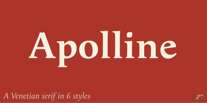
  33. Apolline Std by Typofonderie, $59.00
    A Venetian serif in 6 styles The Apolline typeface family was created by Jean François Porchez as a means to study the transition from Renaissance writing into the first printing types. Rather than sticking to the method commonly used these days for the creation of revivals of Jenson or Bembo types, it seemed more interesting to try and get in the same mindset as those exceptional designers during this pivotal period in the history of typography. Thus Apolline is an exploration of the design methods used by people like Nicolas Jenson and his contemporaries for adapting handwriting with its multiple occurrences (a, a, a, b, b, b…) into single, unique signs (a, b…). Initially Jean François made drawings modelled after his own calligraphy. They were done at a very small size on tracing paper (2 cm high for the capitals) to preserve the irregularity of human handwriting. Besides emphasising the horizontal parts of the letter forms, the serifs were designed asymmetrically to reinforce the rhythm of the writing. The final drawings were produced at a large size (10 cm high for the capitals) to allow for subtle optimisation of specific details. The very narrow and fluid Apolline italic Influenced by various concepts for an ideal italic by Van Krimpen, Gill, etc. Apolline italic was designed at 8° degrees. Although the structure of the letterforms were informed by chancery scripts, the italic has full serifs like the roman. Very narrow and fluid, its unique design creates a good contrast when used in combination with its upright counterparts. Thanks to the presence of the serifs similar to roman typefaces it sets very neatly in large sizes. The next step was digitising the drawings with Ikarus (the pre-Bézier-curves era) to create the final roman and italic fonts. Two years later, when the family was expanded to six series the same method was used, this time with Fontographer. This was necessary for correcting a few problems caused by the conversion to Bézier outlines, and to add intermediate weights. Before the advent of feature-rich OpenType, quality type families consisted of several separate fonts for each weight to provide users with various sets of numerals, an extended ligature set and alternates, ornaments, and so on. Introducing Apolline Morisawa Awards 1993
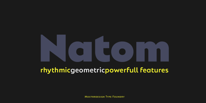
  34. Natom Pro by Mostardesign, $25.00
    A family of fonts with rhythm. Natom Pro is a modern and geometric font family adapted to the professional requirements of graphic designers, web designers and mobile application developers. Comprised of 19 styles including 8 styles designed especially for the design of headlines, Natom Pro is a very versatile family of fonts that can be used in many projects such as editorial design, branding or corporate identity creation, design of posters or logos, the creation of websites or the development of mobile applications. This font, with a resolutely contemporary aspect, also hides a unique typographic design since it has 2 distinct styles (Title and Roman) which have 2 different typographic rhythms in order to graphically differentiate the appearance of titles, subtitles and long paragraphs. With this design of rhythmically differentiated glyphs according to the styles, the headlines have a very graphic aspect while the long texts have a more classic aspect in order to keep optimal readability in all scenarios. Its architecture is also very modern since it was designed and drawn with particular attention to the geometry of the forms with clear and open endings cut at 90 degrees. The number of styles has also been simplified with the most used thicknesses (Extra Light, Light, Regular, Medium, Bold and Black) in order to speed up your graphic design process. For the more experienced designers, Natom Pro is also available in a variable version. Natom Pro is also equipped with powerful OpenType features like case sensitivity, true small caps, full ligature set, tabular figures for tables, « old styles figures » to elegantly insert figures into your sentences, numbers circled or even alternative characters to satisfy the most demanding professionals.
  35. LazyMeow - Personal use only
  36. SteveHandwriting - Unknown license
  37. Casino - Unknown license
  38. Knockout - Unknown license
  39. ZirkleOne - Unknown license
  40. CoolHandLuke ttext - Unknown license
Looking for more fonts? Check out our New, Sans, Script, Handwriting fonts or Categories
abstract fontscontact usprivacy policyweb font generator
Processing