10,000 search results (0.042 seconds)
  1. Stahlbeton - Unknown license
  2. A bite - Personal use only
  3. MyBlueRoom - Unknown license
  4. Montells by Olexstudio, $16.00
    MONTELLS - Display Font will look gorgeous on all your designs, invitation, poster design, book design, branding materials, logo's and all project design other. MONTELLS - Display Font contains standard characters, character is Uppercase, Lowercase, numbers, punctuation, ligatures and international glyphs.
  5. Rajomon by Etewut, $20.00
    Introducing Rajomon the hand drawn script made with dry brush. All European languages are in. More of all there are initial, final and alternative letters for making your lettering on a high level as a peak of the rock!
  6. Samurai - Unknown license
  7. Auchentaller by HiH, $12.00
    Auchentaller was inspired by a travel poster by Josef Maria Auchentaller in 1906. To our knowledge, it was never cast in type. Grado lies on the northern Adriatic, between Venice and Trieste. At one time the port for the important Roman town of Aquileia. With the decline of the Roman Empire, the upper Adriatic region came under the rule of the Visigoths, the Ostrogoths, the Byzantines, the Lombards, the Franks, the Germans, the Venetians and finally, in 1796, the Austrian Hapsburgs. So it remained until the dissolution of the Austro-Hungarian Monarchy in 1919, following World War I, when the seaport of Trieste was awarded to Italy. With Trieste came Montefalcone, Aquileia and Grado. The area was marked by years of political tension between Italy and Yugoslavia, exemplified by the d'Annunzio expedition to capture Fiume (Rijeka) in September, 1919. Some basic discussion of the period from 1919 to 1939 may be found in Seton-Watson’s Eastern Europe Between The Wars (Cambridge 1945) and Rothschild’s East Central Europe Between The Two World Wars (Seattle 1974). In 1965 I was traveling by train from Venice to Vienna. Crossing the Alps, the train stopped for customs inspection at the rural Italian-Austrian border, just above Slovenia. We were warned not to get off the train because there were still shooting skirmishes in the area. Through all this, Grado remained literally an island of tranquility, connected to the mainland by a only causeway and lines on a map. Auchentaller not only painted the beach scene at Grado, he moved there, living out the rest of his life in this comfortable little island town. His travel illustration contains the text from which the design of our font Auchentaller is drawn. The text translates: "Seaside resort : Grado / Austrian coastal land". Please see our gallery images to see a map locating Grado, as well as Auchentaller’s painting of the resort. Auchentaller is a monoline all-cap font, light and open in design , with a lot of typically art nouveau letter forms. Included in our font are a number of ligatures. As is frequently seen in designs by German speakers, the umlaut is embedded in the O & U below the tops of the letters. This approach led to two whimsies: a happy umlauted O and a sad umlauted U. This font has a clean, crisp look that is very appealing and very distinctive. Auchentaller ML represents a major extension of the original release, with the following changes: 1. Added glyphs for the 1250 Central Europe, the 1252 Turkish and the 1257 Baltic Code Pages. Add glyphs to complete standard 1252 Western Europe Code Page. Special glyphs relocated and assigned Unicode codepoints, some in Private Use area. Total of 336 glyphs. 2. Added OpenType GSUB layout features: pnum, liga, salt & ornm. 3. Added 116 kerning pairs. 4. Revised vertical metrics for improved cross-platform line spacing. 5. Revised ‘J’. 6. Minor refinements to various glyph outlines. 7. Inclusion of both tabular & proportional numbers. 8. Inclusion of both standard acute and Polish kreska with choice of alternate accented glyphs for c,n,r,s & z. Please note that some older applications may only be able to access the Western Europe character set (approximately 221 glyphs). The zip package includes two versions of the font at no extra charge. There is an OTF version which is in Open PS (Post Script Type 1) format and a TTF version which is in Open TT (True Type)format. Use whichever works best for your applications.
  8. ATF Garamond by ATF Collection, $59.00
    The Garamond family tree has many branches. There are probably more different typefaces bearing the name Garamond than the name of any other type designer. Not only did the punchcutter Claude Garamond set a standard for elegance and excellence in type founding in 16th-century Paris, but a successor, Jean Jannon, some eighty years later, cut typefaces inspired by Garamond that later came to bear Garamond’s name. Revivals of both designs have been popular and various over the course of the last 100 years. When ATF Garamond was designed in 1917, it was one of the first revivals of a truly classic typeface. Based on Jannon’s types, which had been preserved in the French Imprimerie Nationale as the “caractères de l’Université,” ATF Garamond brought distinctive elegance and liveliness to text type for books and display type for advertising. It was both the inspiration and the model for many of the later “Garamond” revivals, notably Linotype’s very popular Garamond No. 3. ATF Garamond was released ca. 1918, first in Roman and Italic, drawn by Morris Fuller Benton, the head of the American Type Founders design department. In 1922, Thomas M. Cleland designed a set of swash italics and ornaments for the typeface. The Bold and Bold Italic were released in 1920 and 1923, respectively. The new digital ATF Garamond expands upon this legacy, while bringing back some of the robustness of metal type and letterpress printing that is sometimes lost in digital adaptations. The graceful, almost lacy form of some of the letters is complemented by a solid, sturdy outline that holds up in text even at small sizes. The 18 fonts comprise three optical sizes (Subhead, Text, Micro) and three weights, including a new Medium weight that did not exist in metal. ATF Garamond also includes unusual alternates and swash characters from the original metal typeface. The character of ATF Garamond is lively, reflecting the spirit of the French Renaissance as interpreted in the 1920s. Its Roman has more verve than later old-style faces like Caslon, and its Italic is outright sprightly, yet remarkably readable.
  9. Presley Slab by Sudtipos, $49.00
    The lightest weight of Presley Slab takes inspiration from a late nineteenth-century type specimen, but what began as a decorative and delicate contrasted serif stirred Alejandro Paul’s imagination to conjure voluptuous reverse contrasted letterforms. These became the heaviest weight of Presley Slab, which nods to the lacquered hairstyles from the birth of rock ’n roll with its idiosyncratic ball terminals. Its playful allure and swagger remains visible in the weights that stand between these two extremes but as the curls loosened, many things happened in the design process including the appearance of swashes and alternates. Presley Slab’s personality has breadth; it is a fun, confident and contemporary palette of letters that will perfectly perform for any job, from editorial design to branding. The Extra Bold and Black weights are a powerful option at large sizes for use on posters and billboards; the graceful Thin and Extra Light weights are delicate options for packaging design or fashion branding. Despite it conjuring images of mid-century music halls, Presley Slab is also staunchly European in it’s aesthetic, offering everything from good-humour to elegance with its unique touches.
  10. Semiramis - Unknown license
  11. Goodfellow - Unknown license
  12. Hyacinth - Unknown license
  13. Stonecross - Unknown license
  14. Baraquiel - Unknown license
  15. Summerisle Demo - Unknown license
  16. HobbesFriend - Unknown license
  17. Scrawlies - Unknown license
  18. Queensland - Unknown license
  19. Munich - Unknown license
  20. Pavane - Unknown license
  21. Narrow Stencil JNL by Jeff Levine, $29.00
    Narrow Stencil JNL is based on a set of 12 inch tall letter and number stencils, generally used for marking and identification.
  22. LD Lanky by Illustration Ink, $3.00
    Long, tall and fun, that's what this cool font is. Download "Lanky" for scrapbook and greeting card journaling, captions, titles, and sentiments.
  23. Restou by Forberas Club, $18.00
    Restou is handwritten font for children theme, playful event, wall type, your signature, or a poster. This font is for personal use.
  24. Chat Love by Sakha Design, $9.00
    Chat Love is a cute and adorable display font. Fall in love with it and bring your projects to the highest levels!
  25. Rubens Expanded Regular by Wooden Type Fonts, $15.00
    A sans serif with splayed ends, descenders of the lower case dropping below the baseline, very tall x-height. The expanded version.
  26. Pomthinq by Stringlabs Creative Studio, $29.00
    Pomthinq is a remarkable brush script font. Fall in love with its incredibly versatile style and use it to create spectacular designs!
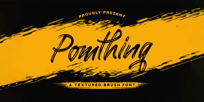
  27. Cross Stitch Delicate by Gerald Gallo, $20.00
    Cross Stitch Delicate is based on upper case characters 21 stitches tall and contains the characters A-Z and numbers 0-9.
  28. Joyscript by Jonahfonts, $25.00
    Inspired by many hand-lettered European package designs. This script face is suitable for logos, casual headlines and designs calling for attention.
  29. KG Ways To Say Goodbye by Kimberly Geswein, $5.00
    This unique handwriting font features extremely tall, loopy descenders and ascenders. The capitals, when used by themselves, offer a totally different look.
  30. Throrian Commonface is a unique font that is imbued with a distinctive personality, created by the talented artist Bill Roach. This typeface stands out for its imaginative flair and the creative esse...
  31. The Guede Demo font, crafted by the talented David F. Nalle, is a distinctive and visually compelling typeface that offers a glimpse into the broader capabilities and aesthetics of its full version. ...
  32. Ah, the Amsterdam Graffiti font! Picture this: you're wandering the vibrant streets of Amsterdam, where the scent of fresh stroopwafels fills the air and bicycles whiz past at every turn. Suddenly, y...
  33. Signatria - Personal use only
  34. Movement - Personal use only
  35. Annabel Script - Unknown license
  36. PLASTIC PILL - Personal use only
  37. Crimson Petal - Personal use only
  38. the DEEPER - Personal use only
  39. Giant Head OT - Unknown license
  40. Bifurk - Unknown license
Looking for more fonts? Check out our New, Sans, Script, Handwriting fonts or Categories
abstract fontscontact usprivacy policyweb font generator
Processing