5,536 search results
(0.053 seconds)
- Blackcurrant by Device,
$39.00 Lively, friendly and fun. Blackcurrant is derived from a poster campaign Rian Hughes designed for the youthful Japanese woman's outfitters, Yellow Boots. The original logo formed the basis of the Black version; the narrower Squash version was added fro the commercial release. The lower case was added two years later due to popular demand. In 2010 the font was further accessorised with extensive ligatures, made possible with the then-new Opentype technology.
 - HiFi by Pelavin Fonts,
$25.00 HiFi is a geometric script whose genesis lies in drive-in movie theaters, vintage auto emblems and radio dials. It embraces the stylistic tenets of retro futurism and proposes that the evolution of design styles, rather than being linear, is a circular process, continually revisiting and reshaping itself. It evokes the 40s & 50s and pre-transistor electronics when you turned your radio on and waited patiently for the tubes to warm up.
 - Crowbar by Hanoded,
$15.00 Technically a crowbar is a straight metal rod used for digging. The tool I had in mind when I named this font is called a jemmy or pry bar, but I guess I liked the name crowbar better. Crowbar font, like its namesake, is a very useful tool: its brush-like appearance fits any design, especially if you are aiming for the ‘scary’ look. Comes with a toolbox full of diacritics too!
 - De Fonte Plus by Ingo,
$39.00 A variation of ”Helvetica according to the blur principle.“ The underlying typeface is ”Helvetica“, the only true ”run-of-the-mill“ typeface of the twentieth century. The distortion principle used simulates the photographic effect of halation and/or overexposure. The light weight, »DeFonte Léger«, nearly breaks on the thin points, whereas on those points where the lines meet or cross, dark spots remain. The characters are ”nibbled at“ from the inner and outer brightness. On the normal and semibold typestyles, »DeFonte Normale« and »DeFonte Demi Gras«, the effect is limited almost exclusively to the end strokes and corners, which appears to be strongly rounded off. The bold version »DeFonte Gros« is especially attractive. As a result of ”overexposure“, counters (internal spaces) are closed in, while characters become blurred and turn into spots; new characteristic forms are created which are astoundingly legible. The fat version »DeFonte Gros« is particularly appealing. “Overexposure” leads to drifted counters, letters blur into spots; new characteristic forms emerge, which are surprisingly easy to read.
 - Sweet Steeffie - Personal use only

- Frisco Antique Display SG by Spiece Graphics,
$39.00 Here is a decorative condensed antique design that is sure to fit a variety of contemporary situations. The Bruce Type Foundry (later acquired by V. B. Munson) developed this wonderfully shaded Tuscan in the 1880s - or possibly earlier. It was known back then as Style No. 1050 and carried a pronounced three-dimensional look with a thin hairline at the bottom and right of each stroke. It is best to use Frisco Antique in large display sizes because it is easy to lose these delicate hairlines. A lowercase and several alternate characters have been provided for your convenience. Frisco Antique Display is also available in the OpenType Std format. Some new characters have been added to this OpenType version. Advanced features currently work in Adobe Creative Suite InDesign, Creative Suite Illustrator, and Quark XPress. Check for OpenType advanced feature support in other applications as it gradually becomes available with upgrades.
 - Godwit by yasireknc,
$19.00 Godwit is an experimental high-contrast serif font. The piece screams creative freedom and exploration, as the color literally breaks through the boundaries of the original type. The final piece is really fluid as each letter links smoothly into the next and you can feel the real natural ink paths. This is a benefit of Godwit and the most powerful-distinguishable feature, as most standard fonts wouldn’t allow for this fluidity, especially a serif font. The Aphorism: The main idea comes from being fluent and smooth-spoken natural ink shapes. As we go into the details, the organic shape of the body makes the font a unique piece. The collection lends itself to the design, packaging, and advertising of everything with a romantic feel like liquid love potion; weddings, greetings, cosmetics, lingerie, book covers, and too many more to mention! This font is a great place to begin getting that tone.
 - Styled Up by Nicky Laatz,
$15.00 Are you looking for a font that says "I'm unique"? Say hello to Styled up! A new authentic hand-brushed, modern calligraphy font with a stylish flair and a quirky personality. "Styled up!" comes with a complimentary caps font, perfect for when you need to add extra text in those stubborn empty spaces in your type designs. Styled up! is super special in that it creates completely unique and individual designs - you can write one line in a million different ways thanks to it’s opentype features with 2 sets of extra alternate lowercase letters and an extra set of Uppercase alternate letters. Styled up! also comes with a comprehensive set of double letter ligatures to make your designs look even more naturally written. Styled up! is perfect for any project needing a unique hand lettered touch - branding, greeting cards, logos, websites, wedding signage, printables, and super stylish merch.
 - Turntable Stencil JNL by Jeff Levine,
$29.00 A disc jockey-only promotional sleeve for a 1964 [45 rpm] release of “Close to Me” and “Let Them Talk” by Dan Penn featured the song titles printed in a stencil typeface on the record sleeve. Closely resembling a stencil version of Franklin Gothic but with its own unique characteristics, this design has been reinterpreted as Turntable Stencil JNL and is available in both regular and oblique versions. For trivia buffs, Dan Penn is a singer-songwriter-record producer, often collaborating with Dewey Lindon “Spooner” Oldham; both closely associated with the late Rick Hall’s Fame recording studios in Muscle Shoals, Alabama. In 1964, Hall started the Fame record label, and for a time it was distributed by Vee-Jay Records of Chicago, the first major Black-owned record label in the United States. Penn’s release was only the second for the new label; Fame 6402.
 - Serendipity by Nicky Laatz,
$15.00 Say hello to **Serendipity** - A font that you were meant to find, and is now destined to be with you :) An elegant cousin of Saturday Script, Serendipity is a lovingly handwritten brush script , with an air of grace and flamboyancy. **Serendipity** is special in that one word can be written in a million different ways - thanks to the large selection of extra letters that it has built in. It comes with 2 sets of alternate lowercase letters, a set of alternate uppercase letters as well as a set of double letter ligatures - all for you to play with, and make your words look exactly how you need them to look. Perfect for Type-based creations, branding, websites, merchandise, packaging, quotes, invites, greetings and so much more, Serendipity will take you where you need to be. The brush script comes in 2 variants - Regular, and Wide each with its own unique feel.
 - Julietta Alexart by Piece of Cake Typework,
$19.00 Hello World, Introducing, Julietta Alexart is a beauty script font suitable for your design project needs, such as; wedding themes, social media posts, quotes, overlays on images, tagline logos, posters, print needs, website banners, and more. Features A set of uppercase and lowercase glyphs Number, symbol, and punctuation Multilingual support Some swashes and ligature So Easy to Use Access Swashes by keyboard key bracket left ' [ ' to feature beginning swash 1 key brace left ' { ' to feature beginning swash 2 key parent left ' ( ' to feature beginning swash 3 key plus ' + ' to feature middle swash 1 key equal ' = ' to feature middle swash 2 key bracket right ' ] ' to feature ending swash 1 key brace right ' } ' to feature ending swash 2 key paren right ' ) ' to feature ending swash 3 For Example type (you=me) Thank you a million times for downloading and using this font for your projects. Enjoy this font and happy creating!
 - Belda Didone by insigne,
$25.00 Belda Didone: the elegant strokes of Belda, now with higher contrast. A sleek Didone fusing graceful motion with an elegant typeface, this family offers new versatility. Belda Didone is a refined gem of a font that provides an unmatched level of luxury. Belda Didone is the child of Belda, offering new opportunities for a brave new world. The high contrast strokes reference the delicate shapes, curves, and sharp serifs of the original. The design of Belda Didone represents a unique balance of harmony and elegance. The architecture is robust and elegant. Belda’s forms have an intense luster and sparkle that captivates the reader’s eye. Belda Didone has plenty of OpenType alternates, including small capitals, titling, and a wealth of weights and widths. This font has the potential to serve as both text and titling. It’s an excellent choice for book jackets, advertising, packaging, and other luxury applications.
 - Basil by Karandash,
$- A mix between tradition and innovation, Basil is a unique humanist slab serif well suitable for broad range of design projects - editorial, logotype, poster, etc. With its tall x-height and generous internal spaces, the type family was especially designed with legibility in mind and is well suitable for body text at small sizes. In the same time Basil is equally able as titling and headline font due to numerous distinctive visual features that shape its attractive appearance. A true workhorse, packed with lots of OpenType features and full multilingual support, the type family consisting of six weights, with Regular available for free! Basil type family received Special Mention in Cyrillic text Typeface category at 7th International Type Design Competition for non-Latin typefaces - Granshan 2014. It also was exhibited at New Bulgarian Typography exhibition part of Sofia Design week 2013 and then took part in several travelling exhibitions.
 - Mountain by Volcano Type,
$29.00Mountain is a digital revival and extension of Teutonia, an old metal typeface released by the Roos & Junge type foundry (Offenbach am Main, Germany) in 1902. Teutonia’s design was popular during both the Art Nouveau and the Constructivist eras, where similar letterforms could be seen as far away as the Soviet Union. Although it slipped under the radar during the 1930s and 40s, this style feels extremely contemporary today. Mountain’s underlying geometric feeling is reminiscent of pixels and grids, suiting it for application with music and art, as well as history. Yet this typeface is not as static as it seems at first glance; playful diagonals—like those seen on the capitals D, L, P, and W—enliven the otherwise stern horizontal and vertical motion. Teutonia was a simple upper and lowercase display type. Mountain adds upon these by adding small caps and obliqued italic companions, rounding out this typographic toolkit. - Rebelton by Konstantine Studio,
$7.00 note: it's an All-Caps font, so there's no Lowercase letters in this font. Fast-forward to the modern and futuristic era, a font with strong characters and a long versatility in any era is a must-have survival mode item. Rebelton family was born to company that mission on earth. A set of family fonts with special mood and characters in every single one. Team up with each other to make a strong vibe in your visual project. Because that's what family stands out for. Language Support: Albanian, Basque, Catalan, Cornish, Croatian, Czech, Danish, Dutch, English, Esperanto, Estonian, Faroese, Finnish Scots, French, Gaelic, Galician, German, Greek Transliterated, Hawaiian, Hungarian, Icelandic, Indonesian, Irish, Italian, Latvian, Lithuanian, Maltese, Nynorsk Bokmal Norwegian, Polish, Portuguese, Romanian, Slovak, Slovenian, Spanish, Swedish, Turkish, Welsh. If you doubt with it please type it out in the text box below, I hope it will support your language too :)
 - Lavire by Nathatype,
$29.00 Elevate your design projects with the distinctive and captivating Lavire. Lavire is an uppercase display serif font that is effortlessly made in a truly unique typographic masterpiece. Each uppercase letter in Lavire is a work of art in itself. The serifs, which are typically known for their traditional elegance, take on a modern and imaginative twist with Lavire's addition of artistic lines and flairs. The artistic lines and flairs in this font are carefully crafted to enhance the overall composition of each letter. They bring a sense of motion and dynamism to the font, making it particularly well-suited for projects that seek to convey a sense of movement or elegance. Lavire fits in headlines, logos, posters, flyers, branding materials, print media, editorial layouts, and many more designs. Find out more ways to use this font by taking a look at the font preview.
 - Egyptian Hieroglyphics – Deities by Deniart Systems,
$30.00 Give your documents a sense of history. The study of the ancient Egyptian Hieroglyphics has been an ongoing fascination by scholars and Egyptology buffs for literally centuries. The discovery of the Rosetta stone in 1799 provided an incredible breakthrough in deciphering the hieroglyphs, however there continues to be conflicting opinions on the literal translation of both the phonetic and ideographic symbols. As such, the interpretation provided in this manual represents an assembly of the most popular transcriptions. This series contains 62 assorted gods and deities as well as a few well known kings or pharaoh's from the New Dynasty. It is important to note that most of the gods and deities were represented in many different forms throughout the centuries and regions of Ancient Egypt, and these are but some of these representations. NOTE: this font comes with an interpretation guide in pdf format.
 - Ragata by Arterfak Project,
$17.00 Ragata is a bold and playful display font that draws inspiration from retro sans serif and vintage logo design. With its elegant yet lively character, Ragata is perfect for creating eye-catching headlines, labels, badges, logos, stickers, motion graphics, posters, and more. The font family comes in three styles: Regular, Outline, and Extrude, which can be combined to create a unique 3D effect. In addition, Ragata is equipped with stylistic alternates and ligatures, giving you even more creative control. Ragata also has multilingual support, making it a versatile choice for designers and creatives from all around the world. Whether you're creating a bold, retro-inspired design or something more modern and playful, Ragata is a versatile and stylish font that is sure to impress. What you'll get : Ragata - Regular Ragata - Outline Ragata - Extrude Uppercase & Lowercase Numbers & Symbols Stylistic alternates & ligatures Multilingual support Thank you for visiting!
 - Ciroya by Twinletter,
$17.00 Welcome to Ciroya, a typeface universe full of passion and fun! Ciroya is the answer if you want a strong, bold, and vivid style for your projects. Ciroya is available in three different styles: regular, outline, and shadow. You can use this to create effects that suit your vision, such as colorful to lighter outlines or shadow effects. But wait, there's more! Ciroya also has a plethora of other ligatures and characters, allowing you to express your creativity and create genuinely unique and spectacular designs. Ciroya, of course, supports several languages, allowing you to engage with audiences worldwide. Make Ciroya your top choice for projects that require a playful, playful look. Let your message be combined with Ciroya's carefree touch and make an unforgettable impression. With Ciroya, every word becomes more vibrant and colorful. Explore your creative potential right away with this fun font!
 - Letterbot by Comicraft,
$19.00 "If you prick me, do I not bleed? If you tickle me do I not laugh? If you poison me do I not DIE? And if you wrong me shall I not REVENGE?" "I am not a TYPEWRITER! I am not a MACHINE! I am -- NOT -- JUST -- a lettering ROBOT! I -- AM -- A -- HUMAN -- BEING!" Having trouble with YOUR lettering artist? LETTERBOT is here to help. Take all the fuss and muss out of dealing with a real person and install this helpful and responsive robotic font. It has no opinions of its own and will assist you in the lettering of your comic without all that tedious human interaction which lettering artists seem to think they're entitled. Designed by John JG Roshell.* *Now obsolete. Features: Four weights (Regular, Italic, Bold & Bold Italic) with upper and lower case alphabets. Includes Western & Central European accents and Cyrillic characters.
 - Gentona by René Bieder,
$25.00 Designed for a wide range of applications, Gentona was intended to support the goals of contemporary design paired with a mostly swiss oriented demand on typography – neutrality. The result is a nine-weight neo-grotesque family ranging from sharp and fine thin cuts to muscle-bound and strong heavy weights. Gentona’s confident and open shapes support legibility especially in small sizes while its alternative shapes and letterforms create flexibility. A wide range of typographic features round up the whole family.
 - Kids Script by Tipo Pèpel,
$32.00 Kids Script is based on the calligraphic models used in Spanish’s primary school in the 40’s. The result is a fresh and naive typography perfect for use in children’s oriented publishing. Taking advantage of Opentype functions, it’s possible to get different styles of writing, adding initials, ligatures, contextual characters and alternatives, plus a complete set of uppercase letters. The font contains three different weights for solving the most common issues, working with perfect legibility and readability in all sizes.
 - Heidth Variable by Arkitype,
$40.00 Heidth Variable has 2 styles, regular and slanted with varying extremes in width and height. It is designed as a display font for fun typographic use. Heidth is perfect for use in branding, posters, print campaigns packaging or what ever you need to have fun expressive typography. Wide or high, Heidth Variable is extremely versatile and works for any artwork layout and orientation. Please note: Being a Variable font, you will need software that supports variable fonts.i.e Adobe Illustrator, Photoshop etc.
 - Eloisa by StuArt,
$9.00 Eloisa is based on the penmanship of Andrea Stuart's eponymous aunt. The slow, meticulous strokes with which Eloisa writes is the result of formal (and meticulous) instruction in cursive writing back in her secondary education in an exclusive all-girls school. The interesting mix of smooth curves and sharp strokes combined with the slanted orientation make for an elegant yet dynamic visual appeal. Eloisa is perfect for branding, invitations, greetings, or any classy rendering of text you may imagine. Be classy!
 - Garbata by Zetafonts,
$39.00 Garbata was designed in 2020 by Francesco Canovaro, looking for an approach to sans serif design that ignored the over-exploited grotesque and modernist models. It takes its skeleton from old style typefaces like Windsor or Cooper, keeping the quirky sloped shapes of some letters and adding to the historical smooth shapes a flat brush calligraphic sensibility. The result of these different historical influences is a humble yet distinctive sans serif typeface, developed in a wide range of weights, with finely-tuned differences between the medium, text-oriented cuts (with wider tracking and more regular design) and the more extreme, display-oriented weights. This play on subtlety allows Garbata to be surprising in all uses: humble and readable when set in body text, it shows all its elegant, whimsical qualities in logo design and display use. Equipped with all advanced OpenType features you expect from a production typeface, Garbata comes with an extended character set covering over two hundred languages with latin and Cyrillic glyphs. Designed with an Italian sensibility mixing craftsmanship and artistry, Garbata is ready to help you make your designs timeless, elegant and unusual.
 - Menhart by Monotype,
$29.99Czech designer Oldrich Menhart (1897-1962) devoted his life to making letters. He was a calligrapher, lettering artist, and typeface designer with over twenty faces to his credit. The Monotype typeface, Menhart, was the second of his designs. Menhart began work on the design in the early 1930s and turned over his final artwork to the Monotype Drawing Office in 1934. The first size cut was 14 Didot (Didot points are the traditional European system of type measure, and are roughly equivalent to the point system commonly used by today's digital fonts). The 14D font was followed by 18D and 24D, indicating that the design was considered most suitable for display work. However, a 10D size was later cut from the same master drawings at the request of a Monotype customer. Menhart's design was light and open, with an even color and a slight squareness" to its round shapes. Because the Czech alphabet has 15 accented letters, Menhart included these diacritics as an integral part of his design, not as an afterthought. As a result, accented copy set in Menhart has a cohesive quality rarely seen in other typefaces. Monotype's new digital release of Menhart is the first revival since the hot metal fonts were cut. Menhart Display is based on the original Monotype drawings, while a slightly heavier, re-spaced version has been created for text sizes. Both versions offer the full capabilities of the OpenType format, such as the automatic insertion of old style figures, ligatures and small caps. In addition to English, the extended character set supports most Central European and many Eastern European languages. One of Menhart's lifelong goals was to share the richness of his Czech culture by drawing typefaces that uniquely served Czechoslovakia literature. In his words: "I believe that a Czech style of type comes above all from the spirit in which it was designed, which gives it its 'signature,' and not so much from decorative composition, and even less from the geographic location of its creation." The typeface Menhart is a tribute to his values. Now, Menhart Pro and Menhart Display Pro capture the unique personality of this timeless design while greatly extending its range of use. " - PR Agamemnon is a captivating and distinctive font meticulously crafted by the acclaimed Castles & Crypts. This font stands out due to its unique blend of ancient inspiration and modern design elemen...
- Kyboshed - 100% free

- Suncos by HansCo,
$15.00 Suncos is a retro funk fonts that feels casual and clean an incredible modern retro aesthetic. Use this display font to add that special retro funk vintage touch to any design idea you can think of! Very suitable for Logotype, Stickers, Packaging design, Cricut Project, Headlines, Brand identity, T Shirt or Apparel industry, Posters, Magazines, Books, YouTube, Instagram, Websites, or any of your creative design projects. Enjoy!
 - Blue (Not) Mono by Volcano Type,
$35.00 As a binary system, at the junction to two antagonist drawings, the Blue (Not) Mono typeface is a hybrid between the monospace and the humanistic sans-serif families. Declined to several variants and weights: a true monospace and a proportional one, a roman and italic style, bold and the main purpose is obviously to maintain in the same time a calligraphic identity, and a computing legacy.
 - Mariné STD by TipoType,
$19.90Mariné STD is a geometric sans but with the softness of humanistic strokes. It’s mild contrast and multiple different styles allow Mariné to work well as both a text and display font. Mariné STD is a selected version of Mariné Family. - Ideal for print and identity works. - Works well for text or display uses. - Designed for web and apps. - Look serious or look casual. - NorB Marker by NorFonts,
$28.00 NorB Marker is a handwritten text font emulating a marker pen. The fonts set can be used with any word processing program for text and display use, print and web projects, apps and ePub, comic books, graphic identities, branding, editorial, advertising, scrapbooking, cards and invitations and any casual lettering purpose… or even just for fun! The fonts set features 4 weights: Regular Italic Bold Bold Italic
 - NorB Croquis by NorFonts,
$28.00 NorB Croquis is a handwritten text font witch can be used with any word processing program for text and display use, print and web projects, apps and ePub, comic books, graphic identities, branding, editorial, advertising, scrapbooking, cards and invitations and any casual lettering purpose… or even just for fun! It comes with 12 weights: Normal, Medium, Bold and Cut Tip along with their Italic and Oblique versions.
 - Glupy Retro by HansCo,
$15.00 Glupy Retro is a display type font with the style fat below and skinny on top. Use this display font to add that special retro vintage touch to any design idea you can think of! Very suitable for logotype, Stickers, Packaging design, Cricut Project, headlines, brand identity, t shirt or apparel industry, posters, magazines, books, YouTube, Instagram, websites, or any of your creative design projects. Enjoy!
 - King and Queen by Fype Co,
$21.00 King and Queen is a contemporary, classy and fresh serif typeface that best suits your design needs. Its ideal for headlines and brand identity design. King and Queen also includes a version, with a greater contrast between thick and thin strokes, for use in even larger sizes. The font comes with italic styles which can be used individually or in combination with the upright variant.
 - August Cameron by Agniardi,
$15.00 August Cameron is a signature font with beautiful curves and alternate characters. A style that we choose was the natural look hand made, unique identity. South Portland also comes with alternative characters that are carefully created for adding a minimalist decor of the letters. Stylistic alternates allows versatile design options and works perfectly for Headlines, Posters, Logos Packaging, Branding, T-shirts, Greetings, Presentations and much more.
 - Autorich Sans by Typia Nesia,
$20.00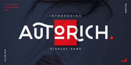 Autorich Sans is a display sans font, comes with 2 set of upper case (allcaps), 58 ligatures and some alternate. Great for brand identity, poster design, website / display, editorial, and more. **FEATURES :** * Basic A-Z * Numbers * Symbols * Stylistic Alternates * Standard Ligatures * Discretionary Ligatures * Oldstyle Figures * PUA Encode * Multilingual support Thank you for your purchase! and hope you're having fun with Autorich Sans ! Happy creating! Typia Nesia Studio
 - NorB Casual by NorFonts,
$28.00 NorB Casual is a handwritten text font which my daily casual writing, it can be used with any word processing program for text and display use, print and web projects, apps and Comic Books, graphic identities, branding, editorial, advertising, scrapbooking, cards, and invitations or even just for fun. This font comes with 16 styles, Light, Normal Bold and Heavy each with their Italic and Condensed version.
 - Tektype by Arkitype,
$30.00 Tektype has been designed as a one weight display don't font which makes it simple and easy to use, it has been specifically created for the designer to do very little customisation. Tektype has additional alternates which makes it versatile in use. Create Logos and unique identities, aimed at the tech industry this font can create a slick look and feel to any branding.
 - ITC Ellipse by ITC,
$29.99ITC Ellipse is the work of designer Jean-Renaud Cuaz, who specializes in visual identity programs combining graphic and typographic design. Cuaz contends that the ellipse has become prevalent in current design as a result of software which makes it possible to manipulat circular forms. ITC Ellipse is an excellent display typeface whose classical structure and proportions make it flexible enough for a variety of applications.

