10,000 search results
(0.036 seconds)
- Graziella Script by Black Studio,
$25.00 Graziella Script is a calligraphy script font that comes with exquisite character changes, a kind of classic decorative copper script with a modern twist, designed with high detail for an elegant style. Graziella Script Manuscript is attractive because it is smooth, clean, feminine, sensual, glamorous, simple and very readable, because of its many fancy letter joints. I also offer a number of decent stylistic alternatives for multiple letters. Classic styles are very suitable to be applied in various formal forms such as invitations, labels, restaurant menus, logos, fashion, make up, stationery, novels, magazines, books, greeting / wedding cards, packaging, labels or all kinds of advertising purposes. . . . . . . Graziella Script has 436+ Glyph alternative characters, including multiple language support. With OpenType features with alternative styles and elegant binding. The OpenType feature works automatically, but you can access it manually and for the best results necessary for your creativity in combining these variations of the Glyph. I really hope you enjoy it! I can't wait to see what you do with the Graziella Script! Feel free to use the #Black Studio tag and the #Graziella Script font to show what you've been up to.
 - Fugu by Positype,
$25.00 When Baka and Baka Too did very well commercially (Baka was named the Best Cursive Rough Script in 2005), I shied away from doing rough, handwritten scripts in fear as being seen as a one-trick-pony. A few years have passed and some early sumi-e brush ‘doodles’ kept appealing to me. I initially thought this new font would just fall under the Baka mantle and just become a new sibling, but as brush hit paper over and over again, the letters took on a different personality from Baka. This new font was turning out to be far more expressive, smooth and rough, tasty but sticky. This dichotomy demanded a new name. The rough and smooth texture suggested the name Fugu—oddly delicate while rough and functional.
 - Museum Ornaments by T4 Foundry,
$7.00Museum Borders and Ornaments is part of a typographical treasure, the Norstedts type collection in Sweden. Type designer Torbjörn Olsson has painstakingly translated the original 34 Ornament matrices in the collection to Open Type. Among them are several of Granjon's arabesques, as well as symbols from both Swedish and Danish typefoundries. The signs were cut in the 16th, 17th and 18th centuries. The old Swedish name for these "type trademarks" were "rössjor". Museum Borders and Ornaments is an OpenType creation, for both PC and Mac. Swedish type foundry T4 premiere new fonts every month. Museum Borders and Ornaments is our tenth introduction. Museum Borders and Ornaments is part of the growing Museum type family. Museum also includes Museum Tertia Cursive, an exquisite 1700's typeface with modern additions, and Museum Fournier, a set of Rococo capitals designed by Pierre Simon Fournier le Jeune circa 1760. - Sumergible Script by Andinistas,
$39.95 Sumergible Script is a striking font that simulates it has been written with a dry pointed brush on textured paper. Its purpose is to decorate and accompany photos, illustrations and textures by letters designed with a generous horizontal spacing between lowercase which reinforces the idea of hurriedly and interrupted cursive calligraphy. In that sense it is spontaneous and useful to form vibrant words and sentences, shining short messages on book covers, posters and other graphic design media. Sumergible Script has new alternative letter forms that are activated with OpenType features creating hierarchy changes in writing. With Swash for example, you can change the character case with metric and similar proportions. With Titling it becomes even more expressive capitalization. Other OpenType features are: Fractions and Superscript. In short, Sumergible Script is designed to mix and match words and short phrases with a vital and expressive handwritten feel.
 - Fondue by Latinotype,
$29.00 Fondue: an eclectic-flavoured contemporary typeface. Designed by Jorge Alberto Martínez and Latinotype Team. Fondue is a type family of eclectic shapes, inspired by Art Deco designs, in particular, the lettering used by the Mexican cartoonist Ernesto “El Chango” Cabral on almost the entire publication Revista de Revistas ("Magazine of Magazines"). Far from being a copy, Fondue expects to be an adaptation of the thinking of that time to be used in contemporary context. Fondue has a cursive ductus, wide horizontal proportion and large x-height. Its friendly consistent rhythm makes it ideal for medium-sized text, headlines, branding, and so on. The family comes in 6 weights, from Thin, which reminds of the cartoonist’s loose strokes, to Ultra Bold, the version with powerful and unique voice. Fondue has a set of 496 characters that support 207 different languages.. OpenType features include standard and discretionary ligatures as well as stylistic alternates.
 - Plathorn by insigne,
$24.00 Vast and untamed, the American West once stretched as free and wild as imagination itself. Still beautiful, the Wild West of long ago and the new West of today is now to be found in insigne’s new face, Plathorn. That’s right, folks. When the West called, Jeremy Dooley reached up like Pecos Bill, grabbed it by the reins and pulled it in, then using its wide, roaming elements to design this functional font that still has an unbroken spirit burning deep inside. This down right, no-nonsense, orthodox face leaves off any of that extra fancy stuff that doesn't belong on a ride. Plathorn comes with a family of cowhands as wide as the Rockies, bringing specifically tailored condensed and extended sub-families along with it too. By design, it’s not very obtrusive like its unorthodox reversed tension brethren. Leave those for the next font rodeo. This mount features barely a hint of a serif that hearkens back a hundred years or so to sign painters and package lettering artists of early twentieth century. They're sure to put the sharpness, gumption and grit you need into your copy. So grab a tall glass of Plathorn and drink in the deep taste of America’s big country. Put it in your next magazine. Put it in your brand. This typeface’s offbeat appeal is bound to bring a bit of wild U.S. to your free-spirited work.
 - California Personal Use - Personal use only

- Enlighten - Personal use only

- MicroMieps - Unknown license

- Gumblery by PizzaDude.dk,
$15.00 A futuristic stylistic font with smooth curves, and rounded corners. Comes with more than 500 different ligatures that curl and swurl the letters in funky forms.
 - BB book A by bb-bureau,
$65.00 bb-book A — breaking rules typeface Expressive book serif (triangular and curved) kicking up weight, width and contrast — in 4 styles: light, regular, medium and bold.
 - Bullerby by Maria Brachmańska,
$10.00 Bullerby is a font inspired by children's handwriting. The letters are characterized by charming curves in the lowercase and distinct condensed traits in the upper case. It is very versatile in use: it is ideal for logos, packaging, posters, advertisements, and much more. The font supports 68 languages.
 - Cabragio by Aah Yes,
$3.95Cabragio is a free-flowing informal font, very curvy and quite heavy. The free-flowing effect is especially apparent in the lower case letters, and this font is definitely something a bit different -- yet is highly readable and attractive. Original and distinctive! - Vasmook by Sealoung,
$20.00 Vasmook - Beauty Display Serif - Modern Classy Fancy Font Vasmook font comes with some ligatures, so you can combine it to make a perfect typography design. Vasmook Elegant Beauty Display Serif font is perfect for your up coming projects. Such as luxury logo and branding, classy editorial design, woman magazine, cosmetic brand, business, fashion promotional, art gallery branding, museum, historical of architectural, boutique branding, stationery design, blog design, modern advertising design, card invitation, art quote, home decor, book/cover title, special events and any more. The Vasmook also includes the full set: Uppercase and Lowercase Multilingual Symbol Number Punctuation Ligature Alternative multilingual That's it! Have fun with Vasmook Elegant Beauty Display Serif font . Thank you!
 - Falstaff MT by Monotype,
$29.99 Falstaff first appeared with Monotype in 1931, an alphabet in the style of a wide, bold antiqua that was especially popular in the first third of the 19th century. Such typefaces distinguished themselves through their consistent basis in the transitional antiqua style. They are characterized by their extremely fine unflexed serifs with no curve connecting them to the thick strokes. The numerals with their generous curves and ball-like stroke endings and beginnings are particularly decorative. The vertical strokes are dominant and give lines of this typeface a column-like and therefore static look. Falstaff is today often used for book titling, especially for mystery novels. It is best used sparingly in middle and larger point sizes.
 - Amys Hand by Kustomtype,
$15.00 "The Amy Winehouse Script" unveils a unique window into the artistic and personal world of the iconic British singer and songwriter, Amy Winehouse. Renowned for her soulful voice and heartfelt lyrics, Amy's handwriting, a lesser-known facet of her life, offers a captivating story. Amy's script mirrors her artistic and unconventional spirit, marked by artistic flourishes and cursive elegance, echoing her expressive personality. Her cursive style, chosen for its fluidity, mirrors her singing, creating a deep connection between her music and script. Her individualistic script is characterized by varied letter sizes and shapes, reflecting her nonconformist nature and her desire to stand out. It can be messy, much like her turbulent life, representing her emotional journey, marked by highs and lows. Amy's handwriting evolved with her emotional state, sometimes appearing chaotic during difficult times. It's important to note the limited public samples, making it challenging to draw definitive conclusions. "The Amy Winehouse Script" invites you to explore uncharted territories of her life and artistry, offering fresh insights into her unspoken expressions and enduring intrigue. In every line, you can hear the music of her words and the story of her script, reminding us how art transcends boundaries, leaving an indelible mark.
 - Gessetto by Resistenza,
$39.00 Gessetto is an extensive chalk font family, containing script, sans, roman, figures and ornaments. One of the things most charming about chalkboard lettering is the variation; in both texture and style. Our goal was to achieve a real chalk effect using the varied typographic genres in a digital format. With flexibility and control for the designer in mind, we built a digital chalk toolkit. The script is a fusion of Italic Roman and cursive, it contains swashy alternates for each capital letters with some long and extended flair on some ascendent and descendent letters. An all caps high contrast sans is in 5 complimentary styles. The Roman is precisely proportioned and maintains elegance while being bold. There is a set of Figures and ornaments. Gessetto is perfect to grab attention on signage, print advertising and editorial applications like book covers, but suits branding applications too. The diverse styles and subtle handcrafted textures in this display type family will well serve any designer looking for the authentic chalkboard aesthetic. We recommend to combine Timberline with: Turquoise
 - Nuqat by Arabetics,
$39.00 An isolated letters typeface design with a comic feel. All letters start with a prominent circular dot. All final shape letters end with a smaller dot, in addition. The Nuqat (Arabic for dots) font family has four members which include two weights, normal and bold, and comes in regular and left-slanted italic styles. This font family design follows the guidelines of Mutamathil Taqlidi type style with one glyph for every basic Arabic Unicode character or letter, as defined in the latest Unicode Standards, and one additional final form glyph, for the freely-connecting letters in traditional Arabic cursive text. The Nuqat font family employs variable x-height values. Nuqat includes only Lam-Alif ligatures. Soft-vowel diacritic marks, harakat, are selectively positioned. Most of them appear by default on the same level, following a letter, to ensure that they would not interfere visually with letters. Tatweel is a zero-width glyph. Keying the tatweel key before Alif-Lam-Lam-Ha will display the Allah ligature. Nuqat includes both Arabic and Arabic-Indic numerals, in addition to standard punctuations.
 - Mosquito Formal by Monotype,
$29.00Mosquito Formal, by Éric de Berranger, takes the original jaunty design of Mosquito and dresses it in a tuxedo. The stressed character strokes, simple, straightforward shapes, relatively large x-height, open counters and hint of Peignot are still there, but the cursive strokes and lively terminals have been replaced with traditional designs. The result is a more serious-and more sophisticated typeface. The idea," says Éric de Berranger, "was to assuage the drawing of Mosquito. To 'calm' it; and eliminate its idiosyncrasies while preserving character structure and general appearance." Although still distinctive, as Éric de Berranger puts it, "Mosquito Formal is more to be read than seen, it is more invisible and thus, more readable than my earlier design." He does, however, use both typefaces in his graphic design projects: Mosquito for headlines and in applications where the lively design is appropriate, and Mosquito Formal for those instances that require a quieter more sophisticated look. Mosquito Formal is available in three weights with complementary italic designs in addition to a suite of small caps and old style figures. " - Mimolette by The Ampersand Forest,
$20.00 Every designer has a favorite geometric sans serif. For a century, they've been a staple for text that needs to be clear, strong, architectural, and objective. Mimolette offers a sans serif family that's great for text and display alike—the panache of Neutraface, the readability of Avenir, the sleekness of Avant Garde, the strength of Mark, the architecture of Gotham, and the classic lines of Futura—but she's entirely her own creature, and she's designed to offer maximum versatility and beauty at an affordable price. And she's got some nifty features, too! Her italic is a true italic, not just an oblique. Are the uberpointy diagonals (AMVW) not working in a particular context? Activate Stylistic Set 01, and they become flat-topped! Want more playful cursive alternatives in the italic? Activate Stylistic Set 02, and you've got them in the A, E, K, Q, R, and k. She's got true small caps in all styles! She's got true fractions in all styles, as well as oldstyle (small cap) and lining numerals, in both tabular and proportional widths. Best of all, perhaps, Mimolette was made with love, as always, by yer pals in the Ampersand Forest.
 - Paperly by Rachel Kick,
$4.00 Paperly is the perfect way to add a friendly, hand-written touch to any project! It's simple and minimalist design conveys a calm and friendly feel. It was designed by Rachel Kick based on original hand-drawn letters. Each character was initially drawn on paper before being transformed into a simple typeface. It has 4 styles that can be combined or used individually to fit the needs of any project.
 - Urban Cowboy by Miguel Ibarra Design,
$20.00 Urban Cowboy is a western styled typeface created by Miguel Ibarra. It was designed specifically for display and headline purposes. Urban Cowboy is a fun and bold typeface, that has a combination of western slab serifs with a modern "Tuscan" form. Perfect for that western look, or for a bold logotype. A single set of stylistic alternates can also be applied under ss01 for applications that support them.
 - Flox Rounded by ParaType,
$30.00 Flex Rounded display typeface was designed in 2000 by Vladimir Pavlikov as alternative 'soft' variant to the original Flox face. In contrast to Flox there are rounded stroke ends and curved shapes in most of Flex characters. The project was aimed to create a decorative vivid alphabet of geometric shapes. Cyrillic was developed in 2005. For use in advertising and display typography. Licensed by ParaType in 2005.
 - Audica by Aqeela Studio,
$20.00 Audica is an exquisite vintage-style script font that exudes timeless elegance and sophistication. Its flowing cursive strokes and intricate details add a touch of charm to any design project. Perfect for invitations, logos, branding, and packaging, this font evokes a sense of nostalgia while maintaining a modern edge. With Audica, elevate your creations with its graceful and captivating allure.
 - Eastside Brush by Adam Fathony,
$12.00 Eastiside Brush is Inspired by a casual style from sign painter who create a beautiful lettering trademark. A classical, timeless, and contemporary. Eastside Brush comes with 3 style, That's script style, cursive style, and capital style for all caps letter. It s should be easy to mix and match which best style for your design. Multiple language are available to all fonts.
 - Dempsey by Just My Type,
$25.00 Creative people tend to mix printing and cursive, i.e. some letters connected, some not. Why? Who knows? Handwriting analysts have a field day with this sort of thing. Have a field day of your own with Dempsey, based on the writing of Tucson film teacher, media artist and programmer, Vikki Dempsey. It’s fun, assertive and will make you look even more creative.
 - Adenium by Inumocca,
$17.00 Adenium Typeface inspired by the Shape of the Adenium Tree, Vintage Display typeface , Classic Taste with some Curly and Curved its Great flexible typeface. unique Stylictic Set and Beautiful Ligature, Really playful typeface to covering your Project, like Lettering, Website Interface, Bookcover or Book Content, Magazine cover, Branding, Poster, wedding invitations, Quotes Lettering, Logos, and more your project design. - Unique glyphs - Multilingual Characters - UPPERCASE - Lowercase - Numeric - Symbol - Punctuation Character - Ligature - SS01, SS02, SS03, SS04 inumoccatype Studio
 - Luben by Octopi,
$7.00 Luben is a quirky serif font in five weights. The high x height gives it excellent readability and the curves give it a kind of retro feel.
 - Ongunkan Linear B Syllabary by Runic World Tamgacı,
$100.00 This font is based on the Latin-based font for Linear B syllable writing. It contains all the characters. To see some full characters, you can use Turkish characters by selecting the font from the add character section of the word program. Linear B was a syllabic script that was used for writing in Mycenaean Greek, the earliest attested form of Greek. The script predates the Greek alphabet by several centuries. The oldest Mycenaean writing dates to about 1400 BC. It is descended from the older Linear A, an undeciphered earlier script used for writing the Minoan language, as is the later Cypriot syllabary, which also recorded Greek. Linear B, found mainly in the palace archives at Knossos, Cydonia, Pylos, Thebes and Mycenae, disappeared with the fall of Mycenaean civilization during the Late Bronze Age collapse. The succeeding period, known as the Greek Dark Ages, provides no evidence of the use of writing. Linear B, deciphered by English architect and self-taught linguist Michael Ventris based on the research of American classicist Alice Kober[5] is the only Bronze Age Aegean script to have thus far been deciphered.
 - FF Kievit Slab by FontFont,
$65.99FF Kievit Slab is an industrial strength, do anything, go anywhere, kind of design. Its exceptional legibility and straightforward strength contrasts with a friendly humanistic underpinning. Michael Abbink and Paul van der Laan carefully revised character shapes and stroke contrast of FF Kievit, when they adapted them to FF Kievit Slab. The result is that the striking and powerful FF Kievit Slab easily complements the other members of the FF Kievit super family, that also includes FF Kievit and FF Kievit Serif, and stands on its own in as a multi-talented design. Though created from the sans, FF Kievit Slab is not FF Kievit with slabs serifs tacked on. The family is the fruit of a four-year collaboration between Abbink and Van der Laan, to make the perfect companion to the FF Kievit family. Each glyph was painstakingly adjusted and to achieve proper density, contrast, and balance, while remaining a perfect companion to its sans serif and oldstyle cousins. Its nine weights and italics also harmonize perfectly with the original FF Kievit design. Each of the FF Kievit styles is a typographical all-rounder that is equally at home in headlines as it is in text copy. Together, the three designs of the FF Kievit super family span a wide and deep typographic universe in which they support one another perfectly. These fonts will help you achieve your typographic goals, no matter how lofty. Featured in: Best Fonts for Websites - ATC Timberline by Avondale Type Co.,
$20.00 ATC Timberline, is an ultra wide-set sans-serif typeface. With its sharp points and extended curves, ATC Timberline feels just at home in mid-century modern as it does in forward-looking modern settings. Contains 370+ glyphs, full alphabet, ligatures, numberals, accents and punctuation. File type included in download is .otf. ATC Timberline was released in 2016.
 - Love Bubble by Mazkicibe,
$10.00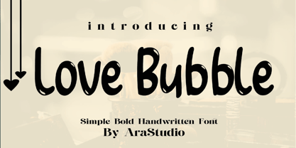 Love Bubble Font is a handwritten and modern font that combines a sweet touch and beautiful curves in every letter. using a touch of soft body curves so that it is pleasing to the eye Love Bubble Font is great for: Wedding invitations, Birthday invitations, fashion magazines, logos, signatures and is great for watermark photography.
 - Lucca by João Henrique Lopes,
$39.00 Inspired by Italian Renaissance fonts like Poliphilus, Blado, Centaur and Arrighi, Lucca presents a simple charm and a powerful classic feel. It is cute, friendly, clear and superbly readable. Its low contrast provides Lucca a firm yet flexible substance, making it sensual and enticing. There’s a certain degree of abstraction in the precise endings, and the whole design was made to survive even in the harshest conditions, conserving its readability and beauty.
 - WHISPERS CALLIGRAPHY_DEMO_essential_BOLD - Personal use only

- Centennial Script by Canada Type,
$24.95 Centennial Script was designed and cut by Hermann Ihlenburg in 1876 (the centennial of American independence, hence the typeface's name) for the MacKellar, Smiths & Jordan foundry in Philadelphia. Ihlenburg was then only 33 years old, and these beautiful forms put him on his way to become the most prolific and innovative deco, ornamental and script typeface designer and punch cutter of the nineteenth century. In trying to be a true homage to the history of the new world, Centennial Script transcends its then-contemporary deco fashion to embrace script elements historically similar to lettering found on maps or political documents of the 18th century. Letters like the p and s extend themselves high and mighty to accentuate words and lines of text in a fancy hand-drawn manner. The dots on the i and j are those of a careful scribe who acknowledges the importance of the document being lettered. The lowercase letters connect with two slight angular motions of the hand, also very carefully and elegantly. Even the ligatures and ending swashes Ihlenburg made for this face were reminiscent of a mapmaker's patient hand, though Ihlenburg's elegant touch in them cannot be mistaken. Although Centennial Script was one of the few Ihlenburg faces to make it to film type technology, the transition was neither credited nor faultless. The film type version was a bit sloppy in the way the connectors were made, so the lowercase needed a lot of manual work to typeset properly. To alleviate such waste of time for the user of this digital version, the connectors were redrawn according to the original metal ones made by Ihlenburg himself, and tested thoroughly in print to ensure the quality of the typeface's flowing cursive nature. This wasn't an easy task, and very time-consuming, since the changing angles on both ends of the connection made it impossible to escape from having to build every lowercase letter with both left and right connectors that would fit with the rest of the letters. This is one typeface that couldn't be revived in any other manner than the way it was originally made, regardless of more than 130 years of technological advances since the face was designed. Centennial Script comes in all popular font formats, and supports most Latin-based languages. Also included is an Alts fonts that contains alternates, ligatures, snap-on swash endings, some ornaments, as well as a complete set of the lowercase without left side connectors, for a more natural combination when following a majuscule, or just in case the user finds it fit to set the copy in a non-connecting script instead of the face's original connected flow. Centennial Script Pro, the OpenType version, combines the main font with the Alts font in a feature-packed single font. Use the ligature feature to set wordmarks like Mr, Ms, Mrs, Dr, and &Co, the stylistic alternates feature to replace some letters with their alternative forms, the contextual alternates feature for better uppercase-lowercase sequences, and the titling feature to set your text in a disconnected script. Centennial Script is the only script we currently know of that can be set connected or disconnected simultaneously, either using the titling feature in the OpenType Pro version, or manually in the other formats.
 - Frames And Borders by Outside the Line,
$19.0032 borders and frames, round ones, square ones, rectangles and an oval. Curly Qs, vines, flowers, dots and swirls in outline and reverse. Plz note that this is not a dingbat font and needs to be used in large sizes of 72 point or more. Don't miss Rae's other frame fonts. Frames & Borders Too and the new Frames and Banners. - Restrick by ZetDesign,
$15.00 Restrick is a strong display font. uses curved corners for flexible use on a variety of media displays. This font is very suitable for use as a headline in a newspaper, poster, or magazine. This font is available in regular and italic format.
 - Ace Crikey - Unknown license

- Danu by Phoenix Group,
$12.00 Danu font is a font with a traditional style with a minimalist approach, this font is inspired by Javanese script with curved letters and some dots in it.
 - Aunchanted Elite by Typotheticals,
$5.00 Originally released free as Aunchanted, but completely redrawn with gentler curves to give a softer feel to the face. Aunchanted Elite has been expanded and updated in 2022


