10,000 search results
(0.026 seconds)
- Bloomy by BrandCarry,
$19.00 Bloomy is a picture font consisting of 52 high quality flower shapes with clean outlines and a minimum of vector points. This unique set of natural forms may be well used in graphical design projects like brochures, advertisements, posters, etc.
 - Huntsman by Solotype,
$19.95Issued from the Haddon Foundry in England. Most of their original faces had names beginning with H, like their own name. Some of their types were designed by Phil May, but we cannot guarantee that this is one of them. - Kylemott by Typotheticals,
$10.00Kylemott was developed from an earlier font called Quadlateral. It was a look at the curve and line used in an angular fashion. - Cardo - Personal use only

- PharmaCare - Unknown license

- Hex Braille by Echopraxium,
$5.62 The purpose of this monospace font is to display braille in an original although rather steganographic way. Its glyphs are built from a flat hexagon which can be read as 3 rows of 2 vertices (i.e. regular braille glyph grid). The initial design is illustrated by glyphs 'ç' (no dot) and 'û' (6 dots) as shown by poster 5. Glyphs are connected to each other, thus 6 connections for each hexagon (2 on left/right and 4 on top/bottom). In the final design many diagonal segments of the hexagon were removed for esthetical reason. Text is displayed not as a honeycomb but as a lattice instead which mixes hexagons, squares and "irregular convex octagons" (mostly unclosed), the design favored squares over octagons. The whole slightly resembling a PCB. Text can be framed with 3 sets of Frame glyphs (as shown in Poster 4): Octagonal: { €, °, £, µ, §, ¥, ~, ¢ } which can be mixed with Rectangular High Rectangular Low: { è, é, ê, ï, î, à, â, ä } Rectangular High: { Â, ù, Ä, Ê, Ë, ô, õ, ë } which can be mixed with Octagonal NB: When using Frame glyphs, it is advised to show Pilcrow (¶) and Non Breaking Space, which are replaced by empty shapes (e.g. in Microsoft Word, use CTRL+8 or use [¶] button in the ribbon).
 - Mundo Sans by Monotype,
$50.99 Mundo Sans, by Carl Crossgrove for the Monotype Studio, is distinctive, approachable – and ready to tackle jobs both big and small. Its open counters and large x-height, which give the design a straight-forward no-nonsense mien, are softened by inviting calligraphic undertones. With 10 weights and a complementary suite of cursive italics, there is little outside the range of the Mundo Sans family. The light weights are elegant in packaging and brochure design, the medium are easy readers in digital blogs and print periodicals and the bold command attention in banners and headlines. Mundo Sans is at home in a wide range of sizes, and comfortable in everything from wayfinding to mobile apps. Mundo Sans takes on complicated branding projects with efficient grace. The family enables companies and products to express their brand seamlessly in websites, advertising, corporate messaging, packaging – virtually everywhere visible engagement is possible. A large international character set, that includes support for most Central European and many Eastern European languages, ensures ease of localization. Mundo Sans was originally released with seven weights. The family was updated with three new roman weights and their italics in 2019 that extend and diversify its range of use: a fine hairline weight, a book weight, slightly lighter than regular, and a demi that is subtly lighter than the medium. The design is also is a good mixer. It easily pairs with everything from refined Didones to stalwart slab serif designs. And if you need a more harmonious palette, look no further than Mundo Sans’ relative, Mundo Serif. The two designs harmonize with each other perfectly in weight, typographic color and proportion. Mundo Sans’ italics are true cursive designs, with fluid strokes and obvious calligraphic overtones. The flick of the down-stroke in the ‘a,’ the descending stroke of the ‘f’ and baseline curve of the ‘z’ add grace to the design and distinguish it from more mechanistic styles. Mundo Sans is a design with deep roots. It was originally drawn to pair with classic Renaissance book typefaces like Bembo® and ITC Galliard®. With a hint of diagonal stroke contrast and gentle flaring of strokes, Mundo Sans complements these designs with warmth and grace. Crossgrove says that Mundo isn’t meant to be showy or distinctive. It is intended to follow the tradition of sans serif designs that have a wide range of uses, enabling comfortable reading and clear expression. Crossgrove has designed a variety of typefaces ranging from the futuristic and organic Biome™ to the text designs of Monotype’s elegant Walbaum™ revival. His work for Monotype also often takes Crossgrove into the realm of custom fronts for branding and non-Latin scripts.
 - Sharp End by Asritype,
$18.00 Sharp End fonts support Latin Based Languages only (see Tech Specs). Sharp End's creation is inspired by Gothic sharpness shape but only applied to the ends of normal letters. Make the font look beautiful and elegant, look as semi-serif, as calligraphic touch or others. The base of the Capital Characters is set a little bit lower than the small cases/lowercases. On small/normal size typing, the difference is less visible (obscure), but will be more visible/more clear as the typing set larger. Thus, Sharp End fonts will work well for both text and display. The fonts has also character variants. The character variations (in PUA) set in 5 stylistic sets ss01 ... ss05 (see Sharp End opentype features poster). So, these character variations will be easier accessible in more common application such as MS Words, Text Edit or the others. The glyphs may also be accessed via Character Map, Character viewer, insert character, insert symbol or other similar tools. You can use Sharp End for most of typing and design means such as: greeting, invitation, wedding and other cards; books, magazines, news, banners, logos, Pamphlets, advertising etc., for printing or digital/web display. As addition, with 3 weight variants, the regular will fit for longer text for normal use, while the bold and semi-bold is more suited for the covers, impressions, titling, Logos, design or other usage. With its smoothness curve and sharp ends, Sharp End will pairs well to most fonts of various kinds: Sans Serif, Serif, Handwritten, Scripts and others. As the example in one poster, Sharp End is paired with Astonice and Apresia Script (ornamented script font, one of the richest letter variations and ornaments). Thank you for visiting. Again, thank you very much for downloading this awesome fonts.
 - Tompouce by Hanoded,
$15.00 A Tompouce (also know as Tompoes) is a typical Dutch pastry. It consists of a thick layer of pastry cream, sandwiched between two layers of puff pastry. It usually comes with pink icing, except on the king’s birthday, when the icing is orange. Tompouce is also a very nice connected script, with a lot of curly letters, some double letter ligatures and all the diacritics you can throw a pastry at. If it is an elegant, yet fun connected script you’re looking for, well… Tompouce may just be what you need!
 - Stencil Label JNL by Jeff Levine,
$29.00 In the 1943 Three Stooges comedy short “Higher than a Kite”, Curly reaches into a box with the label “hand grenades” painted on its side and pulls out one of the devices. The bold, squared stencil hand lettering on that prop inspired Stencil Label JNL, which is available in both regular and oblique versions.
 - Vermicello by ParaType,
$30.00 An original display typeface was designed for ParaType in 2007 by Isabella Chaeva. Informal handwriting shapes of letters are formed by several separate elements — traces of monoline writing tool like broad felt-tipped pen. The name of the font reveals the fact that curvy strokes resemble worms. For use in advertising and display typography.
 - VVDS Ginsburg by Vintage Voyage Design Supply,
$10.00 Ginsburg it's a modern display all-caps font-family based on geometric forms and abstract wavy lines with an old school constructivism look. Inspired by Moses Ginsburg architecture projects. Playful, modern, suitable for many typography projects as headers, logos, block texts, etc. You may be more strict in your typography or you may be more groovy or playful with alternates characters. Use this family in vintage spirit for TV series, Podcasts titles, exhibition posters or design a modern extreme sport brochure, . Flexible, Catchy and Brazen — it's all about Ginsburg! Six widths: Thin / Light / Normal / Medium / Semi Bold / Bold. Opentype Features as Stylistic alternates, Oldstyle figures / Fractions. Multilingual
 - Kesora Faux by Twinletter,
$15.00 KESORA is a Japanese-style font that we carefully crafted to give your composition the proper look. This font is really versatile, so you may use it for a wide range of projects. Your project will always appear special to your audience if it has the proper composition, beautiful appearance, and unique shape. Logotypes, food banners, branding, brochure, posters, movie titles, book titles, quotes, and more may all benefit from this font. Of course, using this font in your various design projects will make them excellent and outstanding; many viewers are drawn to the striking and unusual graphic display. Start utilizing this typeface in your projects to make them stand out.
 - Johnstemp by Linotype,
$29.99As a spinoff to his Tagesstempel™ design, Georg John created Johnstemp™ in 2008. The Johnstemp family has four weights, as well as a special Mix" variant. Each of the basic fonts (Light, Medium, Bold, and Heavy) contain many alternate glyphs, allowing users to set text that realistically simulates stamped impressions. For even faster design, Johnstemp Mix is the perfect choice; it contains letters with far more stylistic and weight variation out-of-the-box, and was developed to create even livelier impressions. Here as well, many alternates are included in the character set to prevent too much repetition of the same glyphs. " - Art Director JNL by Jeff Levine,
$29.00 Free-form hand lettering on a 1979 poster for the Washington, D.C. exhibition of watercolors and etchings by the Elie Abrahami inspired Art Director JNL, which is available in both regular and oblique versions. This type of lettering was most popular in the late 50s through the mid-60s for movie titles, greeting cards and poster text.
 - Brocken by RMU,
$35.00 Good ideas never will die. Based on the concepts of former Leipzig student Volker Küster in the mid-1960s, I redrew and digitized the basics and extended them into a complete multilingual caps-only poster font which I named “Brocken”. Its letter-forms strongly remind me of the mighty rocks covering the highest peak, Brocken, in Northern Germany.
 - P22 Akebono by IHOF,
$24.95 Akebono means dawn in Japanese. It expresses the pleasure of imbalance. Stems and strokes are mixed--straight and round with slender terminals and arches. Akebono is available in three styles; Regular, Alternate, Italic. Akebono Alternate resembles the Regular but features some of the hooked tails found on the Italic. P22 Akebono is licensed exclusively to P22/IHOF
 - CA Coronado by Cape Arcona Type Foundry,
$19.00 CA Coronado is a nice display font for use in titles, logos and headlines. With its used look it creates a friendly and human feeling. Upper- and lower-case characters differ in details and can be mixed to get a vivid look. For the best authentic look, the ‘Regular’ can be used as filling and complements the Shadow-style.
 - Mexican City by Typefactory,
$14.00 Mexican City is a slab serif font with western feel. With its neat and beautiful arrangement of letters, this typeface will look outstanding in both formal and non-formal designs. Perfect for headlines or logos, jacket, Porter finds its inspiration in the style of mid-19th century typefaces using generous slab serifs and a hard-working appearance.
 - Honey Love by Dhan Studio,
$15.00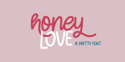 Honey Love is a pretty font that has a unique and attractive style, this font also has a lovely alternatives, which will make your designs even more perfect if you want to mix them in each of your designs. Perfect for logos and quotes or you can use it in any design you want to use.
 - Trionik by Josiah Tersieff,
$15.00 Trionik is a monospace experiment in modular, grid-based typography. It is a future-forward take on the computer system typefaces of the mid- to late-20th century—when computers began to rise in usability and integrate into all art forms. Working best as a display font, the Trionik family features 4 separate styles with varying widths.
 - Humorist JNL by Jeff Levine,
$29.00 The May 7, 1936 issue of “The Film Daily” carried an ad for the Will Rogers Memorial Hospital Fund. (In August of 1935 Rogers, along with famed aviator Wiley Post died in a plane crash.) While the fundraising for the hospital was a serious event, Rogers is remembered as a humorist, hence the font’s name of Humorist JNL.
 - Bublik by ParaType,
$25.00 Bublik (one weight) belongs to a mixed stylistic group. It combines features of sans serif and serif typefaces. Some letterforms were inspired by antique Slavic typefaces and scripts of XV-XVIII centuries, especially by skoropis' (handwriting). The type has a fresh and original look. Bublik was awarded for Excellence in Typographic Design in TDC2 2005 Type Contest.
 - Paper Sting Stencil by PizzaDude.dk,
$17.00 I made Paper Sting using an inky pen. There is a great variation in the stroke width, which gives a very lively handmade feeling. Paper Sting comes in two versions: Regular and Stencil - mix them for cool realistic results. Of course there is multi-lingual support as well as contextual alternates, which means 5 different versions of each letter.
 - Lupo by Typoforge Studio,
$19.00 Font Lupo is the younger brother of Kapra. However, unlike Kapra it is characterized by the sharpness of the finish. It is inspired by a You And Me Monthly published by National Magazines Publisher RSW „Prasa” that appeared from Mai 1960 till December 1973 in Poland. Font Lupo is designed in one version – lower and uppercase characters.
 - Flocking Stencil JNL by Jeff Levine,
$29.00 Vintage packaging for Frosty Stencil Flock contained the hand lettered term “spray flock” which served as the basis for Flocking Stencil JNL; available in both regular and oblique versions. Commonly referred to as “Spray Snow”, these kits of holiday stencils and spray cans were a popular item in the households of the 1950s and early-to-mid 1960s.
 - Cervo by Typoforge Studio,
$25.00 Font Cervo is the younger sister of Kapra. It is characterized by eight different varieties – lower and uppercase characters and in contrast to Kapra is “slimmed” version (from Medium to Thin). It is inspired by a You And Me Monthly published by National Magazines Publisher RSW „Prasa” that appeared from May 1960 till December 1973 in Poland.
 - Soft Lime by PizzaDude.dk,
$10.00 Soft Lime is my simple, yet powerful typeface. It definitely fits in the comic department, but is very useful for posters, postcards (do anybody use these anymore?!) greeting cards and anything that needs a legible handmade typeface. It comes in several versions, that can be mixed for great results - and of course they all have multilingual support!
 - Vindeco by Andrew Footit,
$24.00 Vindeco is a classic typeface, vintage with a mix of decorative. It looks stylish and elegant in any layout with it’s slick lines, use it for your magazines, brochures and editorial layouts. Vindeco is designed to make eye-catching headings and typographic designs, use it on invites and in magazines, Vindeco looks beautiful on its own or with imagery.
 - Prospect Heights JNL by Jeff Levine,
$29.00 While the inspiration for Prospect Heights JNL may have been a piece of vintage sheet music entitled "My Ohio Lullaby", the name is classically New York. To be precise, it's a neighborhood in the Borough of Brooklyn. Prospect Heights JNL is available in both the regular version (with an engraving line) and a solid (plain) version.
 - Put My Foot Down by Ingrimayne Type,
$14.95 If you grew up in the north, you may have stomped out letters in the fresh snow during the winter. Memories of such winter fun helped inspire this typeface. If one can do the typeface with shoes or boots, one can also do it with bare feet and hands. Non-human variants are possible, such as bird tracks.
 - Master by Jure Kožuh,
$29.00 Master of the World was included on the front page of a novel in several parts, The Count of Monte Christo (mid 20th century). Typeface characters show design guidelines of the pre-war era (2nd world war). The idea of development origins from a wish to evolve traditional forms of typefaces which were used in Slovenia.
 - Daphne Script by Ludwig Type,
$89.00 This gentle script, designed by writing master Georg Salden, is full of grace and vitality. The richness of ideas appear particularly in the curved capital characters. Lower case letters have curved elements primarily at the ascender and descender parts. Daphne Script contains numerous alternate characters and other OpenType features.
 - Bestiful by GlyphStyle,
$16.00 Beautiful is a font with a modern calligraphy style and free form, has a curly end, not found in other fonts. Charming and beautiful font - Font feature Uppercase, Lowercase, Numerals & Punctuations, Stylistic alternate(ending), Ss01(beginning), Ligature, Swashes, Multilanguage
 - Meigtan by Dicubit,
$10.00 Meigtan is a curly typeface/font designed with carefully handcrafted. This perfectly made to be applied in logo or branding, stationery, books, packaging, fashion, magazines, t-shirt, greeting or wedding cards, vintage design, novels, labels and many advertising purposes.
 - Kiks by David Engelby Foundry,
$25.00 Kiks is the Danish name for biscuit. Just like a biscuit this font throws its crums in every direction with curvy, bold letters. A display font made for headlines and everything else that needs to be visually loud. Enjoy!
 - Steak by Sudtipos,
$59.00 Here I am, once again digging up 60-year sign lettering and trying to reconcile it with the typography of my own time. The truth is I've had this particular Alf Becker alphabet in my sights for a few years now. But in the typical way chaos shuffles the days, Buffet Script and Whomp won the battle for my attentions way back when, then Storefront beat the odds by a nose a couple of years ago. Nevertheless, revisiting Alf Becker’s work is always a breath of fresh air for me, not to mention the ego boost I get from confirming that I can still hack my way through the challenges, which is something I think people ask themselves about more often as they get older. You can never tell what may influence your work, or in this case remind you to dig it out of dust drawers and finally mould it into one of your own experiences. On my recent visits to the States and Canada, I noticed that quite a few high-end steak houses try their best to recreate an urban American 1930s atmosphere. This is quite evident in their menus, wall art, lighting, music, and so on. The ambience says your money is well spent here, because your food was originally choice-cut by a butcher who wears a suit, cooked by a chef who may be your neighbour 20 minutes from downtown, and delivered by a waitress who can do the Charleston when the lights dim and who just wouldn't mind laughing with you over drinks at the bar later. So Steak is just that, a face for menus and wall art in those places that see themselves in the kind of jazzy, noirish world where one-liners rule and exclamation points are part of a foreign language. As is usual with my lettering-inspired faces, there is very little left of the original Alf Becker alphabet. Of course, the challenges present in bringing typographic functionality to what is essentially pure hand lettering gives the spirit of the original art a hell of a rollercoaster ride. But I think that spirit survived the adventure, and may in fact be even somewhat magnified here. This font is over 850 glyphs. It’s loaded with ligatures, swashes, ending forms, alternates, ascender and descender variations, and extended Latin language support. Steak comes in 3 versions. According to your taste you can choose Barbecue, Braised or Smoked. It’s up to you!
 - CF Cozyscript by CozyFonts,
$25.00 CF Cozyscript is an even weighted connecting script. Created in the spirit of the Old Grade School cursive chart seen above the blackboard in the front of the classroom. Giving students a constant visual reference of the smooth flow of Caps and Lower case script. Neither formal nor casual but a combination of both styles. Cozyscript is currently available in 3 styles: Light, Medium & Rounded. The Light & Medium styles are best suited for Invitations, Notes, Advertising, Personal Letters, and Sensitive Subjects such as Movie Titles, Biographies, Wedding paraphernalia, etc. The Light & Medium Glyphs finish in squared-off ends, whereas the Rounded version is slightly bolder than the Medium version with rounded ends resembling a tubular look. The Rounded version lends itself to effective use in Sports, Music, and Advertising, Graphics, Signage, Branding, Neon effects, Logos, Titles, and Packaging. With over 300 glyphs applicable in over 100 languages, Cozyscript is available for use! Cozyscript is CozyFonts Foundry's 17th Font Family released and 2nd script font by Tom (Cozy) Nikosey, California Designer.
 - Maritha by Doehantz Studio,
$21.00 Maritha is a gorgeous, cursive and thick lettered handwritten font, crafted to give your headlines and logotype projects a stylish touch. This font reads as strong, confident, and dynamic and can add tons of nostalgic character to your designs. Maritha is PUA encoded which means you can access all of the glyphs and swashes with ease!
 - Rozza by Serebryakov,
$49.00 Rozza is a single weight stencil cursive fat face font for extremal display use. Looking at this font the story of beauty and the beast comes to mind. That is how I would describe it. On the one hand prickly and dangerous, and on the other - pulsating beauty and passion. Try to combine Rozza together with Displace — great pair!

