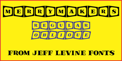
A throwback design reminiscent of 1950s signage and print ads, Merrymakers JNL takes a previous release (Bluesman JNL) and places the letters and numbers inside parallelograms with ‘TV screen’ openings. Merrymakers JNL is available in both regular and oblique versions. The upper case A-Z characters have the taller side of the shape to the left, while the lower case a-z has the taller side to the right. To make a ‘fan fold’ or zig-zag message, simply alternate upper and lower cases as in this example: C-a-R D-e-A-l-E-r-S You can type spaces between words, but if you prefer blank connectors, use the following: Upper case solid black connector – left bracket key Lower case solid black connector – right bracket key Upper case ‘TV screen’ connector – left brace key Lower case ‘TV screen’ connector – right brace key There is a very limited set of punctuation available. The upper case ampersand, question mark, exclamation point, period, comma, single quote and double quote are all on their respective key positions, but to accommodate the lower case [smaller side] versions, those glyphs have been reassigned to other standard keyboard positions: Type @ to get & Type # to get ? Type $ to get ! Type ^ to get . Type * to get , Type - to get ’ Type = to get ” Additionally, to access the lower case [smaller side] versions of the numerals, type the following keys: Type % to get 0 Type ( to get 1 Type ) to get 2 Type + to get 3 Type / to get 4 Type : to get 5 Type ; to get 6 Type < to get 7 Type > to get 8 Type \ to get 9
Alphabet_02, while a hypothetical creation for the purposes of this discussion, can be visualized as a font that exudes a blend of modern sophistication and artistic creativity. Picture Alphabet_02 a...
Ah, Savia Outline, the font that decided it was too cool for school and then became the school everyone wanted to attend. Crafted with the delicate touch of a love-stricken poet and the precision of ...
Ah, the LondonBetween by Francois Bruel – now that’s a font with more personality than my Aunt Edna at a yard sale! First off, let's establish the vibe of this font. Imagine if a cup of Earl Grey tea...
Aron Grotesque is a distinctive typeface designed and released by Monofonts, showcasing a modern and versatile sans-serif design. This font family distinguishes itself through a blend of contemporary...
Jambetica is a distinctive font that captures the creative spirit of its creator, embodied by the playful yet purposeful name "Jambo!" Reflecting a blend of modernity and personality, Jambetica isn't...
Cetus is a font that embodies the fluidity and vastness of the ocean. Inspired by its namesake, the whale constellation in the night sky, Cetus is both majestic and mysterious, offering a deep dive i...
The KG What the Teacher Wants font, crafted by Kimberly Geswein, is a testament to the personal and approachable style that has become synonymous with educational and instructional environments. At i...
The font named "Set Fire to the Rain" by Kimberly Geswein is an embodiment of expressive creativity and a palpable emotional resonance. Designed by Kimberly Geswein, a designer known for her diverse ...
The Brewsky font, designed by the talented Tup Wanders, is a unique and charismatic typeface that embodies a perfect blend of playfulness and artistic flair. This font manages to capture the essence ...
"Talvez Assim," a font created by PintassilgoPrints, is a unique and intriguing typeface that stands out for its distinctive characteristics and playful charm. This font is a true testament to the cr...
The Siamese Katsong font, designed by Vic Fieger, is a distinctive typeface that stands out due to its playful and whimsical characteristics. This font captures the essence of creativity and eccentri...
"Umberto" is a distinctive font crafted by the acclaimed font foundry, Blambot Fonts, which is renowned for its specialization in typefaces tailored specifically for comic books and graphic novels. B...
"Quick End Jerk" is a distinctive font designed by the talented Vic Fieger, a name well-recognized in the font design industry for creating a variety of unique and eye-catching typefaces. This partic...
As of my last update in early 2023, Andreas Sans Cnd may not be widely recognized in the mainstream of typographic designs, yet the essence of its name provides insight into its style and characteris...
Jadefedga[08], created by the talented designer junkohanhero, is a font that immediately captures the attention with its distinctive blend of creativity, uniqueness, and versatility. Its design is no...
Philippe Blondel's creation, the Georges font, is a captivating and versatile typeface that beautifully combines the essence of classic elegance with a touch of modern simplicity. At first glance, Ge...
Elektrogothik is a typeface that encapsulates the spirit of two seemingly disparate worlds: the dark allure of gothic culture and the energized pulse of electronic music. This font is designed to bri...
The Embossing Tape 2 (BRK) font, created by AEnigma, stands as a quirky and distinctive typeface that captures the essence and nostalgic feel of labeling used in handheld embossing label makers. This...
U.S.A. Condensed is a distinctive typeface designed and released by Iconian Fonts, a notable foundry known for its extensive collection of unique and thematic fonts. Iconian Fonts, operated by Dan Za...

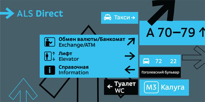
ALS Direct is an open and dynamic typeface with clear-cut letterforms that make it instantly readable. It lends text a neutral, yet agreeable and modern feel. Direct has nine font styles convenient for the purposes of navigation signage. Regular-style letterforms are rather wide, because direction signs are likely to appear before readers at an angle, so the type needs to withstand perspective distortions. And as signs and boards may vary in size, Direct was developed to include several width variations. Condensed fonts can be used where horizontal space is limited, allowing you to keep proper height and readability of the characters. A signage typeface must be easily readable from some distance away and have simple letterfoms with clear-cut features to quickly identify characters. Designing a type for a potentially wide range of purposes calls for a universal approach. If not destined to be used for navigation in a particular building, it shouldn’t incorporate any peculiar elements to agree with certain design or architecture. All of the above determined our choice of a sans serif with large apertures and definite features allowing readers to instantly recognize letters. Descenders are made compact not to interfere with the line below. And the low contrast between thick and thin strokes renders all elements equally perceptible. The x-height is significant, close to the cap height, which inhances readability of the lowercase type. There are two reasons why directions must not be set in all caps. Firstly, lowercase letters are more diverse and include ascenders and descenders identifying some of the letters in the line. And secondly, having learned to read, people recognize word shapes rather than individual letters, which makes lowercase text more readable. With Direct being a signage typeface, first to be developed were its width variations, and different weight styles and italics were added later. Another thing to be kept in mind was that signs often use dark background colors, and black type on a white background appears smaller than white type on a black background. Direct is the first Cyrillic typeface created for navigation purposes. Before that, designers could use the Cyrillic version of Frutiger (Freeset) developed by Adrian Frutiger for the Paris Charles de Gaulle International Airport, and a number of other, mostly body copy, neutral sans serif types. However, signs and boards were dominated by Arial, which Direct would be glad to replace offering elegance and lucidity of form instead of type bluntess. Direct was designed as a signage typeface, but its neutral style and clear-cut letterforms suggest various other ways of application.
Opal, while not one of the most ubiquitous names in graphic design or typography, carries with it an air of elegance, versatility, and clarity. It's a typeface that seems to bridge the gap between th...
Alright, picture this: Smiley Font isn't just a font; it's like a burst of happiness captured in typographic form. Imagine every letter you type infusing a little sprinkle of joy into your text, embo...
Cue the sultry saxophone soundtrack and dim the lights, because the world of typography just flirted with the extraordinary—please welcome to the stage, SexyRexy. If fonts were people, SexyRexy would...
As of my last update in early 2023, the font "Amable" designed by Alberto Rodriguez stands as a delightful testament to the fusion of creativity and typography. This distinctive typeface embodies a f...
The font "WereWolf" by GautFonts is a unique and expressive typeface that truly stands out due to its thematic design and playful character. This font has been meticulously crafted to evoke the myste...
Snobjury, crafted by the creative minds at KLoNk, is a unique font that strikes an intriguing balance between playful whimsy and structured elegance. Its design philosophy seems to espouse a kind of ...
Defatted Milk, designed by Nils von Blanc, is a font that immediately stands out due to its unique characteristics and the intriguing story behind its creation. Nils von Blanc, known for his innovati...
As of my last update in April 2023, "Republic" by DesignStation stands as a contemporary example of a font that beautifully marries versatility with distinctive style, crafted to cater to a wide arra...
The Sony logo, recognized globally, is a masterclass in branding through simplicity and elegance. Its typographic representation is iconic, embodying the essence of the brand's identity—innovation, r...
The Smargana typeface is a distinctive font characterized by its unique blend of tradition and modernity. With its origin steeped in a rich typographic tradition, Smargana offers a contemporary twist...
The GirlieLeslie font by Fontalicious is a playful and whimsical typeface that seems to exude a sense of fun and creativity. Designed with a certain light-heartedness in mind, it's the kind of font t...
The original metal Neue Haas Grotesk™ would, in the late 1950s become Helvetica®. But, over the years, Helvetica would move away from its roots. Some of the features that made Neue Haas Grotesk so good were expunged or altered owing to comprimises dictated by technological changes. Christian Schwartz says Neue Haas Grotesk was originally produced for typesetting by hand in a range of sizes from 5 to 72 points, but digital Helvetica has always been one-size-fits-all, which leads to unfortunate compromises."""" Schwartz's digital revival sets the record straight, so to speak. What was lost in Neue Haas Grotesk's transition to the digital Helvetica of today, has been resurrected in this faithful digital revival. The Regular and Bold weights of Helvetica were redesigned for the Linotype machine; those alterations remained when Helvetica was adapted for phototypesetting. During the 1980s, the family was redrawn and released as Neue Helvetica. Schwartz's revival of the original Helvetica, his new Neue Haas Grotesk, comes complete with a number of Max Miedinger's alternates, including a flat-legged R. Eight display weights, from Thin to Black, plus a further three weights drawn specifically for text make this much more than a revival - it's a versatile, well-drawn grot with all the right ingredients. The Thin weight (originally requested by Bloomberg Businessweek) is very fine, very thin indeed, and reveals the true skeleton of these iconic letterforms. Available as a family of OpenType fonts with a very large Pro character set, Neue Haas Grotesk supports most Central European and many Eastern European languages.

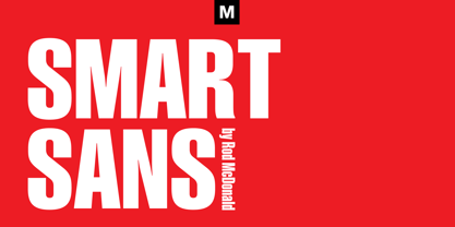
Smart Sans is a personal tribute to Leslie (Sam) Smart, the first type director to be hired by a major typesetting house in Canada. Smart was a twentieth century design pioneer who raised the standards of Canadian typography. Together with three of his peers, he established the first Type Directors Club in Toronto. After Smart's death in 1998, type designer Rod McDonald decided that something should be done to commemorate Smart's life and achievements. I had first thought of establishing a scholarship in Sam's name, but a typeface design soon replaced this idea," says McDonald. "Once I decided to design a typeface, however, it became a foregone conclusion that it would be a sans serif - for no other reason than that I loved the name Smart Sans." Two typefaces served as inspiration for McDonald's work. "Like thousands of designers, I'm keen on Matthew Carter's Helvetica Compressed series. And, when I was younger, I also loved Fred Lambert's Compacta," says McDonald. "I thought there might be a place for a small range that could take over from these 'old workhorses' and, in the process, bring a fresher look to the genre." McDonald drew three weights for the Smart Sans family, all ideally suited for setting attention-getting headlines and powerful display copy. The two-storied 'g' contributes to the design's lively personality, and the short 'r' helps maintain tight, even spacing. Smart Sans is the perfect homage to a great typographer, because it raises the bar on what to expect from condensed sans serif typefaces. Sam Smart would be pleased."
Alfie by Monotype, $29.99 
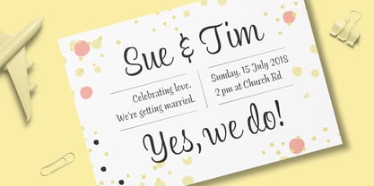
Alfie™ is lively, friendly, inviting and easy on the eyes. What more could you want in a script? How about four flavors of the same design? Alfie Script is a delightful connecting script with a touch of comfortable elegance. Use it for everything from social announcements to headlines and packaging. Alfie Casual is a little more laid-back with letters standing on their own. It works great in short blocks of text copy, subheads and navigational links. Alfie Informal has spirited serifs and its own demeanor, while Alfie Small Caps does a fine job of supporting its other siblings. There’s an immediacy to words and messages set in these lighthearted confections. Jim Ford was practicing drawing with a new brush pen when the inspiration for Alfie came to him. He had filled several pages in a notebook with letters and, at one point, realized that there might be a typeface among them. As it turned out, there were four. The process, however, wasn’t choosing one design and modifying it. The makings of all the designs were on the pages. It was just a matter of culling out the right collection of characters to build the foundations for the four flavors of Alfie. Because they share the same family roots, each design in the Alfie family can be paired and intermixed. Ford admits that there’s a hint of Emil Klumpp’s 1950s Murray Hill typeface (https://www.myfonts.com/fonts/bitstream/murray-hill/) in the Alfie family. Just enough to give the design a 50s vibe. (Some fashions never go out of style.)


