7,359 search results
(0.02 seconds)
- Makeba Retro Funky Groovy by Beast Designer,
$15.99 Makeba Retro Funky Groovy Font is a fun and funky display font that brings back the spirit of the 70s. Its bold, rounded letters feature groovy curves and playful embellishments that exude a retro vibe. This font is perfect for creating eye-catching titles and headlines for posters, album covers, and other retro-inspired designs. The font’s energetic and upbeat personality is sure to make any project stand out.
 - Albion's Marker No.1 by Greater Albion Typefounders,
$16.50 Albion’s Marker No.1, as the name suggests is the first in a series of ‘Marker Pen’ typefaces- merging good type design practice with deliberately casual and hand-drawn letter forms. Inspired by the great classic typefaces such as Bembo and Caslon, the design of Marker No.1 offers a unique blend of legibility and relaxed randomness.
 - Soul Material Design Dingbatz by Otto Maurer,
$9.00
- FF Tag Team Marker by FontFont,
$68.99German type designer Thomas Marecki created this display and script FontFont in 1994. The family contains 2 weights: Skinny and Fat and is ideally suited for music and nightlife. FF Tag Team Marker provides advanced typographical support with features such as swashes, ligatures, alternate characters, and case-sensitive forms. It comes with proportional oldstyle figures. - Tecna Dark Down Triangle BNF by Descarflex,
$30.00 The Tecn@ Dark&Light Triangle Background Nomenclature Font family is differentiated by the direction of the triangle tip in the 4 cardinal points. The family were designed to head, enumerate, indicate or highlight writings or design plans, for this reason, the characters are available only in capital letters and some signs or symbols that can serve such purposes. A triangle or empty character is included so that the user can use it overlaying any character of his choice or to be used alone.
 - Iwata UD Maru Gothic Pro by IWATA,
$199.00 ???????????UD????????????????? ??????????????????????????????????????????
 - Tecna Dark Right Triangle BNF by Descarflex,
$30.00 The Tecn@ Dark&Light Triangle Background Nomenclature Font family is differentiated by the direction of the triangle tip in the 4 cardinal points. The family were designed to head, enumerate, indicate or highlight writings or design plans, for this reason, the characters are available only in capital letters and some signs or symbols that can serve such purposes. A triangle or empty character is included so that the user can use it overlaying any character of his choice or to be used alone.
 - Tecna Dark Left Triangle BNF by Descarflex,
$30.00 The Tecn@ Dark&Light Triangle Background Nomenclature Font family is differentiated by the direction of the triangle tip in the 4 cardinal points. The family were designed to head, enumerate, indicate or highlight writings or design plans, for this reason, the characters are available only in capital letters and some signs or symbols that can serve such purposes. A triangle or empty character is included so that the user can use it overlaying any character of his choice or to be used alone.
 - Tecna Dark Up Triangle BNF by Descarflex,
$30.00 The Tecn@ Dark&Light Triangle Background Nomenclature Font family is differentiated by the direction of the triangle tip in the 4 cardinal points. The family were designed to head, enumerate, indicate or highlight writings or design plans, for this reason, the characters are available only in capital letters and some signs or symbols that can serve such purposes. A triangle or empty character is included so that the user can use it overlaying any character of his choice or to be used alone. What is Lorem Ipsum? Lorem Ipsum is simply dummy text of the printing and typesetting industry. Lorem Ipsum has been the industry's standard dummy text ever since the 1500s, when an unknown printer took a galley of type and scrambled it to make a type specimen book. It has survived not only five centuries, but also the leap into electronic typesetting, remaining essentially unchanged. It was popularised in the 1960s with the release of Letraset sheets containing Lorem Ipsum passages, and more recently with desktop publishing software like Aldus PageMaker including versions of Lorem Ipsum. Why do we use it? It is a long established fact that a reader will be distracted by the readable content of a page when looking at its layout. The point of using Lorem Ipsum is that it has a more-or-less normal distribution of letters, as opposed to using 'Content here, content here', making it look like readable English. Many desktop publishing packages and web page editors now use Lorem Ipsum as their default model text, and a search for 'lorem ipsum' will uncover many web sites still in their infancy. Various versions have evolved over the years, sometimes by accident, sometimes on purpose (injected humour and the like). Where does it come from? Contrary to popular belief, Lorem Ipsum is not simply random text. It has roots in a piece of classical Latin literature from 45 BC, making it over 2000 years old. Richard McClintock, a Latin professor at Hampden-Sydney College in Virginia, looked up one of the more obscure Latin words, consectetur, from a Lorem Ipsum passage, and going through the cites of the word in classical literature, discovered the undoubtable source. Lorem Ipsum comes from sections 1.10.32 and 1.10.33 of "de Finibus Bonorum et Malorum" (The Extremes of Good and Evil) by Cicero, written in 45 BC. This book is a treatise on the theory of ethics, very popular during the Renaissance. The first line of Lorem Ipsum, "Lorem ipsum dolor sit amet..", comes from a line in section 1.10.32. The standard chunk of Lorem Ipsum used since the 1500s is reproduced below for those interested. Sections 1.10.32 and 1.10.33 from "de Finibus Bonorum et Malorum" by Cicero are also reproduced in their exact original form, accompanied by English versions from the 1914 translation by H. Rackham. Where can I get some? There are many variations of passages of Lorem Ipsum available, but the majority have suffered alteration in some form, by injected humour, or randomised words which don't look even slightly believable. If you are going to use a passage of Lorem Ipsum, you need to be sure there isn't anything embarrassing hidden in the middle of text. All the Lorem Ipsum generators on the Internet tend to repeat predefined chunks as necessary, making this the first true generator on the Internet. It uses a dictionary of over 200 Latin words, combined with a handful of model sentence structures, to generate Lorem Ipsum which looks reasonable. The generated Lorem Ipsum is therefore always free from repetition, injected humour, or non-characteristic words etc.
 - Tecna Dark Square BNF V1.2 by Descarflex,
$30.00 The Tecn@ Square family were designed to head, enumerate, point out or highlight a point in a writing or plan. In this sense and for this reason, the characters are available only in capital letters and some signs or symbols that could serve such purposes. Among other applications, these characters are used in the personalization of plans, highlighting or indicating parts of the design that facilitate the Descriptive Memory of the plan or the development of a Manual or Installation Instructions.
 - Maiers Nr 42 Pro by Ingo,
$42.00 A handwritten decorative font with brush characteristics This attractive decorative script is found in a pamphlet of script samples from around 1900 which was issued by Otto Maier publishing house in Ravensburg/Germany. The forms and flow of Maier’s Nr. 42 are obviously influenced by Art Nouveau. In the original sample, only the Latin alphabet appears. All other characters, especially the Greek and Cyrillic letters, were modeled on elements of the original. A typeface can first reveal a true "handmade" character when the letter forms do not continually repeat themselves – a completely normal occurrence with handwriting. Thanks to OpenType, some key letters of Maier’s Nr. 42 appear in various alternative forms depending on the combination of letters. For example, the difference is obvious between an e followed by i and an e followed by l. Using this principle, a number of letter combinations are presented with alternative character forms so that overall a very lively impression is created.
 - Maiers Nr. 8 Pro by Ingo,
$27.00 A handwritten ”font for technicians“ from ca. 1900. Very geometrical, rigid forms borrowed from the typical characteristics of Jugendstil / Art Nouveau. This script is found in an old magazine which was issued sometime in the years shortly before WWI. The original copy, produced by means of a galvanized plate, is just 7 centimeters wide. It served as the model for technical professions in which, at that time, the captions of drawings were still done by hand. ingoFonts has not only digitized this beautiful typeface, we have also extended it to a whole family. In »Maier’s Alte Nr. 8« special attention was given to ensure the ”uneven“ edges, typical of handwritten script, remained effectively noticeable even in the digitized form. As a result, this ”technical“ font retains a handmade touch, while »Maier’s Neue Nr. 8« is the clean version with exact contours. The Art Nouveau forms, which are characteristic for the period of origin around the turn of the century around 1900, look especially pretty. The high degree of abstraction also seems strange in Maier's No. 8, especially when the age of the original is known. It is generally assumed that it was not until the Bauhaus in the late 1920s that such "modern" typefaces were created. Maier's No. 8 is a generation older! So many of today's supposedly "ultramodern" typefaces look quite old in comparison. In addition to the original two weights, Light and Bold, the Maiers Neue Nr. 8 got a regular and a extra-bold weight. Furthermore, the Neue is also available in italics. Although this is only a slanted version, unlike common practice, it is inclined to the left. Maier’s Nr. 8 Pro is suitable for all European languages. It includes ”Latin Extended-A,“ for Central and Eastern Europe incl. Turkish, and even Cyrillic and Greek, too. The font includes several stylistic alternates as well as a number of ligatures.
 - Maiers Nr 21 Pro by Ingo,
$42.00 A handwritten ”font for technicians“ from ca. 1900. Very geometrical, rigid forms borrowed from the typical characteristics of Jugendstil / Art Nouveau. This script is found in a magazine from the Otto Maier publishing house, Ravensburg, which was issued sometime in the years shortly before WWI. The magazine is entitled ”Schriften-Sammlung für Techniker: Verkleinerte Schriften der wichtigsten Alphabete“ (Collection of scripts for technical specialists: reduced scripts of the most significant alphabets) and published by Karl O. Maier. The original copy, produced by means of a galvanized plate, is just 7 centimeters wide. It served as the model for technical professions in which, at that time, the captions of drawings were still done by hand. The characters have been scanned, digitized and greatly magnified. Special attention was given to ensure the ”uneven“ edges, typical of handwritten script, remained effectively noticeable even in the digitized form. As a result, this ”technical“ font retains a handmade touch. Especially worthy of note are the Jugendstil forms characteristic at the turn of the19th century. In comparison, many alleged ”ultramodern“ font types of today suddenly look quite old-fashioned. Maier’s Nr. 21 Pro is suitable for all European languages. It includes ”Latin Extended-A,“ for Central and Eastern Europe incl. Turkish, and even Cyrillic and Greek, too. The font includes several stylistic alternates as well as a number of ligatures.
 - Make No Sense by Atom,
$14.00 Make No Sense is a natural, bold and powerful handwritten font. This will turn any design idea into a standout! Make No Sense make unreasonable designs outstanding!
 - Make Things Right by PizzaDude.dk,
$20.00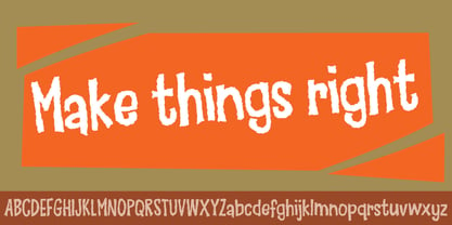
- Punch Label - Unknown license

- Embossing Tape 2 (BRK) - Unknown license

- KG Makes You Stronger - Personal use only

- Make Fun Of Me by PizzaDude.dk,
$20.00 This 3D lettering font was done with my inky ballpoint pen. Comes with ligatures for double lettering and alternate letters in upper- and lowercase.
 - KG Makes You Stronger by Kimberly Geswein,
$5.00 Crayon-style script handwriting. Can also work as a colored pencil or chalk handwriting. Perfect for teachers!
 - Might Makes Right Pro BB by Blambot,
$9.00 Might Makes Right Pro BB is an all-purpose comic book dialogue font inspired by Bronze Age comics. It’s designed to compliment a wide variety of art styles. The opentype version has autoligatures to swap out adjacent, identical letter pairs for a more organic look, and a wide variety of European characters are included. This Blambot classic comic book dialogue family has been updated with even more European characters, improved spacing and kerning, contextual alternate correction of errant serif-I, and a fourth weight, plain Bold.
 - Blasphemy - Unknown license

- JASON PERSONAL USE - Personal use only

- Diablo - Unknown license

- Old Typewriter - Unknown license

- You Can Make Your Own Font - 100% free

- Driveway Stencil JNL by Jeff Levine,
$29.00We've all seen the informational markings on commercial driveways or roadways instructing us which way to turn, where to park, etc. They are usually in stencil lettering 16 inches or taller, with compressed letters that make the horizontal strokes look slightly thicker than the vertical ones. By condensing the lettering in Narrow Stencil JNL by 20 percent, the result is Driveway Stencil JNL - a digital emulation of those painted road markings. - Sepulcra - Personal use only

- Mephisto™ - Unknown license

- Makenn01 by giftype,
$20.00 Font Makenn01 is inspired by Asen Petrov’s Perfograma font , based on in the IBM Harvard Mark 1 machines the first electromagnetic computer presented by Howard Aiken this november 84 years ago ,in fact this basic technology received its instructions and data trough punched tapes . It is therefore an interpretation in wich circumferences have been used instead of circles linked with a line , and the name used also refers to Mark 1 calling it Makenn 01 , giving a touch of identity since this name resembles , Carmen my name , the 01, is like a restart of 0 , with the 1 of the Mark 1. It has Greek and Cyrillic characters.
 - Stroom Script by wearecolt,
$12.00 Your new favourite handwritten script font. A great display font with a natural flow. All hand-drawn glyphs with custom linked letters for a unique marker pen look. Perfect for magazine titling, logo marks, signatures. Features: • Regular and bold weights • Alternative glyphs • Ligature sets
 - HAPPY DONUTS - Personal use only

- Black Metal G - Unknown license

- Exquisite Corpse - 100% free

- Ettore by Comics Font Store,
$9.00 ETTORE is a font for onomatopoeia. Friendly-looking, it is inspired by the lettering of the classic French comics with an adventurous and humorous font-style. It is chunky, marked, with low contrast. The kerning is perfectly balanced. It is made with a chisel-tipped marker determining its thick, square, flat stroke.
 - Bayfront by Parker Creative,
$18.00 Introducing Bayfront, a thick handwritten marker font with a sandy variation! Designed to emulate the casual look of marker writing, Bayfront also takes to the beach with a special 'sandy' version which features large distressed markings and imperfections. This distressed style creates a very natural weathered look which is great for bringing an interesting texture to your signage, social media graphics, marketing collateral, websites and more. Bayfront just might be the perfect summertime font for your next project!
 - Tushy Perfume by Forberas Club,
$16.00 It's Tushy not stussy, even it's Pretty but ain't lazy. yoo what's up, this font is dedicated for you to be your crafting material. Super ready for any craft project as branding image, any tags, card maker, invitation card, greeting card, wedding decoration for your farmhouse wedding or rustic look, or decorative material.
 - MB TyranT - Personal use only

- Lupus Blight - Personal use only

- Mordred - Unknown license


