10,000 search results
(0.096 seconds)
- Sweet Mango Italic by Letterafandi Studio,
$18.00 Sweet Mango is a modern sans serif font. This font is perfect for logos, greeting cards, package design, brand identity, craft designs, any DIY projects, book titles, wedding invitations, packaging, and more. Include 4 style font : Sweet Mango Regular Sweet Mango Italic Sweet Mango Bold Sweet Mango Italic Bold
 - AZ Plug Italic by Artist of Design,
$20.00AZ Plug Italic font is inspired from a combination of original early 1900’s Edward Penfield and Franz Hazenplug poster art. This font is designed for use as a worn and antiqued headlines or subheadlines. - Grotesque Bold Italic by Wooden Type Fonts,
$15.00 Based on a revival of one of the popular type fonts of the 19th century, suitable for display, or text.
 - Albion Sharp Italic by Greater Albion Typefounders,
$16.00 Albion Sharp Italic is an elegant sharply cut italic display face. Its classical elegance is ideal for setting headings alongside conventional body text faces, and an ideal way to imbue such settings with a little life and energy.
 - Pesto Fresco Italic by Resistenza,
$29.00 Pesto Fresco Italic is a new version of Pesto Fresco handwritten lettering system, a font family built of 27 styles. Overlapping Pesto Fresco Italic Regular with any of the other decorative styles you will get different graphic effects, so just choose the one that fits best with your layout. This font can be used for different purposes from packaging design to web design.
 - KG Primary Italics by Kimberly Geswein,
$5.00 Primary-style italicized handwriting.
 - LTC Law Italic by Lanston Type Co.,
$24.95 Law Italic was designed as an imitation of a formal style of penmanship used in legal documents. It has a more pronounced angle than standard italics. It is intended to be used by itself but can be combined with other faces to suit a designer's inclination. Historically, this face was once used by Bruce Rogers strictly for headings.
 - Sketch Caslon Italic by Wordshape,
$15.00 SketchCaslon Italic is a hand-rendered display typeface with its formal base in the structure of the types of William Caslon.
 - Slanted ITALIC Shift by TypoGraphicDesign,
$19.00 CONCEPT/CHARACTERISTICS The constructed, clear and modern character of the typeface based on the basic form of the triangle. The motto is geometrically and italic. APPLICATION AREA The modern, futuristic and constructed font „slanted ITALIC shift“ would look good at display size for poster, flyer, comics and graphic novel lettering and logos. Headlines in magazines or websites, packaging, music covers or webbanner etc. TECHNICAL SPECIFICATIONS Headline Font | Display Font | Geometric Font „slanted ITALIC shift“ OpenType Font with & 308 glyphs & 6 styles (thin, light, regular, medium, bold, black). Alternative letters, symbols and ligatures (with accents & €) FONT IN USE www.typographicdesign.de/font-in-use-slanted-italic-shift/
 - TXT Antique Italic by Illustration Ink,
$3.00Bring your scrapbook page to life with unique journaling and titles made possible with this cool italic font. It'll add instant flavor to posters, signs, bulletin boards, and word art that call for an old-fashioned, antiqued flair. - Sispectly Harmonies Italic by suhadidesign,
$15.00 Sispectly Harmonies classic and nostalgic serif Hi ladies and gentlemen! In accordance with market demand for classic retro design fonts, I created a serif font that suits your views. The Sispectly Harmonies font is a classic nostalgic serif font. is here to become a market favorite. We made this font look elegant, classy, easy to read, stylish, attractive and easy to use. Sispectly Harmonies Font is a great choice for retro designs, logos, magazines, classic, classy designs, newspapers, modern, books, brand names, branding, and other projects. The Sispectly Harmonies font is here to enhance the quality of your designs. Follow us for the next classy font creation :) Feature: • Uppercase • Lowercase • Regular version • Italicized version • Multilingual Support • Numbers and punctuation
 - Gans Radio Lumina by Intellecta Design,
$1.00See also other font families inspired by Gans' original typefaces: Gans Tipo Adorno , Gans Lath Modern , Gans Titular Adornada , Gans Ibarra , Gans Antigua , Gans Antigua Manuscrito and Gans Fulgor . - Eighty-Eight - Personal use only

- Eight Fifteen - Unknown license

- Knife Fight - Personal use only

- Fight This - Unknown license

- Fight Kid - Personal use only

- Foot Fight - Unknown license

- Fighting Words by Comicraft,
$19.00 Hulk mad. Hulk so mad, Hulk broke font. Puny Comicraft no like mashed up font! Hulk no care. Hulk like to talk like Hulk has mouth full of marbles. Hulk smash! Get FightingWords and Hulk promise not punch your lights out.
 - Pillow Fight by PizzaDude.dk,
$17.00 A pillow fight is usually quite refreshing, no matter what age you have. And here is a font which has the exact same effect on your designs! The Pillow Fight font is multilingual, handmade and is a kind of fresh unicase with a brushy breeze! Go for sayings, short messages or catching headlines when using Pillow Fight!
 - Brihes Quzam by Maulana Creative,
$16.00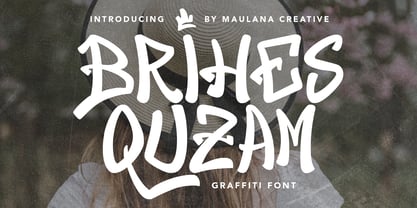 Brihes Quzam graffiti display font. Bold stroke, fun character with a bit of ligatures and alternates. To give you an extra creative work. Brihes Quzam font support multilingual more than 100+ language. This font is good for logo design, Social media, Movie Titles, Books Titles, a short text even a long text letter and good for your secondary text font with script or serif. Make a stunning work with Brihes Quzam font. Cheers, Maulana Creative
 - Brolly Fight by Rachel White Art,
$16.00 Brolly Fight is a fun, slim line font with off-kilter lines. I had so much fun creating this one! It has a stick figure art deco feel. It's fun and playful, with lots of ligatures and alternates to play with. Mix and match lowercase and uppercase letters for a unique look. There are four alternate ampersands, and fun double letter ligatures, as well as playful ligatures for r, k + a, e, o, u combinations. That high lowercase o with an underscore has a twin lowercase a alternate you can access too! Mix and match capitals and lowercase (plus the ligatures & alternates) to create unique text designs. Now with a bold version!
 - Chapter Eight by Aldedesign,
$19.00 Chapter Eight is a stylish signature font that is inspired by modern photography. It’s easy to use, to create a stunning watermark for your photos, invitations, branding. It also works great as a business signature or on other branding materials. - PUA encoded = Accessible in Adobe Illustrator, Adobe Photoshop, Adobe InDesign, even work on Microsoft Word. - PUA Encoded Characters - Fully accessible without additional design software. How to access alternate glyphs? you can see it on this link: http://goo.gl/1vy2fv
 - Cat Fight by Tour De Force,
$25.00 Cat Fight is small decorative font family containing two "weights". They are not weights in actual meaning, as they differ by style but to secure safe OTF usage in all OS, they are named as Regular and Bold. Cat Fight is ideal for lively and cheerful usages on posters, packages, labels, website titles, book covers and other similar situations.
 - Eight Cylinder by Vozzy,
$10.00 Introducing a vintage look label font named Eight Cylinder. All available characters you can see at the screenshot. This font have 8 styles - Regular, Full, Shadow, Shine, Shadow FX, Shine FX, Outline and Print. This font will good viewed on any retro design like poster, t-shirt, label, logo etc.
 - Vital Formations - Unknown license

- Lucas Brandis by Proportional Lime,
$9.99 In the early days of printing everything had to be worked out from scratch. This set of lettering is based on section headings used by the Printer Lucas Brandis (no known relation), the first printer to operate in the city of Lübeck around 1473. They remind me of a medieval version of the spray paint graffiti so often seen on the sides of trains. A bit on the crude side, but also and importantly extremely noticeable. So whether you use it for creating old styled printing or some wild modern eye grabbing text item, its robust and sturdy shapes will be certain to grab the eye.
 - FS Lucas by Fontsmith,
$80.00 Pure and not-so-simple Maybe it’s the air of purity, openness and transparency that they transmit, but geometric typefaces are more popular than ever among leading brands. Based on near-perfect circles, triangles and squares, geometric letterforms look uncomplicated, even though making them readable is anything but – something the designers of the first wave of geometric fonts discovered nearly a century ago. Many of the world’s most recognisable brands in technology, retail, travel, food, manufacturing and other industries continue to be drawn to the straightforward, honest character that geometric fonts convey. Fontsmith set out in 2015 to develop a typeface in the same tradition, but optimised for the demands of modern brands – online and offline usage, readability and accessibility. And, of course, with the all-important Fontsmith x-factor built in. FS Lucas is the bold and deceptively simple result. Handle with care The letterforms of FS Lucas are round and generous, along the lines of Trajan Column lettering stripped of its serifs. But beware their thorns. Their designer, Stuart de Rozario, who also crafted the award-winning FS Millbank, wanted a contrast between spiky and soft, giving sharp apexes to the more angular letterforms, such as A, M, N, v, w and z. Among his inspirations were the colourful, geometric compositions of Frank Stella, the 1920s art deco poster designs of AM Cassandre, and the triangular cosmic element symbol, which led him to tackle the capital A first, instead of the usual H. The proportions and angles of the triangular form would set the template for many of the other characters. It was this form, and the light-scattering effects of triangular prisms, that lit the path to a name for the typeface: Lucas is derived from lux, the Latin word for light. Recommended reading Early geometric typefaces were accused of putting mathematical integrity before readability. FS Lucas achieves the trick of appearing geometric, while taking the edge off elements that make reading difficult. Perfectly circlular shapes don’t read well. The way around that is to slightly thicken the vertical strokes, and pull out the curves at the corners to compensate; the O and o of FS Lucas are optical illusions. Pointed apexes aren’t as sharp as they look; the flattened tips are an essential design feature. And distinctive details such as the open terminals of the c, e, f, g, j, r and s, and the x-height bar on the i and j, aid legibility, especially on-screen. These and many other features, the product of sketching the letterforms in the first instance by hand rather than mapping them out mechanically by computer, give FS Lucas the built-in humanity and character that make it a better, easier read all-round. Marks of distinction Unlike some of its more buttoned-up geometric bedfellows, FS Lucas can’t contain its natural personality and quirks: the flick of the foot of the l, for example, and the flattish tail on the g and j. The unusual bar on the J improves character recognition, and the G is circular, without a straight stem. There’s a touch of Fontsmith about the t, too, with the curve across the left cross section in the lighter weights, and the ampersand is one of a kind. There’s a lot to like about Lucas. With its 9 weights, perfect proportions and soft but spiky take on the classic geometric font, it’s a typeface that could light up any brand.
 - Lucy Samuels by Samuelstype,
$32.00
- Lucid Type B Outline (BRK) - Unknown license

- Lucid Type A Outline (BRK) - Unknown license

- Lucid Type A Outline BRK - Unknown license

- Lucid Type B Outline BRK - Unknown license

- Not Quite Right BRK - Unknown license

- Right In The Kisser by Comicraft,
$29.00 SECONDS OUT! ROUND ONE! The champ comes out swinging, there’s a left hook, a right hook, another left, another left to the chin, a box to the ears, a punch to the stomach, the challenger is reeling, he’s on the ropes, there’s another left to the chin and here’s the knockout, RIGHT IN THE KISSER! The Kisser. The Mouth. You know, what you kiss with? SMAK! It’s a font with a fat lip or one that makes you look like you’re talking’ with a fat lip. Or if you’re more of a lover than a fighter, it’s a big wet kiss from your loved one when the clock strikes midnight on New Year’s Eve. Either way, you win!
 - You Could Be Right by PizzaDude.dk,
$20.00
- Digital Readout Upright - Unknown license

- Alpha Flight Solid - Unknown license

- Groove Machine Upright - Unknown license

- Americana Dreams Upright - Unknown license


