5,228 search results (0.062 seconds)
  1. VTCSuperMarketSale - Unknown license
  2. VTCSundaykomix - 100% free
  3. VTCSuperMarketSaleTall - Unknown license
  4. VTCSuperMarketSaleItalic - Unknown license
  5. VTCBelialsBladeShadow - Unknown license
  6. VTCSundaykomixcaps - Unknown license
  7. VTCSundayKomixTallOutline - Unknown license
  8. VTCBelialsBladeItalic - Unknown license
  9. VTCSuperMarketSaleODS - Unknown license
  10. VTCSundaykomixcaps - Unknown license
  11. VTCGoblinHand - Unknown license
  12. VTCSundayKomixKrumpled - Unknown license
  13. VTCGoblinHand - Unknown license
  14. VTCGoblinHandSC - Unknown license
  15. VTCSundaykomix - Unknown license
  16. VTCSundaykomix - Unknown license
  17. VTCSuperMarketSuperSale3D - Unknown license
  18. VTCSundaykomixcaps - Unknown license
  19. VTCSundaykomix - Unknown license
  20. VTCSundaykomixcaps - Unknown license
  21. VTCSuperMarketSaleDisplay - Unknown license
  22. VTCBelialsBladeTricked - Unknown license
  23. HWT Roman Extended Fatface by Hamilton Wood Type Collection, $24.95
    The design of the first "Fat Face" is credited to Robert Thorne just after 1800 in England. It is considered to be the first type style designed specifically for display or jobbing, rather than for book work. The first instance of Fat Face in wood type is found in the first wood type specimen book ever produced: Darius Wells, Letter Cutter 1828. This style was produced by all early wood type manufacturers. The style is derived from the high contrast, thick and thin Modern style of Bodoni and Didot developed only decades previously. The extended variation makes the face even more of a display type and not at all suitable for text. This type of display type was used to compete with the new Lithographic process which allowed for the development of the poster as an artform unto itself. This new digitization by Jim Lyles most closely follows the Wm Page cut. The crisp outlines hold up at the largest point sizes you can imagine. This font contains a full CE character set.
  24. Iridium by Linotype, $29.99
    Iridium™ was designed by Adrian Frutiger in 1972 for Linotype. It is in the modern" style like Bodoni or Didot, in that it has the sparkle created by a high thick/thin contrast and a symmetrical distribution of weight. But the sometimes harsh and rigid texture of the modern style is tempered by Frutiger's graceful interpretation. Iridium itself is a very hard, brittle and strong metal; yet the Latin and Greek roots of the word mean rainbow, or iridescence. And indeed, this font is infused with a more lustrous and complex spirit than the average rather stark modern typeface - note the stems that gently taper from waist to serif, the nicely curved ovals of the round characters, and the slight bracketing of the serifs. Iridium was originally designed for phototypesetting, and Frutiger himself cut the final master photo-mask films by hand. This digital version has all the craftsmanship of that original and includes the roman, a true italic, and the bold weight. Iridium works particularly well for book and magazine text and headlines."
  25. Rapsodia by Andinistas, $59.00
    @andinistas presents Rapsodia, an uncommon roman caps font with serif and high contrast, designed by #carlosfabiancg. Rapsodia was inspired by Stunt Roman, Speedball Textbook for Pen & Brush Lettering by Ross F. George. Rapsodia has a high and sweetened amount of contrast between thin and thick with drop-shaped finishes, reminiscent of Didot, Baskerville and Bodoni. Its artistic accent translates into Tuscan letters drawn with a flexible tip pen. In that order, Rapsodia combines the visual theatricality of an art nouveau corset, with creative historical classics such as Liza Minnelli, Gene Simmons and Freddie Mercury. Its calligraphic curlers full of Mannerist virtuosity are unnatural in Roman caps typefaces with serif. That is why its internal vein in ascending and descending flourishes protrudes with Chicano circus details like triangular diamonds located in vertical strokes. Rapsodia serves to design words and phrases in fine publications, for this reason most of its upper and lower case letters communicate feelings with classic and luxurious sensation through substitutes, ligatures and alternatives for beginning, middle or end of word, functioning as initials and terminals.
  26. TaitDemo - Unknown license
  27. Prillwitz Pro by preussTYPE, $49.00
    Johann Carl Ludwig Prillwitz, the German punch cutter and type founder, cut the first classic Didot letters even earlier than Walbaum. The earliest proof of so-called Prillwitz letters is dated 12 April 1790. Inspired by the big discoveries of archaeology and through the translations of classical authors, the bourgeoisie was enthused about the Greek and Roman ideal of aesthetics. The enthusiasm for the Greek and Roman experienced a revival and was also shared by Goethe and contemporaries. »Seeking the country of Greece with one’s soul«. All Literates who are considered nowadays as German Classics of that time kept coming back to the Greek topics, thinking of Schiller and Wieland. The works of Wieland were published in Leipzig by Göschen. Göschen used typefaces which had been produced by until then unknown punch cutter. This punch cutter from Jena created with these typefaces master works of classicist German typography. They can stand without any exaggeration on the same level as that of Didot and Bodoni. This unknown gentleman was known as Johann Carl Ludwig Prillwitz. Prillwitz published his typefaces on 12th April 1790 for the first time. This date is significant because this happened ten years before Walbaum. Prillwitz was an owner of a very successful foundry. When the last of his 7 children died shortly before reaching adulthood his hope of his works was destroyed, Prillwitz lost his will to live. He died six months later. His wife followed him shortly after. The typeface Prillwitz as a digital font was created in three optical styles (Normal, Book and Display). The typeface Prillwitz Press was created especially for a printing in small sizes for newspapers. »Prillwitz Press« combines aesthetic and functional attributes which make written text highly readable. It was originally designed for a newspaper with medium contrast to withstand harsh printing conditions. Its structure is quite narrow which makes this typeface ideal for body text and headlines where space is at premium. For the Normal – even more for the Book – a soft and reader-friendly outline was created through a so-called »Schmitz« and optimized in numerous test prints. The arris character and the common maximal stroke width contrast of the known classicist typefaces (Didot/Bodoni) were edited by the study of the original prints. This was also done in order to reach a very good readability in small type sizes. This typeface is perfectly suited to scientific and belletristic works. Accordingly it has three styles: Regular, Bold and Italic as Highlighting (1). The typeface Prillwitz is a complete new interpretation and continuing development of the conservated originals from 1790. They have been kept in the German Library in Leipzig. It was always given the priority to keep the strong roughness and at the same time optimizing the readability of this striking font. The type family has all important characters for an efficient and typographic high quality work. ----------- (1) Accentuation of particular words or word orders (e.g. proper names, terms etc.). Typographic means for Highlighting could be Italic, SmallCaps or semi-bold.
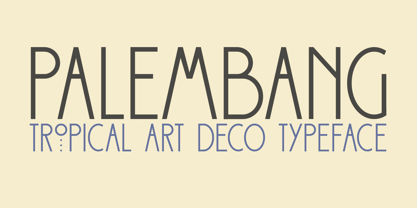
  28. Palembang by Hanoded, $15.00
    Palembang is the second largest city on the Indonesian island of Sumatra. It is also one of the oldest cities in Indonesie and used to be the capital of the powerful Buddhist Kingdom of Srivijaya. After finishing Semarang and Semarang Kolonial fonts, I sort of stayed in the Indonesian mood and named this font Palembang. It is a narrow, tall, all caps Art Deco typeface and would be most suited for headlines, cards, headers and luxury packaging. Palembang comes with royal language support.
  29. Berliner - Unknown license
  30. VTCBelialsBlade - Unknown license
  31. GhostTown - Unknown license
  32. Argonaut - Unknown license
  33. BarbedWire - Unknown license
  34. Blippo by Bitstream, $29.99
    Another variant of Bayer’s Universal Alphabet, resembling ITC Bauhaus in design, ITC Ronda in proportion and fit, prepared by FotoStar in the mid 1970s.
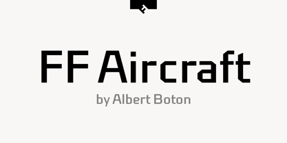
  35. FF Aircraft by FontFont, $41.99
    French type designer Albert Boton created this display FontFont in 2002. The font is ideally suited for advertising and packaging, music and nightlife as well as sports. FF Aircraft provides advanced typographical support with features such as ligatures, alternate characters, and case-sensitive forms. It comes with a complete range of figure set options – oldstyle and lining figures, each in tabular and proportional widths.
  36. Kolega by Just My Type, $25.00
    Maybe I should have named this font “Communist Block”. But it also works well for Colonial-style tavern signs. It’s square, geometric and rigid, and is the perfect thing for totalitarian themes. The family consists of three fonts: Kolega (“Comrade” in Polish), Kolega Tall, and Kolega Podrobska (Fake Comrade). Kolega and Kolega Tall are fully charactered with U.S., European, Greek and Cyrillic glyphs. The latter font is meant to use in English only; although it contains many accents and character variations, they mean nothing. It’s a joke.
  37. Honeyguide by Hanoded, $15.00
    Description: Honeyguide is a beautiful, handmade set of fonts. One is a brushed script font; the other a playful all caps font. Both come with italic styles. Use these two babies for your product packaging and book covers, happy holiday greeting cards and products in need of some quality packaging. A honeyguide, by the way, is a bird species (fam. Indicatoridae) from Africa and Asia. They are famous for leading humans to bee colonies, so they can feast on the grubs and beeswax that are left behind.
Looking for more fonts? Check out our New, Sans, Script, Handwriting fonts or Categories
abstract fontscontact usprivacy policyweb font generator
Processing