10,000 search results
(0.02 seconds)
- SST Thai by Monotype,
$67.99 Designed for global branding and supporting 93 languages, the SST® typefaces blend the organic readability and controlled structure of modern sans serif designs. In combining these attributes, the SST family is understated, versatile – and sure to be a timeless design. The SST Thai family has 4 fonts in total. It spans four weights from light to bold. SST’s subtle design traits provide a quietly handsome and consistently friendly typographic presence that can be used for just about any typographic application. Broad range branding applicability combined with coverage for almost a hundred languages, makes SST one of the most widely accessible and usable typefaces available. Originally designed in partnership with the global consumer brand, Sony, the SST family is one of the most comprehensive type families available. Since extensive multi-lingual support was a critical design goal from the beginning, Akira Kobayashi, Monotype type director and primary designer on the project, turned to a network of local designers around the world for their individual language expertise. As a result, the details – which could be as subtle as stroke curvature and width – are consistent across Latin, Greek, Cyrillic, Arabic and multiple Asian languages. SST performs equally well in print and on-screen and the designs can be used at very small sizes in packaging and catalogs; while massive print headlines – even complicated wayfinding projects pose no stumbling blocks to the family’s typographic dexterity.
 - Saylist by Ardyanatypes,
$15.00 Saylist is a serif font that exudes luxury and elegance. It has various features that will make your designs look beautiful and sophisticated. This font is highly recommended for logos and branding purposes. Still, its versatility allows you to use it for a wide range of design themes, such as luxurious, unique, vintage, and elegant. One of the standout features of Saylist is its unique shape, which gives off a creative impression. The font's clean lines and sharp edges make it easy to read, while its elegant curves add a touch of sophistication. Saylist's balanced letterforms and consistent spacing provide a harmonious and cohesive look, making it an excellent choice for any design project. Saylist is a font that can be used for various design projects. Its elegant and luxurious style makes it ideal for fashion, beauty, and lifestyle branding. It can also be used for headings, body text, invitations, and other print materials. Saylist's versatility allows it to be paired with other fonts to create a unique and cohesive design. Overall, Saylist is a beautiful and versatile serif font that can add a touch of luxury and elegance to any design project. It's unique shape, and balanced letterforms make it a standout choice for logos and branding, while its versatility allows it to be used for various design themes. If you're looking for a font that exudes sophistication and creativity, Saylist is an excellent choice.
 - Jantze by Fontosaurus,
$19.95The Jantze font is a project undertaken by Dan Bailey of Fontosaurus and Michael Jantze, creator of the nationally-syndicated comic strip, The Norm. All their royalties from the font will go to The Lance Armstrong Foundation. For those that have been living under a rock for the last five years, Lance is a professional bike racer that overcame advanced testicular cancer to not only come back to his sport, but to dominate its premiere event, the Tour de France. In climbing to the top of his sport, he has become a legend among cyclists and a beacon of hope for those battling cancer and their families. His foundation provides financial grants to researchers working to improve our odds against the disease, individuals stricken with cancer, and survivors of the disease that are advocates for survivorship issues in their communities. Michael Jantze and Dan Bailey would like you to consider the quote from Ralph Waldo Emerson that brought us to this project: "The purpose of life is not to be happy. It is to be useful, to be honorable, to have it make some difference that you have lived and lived well. We hope that you will help us help Lance Armstrong's legacy be more than that of just sports legend. We hope that you will help those that may someday help you as much as we hope that you will never have to suffer the ravages of cancer. We hope. - SST Vietnamese by Monotype,
$67.99 Designed for global branding and supporting 93 languages, the SST® typefaces blend the organic readability and controlled structure of modern sans serif designs. In combining these attributes, the SST family is understated, versatile – and sure to be a timeless design. The SST Vietnamese family has 4 fonts in total. It spans four weights from light to bold. SST’s subtle design traits provide a quietly handsome and consistently friendly typographic presence that can be used for just about any typographic application. Broad range branding applicability combined with coverage for almost a hundred languages, makes SST one of the most widely accessible and usable typefaces available. Originally designed in partnership with the global consumer brand, Sony, the SST family is one of the most comprehensive type families available. Since extensive multi-lingual support was a critical design goal from the beginning, Akira Kobayashi, Monotype type director and primary designer on the project, turned to a network of local designers around the world for their individual language expertise. As a result, the details – which could be as subtle as stroke curvature and width – are consistent across Latin, Greek, Cyrillic, Arabic and multiple Asian languages. SST performs equally well in print and on-screen and the designs can be used at very small sizes in packaging and catalogs; while massive print headlines – even complicated wayfinding projects pose no stumbling blocks to the family’s typographic dexterity.
 - Mi Negra by Letritas,
$25.00 Mi negra is a funny and hilarious typography designed especially for children, thought and created by Isabel de Gregorio. It could be described as an original combination between a semi-handwright and semi sans-serif font. Thanks to its structure and nice endings "Mi Negra" is recommended for composing short texts (logotypes, packing, posters, etc.). It may similarly be used for illustrations and comics, as well as in printing press works for children from 6 to 13 years old for instance. Mi Negra has been conceived to be a useful support in all kinds of illustrations works (please note that Isabel, the type designer, considers herself primarily an illustrator). The font designer of Mi Negra tells that every time she needed to provide some text data (i.e. in children infographies) and needed to make them more understandable and suitable for children, she used this typography. The former idea was than to create a font who could be a second option to comic sans, but as the project started to reveal its forms, it was clear that it was revealing another connotation and its own character. In this way, Mi Negra went on modifying its forms and the more it developed, the more it was showing its new characteristics and concepts. The family is composed of three weighs: Light, regular and black. It provides also interesting functional ligatures. It also includes a dingbat with nice doggies. It has 434 characters and can work with 208 languages.
 - Evanescent - Unknown license

- Bargain Shopping by Jeff Levine,
$29.00 F.W. Woolworth was once one of the giants of the variety store chains, along with the likes of Kress, S.S. Kresge, McCrory’s, Neisner Brothers, Ben Franklin and others. In 1960, the company brought out a new corporate logo with a type design harking back to the Art Deco style of the 1930s and 1940s. A photo of one of their old store fronts (despite having only eight letters to work with) inspired the digital interpretation of the signage as Bargain Shopping JNL, which is available in both regular and oblique versions.
 - Toonerville NF by Nick's Fonts,
$10.00The original sheet music for Ted (Is Everybody Happy?) Lewis’ signature tune, When My Baby Smiles at Me, inspired this whimsical wonder. The sheet music was discovered in the Library of Congress American Memory Collection, an incredible online resource. The typeface gets its name from a slightly loony early 1900s comic strip by Fontaine Fox. This new and improved version has beefed-up outlines, so it renders well even at smaller sizes. Both versions contain the complete Unicode 1252 (Latin) and Unicode 1250 (Central European) character sets, with localization for Romanian and Moldovan. - Snippity Snap by Hanoded,
$15.00 Snippity Snap is a font made up of glyphs I cut out from black paper with some household scissors, then pasted onto white paper. When I was cutting out the shapes, my children asked me what I was doing, and when I told them, they thought it was pretty cool and started cutting out shapes from paper themselves. The result is a house filled with paper cuttings, which I keep finding everywhere - even in my bed. Snippity Snap is a very nice font for ads, book covers, packaging and children's books. Enjoy!
 - TT Ricordi Greto by TypeType,
$29.00TT Ricordi Greto useful links: Specimen | Graphic presentation | Customization options TT Ricordi Greto is the 5th project from the TT Ricordi collection of fonts, the main task of which is to find gems in old tablets and on stones and bring these inscriptions back to life in the form of contemporary fonts under the general name TT Ricordi. TT Ricordi Greto is Kseniya Karataeva’s original experimental project, inspired by a floor plaque dating from 1423 found in the Basilica di Santa Croce, Florence. When working on the typeface, we wanted to do something new and modern, but at the same time find details or artifacts in the source that could be exaggerated to the maximum. TT Ricordi Greto is a non-contrasting Florentine sans-serif with dynamic proportions and a hint on what would be serifs. The main features of the typeface are the closed aperture, dynamic proportions, and the combination of historical forms with modern visual solutions, flowing terminals with curling dash ends and flared ends, and subtle serifs that hint at the historical material. Another feature of the typeface is a large set of graphic icons (characters and objects), margin markers (flowers, stars and drops) and thirteen catchwords. All icons and spacing have been carefully selected and rendered in order to best match the visual plasticity of the font and interact well with it. The TT Ricordi Greto font family consists of 4 styles: Regular, Medium, Demibold + the Variable font. Each style includes 678 glyphs and 14 OpenType features. In addition to wide language support (extended Latin and basic Cyrillic), each style has two sets of figures and currencies (proportional and tabular), a set of arrows alternative versions of the letter M (flared and straight versions) and the letter Ф (round and oval) and the same a set of icons, margin markers and catchwords. TT Ricordi Greto OpenType features list: aalt, ccmp, locl, numr, ordn, tnum, pnum, case, ss01, ss02, ss03, ss04, ss05, calt. TT Ricordi Greto language support: Acehnese, Afar, Albanian+, Aleut (lat), Alsatian, Aragonese, Arumanian+, Asu, Aymara, Azerbaijani +, Banjar, Basque +, Belarusian (lat), Bemba, Bena, Betawi, Bislama+, Boholano+, Bosnian (lat), Breton +, Catalan+, Cebuano+, Chamorro+, Chichewa, Chiga, Colognian+, Cornish, Corsican +, Cree, Croatian, Czech+, Danish, Dutch+, Embu, English+, Esperanto, Estonian+, Faroese+, Fijian, Filipino+, Finnish, French, Frisian, Friulian+, Gaelic, Gagauz (lat), Galician+, Ganda, German+, Gikuyu, Guarani, Gusii, Haitian Creole, Hawaiian, Hiri Motu, Hungarian+, Icelandic+, Ilocano, Indonesian+, Innu-aimun, Interlingua, Irish, Italian+, Javanese, Jola-Fonyi, Judaeo-Spanish, Kabuverdianu, Kalenjin, Kamba, Karachay-Balkar (lat), Karaim (lat), Karakalpak (lat), Karelian, Kashubian, Kazakh (lat), Khasi, Kikuyu, Kinyarwanda, Kirundi, Kongo, Kurdish (lat), Ladin, Latvian, Leonese, Lithuanian+, Livvi-Karelian, Luba-Kasai, Ludic, Luganda+, Luo, Luxembourgish+, Luyia, Machame, Makhuwa-Meetto, Makonde, Malagasy, Malay+, Maltese, Manx, Maori, Marshallese, Mauritian Creole, Meru, Minangkabau+, Moldavian (lat), Montenegrin (lat), Morisyen, Nahuatl, Nauruan, Ndebele, Nias, Norwegian, Nyankole, Occitan, Oromo, Palauan, Polish+, Portuguese+, Quechua+, Rheto-Romance, Rohingya, Romanian +, Romansh+, Rombo, Rundi, Rwa, Salar, Samburu, Samoan, Sango, Sangu, Sasak, Scots, Sena, Serbian (lat)+, Seychellois Creole, Shambala, Shona, Silesian, Slovak+, Slovenian+, Soga, Somali, Sorbian, Sotho+, Spanish+, Sundanese, Swahili, Swazi, Swedish+, Swiss, German +, Tagalog+, Tahitian, Taita, Talysh (lat), Tatar+, Teso, Tetum, Tok Pisin, Tongan+, Tsakhur (Azerbaijan), Tsonga, Tswana +, Turkish+, Turkmen (lat), Uyghur, Valencian+, Vastese, Vepsian, Volapük, Võro, Vunjo, Walloon, Walser+, Welsh+, Wolof, Xhosa, Zaza, Zulu+, Belarusian (cyr), Bosnian (cyr), Bulgarian (cyr), Erzya, Karachay-Balkar (cyr), Khvarshi, Kumyk, Macedonian+, Montenegrin (cyr), Mordvin-moksha, Nogai, Russian+, Rusyn, Serbian (cyr)+, Ukrainian. - Comenia Sans by Suitcase Type Foundry,
$75.00Comenia Sans was designed in the framework of a unique typographic project for all types of schools. It is a complementary face for Comenia Serif, released by our friends at Storm Type Foundry. Comenia Sans has a lot in common with its serif sister: the height of both upper and lower case, the length of ascenders and descenders, and the general weight. This makes the two perfect partners which work well even when set side by side in a single line of text. Comenia Sans does, however, lack all serifs, ornamental elements and stroke stress variation. All these elements freshen up the feel of long texts, but for shorter texts use, they are not necessary. Despite that, Comenia Sans retains the soft, friendly character of its big sister, as well as a few tiny details which lend it its unique character without compromising legibility or utility. Open counters give all letters an airy feel and permit enough variation in construction. This is why the face works well even in multiple-page texts. All its letters are easily distinguished from each other, so the reader's eyes are not strained. Diacritics and punctuation harmonize with both upper and lower case. As usually, all diacritical marks fully respect conventional shapes of accents and they are perfectly suitable for Czech, Slovak, Polish and other Central European languages, where a lot of diacritics abounds. Similarly to the renaissance italics which refers to the cursive forms, Comenia Sans introduces novel shapes of some characters drawing from the hand-written heritage. This is most apparent in the single-bellied a, the simplified g, and the stem of f which crosses the baseline and ends with a distinct terminal. In the text, emphasized words are thus distinguished not only by the slant of letters, but also by the shapes of the letters themselves. All twelve styles contain set of small caps, suitable for the names, in the indexes or the headlines in longer texts. Legibility in small sizes under 10 points was at the center of designers' attention, too. This is why the counters of a, e and g are large enough to prevent ink spread in small sizes, both on-screen and in print. After all, the font was specifically optimized for screen use: its sober, simple forms are perfectly fit to be displayed on the computer screen and in other low-resolution devices. When used in the context of architecture, the smoothness of all contours stands out, permitting to enlarge the letters almost without limit. A standard at the Suitcase Type Foundry, each style of Comenia Sans boasts a number of ligatures, an automatic replacement of small caps and caps punctuation, a collection of mathematical symbols, and several types of numerals which make it easy to set academic and other texts in an organised, well-arranged way. For the same purpose, fractions may come in handy, too. Apart from the standard emphasis styles, the family also contains six condensed cuts (each set has the same number of characters), designated for situations where space is limited or the need for striking, poster-like effect arises. Comenia Sans is the ideal choice for the setting of magazines, picture books, and navigation systems alike. Its excellent legibility and soft, fine details will be appreciated both in micro-typography and in poster sizes. Although it was designed as a member of a compact system, it will work equally well on its own or in combination with other high-quality typefaces. - Tasmin Reference - Unknown license

- Santa'sSleighFull - Unknown license

- Tom's New Roman - Unknown license

- Prefix - Unknown license

- Sláine - Unknown license

- Alvia by Zane Studio,
$12.00 Alvia is a clean, modern script font that is carefully crafted with a touch of elegance. This font can be used to write letters, invitations, food products, headlines and more. It will turn any creative idea into a true work of art!
 - Baumfuss by Ingrimayne Type,
$9.95 Baumfuss and BaumfussTwo are unpolished, crude typefaces with small flared serifs and very few straight lines. They are a bit heavy to be easily readable at smaller point sizes. Baumfuss has a high x-height, while BaumfussTwo has a more conventional x-height.
 - Obey Obey Obey by Comicraft,
$19.00 YOU WILL OBEY ALL OUR COMMANDS! YOU WILL OBEY INSTANTLY! YOU WILL OBEY WITHOUT QUESTION! OBEY! OBEY! OBEY! OBEY! OBEY! OBEY! YOU WILL BUY THIS FONT OR YOU WILL BE EXTERMINATED! Features Four fonts (Regular, Italic, Bold & Bold Italic) with alternate uppercase characters.
 - Six Feet Over by Brad Mead,
$10.00 Six Feet Over is tall, cool and near impossible to read - what's not to love? This super condensed and trippy typeface was designed to be elusive and is perfect for those that love condensed, compressed - or any other word for squished - fonts.
 - Spooky Ghost by Sakha Design,
$12.00 Spooky Ghost is a cool, fun, and quirky decorative font. This font is PUA encoded which means you can access all glyphs and swashes with ease! Add it confidently to your favorite Halloween designs and let yourself be amazed by the outcome generated.
 - Zephyrine by Muksal Creatives,
$10.00 Zephyrine is modern family of Display fonts. Zephyrine has 6 families font, starting from the small Regular and Regular Italic to the largest black and Black Italic. This typeface is versatile and can be used successfully in magazines, posters, branding, websites, etc.*
 - Eureka Antique by Solotype,
$19.95You may be familiar with a caps and small caps type called Cruickshank. In Germany the same face was called Eureka. We took the small caps, which are not so overblown as the caps, and designed a lowercase to harmonize with it. - Scripty by Turtle Arts,
$20.00Scripty is a hand drawn, calligraphy longhand handwritten font. With careful spacing, the letters can be used together to create words that look like theyπve been written with an old≠fashioned fountain pen, or used alone as embellishment to more plebean text. - Butternut by Ryan Keightley,
$19.00 Butternut’s origins can be traced back to handwriting in felt-tipped marker. Because of this, you’ll find a slight degree of roughness to the edges, yet a fluid softness to the letterforms themselves. As well as some weird, fun details here and there.
 - Invaded 2600 by Fontmill Foundry,
$15.00Invaded 2600 is based on the screen font of the 70's arcade classic Space Invaders for the Atari 2600. Each time you use Invaded 2600 you will be at war with enemies from space who are threatening the earth. Good luck! - Alpha Juliet by Wiescher Design,
$39.50 Alpha Juliet is another font in my alpha-series, the experimental font series. It lends itself to modern designs in all forms. The font can be used together with Alpha Papa since it has the same origins. Your experimental designer, Gert Wiescher
 - Ashlyn by Sipanji21,
$20.00 This font can be used easily and simply because there are many features in it. contains a complete set of lowercase and uppercase letters, assorted punctuation, numbers, and multilingual support. font also contains multiple ligatures and many contain alternative Style Stylistic Sets
 - Toxic Brew by PizzaDude.dk,
$15.00 The Toxic Brew font was initially designed to be a Halloween font, but I guess it turned out not so scary in the end. But maybe you can use it for something scary anyway? I've added several versions, and they mix very well
 - Kaweah by RMtype,
$15.00 Kaweah is a sharp, condensed, serif typeface with wide language support and strong historical roots. The original inspiration for this typeface comes from text in the museum collection of Kings Canyon National Park. It is designed to be used in titles and subheads.
 - Monico by Eotype,
$14.00 Monico is a new condense font that is elegance and versatility. This unique font is perfect for creating beautiful logotypes, stunning magazine designs and more. This font can be your solution in completing projects that are equipped with various alternate and ligature collections.
 - Kids by Nirmalagraphics,
$14.00 Kids is inspired by the writing style of a child who is learning to write letters and numbers. This font can be used for a variety of needs including logos, flyers, magazines, clothes, business cards brochures and more. It includes multi-lingual support.
 - Black Manta Brush by Creaditive Design,
$12.00 Black Manta is a strong charactered, brushed display font. It looks fierce and urban and it will most certainly make each of your designs stand out. Add it confidently to your favorite creations and let yourself be amazed by the outcome generated.
 - Engine Company JNL by Jeff Levine,
$29.00 Engine Company JNL is a slab serif font based on a set of wood type. The design emits an image of strength and purpose, and fits well into any project where a word or phrase must be conveyed forcefully without seeming overly imposing.
 - Tattoo Master by Vozzy,
$10.00 Introducing a vintage look label font named "Tattoo Master". This family includes five styles - Regular, Texture, Shadow, Full and Aged. You can see samples on the posters. This font will be great on any retro design on poster, t-shirt, label, logo etc.
 - Roslyn Gothic LP by LetterPerfect,
$39.00 LetterPerfect's version of this distinctive sans serif design is both legible and approachable, and about as bold as a display font can be. Its friendly persona makes it an ideal choice for greeting cards and invitations, or for use with children's reading material.
 - Creepy Ghost by AEN Creative Studio,
$15.00 Creepy Ghost is a cool and spooky display font. This font is PUA encoded which means you can access all of the glyphs and swashes with ease! Add it confidently to your favorite creations and let yourself be amazed by the outcome generated.
 - TOMO Nara by TOMO Fonts,
$20.00 TOMO Nara adds plenty of joy to any logo, layout or UI. Geometric shapes and a funny look come together in this font – thus, Nara might be the perfect choice for toys, books, packaging, posters or even webapps! Let’s have some fun!
 - Love Sweets by Goodigital13,
$20.00 perfectly suited to signature, stationery, logo, typography quotes, magazine or book cover, website header, clothing, branding, packaging design and more.With the script style this modern font will be perfect for many different projects: watermarks, posters, weddings, branding, logos, fashion, clothes, letters, invitations.
 - Liontin by Fargun Studio,
$12.00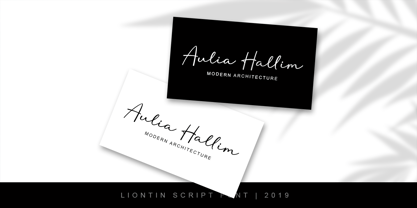 Liontin is modern script, perfect for photography, branding, signature. It is so beautiful and classy for your projects. This Font has given PUA code (specially coded fonts) so that all the alternate characters can easily be accessed by a craftsman or designer.


