10,000 search results
(0.023 seconds)
- SF Big Whiskey - Unknown license

- Green Mountain 3 - Unknown license

- Agathodaimon - Personal use only

- !PaulMaul - Personal use only

- Komika Text Kaps - Unknown license

- Quintus LeadedGlass - Unknown license

- Umbrage - Unknown license

- Parafuse - 100% free

- Distant Galaxy Condensed - Unknown license

- CosmosCaps - Unknown license

- A Charming Font Outline - Unknown license

- Refuse - Unknown license

- Canapé by FDI,
$25.00 Canapé is based on the idea of letters with a subtly curved and slightly modulated line. Through this, the typeface has a warm and friendly, almost haptical appearance which brings some kind of cosiness to your communication with type. Designed and crafted with great attention to detail, the type family is usable for copy texts as well as corporate design or display purposes. Canapé (Serif) with its 4 fonts and more than 4,200 characters contains a large amount of features like small capitals, swashes, 10 different figure sets, automated fractions, ordinals, standard and discretionary ligatures, language support for Central and Western Europe and a small sofa building kit. All features are conveniently accessible through OpenType features. Check out the type specimen PDF for more details and a closer look.
 - Informational Gothic JNL by Jeff Levine,
$29.00 The Wood-Regan Instruments Company (Wrico) of New Jersey manufactured for decades a line of lettering kits called the Wrico Sign Maker. With only special ink pens, plastic templates and a template guide anyone could letter clean, clear signs, posters and notices. Based on the same principles of architectural templates, the lettering was [for the most part] utilitarian and functional. Few templates were of stylized or decorative lettering. Informational Gothic JNL and its oblique version are based on the four inch high lettering templates from one of those kits.
 - Equines by Attractype,
$12.00 Equines Display is a versatile font family designed specifically for display purposes. Its modern, thick and strong appearance is perfect for branding, logos, banners and any lettering that requires bold and clear letters. To add an artistic image rather than just the thickness of the shape, Equines Display adds a rounding feature to the corners of the letters with a cross system, which makes the word display dynamic, strong and elegant. Until this description was published, Equines Display had 14 styles including condesed, expanded, outline and shaded in hopes of meeting the display font needs of designers and everyone at large. Enjoy working with the Equines Display font family. Best regards, Saefulloh - Attractype Foundry.
 - KS Roam by Kreuk Type Foundry,
$16.00 KS Roam is a handmade display font with fun thick brush impression at a glance. Brush inspired display with strong, catchy & striking form display. KS Roam ideally suited for headline title, logo, branding, posters etc.
 - Kontor - Personal use only

- Soul Lotion by TypoGraphicDesign,
$19.00 CONCEPT/CHARACTERISTICS The typeface “Soul Lotion” is a sans serif font for display sizes. Constructed, clear and simply with monoline character. The round and unadorned look is modern & simple. APPLICATION AREA The modern, clear and simply sans serif font “Soul lotion” would be happy as a display typeface in headline size on the following areas and there simply feel good: Logos/Wordmarks, party flyer, album covers, CD covers, Poster design, video game design, and much more as display typeface for print and digital magazines, books and websites. TECHNICAL SPECIFICATIONS Headline Font | Display Font | Sans Serif Font “Soul Lotion” OpenType Font (Mac + Win) with 6 styles (regular, bold, light + 3x italic) & 354 glyphs. Incl. accents, alternative letters, ligatures & €. Desktop Font (.otf) + Web Font (.svg, .eot, .woff) KONZEPT/BESONDERHEITEN Die Schrift »Soul Lotion« ist ein serifenloser Font für Headlinegrößen. Konstruiert, klar und einfach mit gleichbleibender Strichstärke. Die runden und schnörkellosen Formen wirken modern & schlicht. EINSATZGEBIETE Die moderne, klare und einfache Sans Serif Schrift »Soul Lotion«, würde sich als Auszeichnungsschrift in Headlinegröße über folgende Einsatzgebiete sehr freuen und sich dort schlicht wohlfühlen: Logos/Wortmarken, Flyer für fast jede Party, PlattenCover, CD-Cover, PlakatDesign, Videospiel Design, als Headlineschrift für print und digitale Magazine, Bücher und Webseiten u.v.m. TECHNISCHE INFORMATIONEN Headline Font | Display Font | Sans Serif Font »Soul Lotion« OpenType Font (Mac + Win) mit 6 Schriftschnitten (regular, bold, light + 3x italic) & 354 Glyphen. Inkl. diakritisches Zeichen, alternative Buchstaben, Ligaturen & €. Desktop Font (.otf) + Web Font (.svg, .eot, .woff)
 - Alt Gotisch by HiH,
$12.00 Alt-Gotisch Verzierte is a typeface of decorative initials that is Victorian in style and bears a close family resemblance to the many ornamental tuscans cut throughout the nineteenth century by British foundries. Instead of the bifurcated terminals of the archetypical tuscan (see Figgins Tuscan by HiH or Stereopticon by Dan X. Solo), these letters display what Nicolete Gray might call a “wedge and bite” design -- as if they started with the wedge serif of a latin form and someone came along and took a perfectly round bite out of the wedge. We need not dwell on the lack of teeth marks. The calligraphic curls and flourishes are often graceful, sometimes a bit contrived, but always complex. There is a busyness that marks the style of the period. If you ever see an old photograph of a well-appointed Victorian parlor, you will recognize that same quality of busyness. Overdone is a word that frequently comes to mind. Alt-Gotisch Verzierte means “adorned or decorated old gothic.” The typeface is attributed by Alexander Nesbitt to an unidentified German foundry of the nineteenth century (Decorative Alphabets and Initials, Dover, New York 1987, plate 92). The designer is unknown. Our font is supplied with a lower case that is similar to the upper case, but is 15% shorter and is simplified by the omission of the decorative vines. For the lower case, alternate letters A, E, & T; and ligatures LE, OT & LY have been supplied. In addition, a few small decorative vines were planted here and there for optional use. An accented upper case is not part of the original design and is not here supplied. This design is also seen under the name “Sentinel” -- as always, it is worthwhile to compare the completeness of the character set and the faithfulness of the rendering. We believe you will agree that we provide a balance of quality and value that is unmatched in the contemporary marketplace. Alt-Gotisch Einfach is a simplified version of Alt-Gotisch Verzierte. The vine-less lower case of the Verzierte font is the upper case in Einfach. For a lower case for Einfach, the letters were further simplified by stripping away the three-dimensional outline, down to the bare bones and bites, as it were. Einfach, in fact, means “simple” or “plain.” It is interesting to note that this bare bones & bite lower case bears (I have a special license to use two homonyms in the same sentence) a striking resemblance to the 15th & 16th century ornamental letters from Westminster Abbey shown in Plate 47 of Alexander Nesbitt’s Decorative Alphabets and Initials (Dover, New York 1987).
 - WBP Helena by Studio Jasper Nijssen,
$15.00 Helena derived her curves from the old Chinese Tangram puzzle. She sure is playful, though sometimes she bites furiously. No worries! Helena may seem to be a tad crazy, but all in good moderation. Don’t go overboard, use her well and I can assure you … she’ll be worth all your effort.
 - Gobln by Green Type,
$11.00 Gobln is a decorative font. Designed for use in posters, outdoor advertisements, branding, packaging and web sites. Gobln is also perfect for use in the design of invitations and greeting cards. Gobln contains basic and alternative stylistic sets, decorative swash initials & final forms, and standart ligatures that will decorate your design.
 - Borek by Alphabet Design,
$20.00Borek is a geometric monoline sans-serif display font. It works well in both display and text applications. - Antique Light by Wooden Type Fonts,
$15.00 One of the classic display types of the 19th century, a slab font, suitable for text and display.
 - Dividers by Dingbatcave,
$15.00Formerly only available from my own font site for orders over $50, Ann’s Dividers are now being made available separately. Decorative, spirally, funky and artsy lines and separators perfect for web graphics or on a printed page. A must-have for all web graphic designers. There are 72 characters in this font. - Surf Bum by Jeff Levine,
$29.00 The term “Surf Bum” was a slang phrase used to casually describe anyone who spent as much of their time as possible at the beach catching waves in the 1960s. The Revell Company was a well-established maker of plastic model kits such as military airplanes, monsters from Universal horror films and other such items when it hooked up with custom car designer Ed “Big Daddy” Roth to develop a model kit line capitalizing on the surfing fad that was sweeping the West Coast at the time. A number of crazy-looking hot rods, dune buggies and what-have-you were turned out, and one such kit (“Surfite”, with Figure) featured a futuristic one-person dune buggy. It was on the box for the model that the words “with Figure” appear in a casual, brush design type face. Those few letters were the inspiration for creating a new retro type face entitled Surf Bum JNL, which is available in both regular and oblique versions.
 - Kirsty - Unknown license

- Planet Benson 2 - Unknown license

- Vivala Coffee House Icons by Johannes Hoffmann,
$19.00 73 icons on the topic »coffee house.« The extensive kit includes the category’s coffee, drinks, food, coffee makers, roasted coffee and tea. The clear design is adapted to mobile interfaces and suitable for print, as well.
 - Schizotype Grotesk by Eclectotype,
$25.00 A neo-grotesk with a bit more bite, this is Schizotype Grotesk. It's not your usual grot; this is purely display typography. Notches cut deep into the letterforms and the thick/thin contrast isn't always where you might expect. It's intended to be a challenging typeface - not beautiful or particularly 'useful' in any conventional sense, but it is at the very least interesting. In a world where everyone and their dog has their own grotesk offering, perhaps being interesting and that little bit different is in itself enough to give the face its utility. Besides, beauty is in the eye of the beholder. What really matters is what you think! Schizotype Grotesk isn't bogged down with a million and one OpenType features you'll never use, but it does include proportional and tabular lining figures; automatic fractions; numerators and denominators; superscript and subscript numerals; case sensitive forms; and five stylistic sets that change [a], [g], [y], [IJ], and [@] respectively.
 - Seribu Bulan by IKIIKOWRK,
$21.00 Introducing Seribu Bulan - Arabic Type, created by ikiiko. Seribu Bulan is inspired by term in the Islamic world about the night of Lailatul Qadr in the month of Ramadan. Seribu Bulan is a display type adapted from the form of a slab serif style. This typeface has a wide selection of alternative styles to choose from. From hooked letters, to the typical symbols of arabic letters, you can play around by using various stylistic sets to form the character you want. This typeface is perfect for an logo, magazine layout, header & headline design, food & beverages product, packaging, poster, quotes, or simply as a stylish text overlay to any background image that need an a middle east vibes. What's included? Uppercase & Lowercase Number & Punctuation Complete Stylistic Set Complete Alternates Multilingual Support Get also a good offer & FREEBIE at our site : www.ikiiko.com Enjoy our font and if you have any questions, you can contact us by email : ikiikowrk@gmail.com
 - Print Damosel JNL by Jeff Levine,
$29.00 Kevin Curtis runs a site called Damosel's Printer's Blocks, specializing in rare an unusual examples from the years when letterpress was the main source of printed material. He graciously provided the source material for Print Damosel JNL. The collected images represent a varied cross-section of ornamentation, embellishments, attention getters, decorations and whimsical illustrations.
 - London Doodles by Outside the Line,
$19.00 London is always hip. With William and Kate and the 2012 Summer Olympics it made sense that London Doodles would be second in the City Series following Paris Doodles. 29 illustrations and a script word London. Kate’s ring, the Queen’s carriage, crown, skyline, cityscapes, cars, double-decker bus, castles, bridge, tea items, flag and more.
 - Wood Font Four by Intellecta Design,
$22.90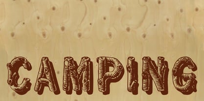 A display and decorative font built upon the theme of wood. Great for display purposes in projects about nature and environmental topics.
 - Wood Font Five by Intellecta Design,
$22.90 A display and decorative font built upon the theme of wood. Great for display purposes in projects about nature and environmental topics.
 - Gyro by Alandya TypeFoundry,
$18.00 Introducing " Gyro Serif Display ", Gyro Serif Display is designed with a conical stem to create a unique style and easy to read. Which are all equipped with plenty of language support and open type features. Gyro Serif Display was made to function especially well at large sizes. Gyro Serif Display is a very versatile font, covering a wide variety of projects, from bold magazine imagery, to branding, poster design, and more.
 - Botany by Adam Ladd,
$25.00 Botany is a distinct, hand-drawn display font with flourish designed to be unique and beautiful, yet functional — carefully drawn for quality but still rough enough to display the handmade, textured appearance. Capitals evoke a natural elegance and grab attention. Botany is great for display, branding, logos, packaging, titles, and more. Botany features: display (flourish) and text styles; regular and italic styles; flourish stylistic alternates; closed counter stylistic alternates.
 - GDR Traffic Symbols by TypoGraphicDesign,
$9.00 The typeface GDR Traffic Symbols is designed from 2021 for the font foundry Typo Graphic Design by Manuel Viergutz. The rough dingbat display typeface is inspired by the past and the future. 306 glyphs / decorative extras like icons, arrows, dingbats, emojis, symbols, geometric shapes, catchwords, decorative ligatures (type the word #LOVE for ❤ or #SMILE for ☺ as OpenType-Feature dlig) and stylistic alternates (5 stylistic sets). For use in logos, magazines, posters, advertisement plus as webfont for decorative headlines. The font works best for display size. Have fun with this font & use the DEMO-FONT (with reduced glyph-set) ■ Font Name: GDR Traffic Smybols ■ Font Styles: 1 Icons + DEMO (with reduced glyph-set) ■ Font Category: Display for headline size ■ Glyph Set: 306 glyphs / decorative extras like arrows, dingbats, emojis, symbols ■ Design Date: 2021 ■ Type Designer: Manuel Viergutz
 - LT Festive Medium - 100% free

- La Pejina ffp - Personal use only

- Obcecada Serif - Personal use only


