10,000 search results
(0.019 seconds)
- Halvert by Din Studio,
$22.00 Halvert is an amazing display font. The font is suitable for any project like branding , lettering , tshirt print and many others. Included Files : Halvert Solid (OTF) Halvert Shadow (OTF) Havert Layered (OTF) Features: Accents (Multilingual characters) PUA encoded Numerals and Punctuation (OpenType Standard) Thanks for visiting and purchasing my font!
 - French Marble by Sronstudio,
$23.00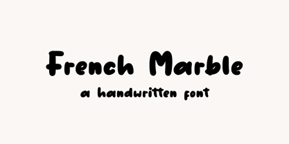 French Marble – Handwritten Font, this font Is perfect for product packaging, product designs, label, photography, watermark, special events, or anything. Features: File OTF, TTF, WOFF Uppercase and lowercase letters Multilingual, numerals, and punctuation If you have any questions feel free to drop me a message Follow Instagram: @sronstudio Thank You!
 - Bullstand by Alit Design,
$19.00 The Bull Stand Victorian typeface is characterized by its intricate detailing, ornate serifs, and elaborate curves. The letters are designed with a fine balance between boldness and delicacy, capturing the essence of Victorian elegance. The typeface showcases the artistic craftsmanship of the time, reflecting the meticulous attention paid to typographic design.
 - Miss You by Beary,
$15.00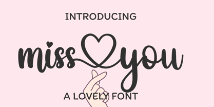 miss you is a romantic and sweet calligraphy typeface with characters that dance along the baseline. It has a casual, yet elegant touch. This font is PUA encoded which means you can access all of the glyphs and swashes with ease! Files Include : - Multilingual Support - Ligature Character - Alternates Character Thanks
 - Korbin by Talbot Type,
$19.50 Inspired by the sans-serifs of the late 19th and early 20th century, Korbin is a legible and versatile text and display face available in five weights. It mixes geometric and humanist traits to achieve a modern, clean, friendly appearance. The italic variations include bespoke characters for a more flowing look.
 - Ambassador Plus by Juraj Chrastina,
$39.00 Hairline display fonts are elegant and subtle with touch of luxury. They are the Champagne of type. Ambassador Plus Family represents a set of classy typefaces best suitable for magazines, cosmetics packaging, advertising or any kind of fine and sensitive design. The quality of spacing and kerning ensured by Igino Marini.
 - Psychoactive by Mysterylab,
$22.00 Psychoactive is a familiar style of pop psychedelic lettering; reinvented, fine-tuned, and balanced to rounded blobs of perfection. This all-caps + small-caps font is a great workhorse for retro t-shirt designs, posters, and album covers. Super-legible and perfectly kerned, it'll get your message out in style.
 - Kulacino by Imagi Type,
$15.00 Kulacino is a modern-retro display typeface inspired by the oldtimes factory signages/ plat licenses. Its seemingly rigid form is tempered by the soft, rounded corners, and fine notched details present at acute angles in the glyphs. You can use Kulacinos into anything as far as your creativity carry you!
 - Chunky Chicken by Hanoded,
$15.00 Chunky Chicken is a fat, weird, funny and unique font. It was named in honor of my five chickens, who, despite the snow and freezing temperatures, keep laying eggs every day. Chunky Chicken is a headline font, ideal for books and posters and comes with a full range of diacritics.
 - Brunches by Trustha,
$18.00 Brunches is a sans serif font family with five different styles. Basically this font is designed with geometric principles. There are several possibilities of styles to choose from as needed. Suitable for all creative project. Brunches will make each project easier and more colorful because it has several different styles.
 - Edigna by Johannes Hoffmann,
$25.00 Edigna is a clean, rounded sans-serif with a tall x-height. It contains five different weights and a matching inline style. The font family supports a variety of languages, including Western, Southern, Northern and Central European as well as Eastern European. It's good for headlines, posters, brands, and magazines.
 - Farmstand by Atlantic Fonts,
$26.00 Farmstand is a fresh and joyful font with the same kind-hearted feeling and naiveté of your local farmstand. Paired with Farmstand Goodies, 52 hand-drawn images of funky farmers' fare, you can celebrate and have some pickles, savor sweet strawberries, or get creative with Cosmos. Sometimes life can be simple.
 - Antic Mosaic by Gleb Guralnyk,
$14.00 Hello, Introducing a vintage font "Antic Mosaic". It's a decorative typeface made of hundreds of mosaic tiles. Five included font variations will help to create different color combinations. Antic Mosaic supports most of the west european languages and also includes ukrainian cyrillic characters (check out the screenshot with all available glyphs).
 - Marithan by Twinletter,
$17.00 With Marithan, every character is a hunk of hero inspiration. This superhero-style display font is the answer for projects that need great visual flair. What’s Included : File font All glyphs Iso Latin 1 Alternate, Ligature Simple installations PUA Encoded Characters – Fully accessible without additional design software. Fonts include Multilingual support
 - Ragtime by ITC,
$29.00Ragtime was designed by Alan Meetks, an all capital condensed sans serif typeface. It features thick/thin weight variances and fine line casing adornment which recalls magazine styles of the 1940s. This typeface should not be letter spaced too closely. Ragtime is excellent for anything requiring an elegant, refined look. - Sendit Safely JNL by Jeff Levine,
$29.00Sendit Safely JNL is a collection of twenty-five universal shipping symbols for labels that ensure the proper handling of packages in transit. There are two variations of each symbol and blank label frame. Also included is a circle with a slash and an "X" for labels indicating “don’t” or “no”. - TessieStandingBirds by Ingrimayne Type,
$13.95 A tessellation is a shape that can be used to completely fill the plane—simple examples are isosceles triangles, squares, and hexagons. Tessellation patterns are eye-catching and visually appealing, which is the reason that they have long been popular in a variety of decorative situations. These Tessie fonts have two family members, a solid style that must have different colors when used and an outline style. They can be used separately or they can be used in layers with the outline style on top of the solid style. For rows to align properly, leading must be the same as point size. Shapes that tessellate and also resemble real-world objects are often called Escher-like tessellations. This typeface contains Escher-like tessellations of birds. A number of years ago I decided to see how many of the 28 Heesch types of tessellations I could use to make birds standing on the backs of other birds. I found standing bird patterns for all 17 of the types that had either translated or glided edges. The TessieStandingBirds typefaces contain the standing-bird shapes that I discovered. At first glance they seem to be quite similar, but small differences matter in how they fit together. Most of the patterns require more than one character. The sample file here shows how pieces fit together to give tessellating patterns. (Earlier tessellation fonts from IngrimayneType, the TessieDingies fonts, lack a black or filled version so cannot do colored patterns.)
 - FF Hertz by FontFont,
$68.99 Low stroke contrast, generous spacing, and fine-grained weights from Light to Extra Bold make FF Hertz a workhorse text typeface which holds up well under today’s widely varying output conditions from print to screen. The quite dark Book style works well on e-ink displays which usually tend to thin out letters, as well as in print when you want to evoke the solid letter image of the hot-metal type era. Two sizes of Small Caps are included: A larger size for abbreviations and acronyms, and a smaller size matching the height of the lowercase letters. FF Hertz is a uniwidth design, that means each letter occupies the same space in all weights. This feature allows the user to switch between weights (but not between Roman and Italic styles) without text reflow. Jens Kutilek began work on FF Hertz in 2012. From a drawing exercise on a low-resolution grid (a technique proposed by Tim Ahrens to avoid fiddling with details too early), it soon evolved into a bigger project combining a multitude of influences which up until that point had only been floating around in his head, including his mother’s 1970s typewriter with its wonderful numbers, Hermann Zapf’s Melior as well as his forgotten Mergenthaler Antiqua (an interpretation of the Modern genre), and old German cartographic lettering styles. Jens likes to imagine FF Hertz used in scientific books or for an edition of Lovecraftian horror stories.
 - Jasna by Naghi Naghachian,
$95.00 Jasna is designed by Naghi Naghashian. This Font is developed on the basis of specific research and analysis on Arabic characters and definition of their structure. This innovation is a contribution to modernisation of Arabic typography, gives the font design of Arabic letters real typographic arrangement and provides more typographic flexibility. This step was necessary after more than two hundred years of relative stagnation in Arabic font design. Jasna supports Arabic, Persian, and Urdu. It also includes proportional and tabular numerals for the supported languages. Jasna Font is available in two weights, Jasna Regular and Jasna Bold. Jasna design fulfills the following needs: A Explicitly crafted for use in electronic media fulfills the demands of electronic communication. Jasna is not based on any pre-digital typefaces. It is not a revival. Rather, its forms were created with today's technology in mind. B Suitability for multiple applications. Gives the widest potential acceptability. C Extreme legibility not only in small sizes, but also when the type is filtered or skewed, e.g., in Photoshop or Illustrator. Jasna's simplified forms may be artificial obliqued in InDesign or Illustrator, without any loss in quality for the effected text. D An attractive typographic image. Jasna was developed for multiple languages and writing conventions. E The highest degree of geometric clarity and the necessary amount of calligraphic references. This typeface offers a fine balance between calligraphic tradition and the contemporary sans serif aesthetic now common in Latin typography.
 - Ridasbin by Twinletter,
$17.00 Say hello to Ridasbin, a loyal friend in the world of design! With this classic serif font, you can feel the luxury of classic modernism in every project you work on. Whether you are creating posters, brochures, or other designs, Ridasbin will give you an elegant and unforgettable touch. The elegant and classy serif style on Ridasbin will make your designs look professional and classy. Each letter is designed with subtle details and perfect proportions, creating a timeless look. Not only that but Ridasbin is also equipped with special features such as ligatures and alternative characters that allow you to experiment with various interesting letter combinations. You also don’t need to worry about using various languages, because Ridasbin supports multilingualism. This means you can be creative and reach audiences from all over the world easily. With Ridasbin, you can present a stunning classic modernism charm in your designs. Display unforgettable elegance and charm, and make a lasting impression on your potential customers. Don’t miss the chance to own this beautiful classic serif font. Get ready for satisfaction and great design results with Ridasbin! What’s Included : File font All glyphs Iso Latin 1 Alternate, Ligature Simple installations We highly recommend using a program that supports OpenType features and Glyphs panels like many Adobe apps and Corel Draw so that you can see and access all Glyph variations. PUA Encoded Characters – Fully accessible without additional design software. Fonts include Multilingual support
 - Plener by LetterPalette,
$20.00 Plener is a type family of layered fonts available in four weights: Light, Regular, Bold, and Heavy. The properties of layered fonts are matched with the classical type family structure, which makes Plener specific. The letters have humanist origins, interpreted expressively with short brush strokes separated in layers. These humanist forms keep the text set in Plein Air surprisingly legible. Layer structure allows the user to play with colors and transparency, giving the text a more personal feel. Plener comes in two additional styles, made of layers from the Light and Heavy weight. These new, display styles, named Plener LLH and Plener LHH are separated from the main family. To make the work easier, we created basic fonts out of merged layers (for every weight and style). We recommend users to set the text using these basic fonts first, then apply an opacity value lower than 100%. When satisfied, copy the text on multiple layers, changing the font to Layer A, B, and C. Apply a unique color to the text on each layer or use the same color but different opacity value. Plener fonts have the following features: ligatures, oldstyle figures, proportional and tabular lining figures, fractions, etc. Besides, there are fifteen dingbats set as discretionary ligatures. Contains Latin and Cyrillic. For some extra tips on how to work with the Plener family, see the pdf file attached to the gallery.
 - Lust by Positype,
$49.00 Lust’s original masters were completely redrawn, expanded, with a new optical size added based on customer requests. Lust now sports 6 fonts, instead of the original 4: Standard, Display, Fine, and complementing Italics. The character set has been expanded as well to include more OpenType features and more swashes. The Lust Collection is the culmination of 5 years of exploration and development, and I am very excited to share it with everyone. When the original Lust was first conceived in 2010 and released a year and half later, I had planned for a Script and a Sans to accompany it. The Script was released about a year later, but I paused the Sans. The primary reason was the amount of feedback and requests I was receiving for alternate versions, expansions, and ‘hey, have you considered making?’ and so on. I listen to my customers and what they are needing… and besides, I was stalling with the Sans. Like Optima and other earlier high-contrast sans, they are difficult to deliver responsibly without suffering from ill-conceived excess or timidity. The new Lust Collection aggregates all of that past customer feedback and distills it into 6 separate families, each adhering to the original Lust precept of exercises in indulgence and each based in large part on the original 2010 exemplars produced for Lust. I just hate that it took so long to deliver, but better right, than rushed, I imagine.
 - Fundstueck by Ingo,
$12.00 Inspired by a find a coarse but decorative font was created. "Fundstueck" ist the German term for it. Fonts can be so simple. That is what I was thinking as my attention was turned to this rusty piece of metal. Only a few centimeters in size, I couldn’t imagine which purpose it might truly serve. But my eyes also saw an E, even a well-proportioned E: a width to height ratio of approximately 2/3, black and fine strokes with a 1/2 proportion — could I create more characters on this basis? Thought it, did it. The form is based on a 5mm unit. The strikingly thick middle stroke of E suggests that the emphasis is not necessarily placed on the typical stroke, and likewise with the other characters. But if the font is going to be somewhat legible, then you cannot leave out slanted strokes completely. Eventually I found enough varying solutions for all letters of the alphabet and figures. A font designed in this way doesn’t really have to be extremely legible, which is why I forwent creating lower case letters. Nevertheless, Fundstueck still contains some diverse forms in the layout of upper and lower case letters. Thus, the typeface is a bit richer in variety. By the way — the “lower” letters with accents and umlauts stay between the baseline and cap height. And with that, you get wonderful ribbon-type lines.
 - Parsi by Naghi Naghachian,
$105.00 Parsi Font family is designed by Naghi Naghashian. This Font is developed on the basis of specific research and analysis on Arabic characters and definition of their structure. This innovation is a contribution to modernization of Arabic typography, gives the font design of Arabic letters real typographic arrangement and provides more typographic flexibility. This step was necessary after more than two hundred years of relative stagnation in Arabic font design. Parsi supports Arabic, Persian, and Urdu. It also includes proportional and tabular numerals for the supported languages. Parsi Font is available in Light, Regular and Bold. Parsi design fulfills the following needs: A Explicitly crafted for use in electronic media fulfills the demands of electronic communication. Parsi is not based on any pre-digital typefaces. It is not a revival. Rather, its forms were created with today’s technology in mind. B Suitability for multiple applications. Gives the widest potential acceptability. C Extreme legibility not only in small sizes, but also when the type is filtered or skewed, e.g., in Photoshop or Illustrator. Parsi's simplified forms may be artificial obliqued in InDesign or Illustrator, without any loss in quality for the effected text. D An attractive typographic image. Parsi was developed for multiple languages and writing conventions. E The highest degree of geometric clarity and the necessary amount of calligraphic references. This typeface offers a fine balance between calligraphic tradition and the contemporary sans serif aesthetic now common in Latin typography.
 - Hello Blushberry Script by Great Studio,
$14.00 Allow me to introduce Hello Blushberry - Font Duo is a playful script containing many choices of alternative characters to choose from as well as ligatures that look natural to add to the authenticity of letters. A collection of strange and initial swash tips is also included to add finishing touches or fill the design space in your type design. Hello Blushberry a modern handwriting fonts, loaded with awesome opentype features, and full alternative upper and lower case character sets. make custom letters a dream thanks to all the extra decorative choices you can enter for beautiful and unique customizations - swash, endings, alternative letters and ligatures all make it the prettiest little thing since tutus and tiara. Designed to work harmoniously, this duo font consists of super fine and casual signature scripts and a complete and clean set of all sans serif letters. Sans Serif fonts consist of two outline fonts of different weights, and a regular version. Layer them with different colors and turbidity to get a million different views. This font is perfect for branding, logos, web and editorial design, branding, prints, invitations, crafts, quotes, and more. Includes Files: • Hello Blushberry Script • Hello Blushberry Script Capitals Need help? If you need help or advice, please contact me by e-mail at Greatstudio92@gmail.com.
 - FF Meta Variable by FontFont,
$344.99The FF Meta® design is a sans serif, humanist-style typeface that was designed by Erik Spiekermann for the West German Post Office (Deutsche Bundespost). It was subsequently released in 1991 by Spiekermann's company FontFont The FF Meta family, initially released as a commercial font in 1991, now comprises over sixty fonts. The FF Meta 2 family was released in 1992, the FF Meta Plus family in 1993, and in 1998 a facelift of the complete font family reclassified the FF Meta series and combined them into family-sets named FF Meta Normal, FF Meta Book, FF Meta Medium, FF Meta Bold and FF Meta Black. These are all available in Roman, italic, small caps and italic small caps. Between 1998 and 2005, further light stroke weights and a condensed family were introduced by Tagir Safayev and Olga Chayeva and were named: FF Meta Light and FF Meta Hairline. The last addition to the growing FF Meta font family is FF Meta Serif released by FSI in 2007. FF Meta Variable Roman is a single font file that features two axes: Weight and Width. For your convenience, the Weight and Width axes have preset instances. The Weight axis has a range from Hairline to Black. The Width axis provides a range of condensed values. This Roman (upright) font is provided as an option to customers who do not need Italics, and want to keep file sizes to a minimum. FF Meta Variable Italic is a single font file that features an italic design with two axes: Weight and Width. For your convenience, the Weight and Width axes have preset instances. The Weight axis has a range from Hairline to Black. The Width axis provides a range of condensed values. This Italic font is provided as an option to customers who do not need Roman (uprights), and want to keep file sizes to a minimum. FF Meta Variable Set is a single font file that features three axes: Weight, Width and Italic. For your convenience, the Weight and Width axes have preset instances. The Weight axis has a range from Hairline to Black. The Width axis provides a range of condensed values. The Italic axis is a switch between upright and italic - Cassandra by Wiescher Design,
$49.50 Cassandra has two kinds of letters, wide Capitals on the (shift) capitals and narrow ones on the (no shift) lowercase. You can match them as you like. Take one narrow S and a wide one or two wide ones, whatever turns you on. It will almost always look good. Cassandra is my "bow" to Adolphe Mouron Cassandre. Yours sincerely mixing things up for you Gert Wiescher
 - Winslow Title by Kimmy Design,
$25.00 Winslow Title is a high contrast modern type family comes in two styles and a monolinear script family. The traditional proportions of Winslow Title are historical in nature and follow the design and style of Winslow Book as a high contrast variant. The Winslow Title Mod family is a contemporary take on the style, with tapering terminals and less pronounced finials. Each family includes both styles, to be accessed through the opentype panel as a stylistic alternate. If preferable, you can purchase the entire family collection to have easier access to both styles, but it's not necessary. The typeface family comprises of roman and italic styles in six weights from Thin to Black and two widths in the roman style: Regular and Narrow. The accompanying script family has a single weight but offers five tracking widths, from Narrow to Wide. The bundle is an elegant combination of styles perfect for titling and display design. The serif typeface is packed with features that make ideal titling styles. Not only do they include the Stylistic Alternates, but also Titling Alternates, Discretionary Ligatures, Small Capitals, Swashes and Contextual Ligatures. As noted previously, the typeface comes in two styles, Traditional and Modern. Each can be accessed either by the Stylistic Alternates or Stylistic Sets. Titling Alternates are alternates that expand the ball terminals to K, R, V, W, and Y (see Titling Alternates slide). Contextual Ligatures are for capital combinations with A that tighten the gap created by the extended serifs. It connects characters with a pairing serif (the lower right serif of the M with the lower right serif of the A) and bridges them together. This combination works for single and multiple A combinations. It is turned on automatically in the Opentype panel and shouldn’t need to be accessed individually. Alternatively, the Discretionary Ligatures feature combines diagonal or baseline stems with lifted small capitals, creating a unique combination of characters. Swashes is an extensive feature that offers up to five swash options per many of each character. These can be selected via the Glyphs panel or as character alternates in Adobe programs. The Script family has a feature set of it’s own, with initial and final swashes on lowercase letters, middle swashes for select characters, and a titling feature that joins words together by replacing the space with a line. Stylistic alternates create a bouncing baseline on connecting strokes. *Note: there is no great need to purchase both families as all styles can be accessed via Opentype features, but if customers prefer to purchase both styles, it can be done by selecting the Complete Typeface Family collection.
 - Spleeny by Galapagos,
$39.00A gentle breeze on a warm summer's day. A cozy gathering of friends and family around a crackling fire. The sweet aroma of freshly baked cinnamon bread. A slow walk in the autumn woods, light sparkling down through the multi-colored leaves. Billowing white clouds against a stark azur sky, leisurely floating past the tops of palm trees. What do these idyllic scenes all have in common? A: Most people can never find the time to enjoy any of them. B: These are just some of the things you would never try to describe using a crankish font like Spleeny Decaf GD. Just as ITC Fontoon was designed to be used with the many critters that populate the "Toonie" series of fonts, Spleeny Decaf GD was created by Steve Zafarana for use in the balloned dialogue portions of a new panel cartoon feature currently under development. Spleeny Decaf GD is the first completed font in a family that ranges from the jittery san serif Spleeny Espresso GD to the sedate and serifed Spleeny Asleep GD. Each font in the series appears a little more relaxed and staid than its predecessor. None of them however, will find themselves being used for the text of any legal documents. Spleeny Decaf GD is the perfect font to use when the weight of the message is leaning towards the light and jocular side of things. So remember, if your documents are starting to put you on edge, it may be time to switch to decaf. Spleeny Decaf GD that is. - Ombres by Typephases,
$25.00 Very close thematically and in style to the rest of our “whimbats” (the Absurdies, Bizarries, Illustries, Genteta and Whimsies series), the Ombres contain a number of peculiar silhouettes and illustrations of people that range from cute to scary, with everything in between. Ombres offers152 pictures in 3 files. These imaginary characters were produced with different techniques: quick pencil sketches, ink, watercolour, though once digitized and simplified to bring them into the font files there is little apparent difference. The silhouettes, rather than flat shadows are more dimensional in their look, because they have been digitized retaining the original brushwork or pencil strokes of their source drawings. Some of them remind of the venerable tradition of metal stock cuts from vintage type foundries. The digitized results are quite different, but the energetic nature of the subjects has been mantained. Their vectorial file format means you can use them at any size with no loss of quality. Every Ombres dingbat offers ready-made images for a variety of creative projects. They can be used as they come or easily customized in any graphics program. At small sizes they are ideal spot illustrations with a whimsical touch; at large sizes they can bring a whole page, a spread or even a big poster to live.
 - Project Y - Personal use only

- Básica - Personal use only

- Project X - Personal use only

- ProLamina - 100% free

- The End. - Unknown license

- Trium - Personal use only

- Athens Classic - Unknown license

- Screenplay JNL by Jeff Levine,
$29.00Screenplay JNL was modeled from the signage seen in an old photo of the RKO movie studios building circa the 1930s. This multi-line lettering is so classic of the Art Deco period. For best effect and readability, use wider spacing between letters. For single words or initials, regular spacing should do fine. - Berto by alphabeet.at,
$30.00 Berto is a variable monoline font face. With two stylistic sets it is flexible in usage either for display or for reading matters. It was specially drawn for a corporate design in 2011, and since then has been continuously rebuilt and extended to a font family with five weights and a variable font.
 - Green Nature by ZetDesign,
$10.00 We're introducing our new product that we named Green Nature..... this font is inspired by leaves, so it gives a beautiful and natural impression. This font is very suitable for clothing, logos, magazines, banners, etc. With natural touch, this font is the best choice for your natural business. Files included: green nature.otf


