10,000 search results
(0.043 seconds)
- MacType - Unknown license

- MicroExtendFLF - Unknown license

- ArmWrestler - 100% free

- Legendum - 100% free

- Telegrama - 100% free

- RaveParty Narrow - Unknown license

- Pakenham - Unknown license

- Omicron Zeta - Unknown license

- Embossing Tape 1 (BRK) - 100% free

- RNS BARUTA BLACK - 100% free

- Throll by Skiiller Studio,
$18.00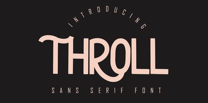 THROLL Modern sans serif font. It has a elegant, classy look and modern. It’s a great font for fashion, apparel projects, signature, album cover, logo, branding, magazine, social media, & advertisements. What's include: Stylistic alternate PUA Encoded Characters - Fully accessible without additional design software. Basic Latin Language Support (AÀÁÂÃÄÅCÇDÐEÈÉÊËIÌÍÎÏÑOØÒÓÔÕÖUÙÜÚÛWYÝŸÆß )
 - Ningrat by Bejeletter,
$20.00 Ningrat is a mix of classic with modern serif font family. It’s weight cover regular. The black weight of Ningrat Display font offers very strong impression. As a great choice for title and headers, it pairs well with most of the popular sans serif fonts for body text.
 - Lunar by Etewut,
$20.00 Lunar is a handwritten sans serif typeface that was created for the opera Pierrot Lunaire during Diaghilev festival 2018 in Perm. There are 3 fonts in the family of LUNAR: light, regular and bold. It supports all EUROPEAN languages, basic CYRILLIC and GREECE language. It's enough to make sensation!
 - Pauline by insigne,
$24.99 Pauline is a sans serif with a strong influence from retro scripts. Pauline is a geometric face formed with slow and deliberate rounded brush strokes. The tall ascenders give it a useful touch of naïveté. It’s a face suitable for some interesting titling and short bits of copy.
 - Condensed Moderne JNL by Jeff Levine,
$29.00 The Dec., 1936 - Jan., 1937 edition of Radio Mirror offered up a condensed, hand lettered sans serif type design that - although an Art Deco style- is also somewhat futuristic in design. This is now available as Condensed Moderne JNL in both regular and oblique versions.
 - Dustown by Letterhend,
$17.00 Dustown is an organic font with natural vibes! Contain two fonts, Sans and Serif with Rough and Stamp Style. You can use this font for every project. Suitable for branding logo, hand lettering, or apparel design. This font duo also support multilingual, number and symbol.
 - Quero by Eotype,
$16.00 Quero is a decorative sans serif font that has thin,elegance and versatility. This unique font is perfect for creating beautiful logotypes, stunning magazine designs and more. This font can be your solution in completing projects that are equipped with various alternate and ligature collections.
 - Extrend by Attractype,
$15.00 Extrend, a clean and modern sans serif typeface, ideal for text that requires more space. suitable for corporate use as well as corporate branding and identity design, magazines, books, comics. With five styles, Extrend can be used to make your creative projects more interesting.
 - Real One Specific by Sulthan Studio,
$8.00 Real one specific! This font duo comes with a script typeface as well as a sans serif typeface. The two typefaces complement each other really well with beautiful, eye-catching handwritten nuances. This font is very light and can also make your job stand out.
 - Sauce Grotesk by Creative Sauce,
$36.00 Sauce Grotesk is a compact typeface much like the classic unassuming sans serif grotesques but with softer features that shows fluidity and a sense of easiness. We wanted a typeface that can relate to a broader audience for maximum message clarity while maintaining aesthetic qualities.
 - Dreamy Notes Script by Subectype,
$15.00 The Dreamy Notes Duo is a stunning and comprehensive duo font (script and sans serif), ideal for giving your projects a branded but friendly feel. The two included styles can be combined together perfectly but are also beautiful on their own. Thank You, Subectype
 - Anona by Nova Type Foundry,
$29.99 Anona brings the upright italic to fruition and shows the handwriting shapes in a sans serif great to use in packaging and branding. Anona is an upright italic sans serif typeface perfect for packaging and playful identities. Explore the stylistic sets to see all the different shapes. Fruity and friendly upright italic sans serif come to brighten your projects. A warm and friendly sans serif will work for your identity. It has a complementary slanted version.
 - #NAME? by OtherwhereCollective,
$29.00 -OC Format Sans is the third incarnation of this geometric grotesk sans serif which fuses the style of Futura with the rhythm and proportions of Akzidenz. It comes in two styles, standard and a new Print family where crisp sharp edges have been made blunt in reference to the ink spread that occurs when printing on uncoated paper stock. It can give digital media a softer more approachable analog aesthetic. Typical of both grotesk and geometric styles the design has an even weight with minimal stroke contrast and the slanted form is an oblique rather than a true italic. The default double-story �a� and �g� give an academic touch, the single story versions of Set 1 are more friendly and approachable while Set 2 changes the look into something more scientific. Made with tireless attention to detail and kerning it's perfect for logotypes and extensive text, supports multiple languages and comes with a plethora of OpenType features including standard and discretionary ligatures, social icons, symbols, and multiple figure styles including roman numerals.
 - Shinokai by Lukas Schiltknecht,
$14.00 The Shinokai is a sans serif of two weights that is both dynamic and consequent. Originally concepted as a font for application letters by Lukas Schiltknecht it quickly became a more sophisticated piece of work. This Typeface is inspired by some of his favorite fonts the FF DIN and the ITC Officina. It is made to suit a variety of uses like advertising and packaging, film and tv, editorial and publishing as well as posters and billboards.
 - Grenoble by Letterhend,
$14.00 Say hello to Grenoble, the sans-serif font that combines the best of modern design with the elegance of vintage feels. With its monoline strokes and clean lines, Grenoble is both simple and sophisticated. Choose between the regular and slant styles to give your designs the perfect balance of classic and contemporary style. This font perfectly made to be applied especially in logo, and the other various formal forms such as invitations, labels, logos, magazines, books, greeting / wedding cards, packaging, fashion, make up, stationery, novels, labels or any type of advertising purpose. Features : Uppercase & lowercase Numbers and punctuation Alternates & Ligatures Multilingual PUA encoded We highly recommend using a program that supports OpenType features and Glyphs panels like many of Adobe apps and Corel Draw, so you can see and access all Glyph variations.
 - Nisse by Typoforge Studio,
$30.00 Say hello to a new Typoforge member! Nisse is a display font family that consists of 4 styles (including italics). The regular and rough versions differ in the amount of wear. It’s inspired by Rex typeface first published by „The Jan Idzikowski and Co. Foundry“ in 1930. Nisse has a high amount of detail making it ideal for large prints and poster design. It is specified by a huge amount of automatic alternates. Each basic latin letter has five versions, the numbers have thee versions and extended latin letters have two versions.
 - Baedar by Craft Supply Co,
$20.00 Introducing Baedar – Bold Rounded Sans Serif Font Baedar – Bold Rounded Sans Serif, a font designed to captivate your attention, is both inviting and approachable. Its rounded corners create a warm and friendly vibe that instantly draws in readers. Eye-Catching Appeal Baedar’s boldness immediately grabs your eye, making it perfect for headlines and attention-grabbing text. Whether it’s a poster, website, or marketing material, this font ensures your message unequivocally stands out. Versatile Usage Furthermore, with its rounded edges, Baedar exudes friendliness. Consequently, it suits a wide range of projects, from branding to social media posts, adding a touch of approachability to your content. Readability and Impact Moreover, Baedar combines readability with visual impact, making it ideal for conveying important messages with flair. Its boldness ensures crystal-clear clarity, while the rounded corners gently soften the overall look. In Conclusion Baedar – Bold Rounded Sans Serif Font strikes the perfect balance between eye-catching design and friendliness, making it an excellent choice for various creative endeavors. Therefore, seize your audience’s attention and convey your message effectively with this versatile font.
 - Kaleko 105 by Talbot Type,
$19.50 Kaleko 105 is inspired by the classic, geometric sans-serifs such as Gill Sans, but has shallower ascenders and descenders for a more compact look. It’s a well-balanced, versatile, modern sans, highly legible as a text font and with a clean, elegant look as a display font at larger sizes. It includes old style non-aligning (lower case) numbers, both proportional and tabular as well as accented characters for Central European languages. The Kaleko 105 family comprises of six weights, and is closely related to Kaleko 205. The most notable differences between the two variations, are the single-storey lower case a and g in Kaleko 105, where they are two-storey in Kaleko 205.
 - Kaleko 205 by Talbot Type,
$19.50 Kaleko 205 is inspired by the classic, geometric sans-serifs such as Gill Sans, but has shallower ascenders and descenders for a more compact look. It’s a well-balanced, versatile, modern sans, highly legible as a text font and with a clean, elegant look as a display font at larger sizes. It includes old style non-aligning (lower case) numbers, both proportional and tabular as well as accented characters for Central European languages. The Kaleko 205 family comprises of six weights, and is closely related to Kaleko 105. The most notable differences between the two variations, are the two-storey lower case a and g in Kaleko 205, where they are single-storey in Kaleko 105.
 - Optima Cyrillic by Linotype,
$65.00Many typefaces are distinctive or attractive at the expense of legibility and versatility. Not so the Optima® family. Simultaneously standing out and fitting in, there are few projects or imaging environments outside of its range. Although Optima is almost always grouped with sans serif typefaces, it should be considered a serifless roman. True to its Roman heritage, Optima has wide, full-bodied characters – especially in the capitals. Only the E, F and L deviate with narrow forms. Consistent with other Zapf designs, the cap S in Optima appears slightly top-heavy with a slight tilt to the right. The M is splayed, and the N, like a serif design, has light vertical strokes. The lowercase a and g in Optima are high-legibility two-storied designs. Optima can be set within a wide choice of line spacing values – from very tight to very open. In fact, there are few limits to the amount of white space that can be added between lines of text. Optima also benefits from a wide range of letter spacing capability. It can be set quite tight, or even slightly open – especially the capitals. If there are any guidelines, Optima should be set more open than tight. It’s not that readability is affected that much when Optima is set on the snug side; it’s just that the unhurried elegance and light gray typographic color created by the face are disrupted when letters are set too tight. Optima is also about as gregarious as a typeface can be. It mixes well with virtually any serif design and a surprisingly large number of sans serif faces. The Optima family is available in six weights, from roman to extra black, each with an italic counterpart. In addition, the family is available as a suite of OpenType® Pro fonts, providing for the automatic insertion of small caps, ligatures and alternate characters, in addition to offering an extended character set supporting most Central European and many Eastern European languages. When you’re ready to find its perfect pairing, browse these fantastic matches: Monotype Century Old Style™, Dante®, Frutiger® Serif, Joanna® Nova, Malabar™, and Soho®. - Optima by Linotype,
$45.99 Many typefaces are distinctive or attractive at the expense of legibility and versatility. Not so the Optima® family. Simultaneously standing out and fitting in, there are few projects or imaging environments outside of its range. Although Optima is almost always grouped with sans serif typefaces, it should be considered a serifless roman. True to its Roman heritage, Optima has wide, full-bodied characters – especially in the capitals. Only the E, F and L deviate with narrow forms. Consistent with other Zapf designs, the cap S in Optima appears slightly top-heavy with a slight tilt to the right. The M is splayed, and the N, like a serif design, has light vertical strokes. The lowercase a and g in Optima are high-legibility two-storied designs. Optima can be set within a wide choice of line spacing values – from very tight to very open. In fact, there are few limits to the amount of white space that can be added between lines of text. Optima also benefits from a wide range of letter spacing capability. It can be set quite tight, or even slightly open – especially the capitals. If there are any guidelines, Optima should be set more open than tight. It’s not that readability is affected that much when Optima is set on the snug side; it’s just that the unhurried elegance and light gray typographic color created by the face are disrupted when letters are set too tight. Optima is also about as gregarious as a typeface can be. It mixes well with virtually any serif design and a surprisingly large number of sans serif faces. The Optima family is available in six weights, from roman to extra black, each with an italic counterpart. In addition, the family is available as a suite of OpenType® Pro fonts, providing for the automatic insertion of small caps, ligatures and alternate characters, in addition to offering an extended character set supporting most Central European and many Eastern European languages. When you’re ready to find its perfect pairing, browse these fantastic matches: Monotype Century Old Style™, Dante®, Frutiger® Serif, Joanna® Nova, Malabar™ and Soho®.
 - PF Diplomat Serif by Parachute,
$45.00 Diplomat Serif is a modern serif typeface with Didone characteristics, quite useful for intense editorial jobs. Its open character shapes, low contrast and discreet serifs enhance legibility and provide a fresh, clean and contemporary look. Its matching sans-serif version Diplomat Sans was designed to complement it for demanding publishing and corporate applications. Supports Latin and Greek.
 - Reaktif by Plasebo Studio,
$14.90 Reaktif type family has been created with a new and modern approach to the popular geometric sans serif type. It has a very legible, multifunctional, contemporary and dynamic design. Sharp-angle details in minuscule letters “a, b, d, f, g, m, n, p, q, r, t, u” boosts its' characteristics in the Reaktif font family. Reaktif type family contains 24 fonts and 550+ glyphs. Stylistic alternatives come with 30+ ligatures and many opentype features. It can meet your needs in many medium such as Reaktif branding, editorial, web and printing.
 - Gilroy by Radomir Tinkov,
$25.00 Gilroy is a modern sans serif with a geometric touch. A younger brother of the original Qanelas font family. It comes in 20 weights, 10 uprights and its matching italics. The Light & ExtraBold weights are free of charge, so you can use them to your heart’s content. Designed with powerful opentype features in mind. Each weight includes extended language support (+ Cyrillic), fractions, tabular figures, arrows, ligatures and more. Perfectly suited for graphic design and any display use. It could easily work for web, signage, corporate as well as for editorial design.
 - SK Gunaydin by Salih Kizilkaya,
$9.99 SK Gunaydin is a display sans serif font family designed by Salih Kızılkaya in 2022. Thanks to its high contrast ratio, it offers high readability in all the media you need. It contains a total of 3120 glyphs, 624 glyphs in each font, and offers full support for languages using the Latin alphabet. This font family, which includes 3 different styles, classic, outline and shadow, and 5 different fonts, contains all the characters you will need in designs. You can visit the Behance prohe page for high resolution versions of the project images.
 - Baggage Claim JNL by Jeff Levine,
$29.00 Sometimes type designs are set aside as one project takes priority over another and occasionally it becomes overlooked. One such example is a set of extra bold, sans serif stencil characters drawn out in 2017. Regrettably, as much time has passed, no backstory can be applied to this typeface. It was checked against existing releases in the Jeff Levine Fonts library and didn’t seem to have been re-worked for any subsequent release. With this in mind, Baggage Claim JNL makes its belated appearance and is available in both regular and oblique versions.
 - Spring Garden by Supersemarletter,
$11.00 Spring Garden is a modern and neat sans serif font. It can be matched to a large set of projects, so add it to your creative ideas and notice how it makes them stand out! Font Features : • Regular version • Character set A-Z in uppercase and lowercase • Alternates option • Numerals & Punctuation • Accented Characters • Multiple Languages Supported • Format File: OTF Recommended to use in Adobe Illustrator or Adobe Photoshop with opentype feature. If you have questions, just send me a message and I'm glad to help. Best Regards, Supersemar Letter
 - Corso by Dominik Krotscheck,
$7.99 Corso is a clean condensed sans serif font family. It comes in upright, slanted and italic, in six weights each. It includes useful typographic features such as fractions, ligatures and case sensitive forms. Also included are double- or single-storey versions of a and g, you can switch via stylistic OpenType sets. Other letters with alternative forms accessible the same way are ß and ampersand. Corso works especially great for larger size uses such as signage, headlines or posters. But that doesn’t mean that it isn’t also useable for short texts.
 - Mene One Mexicali by Handselecta,
$38.00This style mimics the flare or upward fade that comes with the use of a spray paint can, as the tops of the letters flare, and become wider. An original font style, named after the border town of Mexicali, this font style falls under the larger umbrella of what is called Cholo-graffiti style. Originally from New Jersey, MENE has made his home in, New York City. He had a brief albeit satisfying career of street bombing in the late 90s that saw its end with a brief encounter with the Vandal Squad. Now a family man, Mene has dedicated himself to the preservation and education of style in its many forms. - Montio by Katatrad,
$29.00 Montio is a simple Humanist sans serif typeface with rounded corners. It’s a family of 4 fonts: 2 weights and their italics.


