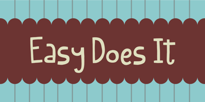
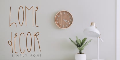
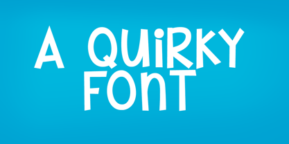
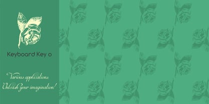
I started making this font with a few days left at work before my 4 weeks vacation. I managed to finish the font on the day my vacation started - but with no stress. Now I can look forward to 4 good weeks at the summerhouse, and look back at the release of this laid back, handmade and somewhat quirky font. Personally I’d use it for anything that needs an organic handmade look - perhaps packaging, posters, flyers or maybe even clothes or toys for kids!
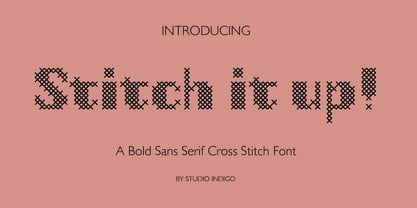
Stitch it up is a bold sans-serif cross-stitch font. It is intended for headings, advertisements and signs rather than continuous body text. It has multilingual support for all European languages.
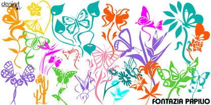
Create your fontisimo butterfly garden with this original fontazia typeface featuring 52 unique hand-drawn butterfly inspired flowers! Whether you're looking for a modern papillion fluttering about or a metamorphosis experience, bring all your butterfly garden fantasies to life with these subtly bold, subtly complex inspirations.
great for any projects including : branding, logo, stationery, business card, signage, flyer, brochure etc. Almost all industries will be match for this typeface: comic, events, florist, gardening, makeup artist, travel, cartoon, musician etc
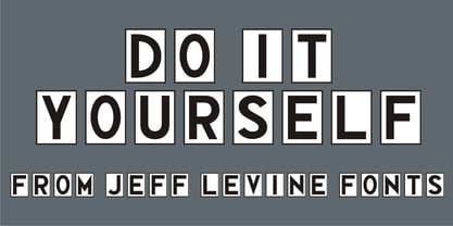
Do It Yourself JNL was modeled after self-adhesive vinyl letters and numbers manufactured by Duro Art Industries of Chicago - formerly the Duro Decal Company. The hand-drawn look of the original lettering was retained by Jeff Levine to stay true to the design, and the rectangles that border each glyph represent the pieces of self-adhesive vinyl onto which the characters were silk screened. Limited character set.
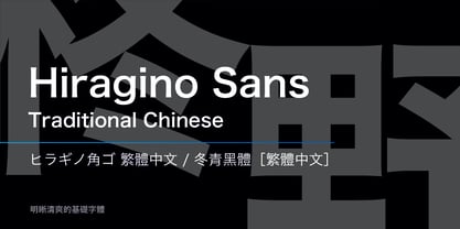
The M XiangHe Hei Traditional Chinese typeface merges traditional brush strokes with modern letterforms to carefully balance traditional calligraphy with humanist design. Named for the smooth movements of a flying crane, the M XiangHe Hei typeface is designed to glide across the page, and features strokes that are partly derived from the Kaishu calligraphic style – an everyday script which dates back hundreds of years. M XiangHe Hei TC features Neue Frutiger for its Latin glyphs, and works harmoniously Neue Frutiger World and Monotype’s CJK typefaces: Tazugane Gothic (Japanese) and Seol Sans (Korean). M XiangHe Hei TC is a great choice for global brands using sans serif Latin typefaces looking to maintain their visual identity, and communicate with a consistent tone of voice with Traditional Chinese. The M XiangHe Hei TC fonts have over 19,000 glyphs, and support the BIG5/HKHCS and CP950 character sets for Traditional Chinese.
Inspired by the large American wood type of the Wild West, Richard Yeend created Italienne Std in 2002. Italienne Std is both very condensed and very decorative. It sports heavy, band like serifs, reminiscent of other italienne-style fonts, like Westside. Italienne-style fonts rose in popularity during the early 19th Century, when designers were first beginning to experiment with extreme contrast within letterforms, and across lines of text. Interestingly enough, letterforms with similar designs were just as common during the 1970s as during the 1870s, so you may use Italienne Std for applications ranging from country music concerts to disco parties. Italienne Std is part of the Take Type 5 collection from Liinotype GmbH."
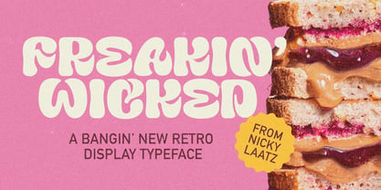
It's phat, it's happy, it's weird, it's wonderful. Say hello to Freakin Wicked Display font! A retro groovy display font, but with a cheeky touch of the future. Great for any project that needs something a little loud and lot avant garde.
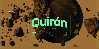
A modern square sans serif that dares to be different. There's a tech-spacey air to Quiron, it will suit all modern display needs. It's low contrast and minimalist nature grants its design an avant-garde look & feel, ready to be part of sophisticated packaging or galactic exploration video game title.
A font that's a sans on the outside and a serif on the inside. Inspired by fonts like Rotis, Clarendon and a little Avant Garde, Interna has a slightly vintage feel to it.
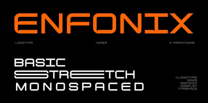
Enfonix is a modern sans display font suitable for the needs of logos, magazines, posters, etc. with dynamic shapes, Enfonix is equipped with 3 alternative width sizes and 2 typeface shapes (Std and Pro). Enfonix is also available in a monospaced style Enfonix Std: Standard form 3 alternative width variations ( Strecth Font ) uppercase and lowercase symbols & numbers multilingual Enfonix Pro: More unique and proportional typeface 3 alternative width variations ( Strecth Font ) uppercase and lowercase symbols & numbers multilingual Enfonix Mono Std: Standard form only one width variation Monospaced uppercase and lowercase symbols & numbers multilingual Enfonix Mono Pro: More unique and proportional typeface only one width variation Monospaced uppercase and lowercase symbols & numbers multilingual
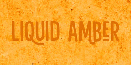
Liquidambar is actually a beautiful tree, native to America. I have one in my garden and I love its autumn colors! Liquid Amber is something else: it is a handmade all caps font that comes with oodles of diacritics, some swashes and some alternate glyphs. Enjoy!
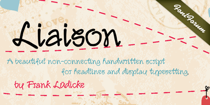
Liaison is a beautiful non-connecting handwritten script for headlines and display typesetting, e.g. for perfumes, reports of the glamour world, magazines about gardening and recipes, covers for romance novels and alike.
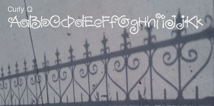
CurlyQ new from Rae Kaiser and Outside the Line. A curly, swirly, girly kind of font. A delightful headline font for your next garden party or note to the kids from the tooth fairy.
Ned Std. is part of a series of typographic experiments from the young Swiss designer Michael Parson. Using a wide, horizontal hexagonal grid, Parson created the system of letters that make up this font. Text set in Ned Regular takes on a modular, honeycomb-like appearance. For an interesting effect, try overlapping individual letters, or use a few letters together as elements in a logo. A great companion face to Ned Std. is Linotype's Hexatype Bold. Both Ned Std. and Hexatype Bold have been included in the Take Type 5 collection, along with eight further constructions from Parson."
Years ago, I developed an interest in the Japanese art of dwarfed potted trees, bonsai. I bought some books on the subject from Brooklyn Botanic Garden. In one -- Handbook on Bonsai: Special Techniques (seventh printing, February 1976) -- the type was bad. Old worn lead type, I suspect, spread wide in the tops of characters and disappearing on the bottoms. Two decades later, I came across my Brooklyn Botanic Garden collection and was struck again by this interesting type. Inspired, I made a typeface. Didn't take me long to decide on a name for it, either: a name with a double-meaning, based both on its look and its inspiration. Bonsai, the typeface, has two styles, a roman and a true italic.
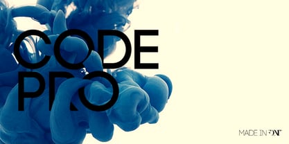
Code Pro is a font family inspired by the original Sans Serif fonts like Avant Garde or Futura, but with a modern twist. It is clean, elegant and straight-to-the-point. Code font is applicable for any type of graphic design—web, print, motion graphics, etc.—and perfect for t-shirts and other items like posters and logos.