10,000 search results
(0.074 seconds)
- Burra by Creativemedialab,
$18.00 Introducing Burra, a Variable display font. All capital alphabet with a wavy psychedelic look. Inspired by liquify and water strokes. Burra Consists of 3 widths and 5 weights on each, a total of 15 fonts. It is Variable font, officially known as Open-Type Font Variations. You can generate lots of width and weights with the two available slider axis. Burra will add fresh fun vibes to your designs. This font is perfect for clothing, book covers, titles, etc.
 - Wonderful Melanesia by Arterfak Project,
$15.00 Say hello to Wonderful Melanesia. A fancy font combination, minimalist signature, and elegant serif. These fonts are carefully designed with attention to every detail of the letterforms, which makes the perfect font combination that you can apply for your design that needs an elegant touch, classy looks, and minimalist. The serif font is designed with a few spacing so that it provides more clarity when reading it, and the signature font designed with dynamic strokes that give it the more natural handwriting. Wonderful Melanesia has equipped with many OpenType features. There are beautiful ligatures, Stylistic alternates, and swashes which you can use it to get your design more softly. Fonts featured : Uppercase Lowercase Numbers Punctuation & symbols Stylistic alternates Ligatures Swashes Accented characters : ÀÁÂÃÄÅÆÇÈÉÊËÌÍÎÏÐÑÒÓÔÕÖØÙÚÛÜÝÞßàáâãäåæçèéêëìíîïñòóôõöøùúûüýþÿıŁłŒœŠšŸŽž Thank you for watching and have a wonderful day!
 - Fortezza by Eurotypo,
$22.00 Fortezza is a family of fonts inspired by the great masters who have created the Modern Roman style: Firmin Didot (1764 -1836) and Giambattista Bodoni (1740 -1813) Both typefaces can be similar, but a trained and close vision, show clear differences in the final result, like its weight and the degree of transition of the strokes. The type of Didot suggests greater warmth and elegance, they are characterized by extreme contrast in thick strokes and thin strokes, by the use of serifs very thin and by the vertical stress of the letters. while the Bodoni type conveys a greater robustness and hardness. Fortezza brings together the elegance and spirit of both types, but proposes a contemporary vision, establishing a distance with certain features typical of the baroque that was manifested at that time.
 - Lazov - Unknown license

- Romance Fatal Goth Premium - Personal use only

- WATERCOLORS CLEAN PERSONAL USE - Personal use only

- TrajanusBricks - Unknown license

- Entendre Rough by Wordshape,
$30.00 Entendre Rough defies the conventions of most distressed typefaces, as it is an actual text typeface family. Sure, you can use it for your big display type, but you can also use it for body text. Entendre Rough is a stately, commanding and handsome distressed sans serif typeface family that pulls reference from Trajan capitals, the history of English calligraphy, and a variety of other sources to summon a sense of warmth, consideration, trust and authority. Entendre Rough spans 22 weights and styles including Regular and Condensed versions. The large x-height and refined characteristics of the family lend the family a sober and sophisticated appearance that is suitable for both print design and on-screen use. Entendre Rough includes Central and Eastern European language support as well as Western European language support, including Greek and Cyrillic. Entendre Rough’s generous x-height and medium-length ascenders and descenders offer pronounced readability, making the family useful for text typesetting both in print and on screen. Within, humanist elements are tempered with monumental construction, making the heavier weights go-tos for display design work. All of the Entendre Rough family of typefaces feature Western, Eastern and Central European language support alongside nuanced Greek and Cyrillic. Entendre Rough pairs well with our non-distressed Entendre family and our rounded sans serif family Elpy, sharing similar proportions and spacing.
 - Athan by Thinkdust,
$10.00 Athan is an uppercase geometric sans-serif typeface designed by Dani Montesinos in 2009. Inspired by one piece of lettering from the 1970s, Athan offers something a little different in terms of typography. With strong geometric forms, and highly distinctive characters, it's sure to catch your eye.
 - Bokis by Sign Studio,
$10.00 Bokis is a sans serif family that has simple and strong characters. This font will provide a confident and impressive base headline to any of your designs. Balance on each side is well maintained. It's ideal for headlines, titles, posters, branding, and logotypes that require big impact.
 - Akerley by Surplus Type Co,
$18.00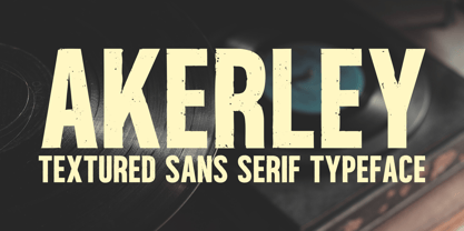 Introducing Akerley, a vintage-inspired textured sans serif font that's perfect for apparel, branding, titles, and headlines. This striking font combines a gritty, handcrafted texture with excellent legibility, making it a versatile choice for your creative projects. Akerley offers a full character set with multilingual support. Elevate your work with the bold and captivating charm of Akerley today!
 - Fromage by Adam Ladd,
$25.00 Fromage is a modern and bold high-contrast sans serif that balances visual interest with restraint. Designed with Adam Ladd’s signature personality, Fromage has dramatically angled terminals and elongated stroke endings that lend both an elegant air and a dynamic rhythm, making it an obvious choice for fashion, beauty, or luxury branding. With horizontal rather than the sheared terminals, Fromage Alt offers a more classic and refined look, conveying touches of a traditional serif Didone.
 - Candytwist by Moderinatos,
$15.00 Candytwist is a stylistic sans-serif font with unique patterns for a holiday season vibe. Geometric yet stylistic, it gives a modern holiday look while having some retro tones. Most notably, the stylistic & symbol will make your branding applications impeccable! Candytwist's features include: A Christmas vibe Multilingual support with most latin languages. Rounded strokes Candy cane design With a minimal and festive design, this font fits with seasonal brands, advertisements, festive publications and more!
 - Kessel 105 Remix by Talbot Type,
$19.50 A remixed variation, available in three weights, of the popular Talbot Type geometric sans Kessel 105 . The addition of occasional flourishes at the intersections of strokes, in both upper and lower case, adds character charm, making the font a perfect titling font to accompany Kessel 105, or a display font in its own right. Kessel 105 Remix features a comprehensive glyph set including a number of discretionary ligatures and accented characters for central European languages.
 - Lemonade Stand by Sharkshock,
$125.00 Looking for the perfect all-caps display font to accentuate your next project? Lemonade Stand is a stylish yet childlike sans that doesn’t take itself too seriously. The characters are wispy in nature with minimal contrast. They were designed to loosely mimic the strokes of a thin paintbrush. Lemonade Stand is equipped with Basic Latin, Extended Latin, diacritics, and Cyrillic. Feature it in a logo, on packaging, or in a children’s book.
 - Salinas by TipoType,
$38.90 Salinas imitates a friendly and warm handwritten typeface. Its particular feeling is achieved thanks to several character variations, which can automatically alternate between three different (and complete) sets of characters, giving the font the proper character of hand writing, mixing: height, weight and inclination. Through its opentype programming, Salinas generates multiple character changes in the text, without losing its surprising legibility in various sizes. The added gestural strokes for titles enriches the spectrum of variants and versatility. Itís ideal for countless pieces of design that require warmth and spontaneity.
 - Bembo Script by Hrz Studio,
$14.00 Bembo is a script typeface with noble and vintage looks. It has serifs at the beginnings of the strokes, swash capitals and formal design. Bembo has lots of alternate characters, swashes and ligatures. It has also a bunch of tails with different shapes and widths to give the vintage logotype or sports look to your design. These alternates makes Bembo very versatile. You can design beautiful, elegant and diverse typographic elements with it. It’s well suited for logos, lettering artwork, t-shirt designs, editorial illustrations to name a few.
 - Parametra by URW Type Foundry,
$39.99 This humanistic sans serif distinguishes itself by its Japanese calligraphy influence. Being written with a felt tip rather than with a brush, its Japanese connotation is remote and non-dominant, thus providing excellent readability and a charm of its own. Parametra is a very elegant and modern typeface achieved by the strong form reduction of the individual characters and at the same time harmonizing them by given parameters. It is something of its own, but quite legible and well-suited for small text. Also, Parametra and Bohemian can be mixed perfectly since their proportions and dimensions are the same.
 - Marlino by Nathatype,
$25.00 Do you want to achieve more? Marlino makes your work got even easier. Marlino is a sans serif font family. It's simple, modern yet purposely function and definitely helps you achieve favorable design results. There are 8 different styles in this family. This variety in styles and character availability gives you some flexibility in terms of where and when you decide to use it. Features: Multilingual Supports Numerals and Punctuations PUA Encoded It can be used for many design projects, such as poster, logo, book cover, branding, heading, printed product, merchandise, quotes, social media campaign, etc. Learn more about how to use it by seeing the font preview. Thank you for purchasing our fonts. Please don’t hesitate to contact us, if you have any further question or issues. We’re happy to help. Happy Designing.
 - Glancias by ScovType,
$45.00 Glancias Display is a contemporary typeface for article headings. In order to create a style that merges serif and sans serif and to attemp a minimalistic final appearance, Glancias Displas removed the serifs while remaining the high-contrast strokes which are usually found in a serif font. By removing serifs and cutting stroke ends vertically and horizontally, the font has been built in a modern, sleek, neutral and also concise look. Over 400 glyphs in total including upper and lowercase characters, figures, ligatures and signs are available. Glancias Display covers Latin based languages of North and South America and most of Western Europe.
 - Bagiqu by Twinletter,
$17.00 Bagiqu is a sporty Sans Serif font. Designed for any purpose you can use it to create a stunning design. The Bagiqu font is ready for your big projects and for the best results of your work. This font is suitable for Logo Design, Poster Design, Signature Design, Branding, and More. You can also use it on social media like a logo etc. This font has 25 alternates and 94 ligatures for all letters and 2 styles, making it a versatile tool for creating originality for your various design needs. You Can Create Professional Quality Typography With These Fonts in Your Artwork or Use It For Personal Projects! What’s Included : - All glyphs Iso Latin 1 - Alternate, Ligature - Simple installations - We highly recommend using a program that supports OpenType features and Glyphs panels like many Adobe apps and Corel Draw so that you can see and access all Glyph variations. - PUA Encoded Characters – Fully accessible without additional design software. - Fonts include Multilingual support
 - Samsekrat by IbraCreative,
$17.00 Samsekrat is an authentic serif typeface that exudes timeless elegance and sophistication. With its meticulously crafted letterforms, Samsekrat strikes a harmonious balance between tradition and modernity, making it versatile for a range of design applications. The serifs are distinct and refined, lending a classic aesthetic to the typeface, while subtle nuances in letter spacing and stroke weights contribute to its overall grace. Samsekrat’s authenticity shines through in its attention to detail, capturing the essence of traditional serif typography while maintaining a contemporary edge. This typeface is a testament to the craftsmanship and artistry behind authentic design, making it a compelling choice for projects that demand a touch of refined character and enduring style.
 - Magnify by XdCreative,
$29.00 Geometric sans serif is one of my favorite fonts because it's so, simple, clean and modern, and a long time I've been dreaming of making this type, inspired by many media and especially "Futura, 1927" ( by Early Bauer) I created "Magnify" Geometric sans. The structure and element shape of Magnify is not really perfectly circle, but slightly oval it can be seen in the uppercase letters O, G, C, Q and in the lowercase letters o, a, c, e. Magnify has 8 weights, - from Hairline to Bold and Matching Oblique. Magnify also has special alternate characters in letters a, g, y and o. it is to give a different look to a paragraph, headline or your display design. thanks, hope you would like and accept "Magnify" as part of your family. thank you in advance
 - Limit Breaking by Letterara,
$12.00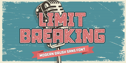 Limit Breaking is natural dry brush font. this font has a striking look and a good flow font that can add style to your designs. It’s perfect for logos, quotes, posters, clothing, advertising, packaging, and every other design which needs a unique touch. This font is PUA encoded which means you can access all of the glyphs with ease!
 - Big by Walking Fearless,
$20.00 BIG is an elegant condensed display font created for strong and impactful headlines. It comes from a series of hand printed specimens taken from wood type found in Andrew Howard’s Studio in Porto (Portugal). A wooden type that reassembles the industrial victorian style which has now been expanded to 20 cuts, ranging from ExtraLight to Bold, with Italics and a stencil version, covering all your needs for a striking visual effect just with plain type with distinctive features and personality, standing out from the crowded world of display sans serif. The font was engineered with essential OpenType features, that allows the user to compose the headlines in two different heights, with case-sensitive punctuation, symbols and special ligatures such as “the”, “of” and “le”.
 - Plectrum CP by CounterPoint Type Studio,
$29.95 As the first multi-font family designed for the CounterPoint font library, Plectrum offers designers and font lovers an alternative to the usual display style fonts of CounterPoint with a low key yet elegant sans serif family that can serve a variety of functions. Designed as a humanist style sans serif, the letters have variation in stroke weight. The italic faces have some variation in the letter design making them more of a true italic rather than simple oblique faces. The complete family consist of four weights: Regular, Italic, Bold and Bold Italic which can be purchased separately or as a complete package. The typeface has some unique features which add warmth to the design such as a slanted cross bar on the lowercase e and a large x-height. This is a solid, versatile family. Available in OpenType and contains support for Latin based and Eastern European languages.
 - Pleasans by Gassstype,
$22.00 Hello Everyone, Introduce our new collection, Pleasans - Sans Serif Typeface ,Extended Display Sans Serif inspired by famous logos of Technology and brands that have very strong characteristics, very suitable for posters, packaging, branding, logotype and more. Pleasans font with strong and challenging nuances. very suitable for the title, typography, Poster, magazines, brochures, packaging,Websites and much more for your design needs, making your designs more modern and professional.
 - Ability by Scholtz Fonts,
$15.00 Ability is a family of stylish and contemporary handwriting fonts that combine the vigor of hand-drawn fonts such as Affable with the elegance of fonts such as Blythe. What is unusual about Ability is that it enables a word to be formed from a group of letters in a variety of ways: not only the conventional linking of letters as in a cursive script or the placing of letters close to each other on a common baseline, but it uses the overlapping of the swashes and swirls that contribute to the individuality of the characters to integrate the letters into a single word. Ability comes in a number of styles: Legacy - Regular (medium weighted and the basic type of the other styles); - Black (a vigorous and dramatic version of Regular); - Condensed Medium - Condensed Light - Linear 45 (medium-weight font made from a mono-width line) - Linear 25 (light-weight font made from a mono-width line) Suggestions for use: - wedding stationery - greeting cards - valentines day media - beauty products media - lingerie tags - women’s magazine pages - classical music media - award certificates - magazine pages The font is fully professional: carefully letterspaced and kerned. It contains over 235 characters - (upper and lower case characters, punctuation, numerals, symbols and accented characters are present). It has all the accented characters used in the major European languages.
 - Headline by Monotype,
$29.99 Headline Bold is a sans serif face in the nineteenth century English Grotesque tradition. The Headline Bold font is based on types from the Stephenson Blake type foundry called Grotesque no. 9. A bold and compact font, its name gives a strong indication of its primary use.
 - Megalito Slab ExtCond - Personal use only

- Freshman - 100% free

- Metal as in Heavy - Unknown license

- Beast Impacted - Unknown license

- Jack Knife by Mike Zuidgeest,
$14.00 The "Jack Knife" font is a unique, handcrafted font that perfectly captures the spirit of the medieval time period. With its spiky, pointy design, this font exudes strength, courage, and boldness – making it the perfect choice for anyone looking to add a touch of daring to their brand. The sharp, jagged edges of the "Jack Knife" font give it a rugged, rustic feel that is both timeless and modern. Its bold, thick strokes make it easy to read even from a distance, while the intricate details and delicate curves add a touch of elegance and sophistication. Whether you're looking to create a bold, daring logo for a whisky brand or add a touch of adventure to your design, the "Jack Knife" font is the perfect choice. Its unique design and versatile style make it suitable for a wide range of projects, from branding and packaging to advertising and social media. So if you're looking for a font that embodies the spirit of the medieval period and exudes strength, courage, and boldness, look no further than the "Jack Knife" font – the perfect choice for anyone who wants to make a bold statement with their design.
 - Volterra by Blank Is The New Black,
$25.00 In today's typographic landscape, few would still consider Bodoni to have a "modern" feel, but there was once a time when it's vertical axis and thinned horizontal strokes were considered radical. Volterra—inspired by the forms of Bodoni—finishes what Bodoni started and eliminates the horizontal stroke altogether, breathing an elegant new energy into a 200-year-old classic. Named for the artist hired to paint loincloths over Michelangelo's "Last Judgement" when nudity in religious art was condemned, Volterra acknowledges that it is no easy feat picking up where a master left off. Volterra takes what has grown to feel traditional and transforms it into a delicate mixture of classic and modern, with razor-edged serifs and ultra-sharp strokes. Strictly a display face, the larger Volterra is used, the better it looks.
 - Heidar by Craft Supply Co,
$17.00 Unveil the Bold Elegance Serif Font – Where letters stand strong, strokes exude confidence, and design speaks with authority. Elevate your creations with this typographic powerhouse that turns words into captivating stories. This typeface is ideal for greeting card, packaging, brand identity, poster, or any purpose to make your art/design project look eye catching and trendy. Feel free to play with this typeface!
 - Pictures Signature by ryan creative,
$10.00 hello creatives. Introducing the latest fonts. Pictures Signature are designed to be inspired by a photo wall with signature-like inscriptions, giving a personal and exclusive impression. This typeface is characterized by steep, curved strokes, with some letters appearing to connect to each other as in handwriting. and is suitable for use in various media such as brand names, name logos, magazines, posters and other digital media. FEATURES Uppercase, lowercase. Support Foreign, Numbers and Punctuation. Alternative, Ligatures, Swash. Input Otf, ttf & Woff Files. Works on PC. Simple installation. Accessible in Adobe Illustrator, Adobe Photoshop. Adobe InDesign, it even works in Microsoft Word. Fully accessible without additional design software. Pictures Signatures are encoded with Unicode PUA, which allows full access to all additional characters without having to design any special software. Mac users can use the Font book, and Windows users can use the Character map to view and copy any extra characters to paste into your favorite text editor/app. thank you for visiting ;)
 - Pipa by Canada Type,
$24.95 Originally made for a health food store chain we cannot name, Pipa is the embodiment of organic display typography. Although it draws inspiration from some cold type ideas, like the uncredited Atlantis from VGC and a couple of older photo-lettering faces, its overall expression is right in line with what has become today's vernacular in integrity organic display packaging. Pipa's construct approaches the thick-and-thin idea from a rarely used perspective, where the flow in form contrast naturally seeps out from within each stroke, while minimizing the amount of strokes helps the totality of the setting come positively alive. This is bead and lava lamp psychedelia for the 21st century. Pipa comes with plenty of alternates, including some very cool unicase variations, and extended Latin language support.
 - Loppemarked by PizzaDude.dk,
$17.00 Loppemarked is Flea market in danish, and that’s where I got the inspiration to do these fonts from! Headline - chunky serifs here and there, and some are missing! No attempt to get it right…anywhere! Text - The letters are scribbled quickly, leaving not much attention to accuracy. Sans - With this font, there has been some effort to hit the same width of strokes, but it is still off here and there. All in all, the sweet innocence in these letters…I love it! <3</p>
 - Minnak by Esintype,
$18.00 Minnak, as a whole geometric display type is our take on Square Kufic (Makili) style Latin script fonts, comes in eleven weights with linear progression. It is an Uniwidth typeface at the core. From Hairline to Black, all multiplexed weights take up the same space in width and can be used interchangeably. Supports wide range of Open Type features, with many stylistic alternates in 12 context. Minnak is also have a close relation with pixel fonts, because in spite of its based on Makili forms, it all started as a pixel font in the drawing stage before further steps came into play. The key difference between Minnak and Makili style is that the latter must have the exact square counters with no diagonal strokes, and any other components of a letterform must conform to be proportional. Such style-specific requirements determine the overall dimensions of the glyphs and therefore, there can be only minor differences between the typefaces. In Minnak, counters are rectangular because of its narrow and condensed proportions, but the Makili form influence is still manifest. This impression is best confirmed with Medium weight where negative spaces and stem thickness are equal. Contrast and virtually no optical correction were presented, as characteristic of its genre had to have equal horizontal and vertical line thicknesses. As per the minimal and authentic look of the type, all glyphs are drawn as straight or only as 45-degree diagonal strokes. The representation of the ‘diagonalless’ approach is preserved by stylistic alternatives, making its similarity in visual aesthetics clearly visible. Marks and punctuation is another feature that doesn’t follow the strict rules of the origin style. Although not a pixel font, all building parts of the glyphs in Minnak share the same unit precision as they are designed with pixel equivalents in mind. Even space characters are designed to match glyph widths, meeting the demands of certain typesetting or multi-line lettering compositions. With its Pseudo Ancient and Runic alternates, extention parts and ornaments included in all weights, Minnak is suitable for branding, logo and monogram designs, the screen titles and headlines, packaging, posters, book covers and more, where it shines at big sizes. Its pixel font-like appearance makes it a significant choice for the modern compositions. Thanks to mostly uniform width design, it is possible to use Minnak also as a system for lettering. This feature can be used as vertical fitting of the letters between the lines. As a casual expression in Turkish, “Minnak” is one of the seven typeface designs in Esintype's ancient scripts of Anatolia project, Tituli Anatolian series — representing Seljuk period in the medieval Anatolia and their tradition of architectural stone ornamentation.


