10,000 search results
(0.014 seconds)
- Jindo by Nine Font,
$25.00 Jindo font family consists of 16 fonts in total. This family consists of 8 weights and matching italics, and supports a number of OpenType features. Its characteristic wide shape makes the text more legible and readable at small sizes. Recommended for magazines, posters, websites, editorial design, and various range of design works.
 - Ondo by JAM Type Design,
$23.00 Ondo is a low contrast geometric sans serif with large open counters which give the typeface a somewhat bold and contemporary appearance. This feature gives Ondo a fun yet sensible feel which can be used for both large chunks of text as well as for short headlines. Ondo comes with more than 370 glyphs, supporting a wide range of languages. With its 10 fonts, Ondo is an ideal font family for text, branding, signage, print and digital design. Give Ondo Demo Medium a try on your personal projects – completely FREE.
 - Ando by JCFonts,
$30.00 Ando is a condensed sans serif typeface available in seven styles. Built on a simple geometric structure, this family packs a lot of elegance with its super smooth curves and unique details. Designed for headlines, Ando really shines when used big, specially in the lighter weights. Initially released in 2011, the family was extended and updated in 2020. OpenType features include standard and discretionary ligatures, stylistic alternates, tabular figures, localized forms, case-sensitive punctuation, and more.
 - Indie by Lián Types,
$37.00 A FEW THOUGHTS Indie is a trendy script, result of the wide range of possibilities that can be achieved using a pointed brush. (1) “You Only Live Once” say The Strokes, (to me, symbols of indie music) so, what would represent that sensation of volatility better than a brush? As you may already know, this time inspiration came from hipsters and indies around us: We may sometimes criticise them, we may sometimes want to be like them, but the truth is that the universo gráfico they generated these past years is gigantic, full of colour and variations. (2) Brush lettering and Sign painting are fields I've been fond of since I started as a designer. Nowadays, these styles are getting a lot of attention and maybe it’s due to the undeniable mark of life that is materialised when using a brush. This tool is so expressive that shows the passions and fears of the artist, and materialises that idea of “living the present”, so popular in this era. When you see Indie, you think of skaters, rollers, surfers, hiphop dancers, street artists, summer, and why not? California beaches. So if you feel life is only one, it’s high time you got Indie into your fonts' collection! STYLES Indie comes in 4 styles plus another one which consists only in capitals. Indie; Indie Shade; Indie Shade Solo; Indie Inline are all open-type programmed and have exactly the same glyphs and metrics, so you can combine them without probem. (I.E. You may use Indie Inline, then write the same word using Indie Shade Solo, and finally put them together). In applications such as Adobe Illustrator, the font has nice results when fi ligatures is activated. However, if you want a more casual look, activate the contextual and the decorative ligatures. NOTES 1. After several years of practicing calligraphy I can say that to me, there’s nothing more satisfying than being able to create fonts out of your own handlettering. I owe a lot of this brush-style to Carl Rohrs. He was the very first calligrapher who taught it to me. His style is unique and what he can do with a brush is truly marvelous. I'm serious. 2. In spite of some particular cases, I can say I'm happy to live in a present in which Typography is living a kind of Renaissance along with Lettering. Like it happened with W. Morris a hundred years ago, handcrafts are being revalued/reborn, and some of this may be happening thanks to these indie designers that, trying to be unique, gave new/fresh air to different areas of graphic design.
 - Indus by Linotype,
$29.99Linotype Indus is part of the Take Type Library, which features winners of Linotype’s International Digital Type Design Contest from 1994 to 1997. Designed by P.H. Hashin from India, Indus finds its historical roots in inscriptions found on ancient Indian graves. Thus Indus has a unique look and is versatile in point sizes from middle to headline. The font combines well with sans serif and slab serif typefaces. - Ingo by Up Up Creative,
$16.00 Introducing Ingo, a sultry display font with smooth curves and high contrast. Featuring an ultra-modern and experimental yet highly readable "deconstructed serif" style, Ingo is perfect for your next editorial, advertising, branding, book, or invitation project. Ingo includes approximately 440 glyphs. OpenType features include multilingual support (including multiple currency symbols - for kicks I even included a Bitcoin symbol in there), standard and discretionary ligatures, and two ampersand variants. The OpenType features can be very easily accessed by using OpenType-savvy programs such as Adobe Illustrator and Adobe InDesign.
 - Nido by Latinotype,
$19.00 Nido is a cute and funny childish typeface, designed for logos, book titles, invitations, birthday cards, flyers, posters, advertising, etc. It comprises 5 styles: black, white, black italic, white italic and dingbats, which can be used nicely together. Nido is a new design by Sofía Mohr. See also Café Brasil http://www.myfonts.com/fonts/sofia-mohr/cafe-brasil/
 - Sana Sans by Latinotype,
$29.00 Sana Sans is a humanist functional typeface with a modern feel. It is intended to be a face well-suited for multiple purposes, especially in publishing. Sana Sans looks perfectly legible and clean in long texts, and neat and simple in headlines. Thanks to its versatility, this font is also ideal for both screen and print usage. Sana Sans consists of 32 styles and 8 weights—ranging from Thin to Heavy—italics, small caps and an alternative family. The alternative family offers slight variants in many glyphs, some of which include the lowercase a, e, l, q, y and uppercase G, L, and Q. Sana Sans was designed by Felipe Sanzana, under the supervision of Latinotype Team.
 - Indie Flower - Personal use only

- Diary Indie by Scratch Design,
$9.00 Introducing "Diary Indie" it's an authentic handwritten with natural character. Perfect for creating Instagram quote posts, novel or book TrueType, invitations, labels, packaging, stationary, etc. This is a full font, which features all uppercase and lowercase letters, numbers and punctuation, multi-lingual, and ligatures. Some swash elements are included as bonuses to bring attention to the fun of authentic Diary Indie! Features: Ligatures Numerals & Punctuation Swashes Accented characters Languages Supported How to use this font: Just open your Opentype features ( Minimum Compatible with Adobe Photoshop CS 6 and Adobe Illustrator CS 6 ) in Adobe Photoshop go to Window - Glyphs and all the alternates will appear while using the script font to use the ligatures and swashes. As you type, your text will look like a natural signature or handwriting.
 - Indoo BT by Bitstream,
$50.99Indoo is a modular geometric design that owes much to the typeface designs of Theo van Doesburg (1883-1931) and the De Stijl principles of abstraction, simplicity, clarity and harmony. That inspiration, combined with the lettering of signage often found in the Indian quarter of Paris, led to the connecting block letter motif of Indoo. The text fonts are joined by a common horizontal stroke positioned at the baseline. There is an accompanying Ornament font for building borders that includes various stylized fleurons and the like. Each font has a drop shadow companion that allows you to build three-dimensional and multi-colored lettering. - MBF Inno by Moonbandit,
$17.00 Inno font, is a modern take on the futuristic scifi theme, this typeface is clean, sharp, and have plenty of alternative, you can easily access them through uppercase lowercase. This font is great for headlines, sub titles and many attention grabber projects.
 - Undos Paintes by Trustha,
$15.00 Undos Paintes is a handwritten font inspired by the industrial feel. Comes in two font styles, regular and oblique. Undos Paintes is suitable for branding, advertising, headlines, and many more.
 - Ando Round by JCFonts,
$30.00 This is the rounded version of Ando, an elegant geometric typeface with smooth curves, designed for headlines. Six styles are available, with the same OpenType features as the original: stylistic alternates, case sensitive forms, tabular figures, and more!
 - Tazugane Info by Monotype,
$187.99 Tazugane Info is a screen-ready Japanese font family, that follows on the debut of Monotype's first original Japanese typeface – Tazugane Gothic. It offers a more restrained personality, with calligraphic design details pared back to create a geometric letterform – a good alternative for designers looking for a matter-of-fact alternative to the warmer Tazugane Gothic tone of voice. Tazugane Info was updated to support the “Reiwa” new era symbol. Reiwa can be written as two kanji: 令和. This update to Tazugane Info includes Reiwa designed as a single ligature and is encoded as U+32FF. “While Tazugane Gothic fits perfectly when your job requires an organic and friendly tone of voice, Tazugane Info provides a more solid look,” says Kobayashi. “I hope that having two options will make it easier to choose an appropriate tone of voice to convey information or brand messaging.” Its strokes create a smooth uninterrupted flow that's designed for use on-screen. Although books, newspapers and magazines are traditionally set vertically in Japan, smartphones, information panels and car navigation systems are all set horizontally – and Tazugane Info has been tailored to this environment, featuring a new set of kana phonetic symbols. Tazugane Info is available in 10 weights, and includes the complete set of kanji and latin found in Tazugane Gothic.
 - Indy Italic by ITC,
$29.00Indy is the work of Chicago-based lettering designer Charles Hughes. The lowercase letters link together to evoke the look of true handwriting and complement a generous and graceful capital alphabet. Indy is a refined handwriting script ideal for anything needing a touch of elegance. - Black Indie by Din Studio,
$29.00 Black Indie is a bold and authentic display font. The font is suitable for any branding project like logo, t-shirt printing and many more. outstanding in a wide range of contexts. Featured : Accents (Multilingual characters) PUA encoded Numerals and Punctuation (OpenType Standard) Thanks for downloading premium font from Din Studio
 - INDG Actio by Iñigo Uriarte,
$5.00 INDG Actio is the result of a several years long exploration. In it, a minimum amount of shapes are assembled into an alphabet of sci-fi feel. It is my personal Eurostil. Inspired by hope of a brighter future, INDG Actio is a great fit for spatial fantasy material, music gear interfaces or forward-looking tech ventures, as an example. Though designed mainly to be a display font for titles, short texts and logos, it is versatile. Have fun with it and adapt it to the specific needs you may have. INDG Actio is a family consisting of 5 weights of 208 glyphs each, including 12 stylistic alternates.
 - Indu Xtrial by Scriptorium,
$24.00InduXtrial was developed for a poster project which needed a modern, degenerated look. We actually designed a custom variant of our Savoyard font with some unique characters and a somewhat different look for a number of the characters. We then degenerated the character outlines in Photoshop, ultimately running them through several permutations to produce two different versions of each character for the main font, plus an additional font with stylized initial capitals and customized small caps. Then, just to cap things off we produced a set of drop-cap initials and unique outline characters. The result is just what you need to express the concept of industrial decay in print. - HGB Info by HGB fonts,
$21.00 HGB Info is a display typeface for my Linotype Nautilus Monoline. This came about while working on the corporate design for the municipality of Weissach im Tal. Shorter ascenders and descenders and a broader letter shape result in more compact word images. The ups and downs are cut vertically. This works particularly well in large degrees. This is the area of application on signage and information systems.
 - Shadows Into Light - Personal use only

- Tazugane Info Variable by Monotype,
$1,049.99 Tazugane Info is a Japanese typeface family developed by the Monotype Studio, an alternative set of kana designed to match the kanji and Latin alphabet which retains the original form of the Tazugane Gothic. In contrast to the Tazugane Gothic, the kana of Info family is more systematically designed in order to give the text a calm, restraint look.
 - HGB Info OSF by HGB fonts,
$20.00 It's nice when a font provides old style figures, small caps and alternate letters. But what to do if my typesetting program doesn't support Open Type features? The solution may be old-fashioned, but it's effective: the variants are placed in separate font families: Standard, Old Style Figures (OSF), and Small Caps (SC). Any word processor can handle it. As a special feature, my OSF fonts also contain alternative letters such as a looped g or descenders in the italic f.
 - Indi Kazka 4F by 4th february,
$25.00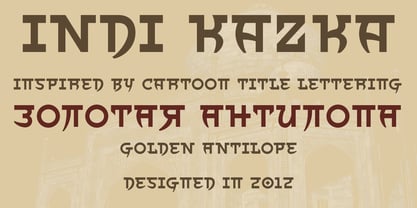
- FF Info Pict by FontFont,
$62.99 Erik Spiekermann, working in collaboration with Ole Schäfer, originally designed FF Info® Display for use in the context of wayfinding systems. The variants FF Info™ Text and FF Info™ Correspondence were developed later for text setting and office communication. FF Info Display The sober and clear forms of the sans serif FF Info Display have been deliberately molded to make them perfect for use on wayfinding systems. The font by Ole Schäfer and Erik Spiekermann not only takes the problem of lack of space into account - it is some 15% narrower than comparable typefaces - the characters have also been designed to ensure they remain legible even in adverse conditions for reading. As text on signs often contains words with which readers are unfamiliar and which are thus deciphered letter for letter rather than perceived as whole words, it is essential to provide for a clear differentiation between glyphs. Additional serifs on the lowercase "i" and uppercase "I" and a small arch on the terminal of the lowercase "l" ensure that it is possible to readily discriminate between these particularly problematic letters. Moreover, sharp corners on glyphs can also make it difficult to read signs with backlighting or when driving past. The rounded corners of FF Info Display counteract this effect and make sure that the character forms remain well defined.FF Info Display is available in five carefully coordinated weights, from Regular to Bold. In the corresponding italic variants, the letters appear overall more rounded while the lowercase "a" has a closed form and the "f" has a descender. Also included among the glyphs of FF Info Display are several ligatures and arrow symbols. Pictograms with different themes that complement the typeface are also available in four weights. FF Info Text Thanks to his know-how gained through designing other typefaces, Erik Spiekermann became aware that fonts created for use in problematic environments can be used in many different situations. In smaller point sizes, FF Info Display cuts a fine figure when used to set longer texts. So Spiekermann carefully reworked FF Info Display to produce FF Info Text, a font perfected for use in this context. Not only can the characters be more generously proportioned, certain features, such as additional serifs to aid with the differentiation of problematic letters, are also no longer necessary in textual surroundings. The upright styles have a double-story "g" while Spiekermann has added oldstyle figures and small caps. FF Info Correspondence FF Info Correspondence has also been designed for setting block text although it recalls the style of old typewriter characters and is specifically intended for use in office communication. The characters of this third member of the family are thus more formal, without rounded terminals but with rectangular punctuation marks. The narrower letters are provided with large serifs to give them more space although, at the same time, this reduces the differences in terms of letter width among the alphabet. In contrast with its two siblings, FF Info Correspondence has only three weights, each with corresponding italic.The three styles of the FF Info super family cover an extensive range of potential applications. If the different kerning is adjusted manually, the three styles harmonize happily with each other and can be readily used in combination to set, for example, headlines and texts and also creative display options.
 - FF Info Text by FontFont,
$75.99 German type designers Erik Spiekermann and Ole Schäfer created this sans FontFont between 1996 and 2000. The family has 10 weights, ranging from Regular to Bold (including italics) and is ideally suited for book text, editorial and publishing, small text as well as web and screen design. FF Info Text provides advanced typographical support with features such as ligatures, small capitals, alternate characters, case-sensitive forms, fractions, and super- and subscript characters. It comes with a complete range of figure set options – oldstyle and lining figures, each in tabular and proportional widths. In 1998, FF Info Text received the The Big Crit award. This FontFont is a member of the FF Info super family, which also includes FF Info Correspondence and FF Info Display.
 - HGB Info SC by HGB fonts,
$10.00 It's nice when a font provides old style figures, small caps and alternate letters. But what if my typesetting program doesn't support Open Type features? The solution may be old-fashioned, but it's effective: the variants are placed in separate font families: Standard, Old Style Figures (OSF), and Small Caps (SC). Any word processor can handle it. HGB Info SC adds real Small Caps to HGB Info.
 - FF Info Display by FontFont,
$72.99 German type designers Erik Spiekermann and Ole Schäfer, and German design agency MetaDesign created this sans FontFont between 1996 and 2000. The family has 18 weights, ranging from Regular to Bold (including italics) and is ideally suited for advertising and packaging, book text, editorial and publishing, logo, branding and creative industries, small text, wayfinding and signage as well as web and screen design. FF Info Display provides advanced typographical support with features such as ligatures, alternate characters, case-sensitive forms, fractions, super- and subscript characters, and stylistic alternates. It comes with proportional lining, proportional oldstyle, and tabular lining figures. In 1998, FF Info Display received the The Big Crit award. This FontFont is a member of the FF Info super family, which also includes FF Info Correspondence and FF Info Text.
 - FF Info Correspondence by FontFont,
$72.99 German type designers Erik Spiekermann and Ole Schäfer created this sans FontFont in 1998. The family has 6 weights, ranging from Regular to Bold (including italics) and is ideally suited for advertising and packaging and logo, branding and creative industries. FF Info Correspondence provides advanced typographical support with features such as ligatures, alternate characters, case-sensitive forms, fractions, super- and subscript characters, and stylistic alternates. It comes with proportional lining and tabular lining figures. In 1998, FF Info Correspondence received the The Big Crit award. This FontFont is a member of the FF Info super family, which also includes FF Info Display and FF Info Text.
 - Square Line Icons Indus by Howcolour,
$17.00 The square icons focus on maximizing the meaning by minimizing the symbols. Let your viewers understand your data without disorientation. Use a metaphorical icon library, designed for fast, intuitive human recognition.
 - Jacinto Sans - Unknown license

- Cocaine Sans - Unknown license

- Idealist Sans - 100% free

- Mobile Sans - Personal use only

- Reactor Sans - 100% free

- Obti Sans - 100% free

- Droid Sans - 100% free

- Obcecada Sans - Personal use only

- Azoft Sans - 100% free

- Happy Sans - Personal use only


Page 1 of 250Next page