10,000 search results
(0.033 seconds)
- MTF Dear Santa Pro by Miss Tiina Fonts,
$9.00 If you’re writing Santa a letter, use this adorable, handwritten childlike font! Dear Santa PRO not only gives you inspiration on how to start the letter, but it also has neat and original characters. This typeface duo also comes with some cute Christmas doodles to complement your writing. Have fun, and create something spectacular this Christmas!
 - Data Error AOE Pro by Astigmatic,
$24.00 The Data Error AOE Family was one of my earliest typefaces, at a time when I had become obsessed with all forms of "digital/techology" typestyles. It's been awhile since the early 2000's, but I've had a hankering for awhile now to revisit this typeface, giving it a more expansive language character set and fill it out with some Opentype features. Inspired by some old printouts of BASIC programs and an Atari 1050 Disk Drive manual with pin printer examples, comes the familiar yet oddly restricted style with this Data Error family. This family comes complete with Regular and Bold versions with their respective Oblique versions. Odd pin printer restrictions inherent in this typeface are: no characters extend below baseline or above ascender line, (except international accents). A nostalgic typeface for computer programmers everywhere, strong and legible at any size, Data Error is perfect for so many purposes, get it today!
 - Novel Sans Hair Pro by Atlas Font Foundry,
$50.00 Novel Sans Hair is the new package of 24 ultra light weights of Novel Sans Pro, the humanist grotesque typeface family within the largely extended award winning Novel Collection, containing Novel Pro, Novel Sans Pro, Novel Sans Hair Pro, Novel Sans Condensed Pro, Novel Mono Pro, Novel Sans Rounded Pro and Novel Sans Office Pro. Novel Sans Hair has a carefully attuned character design and a well balanced weight contrast. Classic proportions and the almost upright italic makes Novel Sans Pro being a modern humanist with the calligraphic warmth of a real italic. Many similarities with the other typeface families within the Novel Collection enable designers to combine the families and reach highest quality in typography. Novel Sans Hair [1020 glyphs] comes in 24 styles and contains small caps, an extra set of alternate glyphs, many ligatures, lining figures [proportionally spaced and monospaced], hanging figures [proportionally spaced and monospaced], small caps figures [proportionally spaced and monospaced], positive and negative circled figures for upper and lower case, superior and inferior figures, fractions, extensive language support, arrows for uppercase and lowercase and many more OpenType™ features.
 - Iwata GKyoukasho Pro N by IWATA,
$199.00 2010年に改定された常用漢字表に対応し、教科書、学習書、参考書などのあらゆる教材に使用できます。 筆やペンの入り、押さえ、ハネ、トメ、筆順などが理解しやすいようデザインしています。
 - Stephanie Marie JF Pro by Jukebox Collection,
$36.99
- Maiers Nr 21 Pro by Ingo,
$42.00 A handwritten ”font for technicians“ from ca. 1900. Very geometrical, rigid forms borrowed from the typical characteristics of Jugendstil / Art Nouveau. This script is found in a magazine from the Otto Maier publishing house, Ravensburg, which was issued sometime in the years shortly before WWI. The magazine is entitled ”Schriften-Sammlung für Techniker: Verkleinerte Schriften der wichtigsten Alphabete“ (Collection of scripts for technical specialists: reduced scripts of the most significant alphabets) and published by Karl O. Maier. The original copy, produced by means of a galvanized plate, is just 7 centimeters wide. It served as the model for technical professions in which, at that time, the captions of drawings were still done by hand. The characters have been scanned, digitized and greatly magnified. Special attention was given to ensure the ”uneven“ edges, typical of handwritten script, remained effectively noticeable even in the digitized form. As a result, this ”technical“ font retains a handmade touch. Especially worthy of note are the Jugendstil forms characteristic at the turn of the19th century. In comparison, many alleged ”ultramodern“ font types of today suddenly look quite old-fashioned. Maier’s Nr. 21 Pro is suitable for all European languages. It includes ”Latin Extended-A,“ for Central and Eastern Europe incl. Turkish, and even Cyrillic and Greek, too. The font includes several stylistic alternates as well as a number of ligatures.
 - Sergeant SixPack - Personal use only

- D3 LiteBitMapism Bold-Selif - Unknown license

- XXII BLACK-BLOCK-SERIFA by Doubletwo Studios,
$22.22
- HV Feliz en Vista by Harmonais Visual,
$9.00 Feliz en Vista - a modern serif, display typeface with beautiful uppercase lettering and a touch of fashionable look. You will be pleased to use many options of alternates and ligatures, perfectly suitable for creating nice, fashionable, lifestyle design such as logos, title and wedding paper and others. To generate all ligature and alternative styles, please open Adobe Illustrator - Type - Glyphs.
 - HV Fitzgerald in Berlin by Harmonais Visual,
$15.00 Fitzgerald is a classic and elegant retro serif with a modern twist. With its decent readability, Fitzgerald is perfect for both displays as well as body text. Inspired by all the retro aesthetics making a comeback, Fitzgerald is perfectly suitable for creating nostalgic yet still clean and elegant designs such as logos, packaging, editorial, and more.
 - HV Olive and Figs by Harmonais Visual,
$15.00 Olive&Figs - a classic Roman-culture-inspired calligraphic serif with elegant, regal, artistic touch. Specially designed for regal, classy projects, perfectly suitable for creating elegant, simple, lifestyle design such as logos, title, packaging and more.
 - PR8 Charade - Unknown license

- Pho Twice by Baqoos,
$18.00 Pho Twice is a boisterous neoteric handwritten typeface apt for headline, editorial, branding, packaging, printed materials and typographic applications. 200+ glyphs including punctuation and numerical.
 - Rhinos Pero by Sipanji21,
$20.00 "Rhinos Pero" is a quirky graffiti font that embodies a playful and unconventional style. Fonts in this category often feature eccentric and unique letterforms, incorporating creative elements that deviate from traditional typographic norms. This particular font might showcase irregular shapes, whimsical characters, or unconventional design traits, offering a distinct and unconventional appearance. With its quirky attributes, "Rhinos Pero" is suitable for designs aiming to convey a fun and offbeat visual impression. It could be applied in various creative projects seeking a playful and distinct graffiti-inspired typographic style. **Uppercase
 - MSung PRC by Monotype HK,
$523.99 Song style typefaces originated in the age of woodblock printing in Song Dynasty. Being an essential Chinese type style for printing and publishing all since Ming Dynasty. Based on the Kaishu calligraphic script, its structure has evolved, regularised and standardised with thick stems (豎), thin horizontal strokes (橫) and triangular finials. Dots (點), hooks (勾) and downstrokes retained some features of calligraphy, hence an appropriate choice for continuous reading. The typeface is equipped with a variety of stroke weights, all highly legible .
 - Bros Signage by Blankids,
$20.00 Are you looking for a vintage layering display font? Do you want of creating Something that stand out and inspire creativity, imagination, and endless fun? Wait no more, we will give you the best choice. Bros Signage a Vintage Layered Font Bros Signage a Vintage Layered Font, Inspiring from old signage typography. This font is perfect for a design that makes it more attractive and playful. made with a very good level of aesthetics making this font suitable for book cover, poster, packging, merchandise, logotype and much more. Bros Signage font includes Multilingual Support, among others : Afrikaans, Albanian, Asu, Basque, Bemba, Bena, Breton, Catalan, Chiga, Cornish, Danish, Dutch, English, Estonian, Faroese, Filipino, Finnish, French, Friulian, Galician, German, Gusii, Indonesian, Irish, Italian, Kabuverdianu, Kalenjin, Kinyarwanda, Luo, Luxembourgish, Luyia, Machame, Makhuwa, Meetto, Makonde, Malagasy, Manx, Morisyen, North Ndebele, Norwegian Bokmål, Norwegian Nynorsk, Nyankole, Oromo, Portuguese, Quechua, Romansh, Rombo, Rundi, Rwa, Samburu, Sango, Sangu, Scottish Gaelic, Sena, Shambala, Shona, Soga, Somali, Spanish, Swahili, Swedish, Swiss German, Taita, Teso, Uzbek (Latin), Volapük, Vunjo, Zulu FEATURES : Uppercase Lowercase Number Punctuation Multilingual PUA Encode Opentype
 - Hernandez Bros by Latinotype,
$29.00 Hernández Bros, is a typeface designed by Daniel and Eli Hernández. Born in the year 2021, in the midst of the Covid pandemic, from a collaborative spirit where everything called them to work together as family, in order to obtain better results in such trying times. The Hernández siblings, started a ping pong of drawings based on Bulfinch found in the 1912 ATF catalogue. From this exercise, Hernández Bros was designed, a modern Sans Serif, with 8 weights ranging from Extralight to Black. This is an elegant font, with beautiful and harmonious contrasts, which makes it ideal for titles, brands, editorial design, magazines among others.
 - 19-PRA by ILOTT-TYPE,
$29.00 Inspired by the elegance of Herman Zapf’s designs crossed with the readability of early 20th century Gothic fonts by Morris Fuller Benton, 19-PRA is a sans-serif with a visible stroke contrast and a humanist tone of voice. The large x-height seen in fonts like News Gothic and Palatino increases legibility and condensed proportions give excellent readability making it perfect for newspaper and magazine publishing. A typeface that can serve for both body text and titling the uppercase excels for headlines and renders beautiful brand names when tracked out. It sets well with both a serif or sans serif and has various open type features including: 12 standard ligatures, 3 discretionary ligatures, tabular figures, old stye figures as well as European accents.
 - Mad Props by Graffiti Fonts,
$19.99Classic & clean tag style lettering that's easy to read & flexible. Mad Props includes 2 full alphabets, full numbers, punctuation & other symbols. This style works well with outlines & effects. - Cro Aloha by FontHaus,
$19.95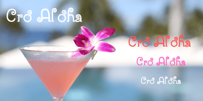
- Choco Bro by Sipanji21,
$18.00 "Choco Bro" is a cute and chubby display font characterized by truncated or shortened characters. Fonts with truncated characters often feature letterforms where certain parts are cut off or abbreviated, giving them a unique and distinctive appearance. This font can be a delightful choice for various design projects, especially those targeting children's themes or playful designs. The truncated characters add a quirky and playful touch to the font, making it suitable for posters, invitations, children's books, or any project that aims for a fun and whimsical typographic style.
 - Chartu Poo by Enfeeltype,
$15.00 Chartu Poo is a stunning modern sans serif font that exudes a sense of luxury and sophistication. Its futuristic concept is truly unique, and makes it stand out from other fonts in its class. The sleek lines and bold curves of Chartu Poo give it a sense of elegance and refinement, while also conveying a sense of modernity and innovation. One of the things that sets Chartu Poo apart is its versatility. It can be used in a wide range of design projects, from logos and branding materials to website designs and advertising campaigns. Whether you're looking to create a bold and impactful headline, or a subtle and understated body copy, Chartu Poo is the perfect font for the job. Another great feature of Chartu Poo is its readability. Despite its bold and unique design, this font is incredibly easy to read, making it a great choice for both print and digital media. Whether you're designing a brochure or a website, Chartu Poo will ensure that your message is conveyed clearly and effectively. In short, if you're looking for a modern sans serif font that combines luxury, sophistication, and innovation, look no further than Chartu Poo. Its unique and futuristic concept, combined with its versatility and readability, make it the perfect choice for any design project.
 - Banzai Bros by Fenotype,
$20.00 Banzai Bros is a deadly efficient multidisciplinary all-caps assault font. It's highly recommended for posters, signs, flags & banners. Banzai Bros comes with a small set of ornaments. Available as a single font or in packs with other Fenotype fonts.
 - Prop Ten by Galapagos,
$39.00Some years ago we developed a monospaced 12 pitch sans serif for a client. We also created a 10 pitch version that was later discarded. PropTen is the 10 pitch version modified to proportional widths. The name PropTen refers to 'Proportional 10 Pitch'- which is a technical impossibility. It does have a slight 'its time to vote' twist to it. You know, after you pick your candidate you also need to vote yes or no on the following Propositions, don't forget Prop10, the team needs those uniforms. - Bros Rover by Blankids,
$27.00 Introducing a new font is Bros Rover Classic Sans Serif. Bros Rover good for logotype, poster, badge, wedding invitation, book cover, tshirt design, packaging and any more.
 - VTCSundayKomixTall - Unknown license

- EvilGenius BB - Personal use only

- Poing by Authentic,
$34.50 Poing is an exceptionally elegant script, I took my fathers Penn font and pimped it to a higher level. It is perfect for invitations and business cards.
 - American Advertise Square Series by Intellecta Design,
$17.90 See also other font families related: American Advertise 013, American Advertise 014, American Advertise 015, American Advertise 016, American Advertise 017, and American Advertise 019.
 - Series A Signage JNL by Jeff Levine,
$29.00 The basis for Series A Signage JNL is Highway Gothic; a type style design formally known as the FHWA Series. The font was developed by the United States Federal Highway Administration, and originally consisted of only capital letters and figures. Each Letter designation represented a character width from "A" (condensed) to "F" (wide). Due to poor visibility at high speeds, Series "A" was discontinued. At one point lower case characters were added to the various widths of the design, but this typeface revival is based on the original guidelines specified in the 1948 (reprinted 1952) book "Standard Alphabets for Highway Signs" [this was the original name for the FHWA series fonts preceding the eventual name change to Highway Gothic]. Unlike the original, Series A Signage JNL is available in both regular and oblique versions.
 - Yan Series 333 JY by JY&A,
$39.00 - National Champion Line Series by Kyle Wayne Benson,
$4.00 National Champion is the overly confident geometric slab that comes in four weights and twelve line styles. He's got a 3/4 cap lowercase, lots of language options, and opentype fractions!
 - WhoopAss - Personal use only

- brunoBook - Personal use only

- Geometry Soft Pro Bold N - 100% free

- Kis Antiqua Now TB Pro by Elsner+Flake,
$99.00 In the course of the re-vitalization of its Typoart typeface inventory, Elsner+Flake decided in 2006 to offer the “Kis Antiqua” by Hildegard Korger, in a re-worked form and with an extended sortiment, as an OpenType Pro-version. After consultation with Hildegard Korger, Elsner+Flake tasked the Leipzig type designer Erhard Kaiser with the execution of the re-design and expansion of the sortiment. Detlef Schäfer writes in “Fotosatzschriften Type-Design+Schrifthersteller”, VEB Fachbuchverlag Leipzig, 1989: No other printing type has ever generated as far-reaching a controversy as this typeface which Jan Tschichold called the most beautiful of all the old Antiqua types. For a long time, it was thought to have been designed by Anton Janson. In 1720 a large number of the original types were displayed in the catalog of the „Ehrhardische Gycery“ (Ehrhardt Typefoundry) in Leipzig. Recently, thanks to the research performed by Beatrice Warde and especially György Haimann, it has been proven unambiguously that the originator of this typeface was Miklós (Nicholas) Tótfalusi Kis (pronounced „Kisch“) who was born in 1650 in the Hungarian town of Tótfal. His calvinistic church had sent him to the Netherlands to oversee the printing of a Hungarian language bible. He studied printing and punch cutting and earned special recognition for his Armenian and Hebrew types. Upon his return to Hungary, an emergency situation forced him to sell several of his matrice sets to the Ehrhardt Typefoundry in Leipzig. In Hungary he printed from his own typefaces, but religious tensions arose between him and one of his church elders. He died at an early age in 1702. The significant characteristics of the “Dutch Antiqua” by Kis are the larger body size, relatively small lower case letters and strong upper case letters, which show clearly defined contrasts in the stroke widths. The “Kis Antiqua” is less elegant than the Garamond, rather somewhat austere in a calvinistic way, but its expression is unique and full of tension. The upper and lower case serifs are only slightly concave, and the upper case O as well as the lower case o have, for the first time, a vertical axis. In the replica, sensitively and respectfully (responsibly) drawn by Hildegard Korger, these characteristics of this pleasantly readable and beautiful face have been well met. For Typoart it was clear that this typeface has to appear under its only true name “Kis Antiqua.” It will be used primarily in book design. Elsner+Flake added two headline weights, which are available as a separate font family Kis Antiqua Now TH Pro Designer: Miklós (Nicholas) Tótfalusi Kis, 1686 Hildegard Korger, 1986-1988 Erhard Kaiser, 2008
 - Out of Line Pro BB by Blambot,
$10.00 Out of Line Pro BB is a comic book dialogue typeface with Greek and Cyrillic support, as well as a hefty compliment of European diacritical glyphs. It's the improved remix of Blambot's popular Out of Line BB set. Designed after Blambot letterer, Nate Piekos's hand lettering, it features opentype autoligatures, contextual alternates, and fractions.
 - Kate Slab Pro Ultra Expanded by Monday Type,
$19.00 Kate Slab Pro Ultra Expanded is a sophisticated and robust modern Slab Serif Typeface that works in a variety of design scenarios. It is designed to work in big attention grabbing headlines as well as in smaller text and even body text. The recognition value of Kate Slab Pro Ultra Expanded is its biggest asset in world of uniformity. Ranging from “100 Thin” all the way to “900 Black” makes Kate Slab Pro Ultra Expanded such an amazing and versatile font family that stands out. Kate Slab Pro Ultra Expanded doesn’t only work great in lifestyle and fashion related contexts but will also look amazing for restaurants, coffee shops or and other use cases that ask for character and identity. To fill all the gaps of a designer’s needs, Kate Slab Pro Ultra Expanded comes with an italic style with every weight. Those italics are equipped with unique and real italic characters and will make you love it. Being a Slab Serif Kate Slab Pro Ultra Expanded manages to remind you of a classic Font Family with a modern and timeless approach that will make you happy for decades. Monday Type can’t wait to see the beautiful designs you are going to create with our Kate Slab Pro Ultra Expanded.
 - Iwata UD Maru Gothic Pro by IWATA,
$199.00 ???????????UD????????????????? ??????????????????????????????????????????


