10,000 search results
(0.026 seconds)
- JH Oleph by JH Fonts,
$9.00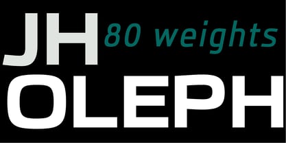 JH Oleph is a modern neo sans humanist Typeface. It includes eight weights and five widths, total of forty weights and another forty italics. JH Oleph may be used as screen display and text type.
 - Latinia - 100% free

- Term - Unknown license

- DornspitzGrotesk - 100% free

- XperimentypoThree-C-Square - Unknown license

- Squad by Fontfabric,
$- Squad is a humanist sans serif with semi condensed proportions. Inspired by Adrian Frutiger’s perfectionist style this typeface is a harmonious breed of humanist heritage and contemporary simplicity. The balanced characteristics, clear and legible silhouette and simultaneously vivid appearance of Squad makes it perfect for any design purpose. The figures are evident — it consists of 18 styles from Thin to Black; covers Extended Latin, Cyrillic and Greek with span for more than 130 languages; flawless functionality and supporting many OpenType features, such as localizations, tabular numerals, inferiors & superiors, numerators & denominators, fractions, discretionary liga- tures, case sensitivity etc. Designers: Svetlin Balezdrov, Svet Simov Features: • Over 780 glyphs in 18 styles (Thin to Black) • Extended Latin, Cyrillic and Greek scripts for more than 130 languages; • High x-height and Semi Condensed proportions; • Moderate contrast and vertical stress; • Humanistic characteristics and open vertical terminals; • True form of italics; • Coverage of multiple OpenType features; • Perfect for text, headlines and web;
 - Mathieu Sans by Borutta Group,
$39.00 I really like the moments when classic meets modern. Mathieu was inspired, by the proportions, texture and elegance of Renaissance typefaces, and by the works of Dutch typographers, in whom I have always appreciated the balance between the traditional approach and experiment. Mathieu has the features of a sans-serif typeface, but you can feel delicate notes of calligraphy through humanistic details. The whole family has several width options complemented by a slightly slanted but expressive italics – making it suitable for both longer texts and for use in visual identities. Karol Mularczyk and Małgorzata Bartosik worked on the project creatively directed by Mateusz Machalski.
 - Streamwood JNL by Jeff Levine,
$29.00 Streamwood JNL is an outline sans wood type re-drawn from vintage source material. The design bears strong resemblance to Woodlawn JNL; but is a bit narrower and has a much different set of numbers as well as a more stylized letter "Q".
 - Bluettelli by Letterara,
$12.00 Bluettelli is a fantastic font trio that combines three beautiful script calligraphy. It has a feminine and elegant look which is great for logos, invitations, and blogs, but can also be used to make a striking headline. Get inspired by this extraordinary set!
 - Astrospy JNL by Jeff Levine,
$29.00Astrospy JNL is a square-shaped, futuristic techno-style font from Jeff Levine. It is very well suited for short phrases, but caution should be used in setting too many words with it because of legibility issues. Best used in larger point sizes. - Agilita by Linotype,
$29.99 Created by German designer Jürgen Weltin, Linotype’s Agilita is a contemporary humanist sans serif family with a wide variety of weights, including both ultra thin hairline options and heavier, dark type. Agilita has rather classical proportions; its clear ascenders and descenders lend more distinct word shapes. Weltin’s design has a dynamic, yet strong and very functional appearance with a fine but clear emphasis on the horizontals. This traditional approach makes it a versatile typeface for large-scale text setting, but it can also be used in complex information design projects, and orientation systems, for example. Hence it was developed carefully into a wide range type family system consisting of 32 styles. This even covers the requirements for display and headline setting. Corresponding condensed weights are suitable where horizontal space is scarce, as in narrow columns and tables, for example. The Agilta Hairline and Agilta Ultra Thin styles were especially made for display use. These fonts should be set at a minimum size of 20 pt for printed project, and about 40 pt on output to laser printers, depending on the paper used. Agilita’s character sets include special symbols and signs that may be used in dictionaries; like arrows for lemmata and signs for cross references, idioms or colloquial language. There are two sets of arrows available in each weight for use in orientation systems. Each font in the Agilta family is built according to Linotype’s Extended European character set guidelines. These offer support for more than 48 Latin-based languages used in Western, Central, and Eastern Europe, including Baltics and Turkey.
 - Gate A1 by ParaType,
$40.00 Gate A1 is a typeface inspired by the famous DIN, but it is more humane compared to the prototype. Thanks to its straightforward, roughly naive construction and slightly increased letter spacing, the font is quite legible, even under difficult conditions. It makes Gate A1 perfect for road signs and orientation, as well as for interfaces. The typeface supports all European languages, including Greek, and the extended Cyrillic covering all major languages. In addition, Gate A1 has a functional set of arrows and several alternate sets of figures and graphic elements. The typeface designed by Dmitry Kirsanov was released in 2012 under the name of DIN PT and re-released in 2022 with additions by Alexander Lubovenko.
 - Full English by Hanoded,
$15.00 I have always been fascinated by the ‘Full English Breakfast’. A Full English usually consists of toast, baked beans, sausages, fried eggs, fried tomatoes, fried mushrooms and sometimes blackpudding (a kind of sausage made from pig’s blood). When I lived in England, my friends were always quite happy to stow away a big full breakfast, but I, on the other hand, could not really set myself to eating one. Full English is a hand made stencil font. If you own a pub and you serve breakfast, you could use it for your signs, but I guess this font looks good on anything that needs a bit of attention. For attention, it will get!
 - Treacle by Hanoded,
$15.00 One of the best desserts I have eaten in my life was a treacle tart. I do know that it was in England and I do know that it was delicious. I really don’t know why I was thinking of that, but that pleasant memory did give me a name for this font. I am still learning my new font software, which is a bit of a slow process. The software I used for this font allows me to add several languages, which, hitherto, I couldn’t access. So, in short, this is my most multilingual font ever: it even includes Vietnamese and a bit of Hiragana and Katakana for you to get creative with!
 - PF Diplomat Sans by Parachute,
$45.00 A clean humanistic sans-serif typeface which complements its serif version Diplomat Serif. It has preserved several of its original characteristics and comes complete with true-italics with a distinct flowing structure. Supports Latin and Greek.
 - Florid Sans by S6 Foundry,
$15.00 Florid Sans perfectly balances minimalist quality with a combination of contemporary details and classic styles. Florid Sans is geometric in nature with humanist quality rooted in the Swiss tradition. Comfortable, breathable apertures make it stunningly versatile.
 - Poetica by Adobe,
$29.00Poetica font was designed by Robert Slimbach in 1992 with particularly generous characters. The typeface family consists of 21 weights to allow for an unusual variety of design possibilities within one typeface family. Numerous swash letters, ornaments and ligatures remind one of the early Renaissance and its unforgettable masters, for example, Giambattista Palatino, who later gave his name to Hermann Zapf's creation. Slimbach used the Lettera Cancellaresca as a model for his typeface, the cultivated humanistic italic which later served as a point of departure for the development of italics of the Renaissance and thereafter. Lettera Cancellaresca is very legible, extremely harmonic and impressively beautiful. The early forms display two different compositional tendencies, namely the static of the simple vertical capitals and the italic dynamic of the slanted lower case alphabet, as shown in the weight Chancery 4. The capitals later conform to the slant of the lower case, as shown in the weights Chancery 1-3. Poetica font should be set according to the included suggestion in order to see the full benefit of its grace and beauty. - Multistrokes - Unknown license

- SmokeShadow - Unknown license

- Smoke-Contour - Unknown license

- BuildYourOwnPeople - Unknown license

- TypoSlabserif-Light - 100% free

- XPCrazy - Unknown license

- Smoke-Disturbed - Unknown license

- Smoke-Black - Unknown license

- FranKleinBook - Unknown license

- Elise by Context,
$12.00 Elise is a sweet natured, layered display typeface, with a few layers but a wealth of options. From the feminine to the fun to the nostalgic, Elise is a capable and personable set. Best used BIG and with color, you’ll always find an occasion for Elise’s charm. To use this typeface, once you have your copy in place in the design program of your choice, copy your text block and paste it directly on top of your existing text block. Set this new text block to a different Elise layer and voila! You’ll already start to see some interesting effects take place. In some cases, different effects are achieved by bringing The Elise Ribbed layer to the front or to the back. Also available is a free ornament set to get you started.
 - P22 Goudy Aries by P22 Type Foundry,
$24.95 Frederic W. Goudy (1865-1947) created over 100 typefaces during his lifetime. Like most type designers, he is known principally to most people only through his eponymously titled faces such as Goudy Modern, Goudy Old Style etc. This set includes one of Goudy's rarest Arts & Crafts styled faces, a font known as Aries. The font was originally created by Goudy for a private press in Eden, New York in 1926. Also included in this set are two decorative fonts: one font of 52 decorative Ornaments & one font that contains 52 Ampersands.
 - Afiga by Degarism Studio,
$30.00 Afiga is a is humanist sans-serif a modern type family inspired form British typography of the early 20th century, Simple and fresh typeface for visual identities, book covers, magazines, and advertisement. Afiga typeface consists of 7 style plus “true italic” set. All of the styles together have over 700 characters, supports more than 50 languages – in Latin based languages Afiga supports OpenType features for fine typography, including Alternate characters, old style figures, Tabular Numbers, proportional figures, ligatures, superscript and subscript figures and support for fractions.
 - Amsi Grotesk by Stawix,
$40.00 In 2015, Amsi Pro was released with the intention of easy usage and headings. After more than 5 years, Amsi has developed itself into the direction of Grotesk, which can be use comfortably as Graphic, both text and headlines, keeping its friendliness trait with Semi-Rounded and Humanist approach looking pleasing to the eye, succeeding the DNA of Amsi. The font has been set to equipped with 3 widths (Normal / Narrow / Condensed) for flexibilities in various demands. We are truly proud to present Amsi Grotesk.
 - Bohy by wkklee,
$25.00Bohy was a candidate when it was felt there was a need for a "house font" to start a design service. Its readability can be relied on to clearly display the most creative or obscured names, yet the adherence to a chosen system of construction to achieve this consistency also make the Bohy characters stubbornly distinguishable from most other font sets if you were to group it under geometric, or technical typeface, or some other categories it should belong (it is considered more constructivist, not humanist, etc...). - Quarion by René Bieder,
$39.00 Quarion is a clean, neo-humanist sans with a contemporary geometric approach. Its design started as an exploration of geometric fonts from the early 20th century, like Futura, Neuzeit Grotesk or Recta which allows the typeface to generate an inviting but sophisticated feel on the page. Although, less contrasting, geometric designs have been quite popular around type designers until today, Quarion finds its niche by combining circular elements with a medium stroke contrast, resulting in a versatile and robust workhorse for any analog or digital application.
 - Kantor by T4 Foundry,
$21.00Kantor's modular stroke and humanist axis defines it as an old-style 15th century Venetian serif typeface. At the same time, the lowercase Kantor alphabet is relatively compressed and has the vertical stems of a textura blackletter. However, Kantor has distinct, penformed shapes and has also kept all the organic irregularities of traditional handwriting (or punch-cutting, as it were). Kantor is not happy, not sad - but calm and dignified. Perfect for buddhist poems, fantasy video games and antique scrolls to give that "long time ago"-feeling. - Submariner R24 by Type Fleet,
$- Submariner R24 diving sans serif experience Submariner R24 is a modification of the Submariner type family. It still holds pleasant humanistic construction, but now the letters are easier. Rounded corners enhance the typeface’s sophistication and broaden its usability. It is a remarkable typographic discovery. The letter construction is more open and the corners are rounded. It is suitable for longer texts, information graphics, signalization, headers and decoration. The typeface’s x-height is exactly 70% of its capitals. The italics are designed at a 9° angle.
 - Traction by Schriftlabor,
$36.99 Traction was originally conceived and designed by Swiss astronomer Christian Thalmann. Schriftlabor designers Chiara Mattersdorfer and Miriam Surányi expanded, completed and produced the font family. This typeface sports signature serifs, soft edges and a fluid, organic design. Enlarged, the organic letters are reminiscent of the profiles of off-road tyres and hiking boots. In text sizes, it is the humanistic forms that set the tone to ensure fluid legibility. Totalling at 18 styles in nine weights, all fonts come with small capitals and all possible numerical variations.
 - Miramonte by Ascender,
$29.99 Miramonte Pro was designed by Steve Matteson in 2006 as a friendly sans serif design suitable for user-interface design, corporate branding and publishing. The name means 'behold the mountains' in Spanish, suggesting the rustic, unrefined type design. Miramonte is based on Stanislav Marso's humanist sans serif released by Grafotechna in 1960. This revival includes a cursive style italic rather than a sloped roman. Miramonte Pro includes an extensive character set for publishing Central and Eastern European languages. Its OpenType features include proportional figures, and tabular figures.
 - Merel by Inhouse Type,
$33.78 Merel is a modern geometric typeface with humanist attributes. Geometry and logic are at the heart of this 6 weight font family. Humanist touches give it a number of distinctive characteristics, as well as aid legibility. Despite being rational and function driven in its nature, Merel has a soft and gentle touch. It was designed to tackle both print and onscreen challenges of the modern environment. Details include reduced x-height, mild stroke contrast and vertically sheared terminals with cushioned finish across the typeface. Merel features a number of alternative characters, manually edited kerning and Opentype features.
 - Mr Happy by Hipopotam Studio,
$22.00 Hand drawn narrow typeface designed for one of our books. You can layer different styles over the background style to achieve lots of colorful effects. Use just one style to get a single color letter or set the shadow and fill over the background style to get a full, three color mode. Mr Happy has upper and lowercase characters with up to three alternate glyphs. Build in OpenType Contextual Alternates feature will automatically set alternate glyphs depending on frequency of appearance of the same character (even in web font but only in HTML5 browsers). The script doesn’t throw random glyphs. For example in the word “HIPPOPOTAMUS” you will automatically get three different “P” glyphs and two “O” glyphs. It really works great but of course you can always fine tune it by hand.
 - Vincente by Dharma Type,
$19.99 Vincente is a contemporary but Didone-look serif with condensed proportion. Inspired by vintage iron works and antique botanical pictorial book. Very simple and orthodox letter forms with some charming accent such as can be seen in "y". Sophisticated curves but they have human warmth as if they are hand-crafted. Consists of six weights and supporting almost all latin languages.
 - Ribjoint by Chank,
$39.95 Created by Chank in 1992, Ribjoint was Chank’s first attempt at creating a Egyptian, cursive font on the computer. Writing cursive with a pencil sure is easy, but getting all the letters to link up correctly in computerized font format is a bit tricky. Not the most graceful script in the world, but it works good enough for a BBQ pit.


