5,454 search results
(0.01 seconds)
- PR Agamemnon - Unknown license

- Olympus - Unknown license

- Cycladic by TEKNIKE,
$39.00 Cycladic is a distinct display monospace typeface. The Cycladic name is derived from the Greek kyklos meaning “circular” and reminiscent of writing in ancient Greece with a geometric circular style. Cycladic is great for fashion, events, branding, nautical and suited for luxury work, display, invitations, writing, architecture, posters, logos, titles and headings. Cycladic is designed by Thoma Kikis and is currently available with Latin, Cyrillic and Greek character sets in 4 styles including Regular, Rounded, Rough and Outline.
 - Cut Cut Cut by Green Type,
$19.00 Cut Cut Cut is a decorative font family. Designed for use in outdoor advertisements, branding, packaging. Cut Cut Cut is also perfect for children's books and cartoon, greeting cards and posters. It is also suitable for use in online activities. Cut Cut Cut contains latin, cyrillic and greek gliphs. There is also a free symbols style.
 - Gamos by Letterara,
$12.00 Gamos comes from Greek which means marriage. Add some love in an instant. The font comes decorated with small embellishments, such as hearts. Making it the perfect font for Valentines Day designs, but also Christmas, Weddings, Anniversaries, Birthday cards, table numbers, header menus, display’s, logos, slider blogs, custom addresses, stamps, packaging, greeting cards, and much more!
 - PF Hellenica Pro by Parachute,
$69.00 The Golden Age of the Greek Civilization. The world’s history carved on stone. Hellenica Pro was created based on numerous photos from archaeological sites and several other historical references dating back to 1100 B.C. In order to capture the essence of this writing, there are a few alternate forms used at lowercase, uppercase and/or accented positions. These alternates come from different regions in Greece. For instance, uppercase Theta was used by the Cretans and the Korinthians, whereas uppercase Delta by the Ionians. PF Hellenica Pro comes in 3 versions: Light, regular and bold. The new ‘Pro’ version has been expanded to include 3 major scripts: Latin, Greek and Cyrillic.
 - Ermou by TEKNIKE,
$199.00 Ermou is a display monospace font. The typeface has a distinct geometry using sharp angled corners as a tribute to writing and carvings of Ancient Greece. The name is derived from Ermou Street (Οδός Ερμού) or “Street of Hermes” named after the Ancient Greek messenger God and "the bringer of good luck" Hermes (Ἑρμῆς). The famous street was one of the first roads designed in modern Athens, Greece. Today Ermou is Athens’ commercial heart and top ten most expensive retail streets in the world. Ermou is great for team sports, display work, invitations, writing, architecture, fashion, posters, titles and headings.
 - Lyps by hgo,
$15.00 Lyps is a contemporary headline family designed by Heiko Hoos. There are 4 font styles: Lyps Regular, Lyps Small, Lyps Extra Small and Lyps Wide. Each font file has OpenType features for ligatures, caps and some alternative Type variations. The Lyps family is suitable for high impact situations like posters, headlines, titles, magazines, packaging and many others.
 - Cephalonia by Design by Pascal,
$40.00 Cephalonia is a geometric sans-serif with a unique set of alternates that draw their inspiration from classical greek engravings. The crossbars in the alt characters O, E, F and D are the most notable examples of this greek influence. The landscape of Greece and in particular its islands were the inspiration behind the angular A, H and G, which conjure images of rolling hills and waves. Cephalonia's alternate Q and ampersand are completely original designs. Cephalonia combines the simplicity and elegance of the most famous geometric sans-serifs while adding original embellishments that make it something new and exciting. The end result is a typeface that can evoke a classic feeling while simultaneously holding an edgy contemporary feel.
 - ROSETTA STONE - Personal use only

- Bum Steer JNL by Jeff Levine,
$29.00 In older American slang, a "bum steer" is a bad tip, some bad advice or being sent in the wrong direction (to name a few examples). Bum Steer JNL was modeled from some playful hand lettering found on a piece of early 20th Century sheet music entitled "When Uncle Joe Plays a Rag on His Old Banjo". It's very possible that "Hobo" (a popular type design of the time) was a strong influence on the sheet music's style of title lettering. It seems that songwriters in those bygone days were prone to cramming as many words from a line of their song into the title itself. Another such example of a wordy song title which coincidently is in keeping with the theme of a "bum steer" (pun intended) is a novelty number from 1915: "Cows May Come and Cows May Go but the Bull Goes on Forever" (words by Vincent Bryan, music by Harry Von Tilzer). [It's kind of self-descriptive, don't you think?]
 - Eleusis by TEKNIKE,
$55.00 Eleusis is a sans serif monospace display font. The typeface has a distinct style inspired by a combination of Naval, Industrial, Mid-Century Modern and ancient sacred geometry, designed to be bold and easy to read. The Eleusis name is derived from the legendary town (Ancient Greek: Ἐλευσίς), home of the Eleusinian Mysteries and birthplace of the great tragedian Aeschylus for its past and present. Contemporary Eleusis is one of the main industrial centers of Greece with refineries and shipbuilding. Eleusis is great for display work, quotes, invitations, posters, titles and headings.
 - Wiley by Molly Suber Thorpe,
$17.99 Wiley is a ligature-rich, decorative typeface with full support for both Latin and Modern Greek. It's a modern twist on vintage Western serif fonts that makes unique logos, personal stationery, and monograms. Wiley has over 80 ligatures and alternates (for Greek, too!), so it's extremely customizable and versatile. Its 500+ glyphs include: the complete Latin alphabet (with all accent marks), the complete Modern Greek alphabet, 80 standard and discretionary ligatures in both Latin and Greek, numerals, ordinals, and fractions, decorative ornaments and finials, extensive punctuation and diacritical markings.
 - Fantasma Lanky Melting by StratosMFonts,
$5.99 A melting member of the Fantasma Lanky font group It's a font family that includes 16 members covering Latin, Baltic, Turkish and Greek languages (Latin 1, Latin 2: Eastern Europe, Greek, Turkish, Baltic)
 - Senator by Emigre,
$39.00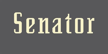 Greek version by Dimitris Arvanitis.
 - Greco by Deniart Systems,
$10.00Based on the modern Greek alphabet. - Pseudo-Hellenic by Simeon out West,
$18.00 Pseudo-Hellenic is a font based the Greek typeface of Firmin Didot. The original Greek typeface became standard during the Victorian era and remained popular until the last part of the twentieth century. Pseudo-Hellenic seeks to create an environment reminicent of the many Greek texts and is meant to re-create their ethos while communicating with a non-Greek speaking audience. Pseudo-Hellenic with full punctuation, a character 221 glyph character set that allows the user to type in most Western European Latin alphabet languages. Being a decorative font, it works best at larger point sizes.
 - MCapitals - 100% free

- Nadah by Nantia.co,
$12.00 Nadah Grunge Handwritten Greek font is a decorative font. Of course, the font supports Greek character set and a full extended Latin character set with diacritics. The raw, organic feeling of the font it makes it ideal for the food industry. Also, it’s ideal for creating social media content, for branding, poster design, wedding invitations, or any other packaging. So with your purchase, what is included? Extended Latin Characters Greek Characters Numerals
 - Nadirii Pro by Nantia.co,
$12.00 Nadirii Pro Greek Cyrillic Font is a fun display typeface with a nostalgic touch. In fact, this typeface supports over 30 languages and it can be a perfect match for all your food packaging projects. Of course, you can use it for organic handcrafted products branding. Also, it can be an ideal tool for storytellers, too! In other words, the crafty feeling of this font is pairing perfectly with illustrations, book covers and handmade social media content. In addition, Nadirii Pro Font supports extended Greek diacritics or Polytonic Greek. Therefore, this feature is perfect for writing Byzantine, Katharevousa and Greek-Orthodox texts, with a modern twist.
 - PF Monumenta Pro by Parachute,
$69.00 Royal, majestic, elegant. These letters are based on Roman and Greek characters carved on stone. They come in 3 different styles. Normal and Shaded are designed to have serifs with a finer thinning. On the other hand, Metallic is bolder and simulates in the most realistic way three-dimensional metallic lettering. There are some alternate characters placed at lowercase positions as well as a few stylistic alternates which are accessed through the OpenType features. Pay attention to letters like Greek Omega (lowercase position) and Greek Xi (lowercase position) as well as B, R, K (lowercase position). Monumenta Pro was recently upgraded to support Latin, Greek and Cyrillic.
 - Quirky Kurlz by Scholtz Fonts,
$22.00 Quirky Kurlz is a cute, curly, vintage font. It's light hearted and funny, rounded and retro. Rounded characters, curly loops and undulating baseline work together to give a lively, look-at-me impression. Use Quirky Kurlz for branding, packaging, girls stuff, kids fashion, greeting cards, party invitations, retro postcards and advertising. Quirky Kurlz has all the features usually included in a fully professional font. Language support includes all European character sets, Greek symbols and all punctuation. Quirky Kurlz makes use of OpenType features to avoid the mechanical look caused by two identical characters side by side.
 - Osnova Navigation by AndrijType,
$18.75 The common Slavic word Основа (Osnova) means basis in English and βάση in Greek. This universal but still distinctive typeface can make a good ground for any design project. Special Navigation version separated by Western Latin, Greek and Cyrillic families is here.
 - Cal Uncial Rough by Posterizer KG,
$19.00 Cal Uncial Rough is a calligraphic font based on sketches written with cane calligraphy pen and ink on coarse-textured paper. Because of the fact that the Uncial don't have lowercase letters, there are small capitals instead of the lowercase. As the Latin version of the Uncial was created from the Greek Uncial script (translating the Bible from Greek into Latin), in addition to the standard Latin graphemes, the font contains the Greek alphabet (and also the Cyrillic letters (Ustav), derived from the Greek Uncial too). Regardless of the stylistic connection, there is a difference between the morphology of related Greek, Latin and Cyrillic letters. Most of the graphemes are based on traditional roman and insular uncial calligraphy. Cal Uncial Rough is suitable for the preparation of calligraphic sketches as well as an application in typography that should bring us closer to historical topics (European literature, quotes, history, film ...).
 - Gorodets by Alexandra Korolkova,
$25.00 Gorodets is a symbol font based on traditional wood-painting style from the town Gorodets on Volga river, Russia. The main motifs of it are decorative flowers, birds, horses and even people, drawn in special way and painted in black, red, blue and green. The Gorodets typeface consists of 60 manually traced images divided into two parts: filled and empty ones. The typeface can be suitable in greeting cards and other printed materials to make them look decorative in a traditional Russian way.
 - Ongunkan Carian by Runic World Tamgacı,
$50.00 Caria (/ˈkɛəriə/; from Greek: Καρία, Karia, Turkish: Karya) was a region of western Anatolia extending along the coast from mid-Ionia (Mycale) south to Lycia and east to Phrygia. The Ionian and Dorian Greeks colonized the west of it and joined the Carian population in forming Greek-dominated states there. Carians were described by Herodotus as being of Minoan descent, while he reports that the Carians themselves maintained that they were Anatolian mainlanders intensely engaged in seafaring and were akin to the Mysians and the Lydians
 - DISCOBOX - 100% free

- Ala Kazam by Scholtz Fonts,
$22.00 Ala Kazam is a new take on Calligraphic fonts. It has all the drama and pen-like quality of the calligraphy genre, but presents as a casual, quirky, magical font. Ala Kazam evokes many moods - it's fun, it's sophisticated, it's fashionable, it's contemporary romance. It's perfect for a host of uses - branding, packaging, kids stuff, fashion, wedding stationery, greeting cards. Vigorous and readable, Ala Kazam has all the features usually included in a fully professional font. Language support includes all European character sets, Greek symbols and all punctuation. Ala Kazam makes use of OpenType features to avoid the mechanical look caused by two identical characters side by side.
 - Antio by Nantia.co,
$12.00 ANTIO Greek Font is a brush font. ANTIO Greek Font is an all Caps marker font. Also, the font is a multilingual font with Greek (of course), Latin characters and diacritics. The style of this typeface is perfect for your modern graphic design needs. Food packaging, restaurant menus, coffee and bar menus, and food industry branding are some examples of the numeral applications of this typeface. The shabby-chic style of the font is perfect for your graphic design needs like social media quotes, blog headers, posters, art projects and why not packaging, and logotypes.
 - UGLY LOVER - Unknown license

- Konkret by MacCampus,
$30.00A modern geometric display font; includes full pan-European character set (Latin, Greek, Cyrillic) - Old Towne Pro by RMU,
$40.00 Classic Western-style slab serif font extended to include Cyrillic and Greek letter forms.
 - Fantasma Lanky by StratosMFonts,
$4.90 The ''Fantasma lanky'' is StratosMFonts' first font project. The ''Fantasma lanky'' style is a sans typeface with a sense of script and a dramatic touch. It's a font family that includes 24 members from Thin to ExtraBlack covering Latin, Baltic, Turkish and Greek languages (Latin 1, Latin 2: Eastern Europe, Greek, Turkish, Baltic)
 - Nautis by TEKNIKE,
$39.00 Nautis is a distinct display monospace typeface. The Nautis name is derived from the Greek nautikos meaning “naval”. Nautis is great for fashion, events, branding, military, navy, nautical, shipping and suited for display work, invitations, writing, architecture, posters, logos and headings. Nautis is currently available with Latin, Cyrillic, Hebrew and Greek character sets.
 - ZWISDOM - 100% free

- Caesar Dressing Pro by Open Window,
$19.95 Caesar Dressing is a 'Markers' take on a Greek alphabet. Open Window fonts gravitate towards more experimental or spontaneous renderings and this one doesn't look out of place next to the most experimental of those. It also maintains the geometric balance of a classic Greek-font quite effectively. Designed by Dathan Boardman of Open Window.
 - The "ROBO" font, designed by George Edward Purdy, is a significant contribution to the typographic world, blending the boundaries between technology and art. At its core, "ROBO" encapsulates the esse...
- POP. 1280 - 100% free

- Ongunkan Rosetta Stone by Runic World Tamgacı,
$50.00 The Rosetta Stone, or Rashid Stone, was accidentally found by a French soldier during an excavation in the fortification of Egypt. The stone was inscribed in three languages, intended to be sent to three major Egyptian temples. These languages are: Demotic (the language used by the people in Egypt), Hieroglyphic and Ancient Greek. This font contains ancient greek.
 - Ongunkan Karamanli Turkic Scrip by Runic World Tamgacı,
$50.00 The font I made based on the Greek alphabet used by the Karamanlı Turks, who are Orthodox Christians, by adapting it to Turkish, which I deduced by looking at the inscriptions and translations. In order to write in Turkish, Turkish special characters are loaded with letter combinations and sounds. But it can still be easily written in Greek.


