Mooncrack is a brush-style font with bold, masculine strokes. This typeface captures attention with its thick and bold letterforms, making it an ideal choice for design projects that require a strong visual presence. It is suitable for various design projects such as logos, branding, posters, quotes, packaging design, labels, and much more!
For once the name of this font corresponds with the way it looks: Fat Inker is a fat, inky font. I made it with a Chinese brush and ink, Fat Inker is a nice poster font and it comes with extensive language support and some cool discretionary ligatures for double letter combinations.
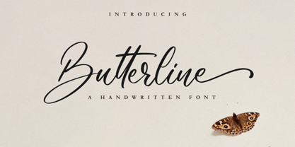
Butterline is a beautiful and elegant script font. Its modern and classy look makes it the perfect font for creating outstanding DIY projects! This font is PUA encoded which means you can access all of the glyphs and swashes with ease! It features a varying baseline, smooth lines, gorgeous glyphs and stunning alternates.
With its straight and clean face Hybi10 Metal can be a quite normal antique font family. But the alternates with different versions of spikes at the uppercase letters gives it an additional use. Decide for your own, how to use it. The styles with real capitals widens the range of use too.
Nick and Daddy is a cute comic font, carefully handcrafted to become a true favorite. Its casual charm makes it appear wonderfully down-to-earth, readable and, ultimately, incredibly versatile. Nick and Daddy will look outstanding in any context, whether it�s being used on busy backgrounds or as a standalone headline!
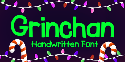
Grinchan is a fun to use Halloween and Christmas font. You can use it for anything ranging from t-shirts, kids’ book designs, and greeting cards to stickers and posters, or anything that needs a casual touch. Fall in love with its incredibly versatile style, and use it to create lovely designs!
Blooming Sakura is a fun font with flower decorative twist. You can use it for anything ranging from regular typing notes, to t-shirts, kids’ book designs, greeting cards, stickers, posters, or anything that needs a casual touch. Fall in love with its incredible style and use it to create lovely designs!
Setter is a type family that stands between geometric and humanist styles. Its unique features and large x-height gives it a modern look. Good for small text blocks, headlines and logos. Vast latin character set: Central, Southeastern and Western Europe. Vietnamese, Pinyin and Pan African Latin. Math and Currency. Enjoy it!
The Craprio is a unique, simple, clean and well appointed display serif. It is perfect for gorgeous logos, titles, web layouts, fashion magazine and branding. It looks very nice and classy in an all-caps with a wide-set spacing, and also very beautiful on its own in capital and lowercase letters.
Black Lonthe is an exquisite blackletter font that exudes timeless elegance. With its bold and ornate strokes, it captures the essence of traditional calligraphy while adding a modern twist. The sleek, sophisticated design of Black Lonthe makes it perfect for creating eye-catching titles, logos, and invitations that leave a lasting impression.
Murisa Elena is an attractive and attractive font. It has beautiful shapes like brush strokes on canvas. Very amazing fonts. You can use it to display your products or your personal and company logo. Murisa Elena appears with a perfect shape, just like you write with your favorite brush. Get it right now.
The Potato font was made using a technique everyone probably knows from childhood - the letters were cut out from a potato which was used as a stamp. It was designed for my cook book. One of its best features is OpenType Contextual Alternates that will automatically replace each glyph with it alternate characters.
Lemah Teles is a display font. It is a tough-looking font with a strong brush touch, ready to rock every design you want to create. It is perfect for logos, quotes, posters, clothing, and so much more! Add it to any of your creative projects, and be amazed by the generated outcome!
Mahdani by Nandatype Studio, $13.00 Mahdani is a unique handwritten brush font. Its unique flow and style makes it perfect to use for prints, logos, signatures, quotes, badges, labels, packaging design, blog headlines or simply use it to add a fancy text on a photo. Mahdani comes with upper and lowercase Basic Characters, Numbers, Marks and Punctuation
Attaboy is a posh word for ‘well done’. It was made with a broken marker pen to give it that ‘eroded’ look. It is an all caps typeface, but upper and lower case can be mixed. Attaboy comes with stylistic alternates for the lower case glyphs and all the diacritics you need.
Hallo Skull is a fun friendly and spooky display font. It is suitable for each of your party designs or Halloween creation. Add it to your creative Halloween-themed ideas and notice how it makes them stand out! This font is PUA encoded which means you can access all of the glyphs.
Wreckout by Stringlabs Creative Studio, $25.00 Wreckout is a gorgeous display font that feels bold. It will turn any design project into an eye-catcher! Its trendy and delicate makes Wreckout look gorgeous in wedding invitations, thank you cards, quotes, greeting cards, logos, business cards and much more. It also includes stunning alternates, ligatures and multiple language support.
Rigo™ is a flexible family of modern sans serif. Rigo is characterized by some humanistic characteristics, its open part of negative space and its overall width make it highly legible and readable at small to large size. The openness helps Rigo to be a good performer on the screen as well.
A cool looking bouncy font, with its unique characters, you can actually mix caps and lowercase letters in the same word. Sugar Shack allows you to be as creative as you want, it has its own designed animation built into the font. Experiment with the characters and you will be quite satisfied.
A "Petit Four" is a small, bite-sized, French pastry. The font before you is a bite-sized Hanoded original. It is hand made, fun to use and comes with a lot of calories. Like its namesake, use Petit Four sparingly and it will be the cherry on top of your design.
Kasih Putih is a modern calligraphy font. It supports common international characters and comes with a set of alternates and ligatures. It is suitable for multiple projects from printed to digital products. It is nice to be printed on billboards, bottles or cups as well as for logos or design for apparel.
Sigmathin is a graceful and refined script font designed to resemble a handwritten signature. Its smooth curves and delicate strokes give it an elegant and sophisticated appearance. This font exudes a sense of style and professionalism, making it an excellent choice for projects that require a personal touch or a touch of class.
Mainsail is a handwritten brush script font. It is casually written with dry brush pen, so it has this nice texture and flow. Mainsail has lots of alternates to make it look more like real handwriting; four sets of lower cases and two sets of upper cases. Mainsail is great option for logos, headlines and packaging. You can also use it in longer texts where you need this casual handwritten look. It will also combine well with sans and serif fonts. Mainsail has OpenType features that automatically makes text look more authentic. Discretionary Ligatures replaces other of two identical letters following each other. Contextual Alternates will unleash the full cycle of the alternates. It will cycle all four lower case sets to make the text look as natural as possible. Mainsail has also underline strokes in separate font called Mainsail Swash. It includes combined 52 different underlines, strokes and circles. With these you can add the final punch to your design.
Goldplay is based on Isidora Sans design yet features rounded shapes. Its rounded, soft terminals give it a friendly and expressive look, and its modern and contemporary style as well as its classic proportions make it an excellent choice for headlines, logotypes, branding, books, magazines, motion graphics, and use on web and Tv. One of its key features is a large x-height which make it look elegant and classy. Goldplay comes in 2 versions—each in 7 weights, from Thin to Black, and matching italics, resulting in a total of 28 fonts. The standard sans serif version—fresh, clean and contemporary—is a perfect choice for editorial and corporate design, headlines, books, magazines or any other piece of graphic design. The Alt semi-serif display version—more expressive and modern—is ideal for logotypes, branding, packaging, and use on web and Tv. Goldplay contains a set of 540 characters that support over 200 Latin-based languages.

Introducing Monto Screen – the latest addition to the Monto superfamily, distinguished by its rational and meticulously constructed aesthetic. This new sub-family complements the success of Grotesk and Grotesk Display while offering a fresh take on Monto's design principles. Monto Screen is purposefully crafted for the digital era, ensuring unparalleled legibility and visual clarity on screens of all sizes. Its stroke endings align precisely at 90 and 0-degree angles, and its rounded shapes feature carefully designed verticals, creating a clean and harmonious structure. Through its rational construction, Monto Screen exudes a very trustworthy feel and established aesthetic, embodying a sense of reliability and timeless elegance. Its cap height aligned to the ascenders presents a unique choice that sets it apart, making it a compelling and distinct addition to the Monto superfamily. Embrace the future of typography with Monto Screen – a modern and rationally designed typeface that sets new standards for clarity and readability on digital platforms.

Create beautiful invitations, eye-catching logos, engaging social media posts, and more with Correspond. Its seamless integration of uppercase and lowercase characters, along with its extensive range of numbers and punctuations, ensures a harmonious and cohesive look throughout your design. One of the key features of Correspond is its multilingual support, allowing you to express your creativity in various languages and reach a global audience. No matter the project, Correspond has you covered with its wide array of characters and symbols. Unlock the full potential of Correspond with its PUA encoding, granting you easy access to a wealth of alternate glyphs and ligatures. This enhances your design possibilities and lets you add your personal touch to every project. Experience the power of Correspond Script Font and elevate your typography game. Its seamless curves and elegant flourishes make it a timeless choice for any design. Discover the beauty of Correspond and let your creativity shine.
• Algarabía "Joy" is a provocative and multilingual text face designed by Leonardo Vázquez. • It was created for a mexican magazine with the same name that uses it as the body text font, and now it's released for the public. • In 1397, Frederic Goudy's was asked to draw a face for the exclusive use of the University of California Press at Berkeley. The font was called California. In 1983 a digital version of this typeface was created by Aaron Burns and it was called ITC Berkeley. • Algarabía is inspired by ITC Berkeley, it keeps the calligraphic touch and weight, but it presents certain features in its design that might result unexpected, yet at the same time they are invisible when used as body text and provides the typeface its unique own personality. • Small Caps and Small caps italic, Included in each version. • Ideal for magazines, Art books or any editorial purposes where legibility and originality are needed.
Zombie Apocalypse is way more versatile as its name would suggest. It might be used as a horror font (red color tones in horror games, movie covers) or in ads for an Offroad Experience Tour (or wherever it comes to dirt, mud and spatters in combination with brown tones). When used with light blue/red/yellow/orange colors, the font can express creativity and freedom (on fashion, inspirational art and advertising) because it is not bound to classic straight-lined fonts. In various shades of gray or in black, it can be used to support a "worn out" look. Zombie Apocalypse - with its "worn out" look and many details - is espacially designed for use with large font sizes, for example in high resolution print media or in large images on digital media. The font is designed to be used in many different languages. It has a large set of accented characters and diacritical marks.
M Banquet is a humanistic script written by a Chinese restaurant owner, which the name ‘Banquet’ comes from. It is a calligraphic style that always being seen in traditional Chinese banquet menu. Incorporated a feeling of masculinity, fill with strength and energy and attracts eyeballs of customers. It was written with a thin ball pen in a unique, personal and expressive writing style, such that it is realistic, natural and masculine. Contrast of strokes is low and the text is visible and eye-catching. Its light to medium stems (豎) make it suitable for small text to subheading with little conglutination. All strokes are irregular, inconsistent, irregularly oriented and tightly coupled. Spatial distribution, positioning, size and relative proportion of radicals fully reflect a natural and personal style. It is one of the few proportional-width font in a full scale. It is best suited for casual lively atmosphere, illustrations, set upright (non-slanted), non-condensed.
M Banquet is a humanistic script written by a Chinese restaurant owner, which the name ‘Banquet’ comes from. It is a calligraphic style that always being seen in traditional Chinese banquet menu. Incorporated a feeling of masculinity, fill with strength and energy and attracts eyeballs of customers. It was written with a thin ball pen in a unique, personal and expressive writing style, such that it is realistic, natural and masculine. Contrast of strokes is low and the text is visible and eye-catching. Its light to medium stems (豎) make it suitable for small text to subheading with little conglutination. All strokes are irregular, inconsistent, irregularly oriented and tightly coupled. Spatial distribution, positioning, size and relative proportion of radicals fully reflect a natural and personal style. It is one of the few proportional-width font in a full scale. It is best suited for casual lively atmosphere, illustrations, set upright (non-slanted), non-condensed.
As of my last update in early 2023, Rosetta Tones isn't recognized as a widely known or established font, but let’s imagine what it could be, drawing from its evocative name that hints at a blend of ...
Brie Light, as its name suggests, is a font that embodies a blend of lightness and elegance. This typeface falls into a sophisticated category of fonts that balance between formality and a touch of p...
The Orange Kid font crafted by Ray Larabie is a distinctly vibrant and whimsical typeface, capturing the essence of fun and creativity. Larabie, a renowned font designer, is known for his ability to ...
SwishButtons by Nick Curtis is a charming and captivating typeface that effortlessly weaves the whimsy of art deco inspirations with the playfulness of modern design sensibilities. Created by the tal...
Squealer, designed by the talented Ray Larabie, is a font that vividly captures the essence of rock and roll's rebellious spirit, drawing heavily on the design aesthetics of the late 20th century. It...
Sure! Qurve Hollow Wide, crafted by the talented Dan Redding, is a distinctive font that immediately catches the eye due to its unique design and broad appeal. This typeface belongs to the larger fam...
RomanticFont2, as its name suggests, is a font that breathes life into the essence of romance, elegance, and an exquisite touch of delicateness. Crafted with a keen eye for harmonizing the traditiona...
The Brewsky font, designed by the talented Tup Wanders, is a unique and charismatic typeface that embodies a perfect blend of playfulness and artistic flair. This font manages to capture the essence ...
Joke font, as its name playfully suggests, embodies a spirit of fun and creativity, standing out with its quirky and whimsical style. Picture letters that seem to dance and wiggle on the page, each c...
As of my last update, the font "Aircloud" by Fontone may not have been widely recognized or described in sources accessible to me, so I can't give a specific description of "Aircloud." However, I can...