7,937 search results
(0.015 seconds)
- Bolivar Shore by Maulana Creative,
$14.00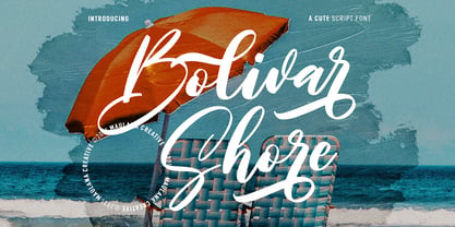 Bolivar Shore is a fancy modern script font. With bold high contrast stroke, fun character with a bit of ligaturess. To give you an extra creative work. Bolivar Shore font support multilingual more than 100+ language. This font is good for logo design, Social media, Movie Titles, Books Titles, a short text even a long text letter and good for your secondary text font with sans or serif. Make a stunning work with Bolivar Shore font. Cheers, Maulana Creative
 - Prumo Deck by DSType,
$40.00 Prumo is a new type system, based on a unique skeleton that flows, like a pendulum, from high contrast to low contrast. It's a sort of typographic journey, from the 18th century typefaces to the 19th century slab serif typefaces, gathering information from the Scotch Roman fonts on its journey. Prumo is a type family with classic proportions that takes advantage of the recent type production technology while looking carefully at the most important historical references.
 - Michega by Maulana Creative,
$18.00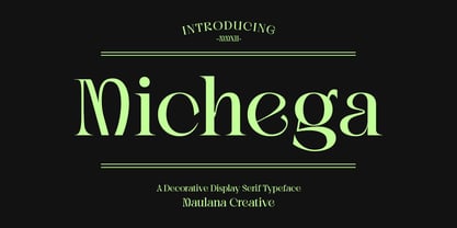 Michega is a decorative and explorative serif font. With high contrast stroke, fun character with a bit of ligatures. To give you an extra creative work. Michega font support multilingual more than 100+ language. This font is good for logo design, Social media, Movie Titles, Books Titles, a short text even a long text letter and good for your secondary text font with sans or script. Make a stunning work with Michega font. Cheers, Maulana Creative
 - Sofimaria by Qaratype,
$18.00 Sofimaria is a super unique ligature font that you wont forget! It’s a high contrast serif that has loads of style. A modern take on a Caslon style typeface, this font is ideal for those bold headings or wedding invitations. It’s got hundreds of characters and ligatures plus all those European letters! Sofimaria pairs perfectly with a light scripts font or minimal sans serif. Main Features: Uppercase & Lowercase letters Punctuation and special characters Multilingual support Ligatures & Alternate glyphs
 - Black Forest by Haksen,
$12.00 Black Forest is a beautiful high fashion font duo that makes for gorgeous logos, posters, wedding invitations, blog posts, social media, and more!I love using them together with layer masks in Photoshop, so it looks like the script is running through the lines of the sans. The sans looks stunning. Black Forest Script includes ligatures to make everything look totally hand-done, and alternates for each letter. What Includes: Black Forest Script OTF Black Forest Sans OTF Thanks
 - Franchek by Maulana Creative,
$22.00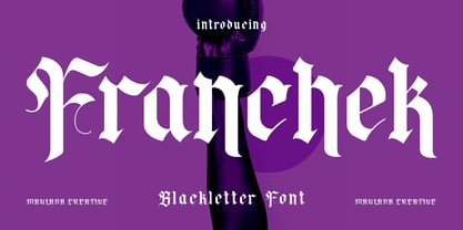 Franchek is a flourish fancy blackletter display font. With medium high contrast stroke, fun character with a bit of ligatures and alternates. To give you an extra creative work. Franchek font support multilingual more than 100+ language. This font is good for logo design, Social media, Movie Titles, Books Titles, a short text even a long text letter and good for your secondary text font with sans or serif. Make a stunning work with Franchek font. Cheers, Maulana Creative
 - Phaserwave by Mysterylab,
$22.00 Part of the wave of modern explorations expanding on the 50+ year-old traditions of groovy psychedelic typography, Mysterylab brings you Phaserwave. With an intriguing fusion of pillowy shapes and sharp stroke ends, this font cooks up a heady mélange of whimsical flow and high precision. We've applied our usual meticulous attention to great kerning, extensive character set, and seamless functionality, so this font's ready to rock your designs any way you might want to do it.
 - Jullysinty by Maulana Creative,
$13.00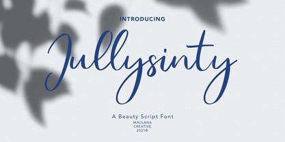 Jullysiinty is casual script font, with high contrast light stroke, slant and fun character. It has Opentype features ligatures of character, To give you an extra creative work. Jullysiinty script font support multilingual more than 100+ language. This font is good for logo design, Social media, Movie Titles, Books Titles, a short text even a long text letter and good for your secondary text font with sans or serif. Make a stunning work with Jullysiinty font. Cheers, MaulanaCreative
 - Oshirist by Maulana Creative,
$11.00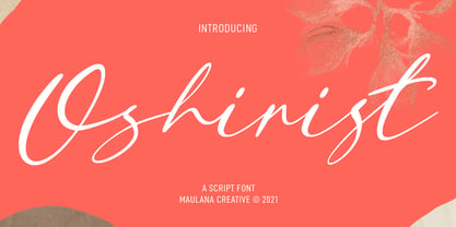 Oshirist is a Fancy unique script font. With high contrast stroke, slanted and fun character with a bit of ligatures. To give you an extra creative work. Oshirist font support multilingual more than 100+ language. This font is good for logo design, Social media, Movie Titles, Books Titles, a short text even a long text letter and good for your secondary text font with sans or serif. Make a stunning work with Oshirist font. Cheers, MaulanaCreative
 - Aster Script by Fenotype,
$25.00 Aster Script is a modern calligraphy script with high contrast. Aster Script is a hand drawn font and it’s great for any display use from packaging to poster and logotype to headline. Aster Script is equipped with contextual alternates and ligatures that are automatically on. The feature is set under Standard Ligature function. In addition Aster Script has Swash alternates for every standard character. Aster Script has wide language support and special characters are PUA encoded.
 - Owlishly by Maulana Creative,
$12.00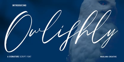 Owlishly is an expressive modern script font. With high contrast stroke, fun character with a bit of ligatures and alternates. To give you an extra creative work. Owlishly font support multilingual more than 100+ language. This font is good for logo design, Social media, Movie Titles, Books Titles, a short text even a long text letter and good for your secondary text font with sans or serif. Make a stunning work with Owlishly font. Cheers, MaulanaCreative
 - Franches by Maulana Creative,
$14.00 Franches is a Cute handwritten font. With high contrast bold stroke, upright and fun character with a bit of ligatures. To give you an extra creative work. Franches font support multilingual more than 100+ language. This font is good for logo design, Social media, Movie Titles, Books Titles, a short text even a long text letter and good for your secondary text font with sans or serif. Make a stunning work with Franches font. Cheers, MaulanaCreative
 - Konstanz by W Type Foundry,
$25.00 Konstanz is a sans serif font family inspired by the design of books and magazines for museums, art galleries, design biennials, architecture, and theater, among others. Its design focuses on a grotesque aesthetic but brings back certain shapes from Bauhaus and Futura. Konstanz includes 8 weights plus its matching italics, besides a stylistic set that increases its use possibilities. Konstanz ensures a graphic with a high impact and is ideal for designing editorial projects, posters, branding, and advertising.
 - Happyfin by MNW,
$80.00 Happyfin is a sumptuous font based upon the free nature of a handwritten text, it balances the organic form with the necessary preciseness of a traditional typed font. With a smooth light hearted elegance, this font is perfect for designs involving organic produce and situations where a professional yet fun and friendly typeface is needed. The font has high readability level, and yet conveys a good deal of character and style within the simplest of forms.
 - Prumo Display by DSType,
$40.00 Prumo is a new type system, based on a unique skeleton that flows, like a pendulum, from high contrast to low contrast. It’s a sort of typographic journey, from the 18th century typefaces to the 19th century slab serif typefaces, gathering information from the Scotch Roman fonts on its journey. Prumo is a type family with classic proportions that takes advantage of the recent type production technology while looking carefully at the most important historical references.
 - TT Nooks by TypeType,
$39.00 TT Nooks useful links: Specimen | Graphic presentation | Customization options TT Nooks is an experimental font family that includes a high contrast serif, TT Nooks, and an upright italic, TT Nooks Script. Despite the difference in style, both subfamilies get along well, which is partially thanks to their similar proportions. Each of the subfamilies includes 4 weights: Light, Regular, Bold and Black. The main subfamily is TT Nooks—a stylish high-contrast serif with a light touch of self-centeredness. If TT Nooks were a person, it would be an elegant lady with an independent and firm personality. In the original sketches of TT Nooks there were traces of a broad pen, but in the course of further evolution the typeface moved away from this style, retaining only the high contrast of strokes. In addition, in the process of design searches TT Nooks has obtained a touch of geometricity. The serifs in TT Nooks stand out especially visibly thanks to their geometric shape that resembles slippers. In addition to their peculiarity, such serifs add stability to the font and allow better compensation of the black and white ratio within the letters. TT Nooks has small capitals for Latin and Cyrillic alphabets, as well as a set of stylistic alternates (including some figures) that makes the typeface a bit more geometric. In addition, we have drawn more than 25 ligatures, including ligatures for capital letters, slashed zero and many other useful OpenType features. TT Nooks Script is a complementary family designed to harmoniously extend the main family and expand its scope. The forms of the characters in bold and light fonts of TT Nooks Script are quite different. For example, Black & Bold have high contrast strokes and an open aperture, and in Regular & Light the aperture of the characters is closed. TT Nooks also has small capitals for Latin and Cyrillic alphabets, ligatures, oldstyle figures and other OpenType features. In light faces, TT Nooks Script is more humanist and has artifacts inherent to the continuous movement of a flat pen. In bold faces, TT Nooks Script has a very dense and dynamic typing rhythm, and the shape of the letters begins to geometrize. We had had the difficult task of preserving the continuity of forms between bold and light faces, and we have managed to solve it thanks to the found rhythm, which united different fonts, and proximate stylistic solutions.
 - Phinney Jenson by HiH,
$12.00 Phinney Jenson ML is a font with deep historical roots firmly planted in the fertile soil of the Italian Renaissance. Twenty years after Lorenzo Ghiberti finished his famous East Doors, the Gates of Paradise, of Santa Maria del Fiore in Florence and about fifteen years before Sandro Botticelli painted his “Birth of Venus,” a French printer by the name of Nicolas Jenson set up a small print shop in the powerful city-state of Venice. The fifteenth century marked the end of the plague and the rise of Venetian power, as the merchants of Venice controlled the lucrative trade of the eastern Mediterranean and sent their ships as far as London and even the Baltic. In 1470, Jenson introduced his Roman type with the printing of De Praeparatio Evangelica by Eusebuis. He continued to use his type for over 150 editions until he died in 1480. In 1890 a leader of the Arts & Crafts movement in England named William Morris founded Kelmscott Press. He was an admirer of Jenson’s Roman and drew his own somewhat darker version called GOLDEN, which he used for the hand-printing of limited editions on homemade paper, initiating the revival of fine printing in England. Morris' efforts came to the attention of Joseph Warren Phinney, manager of the Dickinson Type Foundry of Boston. Phinney requested permission to issue a commercial version, but Morris was philosophically opposed and flatly refused. So Phinney designed a commercial variation of Golden type and released it in 1893 as Jenson Oldstyle. Phinney Jenson is our version of Phinney’s version of Morris' version of Nicolas Jenson’s Roman. We selected a view of the Piazza San Marco in Venice for our gallery illustration of Phinney Jenson ML because most of the principal buildings on the Piazza were already standing when Jenson arrived in Vienna in 1470. The original Campanile was completed in 1173 (the 1912 replacement is partially visible on the left). The Basilica di San Marco was substantially complete by 1300. The Doge’s Palace (not in the photo, but next to the Basilica) was substantially complete by 1450. Even the Torre dell'Orologio (Clock Tower) may have been completed by 1470—certainly by 1500. Phinney Jenson ML has a "rough-and-ready" strength, suitable for headlines and short blocks of text. We have sought to preserve some of the crudeness of the nineteenth-century original. For comparison, see the more refined Centaur, Bruce Rogers's interpretation of Jenson Roman. Phinney Jenson ML has a strong presence that will help your documents stand out from the Times New Roman blizzard that threatens to cover us all. Phinney Jenson ML Features: 1. Glyphs for the 1252 Western Europe, 1250 Central Europe, the 1252 Turkish and the 1257 Baltic Code Pages. Accented glyphs for Cornish and Old Gaelic. Total of 393 glyphs. 400 kerning pairs. 2. OpenType GSUB layout features: onum, pnum, salt, liga, dlig, hisy and ornm. 3. Tabular (std), proportional (opt) & old-style numbers (opt). 5. CcNnOoSsZz-kreska available (salt).
 - Charpentier Renaissance Pro by Ingo,
$42.00 A very legible Renaissance Antiqua This typeface is based on the desire to create an Antiqua like those which might have existed at the beginning of the »printing age« — the basic form oriented on the classical Roman and early Middle Ages models, the ductus defined completely by writing with a wide pen and much individual expression in detail. In the spring of 2005 I had the opportunity to closely examine a few pages in the famous book »Hypnerotomachia Poliphili« from 1499. The script used here from Aldus Manutius is exemplary. Most of the book, however, is not very carefully printed. The characters do not stay on the line; the print is at times too strong and at times much too weak. And on these imperfect pages the true character of the letters is recognizable; that is, that they are cut with lively detail which is a result of the patterns provided by full-time writers. After all, around 1499 script was written as a rule and the printed type was oriented on this pattern. I prefer the typeface on the lightly printed pages. The characters are not placed neatly on the line, but the distinct and emerging lively ductus of the individual characters automatically presents harmonious word formations in the eye of the beholder, with the non-perfect line stepping into the background. Also in Charpentier Renaissance, the strokes of the wide pen are still noticeable. The font has very defined softly bent serifs. The forms are powerful and stand solidly on the baseline. Charpentier Renaissance is very legible and yields a solid and yet still lively line formation. The accompanying italic, like its historical models, has almost no inclination. The lower case characters of Charpentier Renaissance Oblique have such idiosyncratic figures that they can also form a font of their own. Please visit www.ingofonts.com
 - FF Identification by FontFont,
$30.99 British type designer Rian Hughes created this display FontFont in 1993. The family has 5 weights, and is ideally suited for music and nightlife. It comes with tabular lining and proportional lining figures.
 - Oxford Street by K-Type,
$20.00 Oxford Street is a signage font that began as a redrawing of the capital letters used for street nameplates in the borough of Westminster in Central London. The nameplates were designed in 1967 by the Design Research Unit using custom lettering based on Adrian Frutiger’s Univers typeface, a curious combination of Univers 69 Bold Ultra Condensed, a weight that doesn’t seem to exist but which would flatten the long curves of glyphs such as O, C and D, and Universe 67 Bold Condensed with its more rounded lobes on glyphs like B, P and R. Letters were then remodelled to improve their use on street signs. Thin strokes like the inner diagonals of M and N were thickened to create a more monolinear alphabet; the high interior apexes were lowered and the wide joins thinned. The crossbar of the A was lowered, the K was made double junction, and the tail of the Q was given a baseline curve. K-Type Oxford Street continues the process of impertinent improvement and includes myriad minor adjustments and several more conspicuous amendments. The stroke junctions of M and N are further narrowed and their interior apexes modified. The middle apex of the W is narrowed and the glyph is a little more condensed. The C and S are drawn more open, terminals slightly shortened. The K-Type font adds a new lowercase which is also made more monolinear so better suited to signage, loosely based on Univers but also taking inspiration from the Transport typeface both in a taller x-height and character formation. The lowercase L has a curled foot, the k is double junctioned to match the uppercase, and terminals of a, c, e, g and s are drawn shorter for openness and clarity. A full repertoire of Latin Extended-A characters features low-rise diacritics that keep congestion to a minimum in multiple lines of text. The font tips the hat to signage history by including stylistic alternates for M, W and w that have the pointed middles of the earlier MOT street sign typeface. Incidentally, Alistair Hall (‘London Street Signs’, Batsford, 2020) notes that when the manufacturer of signs was changed in 2007, Helvetica Bold Condensed was substituted in place of the custom design, “an unfortunate case of an off-the-peg suit replacing a tailored one” and a blunder that has happily since been rectified, though offending nameplates can still be spotted by discerning font fans.
 - Rose Garden Deluxe by Fenotype,
$25.00 Rose Garden Deluxe is an elegant type collection including a luscious high contrast serif in three weights and an ethereal pen script also in three weights. Together the fonts form an effective all-around set for sophisticated display purposes. The fonts are best used for imposing headlines, as a logotype, in packaging and posters. Rose Garden Serif has an extra high contrast giving it a sophisticated look, suitable for fashion or luxurious high-end products, magazines and anything such. Rose Garden Pen has no contrast, as if it was written with a steady and precise inking pen. Rose Garden Pen is equipped with plenty of useful OpenType features: it has Contextual Alternates and Standard Ligatures to enliven the flow of “writing” and to keep the connections between letters smooth. In addition it has Stylistic and Swash Alternates for every standard uppercase and lowercase characters, as well as for ampersand and few ligatures. On top of that it has initial and terminal swashes - a feature that is set in Titling Alternates. The feature works following: click it on and write normally. Type a space before a word and after it to get a special swash character in the beginning and in the end of the word. If that isn’t enough seek for even more alternates in the Glyphs Palette. Each weight has over 650 glyphs in total. Rose Garden Ornaments is an extension to Rose Garden Pen. It’s a set of Ornaments with the same weight and handwriting style as the font. The swooshes can be combined with the font for even more ornamental looks and the swashes set in lowercase letters can be used as additional terminal swashes, combined with any lowercase character.
 - 321 - Unknown license

- 321 - Unknown license

- Dipple KK S - Unknown license

- enen - Unknown license

- enen - Unknown license

- Mod Circle S - Unknown license

- Happy Serif - Personal use only

- Happy Sans - Personal use only

- PetalGlyph - Unknown license

- Arcandias Downtown by BlackLotus,
$20.00 Arcandias Downtown is a serif with high contrast combined with alternates so that it can match projects created using this font with trends in modern times.This font is made with precision for each character so as to create a quality font that is beautiful to look at. Arcandias Downtown can be used in various projects, both Magazine Titles, Posters, Newspapers, and others. This font has a variety of alternatives, so that any project that uses this font will look striking, beautiful, and modern.
 - Lina Serif by Caroline Herr,
$18.00 Lina Serif is an antiqua balanced between classic and modern. The design focused on the combination of flowing shapes and partially edged transitions, that give Lina her character. The font plays with a high line contrast in combination with dynamic shapes. This makes Lina a casually elegant display font. The terminals remind on floral shapes. Lina gives your design a human, natural touch. Lina Serif is available in 4 weights or as variable font with infinitely variable interpolation of weight.
 - Quiny Alissa by Maulana Creative,
$13.00 Quiny Alissa is an expressive signature script font. With high contrast slanted stroke, fun character with a bit of ligatures and alternates. To give you an extra creative work. Quiny Alissa font support multilingual more than 100+ language. This font is good for logo design, Social media, Movie Titles, Books Titles, a short text even a long text letter and good for your secondary text font with sans or serif. Make a stunning work with Quiny Alissa font. Cheers, Maulana Creative
 - Gella Display by Slava Antipov,
$29.00 Gella Display is a new sans serif family with high internal contrast. It has 10 weights and 4 widths, for a total of 40 styles. This font family good for typing large amounts of text and for headlines, logos, posters, covers, spectacular presentations, and more. Gella Display would be great for branding, websites and other tasks. The typeface supports a huge number of Latin and Cyrillic languages. Gella Display has many OpenType features such as ligatures, alternate characters, fractional numbers, and more.
 - Kontras by Hurufatfont,
$29.00 Kontras has high contrast at vertical and horizontal emphasis. When analyzing characters as a whole, it has contrast at style and practice too. Although has not much alternative characters, it provides decorative and grift effects because of this characteristic. Kontras is ideal for brand building, packet designs, decorative titles and so on. However it contains standard ligatures, contextual alternates (R, a, &), discretionary ligatures and case-sensitive forms. “Kontras” has been derived from “kontrast” which means contrast and opposition in Turkish.
 - Goddess by Device,
$39.00 Decadent, baroque and refined. Sinuous curves, ornate swashes and alternates that can be customized to suit your burlesque ball, bodice-ripping romance novel or high-fashion label. The “Swash” version includes swash capitals that can be toggled on or off using the ‘swash’ option in Adobe apps. The “Title” version includes drop-caps that connect with an underline that runs under the regular characters. These again can be toggled on and off using the ‘swash’ option. Also includes optional stylistic alternates and ligatures.
 - Santa Claus by Mans Greback,
$59.00 Santa Claus is a traditional Christmas typeface. Being decorative and based on antique, Middle Ages letter forms, it aims to be a traditional type for Holiday contexts. The lettering was drawn by Måns Grebäck and put together into a font during 2019. The font is of high quality, and comes with an additional Christmas symbol typeface. You can also use the numbers to access symbols. Example: Santa6Claus It contains all necessary characters and supports a very wide range of international languages.
 - Pincoya Black Pro by Latinotype,
$49.00 Pincoya Black Pro is a font based on lettering found on a poster from the Spanish Civil War, complemented with graphics developed in “La Unidad Popular” (Chilean political coalition) during the seventies. Pincoya has many alternate characters in Opentype format that provide multiple options when composing a text. It is an ideal font for high impact sentences, logotypes, magazine layouts, poster designs, etc. Languages include: Basic Latin, Western European, Euro, Catalan, Baltic, Turkish, Central European, Romanian and Pan Africa Latin.
 - Alulla Saffia by Maulana Creative,
$14.00 Alulla Saffia is a handwritten script font, With a clean, high contrast stroke and fun characters. It has Opentype features of ligatures, makes it a perfect choice for branding and digital designs. Use this font for logos, social media, websites, blogs, instagram, social media, business cards, branding, and more! Alulla Saffia handwritten script font support multilingual more than 100+ language. and good pair for your secondary text font with sans or serif. Make a stunning work with Alulla Saffia script font. Cheers, MaulanaCreative
 - Alifut MF by Masterfont,
$59.00 A practical font family with 4 weights for all your day to day design needs: headlines, body text, signage etc. High legibility at small sizes. An extended sans serif typeface with rounded endings that provides a unique softness appearance without losing legibility. The Pro version is an excellent support for Niqqud (Vowels). All marks are programmed to fit each glyph's shape and width. Best used with apps that support right to left Hebrew text, like Adobe InDesign CC or MS Word.


