10,000 search results
(0.031 seconds)
- Mariah - Unknown license

- Clockwork - Unknown license

- Denmark - Unknown license

- Cuckoo - Unknown license

- Diploma - Unknown license

- Karloff - Unknown license

- Virgin - Unknown license

- Looper - Unknown license

- Nauert - Unknown license

- Transistor - Unknown license

- Tristan - Unknown license

- RusskijModern - Unknown license

- Kroeburn - Unknown license

- KurtRussell - Unknown license

- Ten - Unknown license

- Patrick - Unknown license

- Funk - Unknown license

- Vagabond - Unknown license

- Market - Unknown license

- Wharmby - Unknown license

- Franciscan - Unknown license

- Kringle - Unknown license

- Spirals - Unknown license

- Witzworx - Unknown license

- Maceo - Unknown license

- Sceptre - Unknown license

- Connection - Unknown license

- fuu - Unknown license

- Unicorn - Unknown license

- South Amsterdam DEMO - Personal use only

- Gready PERSONAL USE ONLY - Personal use only

- Classic Roots Personal Use - Personal use only

- Black Jack Personal Use - Personal use only

- VTC NightOfTheDrippyDead - Unknown license

- BARBARA PERSONAL USE - Personal use only

- Candy Cane Personal Use - Personal use only

- Letric PERSONAL USE ONLY - Personal use only

- Dangerfield by Solotype,
$19.95 - Bebop by Présence Typo,
$36.00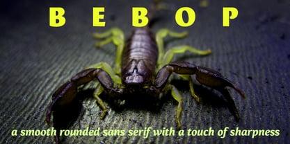
- Typography times - 100% free





