10,000 search results (0.028 seconds)
  1. Hall Fetica Upper - Unknown license
  2. BN-Rock - Unknown license
  3. Y2k Subterran Express KG - Unknown license
  4. JI Tracks - Unknown license
  5. BN-Buzz! - Unknown license
  6. RollerCoaster - Unknown license
  7. BandyCyr - Unknown license
  8. FuturistStencil - Unknown license
  9. GF Vienna heavy - Unknown license
  10. Damn the Man - Unknown license
  11. Saltwater - Unknown license
  12. Will-Harris - Unknown license
  13. AIxDARBOTZCUMI - Unknown license
  14. Dungeon - Unknown license
  15. Silom - Unknown license
  16. Fatty - Unknown license
  17. Quilline Script Thin - Unknown license
  18. Aierbazzi - 100% free
  19. PF Tempesta Seven Extended - Unknown license
  20. Anisette Std Petite by Typofonderie, $59.00
    Geometric font inspired by shop signs in 4 styles Anisette has sprouted as a way to test some ideas of designs. It has started with a simple line construction (not outlines as usual) that can be easily expanded and condensed in its width in Illustrator. Subsequently, this principle of multiple widths and extreme weights permitted to Jean François Porchez to have a better understanding with the limitations associated with the use of MultipleMaster to create intermediate font weights. Anisette built around the idea of two widths capitals can be described as a geometric sanserif typeface influenced by the 30s and the Art Deco movement. Its design relies on multiple sources, from Banjo through Cassandre posters, but especially lettering of Paul Iribe. In France, at that time, the Art Deco spirit is mainly capitals. Gérard Blanchard has pointed to Jean Francois that Art Nouveau typefaces designed by Bellery-Desfontaines was featured before the Banjo with this principle of two widths capitals. The complementarity between the two typefaces are these wide capitals mixed with narrow capitals for the Anisette while the Anisette Petite – in its latest version proposes capitals on a square proportions, intermediate between the two others sets. Of course, the Anisette Petite fonts also includes lowercases too. Anisette Petite, a geometric font inspired by shop signs in 4 styles So, when Jean François Porchez has decided to create lowercases the story became more complicated. His stylistic references couldn’t be restricted anymore to the French Art-déco period but to the shop signs present in our cities throughout the twentieth century. These signs, lettering pieces aren’t the typical foundry typefaces. Simply because the influences of these painted letters are different, not directly connected to foundry roots which generally follow typography history. The outcome is a palette of slightly strange shapes, without strictly not following geometrical, mechanical and historical principles such as those that typically appear in typefaces marketed by foundries. As an example, the Anisette Petite r starts with a small and visible sort of apex that no other similar glyphs such as n or m feature, but present at the end of the l and y. The famous g loop is actually inspired by Chancery scripts, which has nothing to do with the lettering. The goal is of course to mix forms without direct reports, in order to properly celebrate this lettering spirit. This is why the e almost finishes horizontally as the Rotis – and the top a which must logically follow this principle and is drawn more round-curly. This weird choice seemed so odd to its designer that he shared his doubts and asked for advise to Jeremy Tankard who immediately was reassuring: “Oddly, your new top a is fine, it brings roundness to the typeface, when the previous pushes towards Anisette Petite to unwanted austerity.” The Anisette Petite, since its early days, is a mixture of non-consistent but charming shapes. Anisette, an Art Déco typeface Anisette Petite Club des directeurs artistiques, 46e palmarès Bukva:raz 2001
  21. Ubicada - Personal use only
  22. HYPD BD Bardust - Unknown license
  23. VTC Bad DataTrip - Unknown license
  24. VTC Anglika Bent - Unknown license
  25. VTC Bad DataTrip - Unknown license
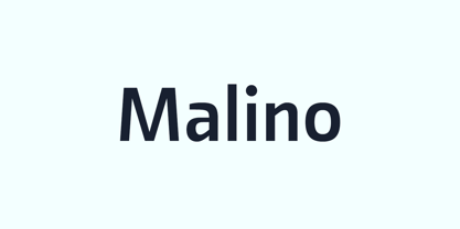
  26. Malino by Lafontype, $25.00
    Malino is a humanist sans serif that gives a slightly stiff and strong feel but still presents a harmonious blend. The main characteristic of Malino is the flat shape at the end of the letter (specific : inner side of the letter C, G, J, S, a, c, e, g and s) and still maintain the curvature of the outside (Overshoot) so that empty space ( Open Counter) looks wider and the level of readability produced is much higher.
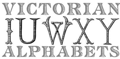
  27. Victorian Alphabets by Intellecta Design, $24.00
    Victorian Alphabets is a incoming family of complete victorian style alphabets, researched and developed upon a comprehensive number of vintage books, magazines and catalogues from XIX century. The "Victorian Alphabets A" font has just A' designs, performing 52 differnt A's to your use. And the Victorian Alphabets B and C has, too 52 B and C letters, only, each. You also can take a look in our massive collection of monograms, here : https://www.myfonts.com/fonts/intellecta/intellecta-monograms/
  28. Ah, Tasmin Reference, a font that strides into the room with the confidence of a catwalk model, yet carries an air of scholarly wisdom reminiscent of a seasoned professor. Picture this: it’s as if He...
  29. HL2MP is not a widely recognized font in the traditional sense, such as Helvetica or Times New Roman, especially within professional typography or design circles. The name "HL2MP" seems to reference ...
  30. Lifetime Font - Personal use only
  31. Matreshka - Unknown license
  32. Angello - Personal use only
  33. Neucha - Personal use only
  34. Janda Celebration Script - Personal use only
  35. Butterflies - Unknown license
  36. KG Cold Coffee - Personal use only
  37. Janda Silly Monkey - Personal use only
  38. KG Seven Sixteen - Personal use only
  39. Janda Cheerful Script - Personal use only
  40. KG Dark Side - Personal use only
Looking for more fonts? Check out our New, Sans, Script, Handwriting fonts or Categories
abstract fontscontact usprivacy policyweb font generator
Processing