10,000 search results
(0.052 seconds)
- Bebas Neue Pro by Dharma Type,
$14.99 Thank you for waiting. Finally, Bebas Neue has got lowercases! Bebas Neue is a world wide, the most popular font family with all caps released in 2010. Bebas Neue has been used from by big companies to by startup designers for many projects. In spite of the fact that Bebas Neue has only Uppercases, it became very popular font for these 10 years. At the same time, we received many requests for adding lowercases. To be honest, we had been developing whole new Bebas Neue with lowercases secretly for long time. Thinner Uppercase from thin to regular weights were redesigned for Pro. New lowercases were designed to match the Uppercases very carefully. You can access Tabular figures by using OpenType tnum features. Almost all European languages are supported by Pro. One more big thing is... Bebas Neue Pro has Italics! Please don't use sloped Bebas Neue. Pro has proper Italics! Bebas Neue “Pro” can extend your possibilities. Be the first to use this professional and premium Bebas Neue!
 - Deco Neue Wilde by Open Window,
$- Deco Neue Wilde is a filter font based on Deco, an original Open Window classic. It sort of speaks for itself but it reminds me of a lava lamp and the countless shapes that you could waste time watching appear.
 - Neue Frutiger Hebrew by Linotype,
$79.00 Neue Frutiger Hebrew was created by Yanek Iontef and a team of designers and font engineers from the Monotype Studio, under the direction of Monotype type director Akira Kobayashi. The family is available in 10 weights from Ultra Light to Extra Black, with matching italics. Neue Frutiger Hebrew embodies the same warmth and clarity as Adrian Frutiger’s original design, but allows brands to maintain their visual identity, and communicate with a consistent tone of voice, regardless of the language. It is part of the Neue Frutiger World collection, offering linguistic versatility across environments – suited to branding and corporate identity, advertising, signage, wayfinding, print, and digital environments.
 - Kapra Neue Pro by Typoforge Studio,
$39.00 Kapra Neue Pro is a younger sister of Kapra Neue – he was the #1 bestselling Grotesque Sans released in 2017 on MyFonts and grandson of Kapra. Now you really have a lot of options to choose! New family is full of everything – 96 weights contain a wide range of instances, from Condensed to Expanded, everything with rounded corners or with sharp ones. Now, font has also: small caps, cyrillic script, and old-style figures. Kapra Neue Pro is inspired by a “You And Me Monthly” magazine, published by National Magazines Publisher RSW "Prasa” in Poland, from May 1960 till December 1973.
 - Neue Frutiger Arabic by Linotype,
$79.00 Neue Frutiger Arabic was created by Nadine Chahine and a team of designers and font engineers from the Monotype Studio, under the direction of Monotype type director Akira Kobayashi. The family is available in 10 weights from Ultra Light to Extra Black. Neue Frutiger Arabic embodies the same warmth and clarity as Adrian Frutiger's original design, but allows brands to maintain their visual identity, and communicate with a consistent tone of voice, regardless of the language. It is part of the Neue Frutiger World collection, offering linguistic versatility across environments – suited to branding and corporate identity, advertising, signage, wayfinding, print, and digital environments.
 - Neue George Pro by Kaligra.co,
$29.00 Neue George Pro is an Elegant contemporary sans serif font family of 8 fonts. Designed with clean and stylized modern European geometry with harmonious appearance for both texts and headlines. Neue George is perfect companion for branding, editorial and signage, also works great for bigger applications.
 - Art Deco Neue by Mom,
$49.00 ArtDeco Neue was design to give a strong characteristic to the titles of the Portuguese Art Magazine. From classic sans fonts (usual used by artists and galleries) this font developed with the double geometric lines of Art Deco architecture creating a contemporary design. The final result of each word depends of the choices the designer makes for each glyph.
 - Neue Frutiger Georgian by Linotype,
$39.00 Neue Frutiger Georgian was created by Akaki Razmadze and a team of designers and font engineers from the Monotype Studio, under the direction of Monotype type director Akira Kobayashi. The family is available in 10 weights from Ultra Light to Extra Black, with matching italics. Neue Frutiger Georgian embodies the same warmth and clarity as Adrian Frutiger's original design, but allows brands to maintain their visual identity, and communicate with a consistent tone of voice, regardless of the language. It is part of the Neue Frutiger World collection, offering linguistic versatility across environments – suited to branding and corporate identity, advertising, signage, wayfinding, print, and digital environments.
 - Revx Neue Rounded by OneSevenPointFive,
$9.00 Revx Neue Rounded is a modern rounded sans serif typeface. It contains 14 styles - 7 uprights and corresponding italics. The typeface supports the OpenType Latin Pro character set of 455 characters. It is packed with powerful OpenType features, alternative glyphs, kerning pairs, guided typing experience, and more which makes the typeface well featured. The typeface is suitable for all platforms (web, display, print, etc.). Revx Neue Rounded blends beautifully in your designs. Revx Neue (Non-Rounded corners): https://www.myfonts.com/fonts/one-seven-point-five/revx-neue/ Feedback: https://forms.gle/iY8Zswmsg689m95M8
 - Neue Reman Sans by Propertype,
$45.00 Neue Reman Sans 1.0 --- New Update! CONDENSED - SEMI CONDENSED - SEMI EXPANDED - EXPANDED It has 70 fonts style in total family + 2 Variable Style. --- It is a Roman, Humanist, Grotesk and Geometri sans serif family. The family comes in 7 weights with matching italics + Variable Font File and includes multilingual latin characters. Neue Reman Sans contains 306 glyphs - this is the first version of Neue Reman Family with standard ligatures and a variety of figures and fractions. We create Neue Reman typeface to use in multipurpose project such as on website, systems, printing, embedding, servers, screens, display, digital-ads, branding, logos, titles, headlines, teks, and everything else. This font is a project that we are working on for the long term. We has updating the Condensed and Expanded versions. Then we plan to continue working on Latin Pro, Greek and Cyrillic. It all will be updated gradually. So, hope you would like the first version of Neue Reman Sans Serif Typeface. Thank you very much.
 - Selfie Neue Rounded by Lián Types,
$29.00 INTRODUCTION When I started the first Selfie back in 2014 I was aware that I was designing something innovative at some point, because at that time there were not too many, (if any) fonts which rescued so many calligraphy features being at the same time a monolinear sans. I took inspiration from the galerías’ neon signs of my home city, Buenos Aires, and incorporated the logic and ductus of the spencerian style. The result was a very versatile font with many ligatures, swashes and a friendly look. But… I wasn’t cognizant of how successful the font would become! Selfie is maybe the font of my library that I see the most when I finally go out, (type-designers tend to be their entire lives glued to a screen), when I travel, and also the font that I mostly get emails about, asking for little tweaks, new capitals, new swashes. Selfie was used by several renowned clients, became part of many ‘top fonts of the year’ lists and was published in many magazines and books about type-design. These recognitions were, at the same time, cuddles for me and my Selfie and functioned as a driving force in 2020 to start this project which I called Selfie Neue. THE FONT "Selfie for everything" Selfie Neue, because it’s totally new: All its glyphs were re-drawn, all the proportions changed for better, and the old and somehow naive forms of the first Selfie were redesigned. Selfie Neue is now a family of many members (you can choose between a Rounded or a Sharp look), from Thin to Black, and from Short to Tall (because I noticed the feel of the font changed notoriously when altering its proportions). It also includes swashy Caps, which will serve as a perfect match for the lowercase and some incredibly cute icons/dingbats (designed by the talented Melissa Cronenbold) which, as you see in the posters, make the font even more attractive and easy to use. You'll find tons of alternates per glyph. It's impossible to get tired with Selfie! Like it happened with the old Selfie, Selfie Neue Rounded was thought for a really wide range of uses. Magazines, Book-covers, digital media, restaurants, logos, clothing, etc. Hey! The font is also a VF (Variable Font)! So you can have fun with its two axes: x-height and weight, in applications that support them. Let me take a New Selfie! TECHNICAL If you plan to print Selfie Neue VF (Rounded or Sharp), please remember to convert it to outlines first. The majority of the posters above have the "contextual" alternates activated, and this makes the capitals a little smaller. I'd recommend deactivating it if you plan to use Selfie for just one word. Use the font always with the "fi" feature activated so everything ligatures properly. The slant of the font is 24,7 degrees, so if you plan to have its stems vertical, you may use Selfie with that rotation in mind. THANKS FOR READING
 - Poster Cut Neue by Adam Ladd,
$25.00 Poster Cut Neue is a hand-drawn, rough display family. With some retro grotesque sans serif inspiration, the characters give an informal and active look and feel. The imperfections keep it casual but it is still legible. Ideal for organic and natural settings where a more human touch is required with branding, packaging, headlines, posters, advertising, illustrations, titles, etc. Switch between upper and lowercase letters for a uniquely drawn glyph, adding variety and helping avoid repetition.
 - LT Binary Neue - 100% free

- LT Streetway Neue - 100% free

- Back In The USSR DL - Personal use only

- Blang Cod by Gatype,
$14.00 Blang Cod Brush is a handwritten script font, based on free-flowing, friendly, and organic signature style expressions. hand painted with love. Blang Cod is available with alternative ligatures and characters in the Open Type Feature. Perfect for branding projects, logos, product packaging, posters, invitations, greeting cards, news, blogs, everything including personal charm. Blang Cod Brush is coded with Unicode PUA, which allows full access to all additional characters without special design software. Mac users can use Font Book , and Windows users can use the Character Map to view and copy any of the extra characters to paste into your favorite text editor/app. Thanks a lot for viewing and let me know if you have any questions.
 - Rough Owl - Personal use only

- Charons Obol - Personal use only

- Barn Owl by astroluxtype,
$20.00 Vintage, country, distressed or just plain worn out. The Texas general store on the side of the highway that has been there since 1954 and they're still selling old fashion bottled soda. A renovation/excavation at a downtown urban construction site reveals the old ad on exterior brick. Barn Owl provides the headline in your project with the ultimate in aged retro visualization. It is a basic minimal font set which includes only uppercase letterforms. It is a headline font best used above 36 points in size. The first of our “Trifonictype” (Tin Sign is the 2nd) there are three components to the font, Barn Owl Outline, Barn Owl Fill and Barn Owl Shadow. These can be used in different combinations for different effects, copy and paste type then indicate a different font each time. Paste in the front or back in application to see effects in combination. Fill and Shadow could be used with irregular letter spacing for various effects. Outline could be used with just Shadow for a another effect. Use your photo manipulation program to overlay and change the transparency of your headline. There are a few extended glyphs and barn(ding)bats in the lowercase letter strokes indicated in a poster sample, these are found only in the Barn Owl Outline. Download PDF manual for complete showing.
 - OBO Regular by Wilton Foundry,
$29.00 OBO is a modern interpretation of the classical Italian letterforms with the readability of contemporary sans typefaces. OBO is ideally suited for creating identities for branding, posters, book covers, headlines, logotypes, restaurant menus, beer labels.
 - OBO Classic by Juri Zaech,
$19.00 OBO Classic is the second installment of the OBO series, a type collection based on a square. Every character is mapped on a 1x1 ratio which allows for horizontal and vertical settings alike. Or mixed, like crosswords. OBO Classic is a display interpretation of a traditional Old-style Serif. The “distortion” which maps each character to a square creates unusual proportions to what we are used to from classic serif typefaces. The result is a monospaced font. While each individual letter feels conventional on its own, when brought together in words the result feels contemporary. Thanks to the square base vertical and horizontal – and mixed – settings are possible and easy to apply. There are a few exceptions for certain punctuation and special characters that are half the width for better spacing; and the word space’s width can easily be adjusted through OpenType stylistic sets. Talking about spacing, for strictly horizontal typesetting there is the option to turn on kerning for a number of characters to create a cleaner texture across words and phrases. OBO Classic is best set in large sizes and is most comfortable in editorial and display settings. A series of icons complete the character set. A selection comes as pixel graphics which adds further contrast to the traditional legacy of the typeface.
 - Charons Obol by Hanoded,
$20.00 Charon's Obol is a scary, brushed typeface. It was created using cheap paint and stiff brushes - hence the rough texture of the glyphs. Using this font will ensure you a safe passage across the river styx - just don't pay the ferryman until he gets you to the other side…
 - Roble Alt by Latinotype,
$26.00 Roble Alt is a variation of Roble. It is a Slab Serif Font, from a mix between Andes and Sanchez, following an harmony with both fonts one sans and one serif with a fresh and dynamic result. Roble Alt is a family of 16 display fonts 8 weights plus italics.
 - DBL Cheque by Letterhead Studio-VG,
$15.00 This is an experimental type, something of retro-futurism and modern robotics in one package, with letters of unexpected proportions and forms. It was inspired by the glorious imagination of the past, but it holds in itself themes that are bound with the future. The DBL Cheque family consists of incredible 22 styles, filling every need for demanding designers.
 - OBO Star by Juri Zaech,
$19.00 OBO Star is a fat, subtly flared display typeface with a not so subtle groove factor. The letters are based on a square and do not have ascenders or descenders. This way the typeface can be used for horizontal and vertical settings, or mixed like crosswords. There are a few exceptions for certain punctuation and special characters that are half the width for better spacing; and the word space’s width can easily be adjusted through OpenType stylistic sets. Talking about spacing, for strictly horizontal typesetting there is the option to turn on kerning for a number of characters to create a more optimal texture across words and phrases. But that’s all just technical talk. The true character of OBO Star is the funky look, amplified by the wide 1x1 format that creates space for unconventional shapes, mostly pronounced in the letters R, K and G.
 - Noble Criatura by pentagonistudio,
$19.00 Noble Criatura Is A Display Font Combinated with Sans/Serif Typefaces. SOFTWARE REQUIREMENTS : Fonts and alternate : No special software required they may be used in any basic program /website apps that allows standard fonts That's it folks! You can go ahead and get cracking :) Follow My Shop For Upcoming Updates Including Additional Glyphs And Language Support. And Please Message Me If You Want Your Language Included or If There Are Any Features or Glyph Requests, Feel Free to Send me A Message. Have a Good Day !
 - Noble Jungle by Olivetype,
$18.00 Noble Jungle is an urban-style hand brush font, with a unique brush texture. It is the best choice for creating eye-catching logos, branding, headlines, apparels, and quotes. The font Noble Jungle contains 204 glyphs. Supporting more than 66 languages, from English to Zulu. It is also PUA encoded, multilingual, and has open-type features such as ligatures. Noble Jungle is cool, casual, and carefree.. Handcrafted with passion and love for your awesome projects.
 - Oil Change by Albatross,
$19.95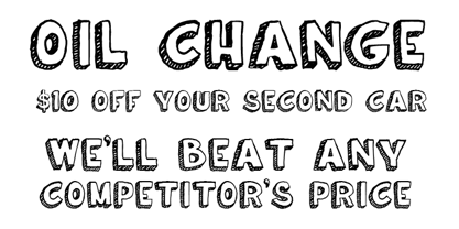
- Able Lead by Sohel Studio,
$16.00 Able Lead is a Modern elegant serif typeface with Unique alternative , multilingual support with perfect kerning. This typeface is perfect for an elegant & luxury logo , classy editorial design, women's magazine, fashion brand , cosmetic brand, fashion promotion , modern advertising design, invitation card, art quote, home decoration , book/cover titles, special events, Tote bag, T-shirt, Advertising and much more. Able Lead Features: · Uppercase And Lowercase · Alternates · Numerals & Punctuation · Accented characters · Multilingual Support · Unicode PUA Encoded While using this product, if you encounter any problem or spot something we may have missed, please don't hesitate to drop us a message. We'd love to hear your feedbacks in order to further fine-tune our products. Thanks and have a wonderful day .
 - Snowy Owl by Ali Hamidi,
$10.00 Snowy Owl is a cute, joyful and fun display font. Whether you use it for cartoon related designs, children games or just any creation that requires a lovely touch, this font will be an amazing choice.
 - Noble Serenity by Hipfonts,
$9.00 Introducing Noble Serenity, where timeless beauty meets serene elegance. This exquisite serif font is a harmonious blend of sophistication and tranquility, designed to elevate your designs with a touch of refined grace. With its clean lines, delicate curves, and perfectly balanced proportions, Noble Serenity exudes an aura of understated charm and sophistication. Each letter is meticulously crafted, reflecting the meticulous attention to detail and craftsmanship of a bygone era. Whether you're designing wedding invitations, luxury branding, or editorial layouts, Noble Serenity brings an air of refined beauty to your projects. Discover the captivating allure of Noble Serenity and let your designs embrace the essence of timeless elegance. Elevate your typography to new heights with this font that whispers of tranquility and commands attention with its noble presence.
 - Ole by Fly Fonts,
$15.00Ole is a retro jazz inspired font with clean lines and a classic style. Use it big to fully appreciate the extreme nature of its design. - Cone Of Silence - Unknown license

- Conte Script Plus by Ingo,
$61.00 A personal handwriting done in pencil. Conté Script is a computer font but has the extraordinary look of handwriting. The typeface is exceedingly lively, diversified and distinct thanks to more than 300 different ligatures, i.e. letter combinations. In addition to the letter combinations in Conté Script, there are also double letters and figures included (aa, ff, AA, MM, 22, 66…) as ligatures with stylistic alternates. Type set in Conté Script appears remarkably similar to a text actually handwritten with a pencil. The typical style of the pencil — crumbliness where pressure lessens and the deep darkness where the pressure of the graphite in it's fullest denseness smudges — is another earmark of Conté Script. The font appears to be written quickly, fleetingly, casually, as if not really to be taken seriously, and as if it would be written one minute and erased the next. Conté Script looks most ”authentic“ around the point size of 18 to 22.
 - Neuer Weltschmerz by Hanoded,
$15.00 About 7 years ago, I released a beautiful (imho) Art Deco inspired font called Weltschmerz. Weltschmerz was an all-caps font and I always wanted to do a lower case version as well. But as things so often go in life, I never found the time and forgot about it. Some time ago, I ‘rediscovered’ my good old Weltschmerz font and remembered that I wanted to create a lower case version. Without further ado: here is Neuer Weltschmerz (‘New Weltschmerz’). I redid the whole font, better kerning, better spacing, better looks… and with a proper lower case! I did keep the original handwritten look intact - because, well, it IS hand made!
 - Neug Asia by Allouse Studio,
$16.00 Proudly Presenting, Neug Asia. A font duo that will give you an a classy impression! Neug Asia can be display for any titles, logo, product packaging, branding project, megazine, social media, wedding, or just used to express words above the background. Neug Asia come with Multi-Lingual Support. Enjoy the font, feel free to comment or feedback, send me PM or email. Thank You!
 - Shorelines Script Bold - Personal use only

- DIST Inking Bold - Unknown license

- D3 Biscuitism Bold - Unknown license

- Goulong Bold Outline - Unknown license


