10,000 search results
(0.045 seconds)
- Medyson - Personal use only

- FuturaPress - Unknown license

- LT Hoop - 100% free

- Ubuntu Titling Rg - 100% free

- Multicolore - 100% free

- Raspoutine Classic - Unknown license

- Ines - 100% free

- ISOCPEUR - Unknown license

- Contour Generator - Unknown license

- SansThirteenBlack - 100% free

- OldStyle 1 - Unknown license

- Resagnicto - 100% free

- Neighbourhood - 100% free

- Pointened - 100% free

- Special K - Unknown license

- TypeWritersSubstitute-Black - 100% free

- NewMedia - Unknown license

- Fabrikat Kompakt by HVD Fonts,
$40.00 Fabrikat Kompakt (formally known as Fabrikat) is a type family designed by Christoph Koeberlin with creative input of Hannes von Döhren. The Sans Serif family is published by HVD Fonts and consists of seven weights plus matching italics. Its geometric design is based on German 20th century engineers’ typefaces and has a plain and precise appearance. The shapes are optically corrected, yet retain an uncut charm. They work best in display as well as text sizes. The type family is equipped for complex, professional typography with OpenType Features like alternate letters, arrows, fractions and an extended character set to support Central and Eastern European as well as Western European Languages.
 - M Kai PRC by Monotype HK,
$523.99 M Kai is a design inspired by the popular Kaiti developed in contemporary China. MKai adopts many features of Kaishu, one of the many Chinese writing scripts and calligraphic style. Yet writing style and constructions have been well-unified to meet quality as typeface. Its strokes has relatively heavier stroke beginning and finishing, as well as thinner middle part. It is catered for fine print with little conglutination. Its medium weight makes it more visible at distance and pretty versatile in use. Zhonggong are tightly built with ample character spacing for good individual character recognition. It is best suited for formal body text, set upright (non-slanted), non-condensed.
 - Buinton Rough by Melvastype,
$35.00 Buinton Rough is roughed up version of Buinton. There are three versions with increasing distress level. Buinton Rough is a script typeface with noble and vintage looks. It has serifs at the beginnings of the strokes, swash capitals and formal design. Buinton Rough has lots of alternate characters, swashes and ligatures. It has also a bunch of tails with different shapes and widths to give the vintage logotype or sports look to your design. These alternates makes Buinton Rough very versatile. You can design beautiful, elegant and diverse typographic elements with it. It’s well suited for logos, lettering artwork, t-shirt designs, editorial illustrations to name a few.
 - Dansley by Letterhend,
$17.00 Meet Dansley – a script font that brings together the vintage and classic looks with a unique twist. Its bold form and chic details add a touch of sophistication and personality to any design project especially in logo, and the other various formal forms such as invitations, labels, logos, magazines, books, greeting / wedding cards, packaging, fashion, make up, stationery, novels, labels or any type of advertising purpose. Features: Uppercase & lowercase Numbers and punctuation Ligatures & Alternates Multilingual PUA encoded We highly recommend using a program that supports OpenType features and Glyphs panels like many of Adobe apps and Corel Draw, so you can see and access all Glyph variations.
 - Home Run by Doyald Young,
$50.00Home Run Script has the formality of 18th-century English roundhands, narrow, tightly fitted and drawn in a very bold weight and inspired by my ITC Eclat font. The x-height is large, and the caps are simply drawn with minimal swashes. Its companion font Home Run Sanscript, sold separately also, has sans serif caps that enable the user to combine script and sanserif caps with the same slope. It has the same lowercase as Home Run Script with a few alternate characters and sans serif lining and Oldstyle figures. Both Young Finesse and Home Run include Richard Isbell’s “interrabang,” appropriately used for statements that are both interrogative and exclamatory. - Puppy Love by Supersemarletter,
$10.00 Puppy Love is a cute and playful display font. It looks wonderful on a variety of designs, both formal and informal. Whether you’re using it for crafting, digital designs, presentations or greeting cards, it’s perfect! Honestly it works perfectly for headlines, logos, posters, packaging, T-shirts and much more. Font Features : • Regular version • Character set A-Z in uppercase and lowercase • Ligatures in Lowercase and special • Alternates option • Numerals & Punctuation • Accented Characters • Multiple Languages Supported Recommended to use in Adobe Illustrator or Adobe Photoshop with opentype feature. If you have questions, just send me a message and I'm glad to help. Best Regards, Supersemar Letter
 - Amanda Manopo by IRF Lab Studio,
$15.00 Amanda Manopo is a calligraphy script font that comes with very beautiful changing characters, a kind of classic decorative copper script with a modern touch, designed with high detail to bring stylish elegance. Amanda Manopo Script is attractive as a typeface that is smooth, clean, feminine, sensual, glamorous, simple and very easy to read, because there are many fancy letter connections. I also offer a number of viable style alternatives for many letters. The classic style is perfect to be applied in various formal forms such as invitations, labels, restaurant menus, logos, fashion, make up, stationery, novels, magazines, books, greeting / wedding cards, packaging, labels or any type of advertising purpose.
 - Foresight by Letterhend,
$19.00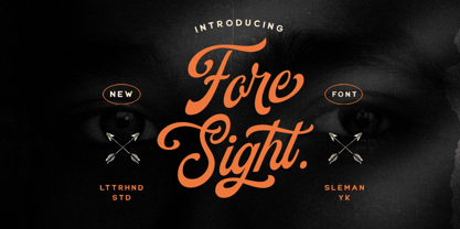 Foresight is a vintage script font which is purposely made for a headline, display or logotype.This type of font perfectly made to be applied especially in logo, and the other various formal forms such as invitations, labels, logos, magazines, books, greeting / wedding cards, packaging, fashion, make up, stationery, novels, labels or any type of advertising purpose. Features : uppercase & lowercase numbers and punctuation multilingual alternates & ligatures PUA encoded We highly recommend using a program that supports OpenType features and Glyphs panels like many of Adobe apps and Corel Draw, so you can see and access all Glyph variations. How to access opentype feature : letterhend.com/tutorials/using-opentype-feature-in-any-software/
 - Bodoni Campanile Pro by Red Rooster Collection,
$60.00 Bodoni Campanile Pro is a font that bridges the gap between a “fat” and a compressed traditional serif typeface. It was originally designed in 1936 by Robert H. Middleton for Ludlow. International TypeFounders exclusively licensed the family from the Ludlow Collection, and Steve Jackaman (ITF) produced a digital version in 1998. Jackaman completely redrew the font for its 2017 release. Bodoni Campanile Pro, much like its transitional status as a font, is successful in both formal and casual roles. The free-flowing aspects of the family, seen especially in the lowercase ‘g’ and the leg of the uppercase ‘R,’ give the family an air of elegance.
 - Blooming Elegant by Nicky Laatz,
$10.00 Blooming Elegant Script Font is a hand-lettered modern calligraphy script with a playful yet elegant nature. It comes in 3 variants : Regular, Mono-line, and Mono-line Bold. The script fonts include Opentype Stylistic Alternates for all lowercase letters, and a selection of Ligatures to add some authenticity to your designs. Included alongside the script fonts, are two companion sans fonts : a neat and sturdy uppercase sans font for more formal-natured designs, and a jaunty, playful uppercase handwritten sans for more casual designs. Also included is a handy set of over 120 lovingly-drawn doodles is also included as 2 separate dingbat fonts.
 - Khalifah Script by Solidtype,
$15.00 Khalifah Script is a calligraphy script font that comes with very beautiful changing characters, a kind of classic decorative copper script with a modern touch, designed with high detail to bring stylish elegance. Khalifah Script is attractive as a typeface that is smooth, clean, feminine, sensual, glamorous, simple and very easy to read, because there are many fancy letter connections. I also offer a number of viable style alternatives for many letters. The classic style is perfect to be applied in various formal forms such as invitations, labels, restaurant menus, logos, fashion, make up, stationery, novels, magazines, books, greeting / wedding cards, packaging, labels or any type of advertising purpose.
 - Antura Script by Solidtype,
$18.00 Antura Script is a calligraphic script font that comes with very beautiful changing characters, a kind of classic decorative copper script with a modern touch, designed with high detail to bring stylish elegance. Antura Script is an attractive typeface that is smooth, clean, feminine, sensual, glamorous, simple and very easy to read because there are many fancy letter connections. I also offer a number of viable style alternatives for many letters. The classic style is perfect to be applied in various formal forms such as invitations, labels, restaurant menus, logos, fashion, make up, stationery, novels, magazines, books, greeting/wedding cards, packaging, labels or any type of advertising purpose.
 - Evidance by Letterhend,
$19.00 Evidance is a sophisticated display typeface with modern look and feel. Perfectly to be applied to the other various formal forms such as invitations, labels, logos, magazines, books, greeting / wedding cards, packaging, fashion, make up, stationery, novels, labels or any type of advertising purpose. Features : uppercase & lowercase (alternate) numbers and punctuation multilingual alternates & ligatures PUA encoded We highly recommend using a program that supports OpenType features and Glyphs panels like many of Adobe apps and Corel Draw, so you can see and access all Glyph variations. How to access opentype feature : letterhend.com/tutorials/using-opentype-feature-in-any-software/ Email us to letterhend@gmail.com if you need something! Happy Designing!
 - Fallery Script by Zane Studio,
$15.00 Fallery Script is a calligraphy script font that comes with exquisite character changes, a kind of classic decorative copper script with a modern twist, designed with high detail for an elegant style. Fallery Script is interesting because it is smooth, clean, feminine, sensual, glamorous, simple and very easy to read, because of its many fancy letter relationships. I also offer a decent number of stylistic alternatives for some of the letters. Classic style is very suitable to be applied in various formal forms such as invitations, labels, restaurant menus, logos, fashion, make up, stationery, novels, magazines, books, greeting/wedding cards, packaging, labels or all kinds of advertising purposes.
 - Aviano by insigne,
$24.99 Aviano is an extended titling face with influence from the power and timeless beauty of classical letterforms. Aviano features extended characters for a formal feel, sharp, powerful looking serifs and geometric and consistent letterforms. Use Aviano as an alternative to Trajan. Aviano includes a number of advanced OpenType features including alternates, 40 unique ligatures and old style figures. The Aviano family was updated in 2008 to include a light and black weight. Be sure to check out the rest of the Aviano series, including Aviano Serif, Aviano Sans and Aviano Slab. Aviano is named for a small town at the base of the Alps in northern Italy.
 - Daily Flashback by Letterhend,
$17.00 Daily Flashback is a sophisticated serif typeface. Perfectly to be applied to the other various formal forms such as invitations, labels, logos, magazines, books, greeting / wedding cards, packaging, fashion, make up, stationery, novels, labels or any type of advertising purpose. Features : lowercase uppercase numbers and punctuation multilingual alternates PUA encoded We highly recommend using a program that supports OpenType features and Glyphs panels like many of Adobe apps and Corel Draw, so you can see and access all Glyph variations. How to access opentype feature : letterhend.com/tutorials/using-opentype-feature-in-any-software/ Email us to letterhend@gmail.com if you need something! Happy Designing!
 - Ember by Device,
$29.00 Ember is an informal script with a judicious sprinkling of ligatures that give it a flowing freehand liveliness. Neither overly formal and stuffy nor cheap and cheerful, Ember is elegant yet friendly, sophisticated yet approachable, fun and frivolous but stylish and well bred. Ligatures are set to be on automatically, and the stylistic alternates and optional final forms for some of the characters can be toggled on and off using the OpenType panel in design applications with advanced OpenType support. Designer Rian Hughes says that he felt he was "possibly channeling the spirit of Roger Excoffon". Neither pastiche nor revival, Ember does seem to evoke the famous French designer's trademark elegance.
 - AwanZaman by TypeTogether,
$93.00 AwanZaman has a three-phase story, beginning with Dr Mamoun Sakkal’s two Arabic styles and culminating with Juliet Shen’s Latin extension. AwanZaman started as simply Awan, a commission for a modern, clean, monoline typeface for writing headlines and story titles in a forward-thinking Kuwaiti newspaper. Awan was based on the geometric forms of Kufic script, while in phase two, a second typeface (Zaman) was designed to add enough calligraphic Naskh details to make it easy to read in demanding newspaper settings. Together these two phases give the typeface a warm, familiar, and progressive look, as well as an explanatory two-part name — AwanZaman. Since most editorials use typical Naskh headline fonts with an exaggerated baseline, Awan’s rational forms immediately distinguish it as a modern and progressive voice in the crowded field of Arabic editorial typefaces. As the companion Arabic typeface, Zaman has the same basic proportions and forms as Awan, but with many cursive, energetic, and playful details. And since modern monoline fonts are increasingly being used to set extended texts, more features were borrowed from Naskh calligraphy to expand the typeface’s use from headlines into text setting. When using the AwanZaman Arabic family, Awan (geometric Kufic forms) is the starting point. To add the sweeping, energetic personality of Zaman (calligraphic Naskh forms), simply activate an alternate character through the option of 20 stylistic sets available in any OpenType-savvy software. The two typefaces function as one file — the AwanZaman Arabic family — allowing users to combine features from both designs to transform the appearance of text from geometric and formal to playful and informal. The third phase of AwanZaman’s development introduced a companion Latin typeface designed by Juliet Shen to fulfil the persistent need in the Arabic fonts market for modern and geometric bilingual type families. Due to the Arabic’s monolinear strokes, AwanZaman Latin was destined to be a sans serif with a tall x-height, larger counters, and corresponding stem thickness to harmonise with the Arabic’s overall text colour and page presence. But it needed much more. One of AwanZaman’s chief assets is making the two languages look on a par when typeset side by side. Arabic and English readers will have a different sense of what that entails, but this type family defers to the Arabic — graceful and artistic with a good mix of straight stems and curved forms. Latin in general doesn’t aesthetically flow the way Arabic does, yet the tone of the Latin needed to mirror both the Arabic’s more squarish curves and formal personality of Awan and the undulating and more playful shapes of Zaman without looking outlandish. That need was met by creating some novel Latin characters, which are accessed through four stylistic sets the same way as AwanZaman Arabic. The alternates are not just clever in the way they look and how they echo the Arabic aesthetic, but also in harmonising the disparate languages and serving designers well when needing a balanced, bilingual text face with a warm and lively voice. AwanZaman is a clever, seven-weight powerhouse that makes extensive use of OpenType’s stylistic sets (20 in the Arabic and four in the Latin) so writers and designers can make the most of everything from a single glyph in display sizes down to dense text in paragraphs. As AwanZaman Arabic has no italic, neither does the Latin; contextual distinction normally handled by italics is achieved by exploiting the family’s seven weights. AwanZaman’s intricate OpenType programming supports Persian and Urdu, with features such as the returning tail of Barri Yeh treated properly. From its inception in geometry to its melding of two worlds with novel forms, AwanZaman is a personal labor by designers Dr Mamoun Sakkal and Juliet Shen, and embodies the TypeTogether ideals of serving the global community with innovative and stylish typeface solutions. The complete AwanZaman Arabic and Latin families, along with our entire catalogue, have been optimised for today’s varied screen uses.
 - Generic by More Etc,
$15.00 The Generic Typeface Collection is a series of sans-serif typefaces inspired by the craftsmanship of graphic design, typesetting, and printing in the analogue era – before Adobe, Macintosh computers and desktop publishing – when dinosaurs ruled the earth. With the use of various typesetting apparatuses or dry transfer type, photo copiers, and shooting layouts and paste-ups to film, the printed results was not as exact, precise and predictable as it is today. When examining old prints, it is difficult not to like the way that characters in over- or underexposed film have a special type of vibe to them that is often sadly lost in today’s pursuit of total perfection. Encouraged by this, I saw a need for a collection of typefaces that are non-clinical and non-conformist, and some that are coarse, rough and distorted – errors that might come from poor exposure when put on film, enlargements from small point texts, or maybe quality loss from successive generations of photocopies. Or all of the above. This is an attempt to incorporate spirit and personality into a set of typefaces without losing distinction. You might call it a homage to non-perfection. I call it human. The Generic Typeface Collection consists of 11 fonts divided into four series. The three standard series – the Formal Release series, the Coarse Copy series, and the Rough Display series – all contain three fonts each. The Extra Splendor series contains a couple of shadow fonts for that little extra sparkle. Formal Release – Handcrafted & Clean The Formal Release series features sans-serif typefaces for everyday use. They are handcrafted and clean, human and uncomplicated. The Formal Release series contains three typefaces that add tons of personality to any text. G10 FR ‘Slim’ – a slightly under-exposed and clean typeface in a regular weight (228 glyphs - 1 alternate) G20 FR ‘Classic’ – a properly exposed clean typeface in a bold weight (228 glyphs - 1 alternate) G30 FR ‘Bulky’ – a heavily over-exposed clean typeface in an ultra weight (228 glyphs - 1 alternate) Coarse Copy – Dirty & Rough The Coarse Copy series features non-conformist typefaces that are worn and rough, maybe after going through that bad copier a few times too much. The Coarse Copy series contains three sans-serif typefaces that add tons of spirit to any text without compromising too much on legibility. Try them on in poster-sizes and everyone will know that you mean business. G40 CC ‘Slender’ – an under-exposed coarse typeface in a regular weight (228 glyphs - 1 alternate) G50 CC ‘Typic’ – a properly exposed coarse typeface in a bold weight (228 glyphs - 1 alternate) G60 CC ‘Huge’ – a heavily over-exposed coarse typeface in an ultra weight (228 glyphs - 1 alternate) Rough Display – Faded & Decorative The Rough Display series features attention-seeking decorative typefaces in three feature-packed fonts. Faded and gritty like the image distortion and degradation from successive generations of photocopies, they are eye-catching typefaces intended to stand out in bigger point sizes. Use these typefaces for signage, headlines and similar situations were a strong typographic statement is desired. We have packed no less than 1,334 alternate characters and 212 discretionary ligatures into this series for a greater chance of not having characters that look exactly the same more than once. G70 RD ‘Slinky’ – an under-exposed rough and decorative typeface in a regular weight (741 glyphs – 448 alternates – 66 discretionary ligatures) G80 RD ‘Standard’ – a properly-exposed rough and decorative typeface in a bold weight (748 glyphs – 448 alternates – 73 discretionary ligatures) G90 RD ‘Swollen’ – a heavily over-exposed rough and decorative typeface in an ultra weight (748 glyphs – 448 alternates – 73 discretionary ligatures) Extra Splendor – Sparkling & Extraordinary The Extra Splendor series features two shadow typefaces for that little extra sparkle. One clean shadow to be used with G20 FR ‘Classic’, and one rough shadow to be used with G80 RD ‘Standard’. Having the shadows separate from the main typeface adds another layer of expressiveness in that you can try out color combinations for that extra splendor. Tips for matching (applies to both the base font and the shadow font): Set the kerning to Metric, not optical. Increase tracking to accommodate for the shadows extra width. G25 ES ‘Classic Shadow’ – a clean shadow to be used with G20 FR ‘Classic’ (228 glyphs – 1 alternate) G85 ES ‘Standard Shadow’ – a rough shadow to be used with 80 RD ‘Standard’ (227 glyphs) OpenType features – alternate characters and discretionary ligatures – can be accessed by using OpenType friendly professional design applications, such as Adobe Illustrator, Adobe InDesign, and Adobe Photoshop.
 - Agafia by ParaType,
$25.00 Agafia handwriting script is based on the hand of Agafia Karpovna Lykova - the last member of the Old Believer family lived like an hermit in the Khakass taiga. The face is developed for the new book on the history of Lykov's family by Lev Cherepanov. It's built in OpenType format with a contextual substitution of letterforms and specific ligatures. Designer - Gennady Fridman. Released by ParaType in 2009.
 - Battle Cry by Comicraft,
$19.00 As Titans Clash in The Final Battle of Good versus Evil, Man versus Machine, God versus Mortal and Coke versus Pepsi, ace lettering artist, Ferran Delgado from Spain teams up with our very own John ‘JG’ Roshell for one last attack on the assembled Cover Lettering Styles of Yore. Fill your lungs and prepare for... BATTTTTTLECRRRRRYYYYYYYYYYY! See the families related to Battle Cry: Battle Scarred & Battle Damaged .
 - Voix by Wilton Foundry,
$9.00 VOIX Regular and Italic is a stylish, modern & monospaced font ready to make your work hard for you! It has several unique glyphs that create a unique style. VOIX is not your typical monospaced boring font - from the outset the goal was to develop an exuberant, dynamic and contemporary mono-spaced font. Ideal for coding, writing and has plenty of attitude to stretch into display formats!
 - Alma by Sudtipos,
$69.00 From the technical hand of Alejandro Paul and the creative jungle in the mind of Angel Koziupa, comes a wild-natured script. Alma may appear slightly weathered, but still maintains a sharp and determined face. The casual strokes are at times pointed, yet ultimately playful. Released in OpenType format to expand possibilities of use with lots of alternates when used with OpenType-aware applications such as AdobeCS.


