1,083 search results (0.018 seconds)
  1. Squarish by The Type Fetish, $10.00
    Squarish could have been the Universe or Helvetica of the 1980's, if only it was designed then. Now it is just a little quirky gridded typeface.
  2. Ticketbook by Suomi, $20.00
    Univers and Helvetica Compressed are most often used for movie posters, but they lack variants. Therefore I made a compressed family with seven weights for more versatility.
  3. Antiquarian Scribe by Three Islands Press, $39.00
    Henri Abraham Chatelain was a cartographer and publisher of the famous Atlas Historique, ou Nouvelle Introduction a L'Histoire, a world atlas released between 1705 and 1732 in Amsterdam. A few years ago, at an antique book shop in London, I bought a page from Chatelain's atlas—a page covering the Near East, India, the Indian Ocean—that had a particularly alluring, oblique handlettering style. The text is in French, which gave me plenty of samples of diacritics and accented characters. The overall effect is neat and legible, with a distinctly historical flair.
  4. Satiga by Sensatype Studio, $15.00
    Helovatica is a sans serif font with modern, corporate, elegant, unique and classy-look. This font crafted specials for logo design projects, ready to use on Logo, Branding, Magazine, Social Media, and Many more that needs modern touches. Helovatica is also included full set of: uppercase and lowercase letters multilingual characters numerals punctuation Wish you enjoy our font. :)
  5. TD Beta by Inusentes Catapusan, $9.00
    TD Beta is a bold and light sans serif typeface inspired by Futura and Helvetica. It is best used for headlines, titles, display, and even long paragraphs on digital collaterals.
  6. Undercoat by Open Window, $19.95
    Undercoat offers a gritty twist on a classic font style (Helvetica). It was completely hand painted which makes the font an organic centerpiece to any of your grungy design applications.
  7. CG Triumvirate by Monotype, $40.99
    CG Triumvirate was designed for use on the Compugraphic phototypesetting system. The CG Triumvirate font family is very similar to Helvetica, and is an ideal font choice for text and display use.
  8. Aura by Monotype, $29.99
    Aura was designed by Jackson Burke for the Linotype foundry in 1960. Aura is a sans serif display font, very similar to Helvetica Inserat. Use the Aura font for headlines and posters.
  9. Neue Haas Grotesk Display by Linotype, $33.99
    The first weights of Neue Haas Grotesk were designed in 1957-1958 by Max Miedinger for the Haas’sche Schriftgiesserei in Switzerland, with art direction by the company’s principal, Eduard Hoffmann. Neue Haas Grotesk was to be the answer to the British and German grotesques that had become hugely popular thanks to the success of functionalist Swiss typography. The typeface was soon revised and released as Helvetica by Linotype AG. As Neue Haas Grotesk had to be adapted to work on Linotype’s hot metal linecasters, Linotype Helvetica was in some ways a radically transformed version of the original. For instance, the matrices for Regular and Bold had to be of equal widths, and therefore the Bold was redrawn at a considerably narrower proportion. During the transition from metal to phototypesetting, Helvetica underwent additional modifications. In the 1980s Neue Helvetica was produced as a rationalized, standardized version. For Christian Schwartz, the assignment to design a digital revival of Neue Haas Grotesk was an occasion to set history straight. “Much of the warm personality of Miedinger’s shapes was lost along the way. So rather than trying to rethink Helvetica or improve on current digital versions, this was more of a restoration project: bringing Miedinger’s original Neue Haas Grotesk back to life with as much fidelity to his original shapes and spacing as possible (albeit with the addition of kerning, an expensive luxury in handset type).” Schwartz’s revival was originally commissioned in 2004 by Mark Porter for the redesign of The Guardian, but not used. Schwartz completed the family in 2010 for Richard Turley at Bloomberg Businessweek. Its thinnest weight was designed by Berton Hasebe.
  10. Paladium Gothic by BA Graphics, $45.00
    A next generation gothic with that clean legible corporate look, very simple yet very dignified. Great for text and head lines, just about any application. If you are tired of seeing Helvetica try Paladium Gothic.
  11. Equestria_Cyrillic - Personal use only
  12. KG Lego House by Kimberly Geswein, $5.00
    Neat handwriting perfect for teachers. This font includes extra math symbols for teachers. Just enough personality while still being perfectly neat.
  13. Concinnitas by Corien’s Handwritingfonts, $24.00
    Concinnitas (Latin for 'neatness') is a very neat print handwriting script. It's a light weight very easy to read, yet elegant handwritten font.
  14. Linoset by Ensor Creative, $20.00
    Linoset was created from cut and printed linoleum. The lettering is based on Helvetica Neue Condensed Bold – it has been cut, printed and re-drawn to take on a completely new life – it's rough, tough and downright nasty!
  15. AdPro by Linotype, $29.99
    Roman Sehrer, a seasoned German advertising professional, digitized his handwriting to create this family of three fonts. Sehrer recommends this family for posters, logos, and restaurant menus. It works well with traditional sans serifs such as Helvetica or Univers.
  16. Impact by Microsoft Corporation, $89.00
    Geoffrey Lee designed Impact font for the Stephenson Blake foundry in 1965. The sans serif display typeface is very heavy and condensed in the grotesque style, similar to Helvetica Inserat. Use Impact font in display situations requiring a strong statement.
  17. Impact by Monotype, $40.99
    Geoffrey Lee designed Impact font for the Stephenson Blake foundry in 1965. The sans serif display typeface is very heavy and condensed in the grotesque style, similar to Helvetica Inserat. Use Impact font in display situations requiring a strong statement.
  18. Heldustry by URW Type Foundry, $35.99
    Heldustry is a sans serif design with letterforms partway between Helvetica and Eurostile. The Heldustry font family has a large x-height and wide characters, making it ideal for situations where there is not much copy but pages must be filled.
  19. Nothing You Could Say by Kimberly Geswein, $5.00
    Neat printed handwriting.
  20. 210 Gulim by Design210, Korean Fonts, $300.00
    A round was added to a neat straight line to express a soft sensibility. It is a neat and flexible font using a clean and stable type of module.
  21. KG Call Me Maybe by Kimberly Geswein, $5.00
    Thin, neat handwritten letters.
  22. Retrograph by GlyphStyle, $15.00
    Retrograph is a handwritten font that looks neat and clear. Consistent lines make this font neat and beautiful. Font feature Uppercase, Lowercase, Numerals & Punctuations, Stylistic Alt, Stylistic Set, Swash Ligature, Multilanguage
  23. Albany by Monotype, $29.99
    Albany, from Monotype Imaging, is a typeface family whose fonts have the same metrics as Arial. However, in contrast to Arial or Helvetica, Albany's letterforms are more open, with more generous apertures and counters. Also, punctuation is not square, as in Arial, but round
  24. Masterforce - Unknown license
  25. KG Eyes Wide Open by Kimberly Geswein, $5.00
    Legible, pretty, neat, connected cursive handwriting.
  26. KG Part Of Me by Kimberly Geswein, $5.00
    Very neat kid-friendly handwritten lettering.
  27. KG Love Somebody by Kimberly Geswein, $5.00
    Upright, neat, and legible teen handwriting.
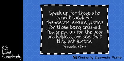
  28. KG Piece By Piece by Kimberly Geswein, $5.00
    A neat, upright printed handwritting font.
  29. Xero by Megami Studios, $12.50
    Xero is an intentionally loose creation of a humanist font, given a Russian flair! Played rougher than its counterparts Helvetica and Arial, Xero works well for those who want to go that route but don't want the sharply defined lines of others in the humanist family.
  30. Bitmax by ITC, $29.00
    Bitmax is the work of British designer Alan Birch, who was inspired by the look of fax transmissions. He took Helvetica medium and used controlled distortions to create this commanding, high-tech style. Bitmax is best used in large display sizes for a limited number of words.
  31. Fonce Sans Pro by Ryan Ford, $10.95
    Fonce Sans Pro is a mono-weight, Swiss-style typeface with influences from great typefaces like Din, Helvetica, Interstate, and Trade Gothic. Its form is unique and sophisticated with an unmistakable Dutch style. It’s subtle and enjoyable, and works beautifully in both display and body copy.
  32. Transformers - Unknown license
  33. KG Empire Of Dirt by Kimberly Geswein, $5.00
    Neat feminine handwriting drawn with a marker.
  34. Janda Everyday Casual by Kimberly Geswein, $5.00
    Neat, pretty feminine handwriting for everyday usage.
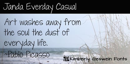
  35. Pacmania - Unknown license
  36. Heltar by The Northern Block, $19.30
    A modern neo-grotesque typeface. Having grown up in Sheffield and been completely immersed in the work of The Designers Republic I became very drawn to their treatment of Helvetica, especially the close tracking of the letter space. This visual investigation led me to the study of the font Hass Unica, a so called improvement to Helvetica. In order not to replicate and become a clone of Unica I redrew all the characters from scratch improving optical appearance, developing subtle corrections and reshaping individual letterforms. The result is a remixed neo-grotesque font that has strong general optical balance with great rhythm under close tracking. Details include 10 weights, an extended European character set, true italic, manually edited kerning and Euro symbol.
  37. Starcraft - Unknown license
  38. Skeksis - Unknown license
  39. Turok - Unknown license
  40. Masterforce Solid - Unknown license
Looking for more fonts? Check out our New, Sans, Script, Handwriting fonts or Categories
abstract fontscontact usprivacy policyweb font generator
Processing