7,955 search results
(0.044 seconds)
- Olimpos by Gatype,
$8.00 Olimpos is a Display sans font that is absolutely perfect for editorial headlines. Her large, bold and slender figure is perfect for posters, t-shirts, and magazine covers. Reserved for capital letters only, this calm and bold typeface is a content creator's best friend. font files Uppercase, Numbers, Punctuation & Symbols. Diacritic for Multilingual Support This Olimpos is a modern sans-serif font that includes 4 weights of the normal style and the Italic style.
 - Troia by Ahmet Altun,
$10.00 Troia Font Family comes in three weights; normal and italic. In addition, with rounded corners, each weight has its own smoother version. Thanks to its large letters and added spaces between the letters, this font can be used to get perfect results and create great works such as web typography, banners, logos, texts, t-shirts and printings, and also presentations. Troia's eye-pleasing and nice-looking style makes writing much more pleasant.
 - Caldense by Tiago Cândido,
$20.00 The typeface was baptized as "Caldense" in order to honor the city of Caldas da Rainha, a small city in Portugal, the typography's birth place. It has three weights, Regular, Demi Bold and Bold and it is a sans serif and grotesque. Each character was based on a grid and was built in modules, having round edges and straight finishes. The font can be used in titles and normal text while being easy to read.
 - Quebra Ex Condensed by Vanarchiv,
$55.00 Quebra Ex Cn (Extra Condensed) is an extend display sans-serif font family, available with four widths (Extra Condensed, Condensed, Normal and Expanded) and ten weights, italics versions are available. The main strokes contain small breaks simulating modulated variations on the letterforms, these details are more present on large body sizes. All font versions contain Latin and Cyrillic encoding characters and also ligatures, case-sensitive forms, fractions, oldstyle and finally tabular figures.
 - Asterlight by NREY,
$19.00 Hi, friends! Introducing new typeface - Asterlight. It is a new display font with 2 styles and cool characters. Asterlight has multilingual support includes cyrillic. Many ligatures make your typography most variable. It works well with normal size text and for large displays or short words. You may combine uppercase and smallcase in the text body, as alternates symbols. The Asterlight typeface is suitable for : product packaging, labeling, logo, classic shop, ethnic shop, titles, etc
 - Blood Script Italic Personal Us - Personal use only

- Linotype Mega by Linotype,
$29.00Linotype Mega is part of the Take Type Library, chosen from the entries of the Linotype-sponsored International Digital Type Design Contests of 1994 and 1997. The fun schrift of German designer Till F. Teenck is available in three weights whose names are word plays in themselves. Mega in (which we hope the font will be) contains relatively light, somewhat irregularly-drawn characters which look as though they were printed by hand and the characters are set rather far apart from each other. This weight is good for short and middle length texts in point sizes of 10 and larger. Mega normal is anything but. The characters are the outline forms of Mega in and their larger width reduces the distance between them. This weight is generally a headline font. Mega out is a very heavy weight and is the filled-in version of Mega normal. The characters flow into each other and look almost like silhouettes. The reduced legibility makes this font suitable exclusively for headlines in larger point sizes. - De Fonte Plus by Ingo,
$39.00 A variation of ”Helvetica according to the blur principle.“ The underlying typeface is ”Helvetica“, the only true ”run-of-the-mill“ typeface of the twentieth century. The distortion principle used simulates the photographic effect of halation and/or overexposure. The light weight, »DeFonte Léger«, nearly breaks on the thin points, whereas on those points where the lines meet or cross, dark spots remain. The characters are ”nibbled at“ from the inner and outer brightness. On the normal and semibold typestyles, »DeFonte Normale« and »DeFonte Demi Gras«, the effect is limited almost exclusively to the end strokes and corners, which appears to be strongly rounded off. The bold version »DeFonte Gros« is especially attractive. As a result of ”overexposure“, counters (internal spaces) are closed in, while characters become blurred and turn into spots; new characteristic forms are created which are astoundingly legible. The fat version »DeFonte Gros« is particularly appealing. “Overexposure” leads to drifted counters, letters blur into spots; new characteristic forms emerge, which are surprisingly easy to read.
 - CA Yoshiro by Cape Arcona Type Foundry,
$30.00 Tomorrow’s Typeface Today Are you ready to take your science fiction, action, military films, shows or video games to the next level? Our family of fonts brings a touch of nostalgia and a dash of modernity to your titles and typography. The CA YOSHIRO “Wide” style bears a striking resemblance to the iconic Eurostile typefaces of the 1960s. It has an immediate sense of familiarity. But what sets it apart is its contemporary, fresh sci-fi design. It’s the perfect blend of classic and cutting-edge, delivering an unprecedented, unconsumed style that promises to captivate audiences like never before. The CA YOSHIRO “Normal” style can also be used for a variety of other projects that require a normal width and just need to show a light technical touch without immediately suggesting a sci-fi reference. In addition, CA Yoshiro has subtle similarities to the monospace fonts commonly used on computer displays and screens. These fonts are the foundation of written programming code and sequences, lending a distinctive character to the digital realm.
 - Speedwriter - Personal use only

- Dawning of a New Day - Personal use only

- Havent Slept in Two Days Shadow - Personal use only

- Nothing You Could Do - Personal use only

- Janda Fabulous - Personal use only

- Swanky and Moo Moo - Personal use only

- joeHand 1 - Unknown license

- Love Ya Like A Sister - Personal use only

- Shining Like Stars - Personal use only

- Easter Parade - Unknown license

- Yellow Peas by Roland Hüse Design,
$24.00 Yellow Peas is a geometric sans serif typeface that comes in 5 different weights. Contains Western and Eastern European languages, Vietnamese accented characters, Russian Cyrillic and Thai character set. Yellow Peas is a clean and modern font with stylistic alternates, standard and discretionary ligatures. Also includes Small Caps feature.
 - Johann by NiceType,
$29.00 Johann is an elegant, geometric, san serif typeface who's clean, simple structure and form create a versatile typeface that works effortlessly across print & digital applications. Created in 2012 by NiceType, the Johann family consists of 5 weights, plus corresponding italic sets that all have their own individual strengths.
 - Hailgen by Akufadhl,
$29.00 Hailgen is a Serif typeface that explores the flexibility in contrast, with a thicker horizontal and thinner vertical contrast. Designed specially for short texts or quotes. Hailgen comes with 5 weights ranging from Thin to Black and is armed with several opentype features and Latin and Cyrillic language support.
 - Recline by Digitype Studio,
$20.00 Recline comes in a modern style featuring 10 weights, 5 straight & angled, making it easy to adapt to your design. An elegant typeface, Recline is perfect for corporate identities, websites, publishing, titles, books, magazines, business cards, logos, product labels, packaging, or any kind of advertising purpose. Thanks for watching
 - Gafeniv by Rvandtype,
$10.00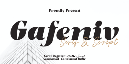 Gafeniv is Duo font Serif & Script. It has a elegant, and modern look which can be used for logos, establishing brand identities, crafting invitations, creating stunning stationery, shaping wedding designs, or producing eye-catching social media posts. Features: 5 Styles Font Numbers and punctuation Multilingual PUA encoded Thank You
 - Music Ad Stencil JNL by Jeff Levine,
$29.00 An ad appearing in the January 5, 1952 edition of Billboard Magazine promoted the then-new releases from Capitol Records. The headline copy was set in a bold, condensed sans serif stencil typeface. This inspired Music Ad Stencil JNL, which is available in both regular and oblique versions.
 - Underdoug by PizzaDude.dk,
$15.00 All caps font with squarish letters. At first sight, it may look a little bit ordinary, but watch it with massive text - then you will notice the bounciness and the contextual alternates that automatically switches between the 5 different versions of each letter! Comes with massive language support!
 - FF Autotrace by FontFont,
$41.99 British type designer Neville Brody created this display FontFont in 1994. The family has 5 weights, and is ideally suited for music and nightlife and poster and billboards. FF Autotrace provides advanced typographical support with features such as ligatures and case-sensitive forms. It comes with tabular lining figures.
 - Ladoni by Diogo Pisoeiro,
$15.00 This typeface is inspired on Bodoni, but this is like his gross sister, because it has angles instead of curves. Is a typeface with personality, strong and robust but at the same time sweet with his italics. This typeface has 5 weights, regular, italic, bold, poster and poster italic.
 - Halvan by driemeyerdesign,
$35.00 HALVAN –a striking type with half-serifs The Halvan font family comes in 5 styles from Roman to Bold, Italic and a Small Caps Version. Each version includes old style figures and lining figures. It is a versatile type and can be used in a wide range of circumstances.
 - Spiced Cheese by PizzaDude.dk,
$20.00 Just like spiced cheese, this font has got a taste that makes the heavens sing! Even though the font is grafitti and comic inspired, the letters suits mostly everything with it's rugged and unpredictable look. Comes with multilingual support along with 5 contextual alternates that cycles AS you type!
 - Hackman by The Northern Block,
$32.00 A geometric sans serif with contemporary lines. Distinctive curves are combined with classical letterforms to produce a clean, linear typeface best suited to identity, mobile and web applications. Details include 9 weights with italics, 500 characters, 5 variations of numerals, stylistic alternatives, manually edited kerning and OpenType features.
 - Arupala Grotesk by Jetsmax Studio,
$15.00 Arupala Grotesk is a Grotesk font this versatile typeface will grab readers’ Attention. This font was inspired by a character named H. Aroepala. This font is suitable for both formal and informal events and is also suitable for various types of print and digital media.
 - Kingdrops by Letterhend,
$19.00 Kingdrops is a cool script typeface. This font perfectly made to be applied especially in logo, and the other various formal forms such as invitations, labels, logos, magazines, books, greeting / wedding cards, packaging, fashion, make up, stationery, novels, labels or any type of advertising purpose.
 - Athellia Script by Lindstrom Design,
$19.00 An upright condensed formal script. Athellia is right at home on packaging, labels, Menus, Headlines, invitations, and title design. NOTE: MyFonts does not display contextual alternates so many of the ‘o’ combinations do not display correctly here but do with open type alternates activated.
 - ENDEMIC Serif by WAP Type,
$20.00 "Endemic" font is perfect for ethnic movie or game titles. or for titles, cartoon-themed writing, because this font is in the serif category but not too stiff or formal. Features: Uppercase, Lowercase Punctuation & Number, Support in Mac and Windows OS Multilingual Support ÀÁÂÃÄÅÆÇÈÉÊËÌÍÎÏÐÑÒÓÔÕÖØÙÚÛÜÝ
 - Hinelka by Awan Senja,
$14.00 Introducing our newest cute serif typeface, Hinelka Unique Script. This font perfectly made to be in poster funny, and the other various formal forms such as invitations, labels, logos, magazines, books, packaging, fashion, make up, stationery, novels, labels or any type of advertising purpose.
 - P22 Bastyan by IHOF,
$39.95 P22 Bastyan is a hybrid Italic Blackletter. This typeface resembles Carolingian miniscule scripts and has a timelessness that evokes formality but defies specific historical categorization. It is available in an optional Opentype Pro version with CE language support, multiple styles of figures, ornaments, and ligatures.
 - Florentine Script II by Monotype,
$29.99Based on script handwriting and engraving used in formal announcements and invitations, the Florentine Script font lends itself to typesetting in which an elegant mood is desired. Florentine Script, Citadel, Flemish Script, and Old Fashion Script have similar lowercase letters but unique flourished capitals. - XKnightMares by Ingrimayne Type,
$6.00 There are three XKnightMares fonts. Each has rather formal chess fonts. The key layout is a bit complicated; see the key guide for detailed information on how to position pieces correctly. In addition to making chess boards, some of the pieces make interesting decorations.
 - Elicit Script Variable by Monotype,
$156.99Elicit Script Variable Set is a single font file that features two axes: Weight and Contrast. Each axis has preset instances The Weight axis has instances from Extra Light to Bold. The Contrast axis has instances from Casual (low contrast) to Formal (high contrast).


