10,000 search results
(0.052 seconds)
- Karayel Handwritten by Tatbikililer,
$19.00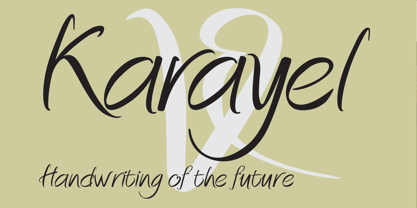 Erdogan Karayel, a master in graphic arts and a cartoon artist, has long dreamed of transforming characters made up of his own handwriting into fonts. This dream has come true with the technical support of Karayel's school friend Sabahattin Kayış, a graduate of the Istanbul School of Applied Fine Arts (Marmara University Faculty of Fine Arts). The biggest problem of handwritten fonts in the font world is the difficulty of reading in long texts due to their curved and flexible letters that create spacing problems when used side by side. The "Karayel Calligraphy", on the contrary, is created as a solution to this problem. It's a font that is sufficiently fluid, visually satisfying and easy to read. In particular, a lot of effort is made to ensure the utmost harmony between the character's spaces. The “Karayel Calligraphy” font is now available for download.
 - Lamaesa by Carlos Maeso González,
$15.90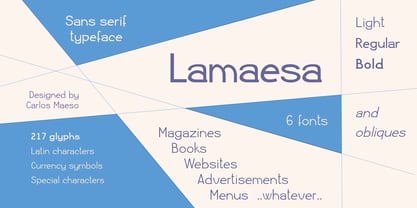 Lamaesa is a versatile and original design sans serif typeface. Designed to be used primarily on medium and large point sizes. Designed so you do not get tired of reading it, but at the same time, so that you notice its particularity. Oriented for use in headlines and continuous text, with a solid appearance, but with a slight aroma of handwriting, which gives it an ambivalent and original character. It is perfect for magazines, company letters, websites, advertisements, restaurant menus, and any support and function where it is essential to attract attention in an elegant and non-abusive way. Basic Latin characters. It consists of 217 glyphs (ISO 8859-15): uppercase, lowercase, numbers, currency symbols, and special characters. It consists of six fonts: light, normal and bold as well as their oblique equivalents. Carlos Maeso González is the designer of the typeface “Lamaesa”.
 - Keroya by Twinletter,
$15.00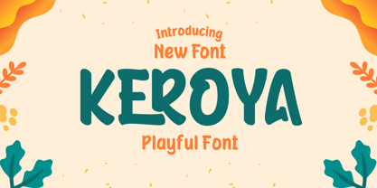 Welcome to the world of Keroya, a relaxed handwritten display font. Do you need a relaxed touch and a non-stuffy title for your project? Keroya is the perfect choice. Keroya brings a relaxed feel and beautiful handwriting to each character. This font is designed to bring your designs to life, giving any project a relaxed and stylish feel. With Keroya, you can create a headline that stands out, a catchy slogan, or a memorable message. Get Keroya now and let your imagination tell a stunning visual story. What's Included: file fonts - All Iso Latin 1 glyphs - We highly recommend using programs that support OpenType features and Glyphs panels such as many Adobe and Corel Draw applications so you can view and access all Glyph variations. - PUA Coded Characters – Fully accessible without additional design software. - Fonts include multilingual support
 - SF Ruqah by Sultan Fonts,
$29.99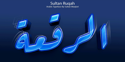 Ten years ago, I introduced a package of Ruqah fonts, with the most prominent being Ruqah Light, Ruqah Regular, and Ruqah Bold. Today, I am thrilled to announce the renewal of these 3 fonts, with improved design and more beautiful lettering. My goal is to eventually create a computerized Ruqah font that closely mimics handwriting. I encourage creators and designers to give this package of Ruqah fonts a try, as they offer great artistic potential and versatility in various creative projects. من عشر سنوات مضت، قدمت حزمة من خطوط الرقعة، من بينها الخط الرقعة الثقيل والخط الرقعة الخفيف. اليوم، أعيد تجديد هذه ٣ خطوط وجعل حروفها أجمل للمساعدة في الوصول تدريجيا إلى خط الرقعة الرقمي القريب من الكتابة اليدوية. فليجرب المبدعون هذه الحزمة من خطوط الرقعة، لأن هذا الخط قادر على التكيف الفني في مختلف المشاريع الإبداعية.
 - Martoni by Artisan Studio,
$17.00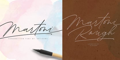 Martoni font has two styles, namely clean and rough. It's a work that is purely a result of handwriting and has natural characteristics. It is perfect for invitations, signatures, blogs, social media, business cards, product brands. Martoni has Stylistic standard, Stylistic Initial, Stylistic Terminal and ligatures, and includes uppercase and lowercase letters, numbers and punctuation marks. Accessed by using OpenType smart programs such as Adobe Photo Shop, Adobe Illustrator, Adobe Indesign, Corel Draw and Microsoft Office. - Ligatures: st nt ult ot ul th at ff el fl ut ll al sl et nl ct cl rt rl tt ft of ss an rr on mm - Swash: A B C D E - Initial and terminal: a b c d e f g h i j k l m n o p q r s t u v w x y z
 - Evertone by ijemrockart,
$15.00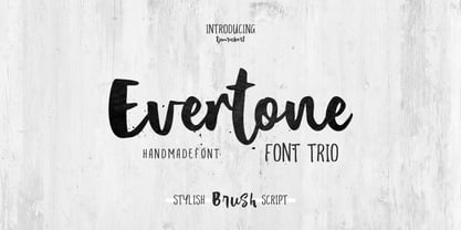 Evertone Family is a modern calligraphy font with a current handwriting style. This font is perfect for branding, wedding invites, magazines, mugs, business cards, quotes, posters, and more. Evertone Family is equipped with 300 glyphs, meaning you will be able to choose the letters according to your likes. There are lots of variation and options for each letter, so you can customize on your design choices. To access the variety of OpenType features you can use applications such as Adobe Photoshop CS / Adobe Photoshop CC, Adobe Illustrator CS / Adobe Illustrator CC, Adobe Indesign and Corel Draw. If you do not have a program that supports OpenType, you can access all the alternate glyphs using Font Book (Mac) or Character Map (Windows). If you have any question, do not hesitate to contact me by email ijemrealmad54@gmail.com Thanks and happy designing :)
 - Geronimo by Canada Type,
$24.95Geronimo is a rough poster script done in the spirit of brush calligraphy experiments conducted by American calligrapher and historian, Professor Alexander Nesbitt. This particular approach to brush script uses a pointed brush. Although Nesbitt considered the pointed brush corruptive and not at all suited to present day western letter forms, he put forth that with enough control of the brush (keeping it upright, maintaining stroke evenness, etc) even an unexperienced letterer can easily draw current day letters, though the result will always show characteristics of the letterer's own handwriting. Geronimo is a great choice for entertainment design, like book covers, film poster and packaging, and CD inserts. It also is a great overall display design for anything that seeks to depict adventure or an environment with a rough human element. Many alternates are sprinkled throughout the font. - Sure thing! HerrCoolesWriting is a delightful creation by the talented font designer Manfred Klein. Designed with a playful and innovative approach, this font is a testament to Klein's knack for crea...
- Mrs Bathhurst by Nick's Fonts,
$10.00One in the series of fonts celebrating the halcyon days of handlettering. Mrs. Bathhurst is based on an alphabet from 1916, prepared by Fred G. Cooper. Warm, endearing, and a little quirky, Mrs. B will brighten up any occasion. Both versions of this font contain the complete Unicode Latin A character complement, with support for the Afrikaans, Albanian, Basque, Bosnian, Breton, Catalan, Croatian, Czech, Danish, Dutch, English, Esperanto, Estonian, Faroese, Fijian, Finnish, Flemish, French, Frisian, German, Greenlandic, Hawaiian, Hungarian, Icelandic, Indonesian, Irish, Italian, Latin, Latvian, Lithuanian, Malay, Maltese, Maori, Moldavan, Norwegian, Polish, Portuguese, Provençal, Rhaeto-Romanic, Romanian, Romany, Sámi, Samoan, Scottish Gaelic, Serbian, Slovak, Slovenian, Spanish, Swahili, Swedish, Tagalog, Turkish and Welsh languages, as well as discretionary ligatures and extended fractions. - FLOWER GARDEN - Unknown license

- Honua by EternalEyes,
$22.00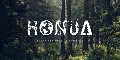 Honua means “Earth” in Hawaiian. Honua is a decorative typeface inspired by nature, and gives back to it by planting trees and corals around the world for every font sold.
 - Merry Baubles by Greater Albion Typefounders,
$6.00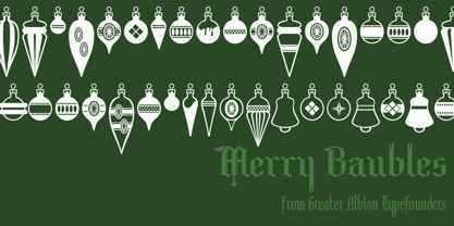 Merry Baubles is a set of fleurons in the form of traditional painted glass Christmas Tree ornaments. That's really all there is to say about this piece of typographic fun.
 - Johto by Superpencil,
$32.00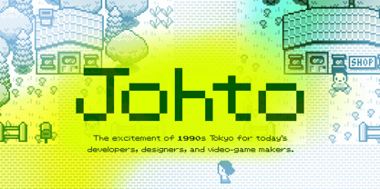 Finally, a font that’s ready for your pixel adventures. Johto is a hand-crafted, pixelated font that captures the excitement of 1990s Tokyo for today’s developers, designers, and video-game makers. We all love the pixelated games we played as kids. Now, as programmers, video makers, and creators of side projects that make our hearts pound with passion, there is nothing more satisfying than imagining ourselves in the shoes of the people that inspired us. We want to feel like we're right back there in the excitement of 1990s Tokyo, as an artist or engineer. Johto was created because of our disappointment with the pixel fonts we found online. And for people like us, who care deeply about the quality of our work - especially the work we do for ourselves - we realized we needed a high-quality pixel font to give our work the look it deserves. With over six hundred characters plus support for dozens of languages, including Japanese, tons of fun hand-crafted ligatures to get the look right, Johto is an authentic nostalgia trip. It has all those missing details you didn't notice, but your brain did.
 - Haunted Brick by LetterStock,
$20.00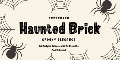 Introducing “Haunted Brick” – The Spooky Halloween Decorative Font Dive into the eerie world of “Haunted Brick,” a spellbinding decorative Halloween font that will send shivers down your spine. Perfect for crafting captivating Halloween posters, invitations, and chilling social media posts, this font boasts a unique hand-drawn style adorned with intricate spider webs in every glyph. Key Features: Spine-Chilling Elegance: “Haunted Brick” strikes the perfect balance between elegance and the macabre, adding a spine-chilling touch to your Halloween designs. Creepy Creativity: Whether you’re conjuring up posters, eerie invitations, or haunting social media content, “Haunted Brick” lends an air of mystery and excitement to your projects. Intricate Spider Webs: Every character in “Haunted Brick” is intricately adorned with spider webs, ensuring that your text is truly one-of-a-kind and perfect for all things Halloween. Why Choose “Haunted Brick”: – Elevate your Halloween designs with a font that’s both spooky and stylish. – Craft invitations that send shivers down the spines of your guests. – Create captivating posters that will haunt the memories of those who see them. – Perfect for adding a dose of horror to your social media posts. Embrace the Spookiness – Download “Haunted Brick” Now!
 - The Wickyfest by Colllab Studio,
$14.00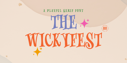 "Hi there, thank you for passing by. Colllab Studio is here. We crafted best collection of typefaces in a variety of styles to keep you covered for any project that comes your way! You want a playful serif font. Something elegant and charming, but still lighthearted , fun and cheerful with a dash of mischief? Introducing The Wickyfest, a playful serif font with a classic tone. If your next project requires a playful touch, you'll love this collection of special characters and features. The Wickyfest style is incredibly well-crafted, resulting in versatile characters that can present a dashing display for your branding designs and ads. For more extravagant projects, try The Wickyfest for children-related graphics, like book covers, movie titles, or posters. Download The Wickyfest Now and make your designs more memorable. String together words that spell out who you are - not just what you do. Sharpen the image of your company or give your online presence a touch of class and charm. Don’t be afraid to let your clients see there’s more to business than just that bottom line. A Million Thanks www.colllabstudio.com
 - Bigsize by Astageni,
$16.00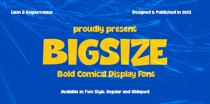 Unleash the playful vibes with Bigsize, a vibrant display font crafted to command attention and inject a dose of fun into any design. The bold, rounded letterforms make it a perfect choice for titles, headlines, and product packaging. Its whimsical charm also positions it as an ideal companion for brands targeting a youthful or lighthearted audience. Bigsize isn't just about fun; it's designed to be both playful and functional. Its readability, even at larger sizes, ensures that your message shines through. The font's distinctive style is a testament to the designer's creative exploration of letterforms, resulting in a typeface that strikes the perfect balance between playfulness and legibility. With over 350 glyphs, including support for broad Latin and Cyrillic languages, Bigsize proves its versatility across various design projects. Whether you're working on posters, billboards, logos, or digital ads, this font is your ticket to making a bold and memorable statement. Whether you're crafting a poster, developing packaging for a brand, or spearheading an advertising campaign, Bigsize is the font that will set your project apart. Its bold and comical aesthetic captivates your audience's attention, while its readability ensures your message resonates effortlessly."
 - Glize by Linecreative,
$16.00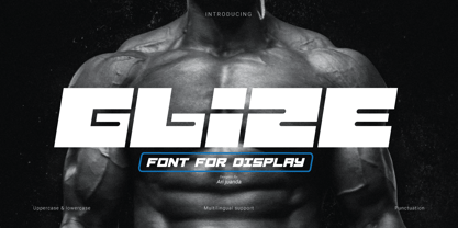 Introducing "Glize" – a dynamic and bold oblique typeface designed to infuse your projects with an unmistakable sense of speed, strength, and sharpness. Crafted with precision, this font exudes a powerful and energetic vibe, making it an ideal choice for projects centered around superhero themes, sports, esports, and other high-energy contexts. The bold strokes of "Glize" create a commanding presence, instantly capturing attention and conveying a sense of forceful momentum. The oblique angles add a dynamic slant, enhancing the font's overall sense of motion and agility. Each character is meticulously shaped to embody a sleek and streamlined aesthetic, contributing to the font's ability to convey a feeling of speed and intensity. Whether you're designing a logo for an esports team, crafting promotional materials for a high-impact sporting event, or working on a project that demands a bold and powerful visual identity, "Glize" is the perfect companion. Its bold oblique design ensures that your message is delivered with vigor, leaving a lasting impression on your audience. Elevate your designs with the striking and forceful character of "Glize" – where bold meets speed, and strength meets style.
 - Breve Title by DSType,
$50.00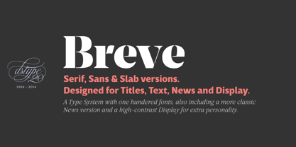 Breve was designed for use in editorial projects. Simple but with enough personality to stand by is own, in a quest for a more forceful and contemporary appearance. All the fonts in Breve superfamily, share the same exact structure, both in terms of anatomy and functionality. The Text versions provide a softer and warm feel to the typographic palette and is intended for use in much longer passages of text, while the Title versions are distinguished by non-descending letterforms, making the titles and headlines much more uniform and interesting. The News version is more classic, with ball terminals and classic proportions, while the Display is, somehow, the set of fonts we had to design: extra-black, ultra-contrasted, proud-display fonts.
 - Breve News by DSType,
$50.00 Breve was designed for use in editorial projects. Simple but with enough personality to stand by is own, in a quest for a more forceful and contemporary appearance. All the fonts in Breve superfamily, share the same exact structure, both in terms of anatomy and functionality. The Text versions provide a softer and warm feel to the typographic palette and is intended for use in much longer passages of text, while the Title versions are distinguished by non-descending letterforms, making the titles and headlines much more uniform and interesting. The News version is more classic, with ball terminals and classic proportions, while the Display is, somehow, the set of fonts we had to design: extra-black, ultra-contrasted, proud-display fonts.
 - Breve Text by DSType,
$50.00 Breve was designed for use in editorial projects. Simple but with enough personality to stand by is own, in a quest for a more forceful and contemporary appearance. All the fonts in Breve superfamily, share the same exact structure, both in terms of anatomy and functionality. The Text versions provide a softer and warm feel to the typographic palette and is intended for use in much longer passages of text, while the Title versions are distinguished by non-descending letterforms, making the titles and headlines much more uniform and interesting. The News version is more classic, with ball terminals and classic proportions, while the Display is, somehow, the set of fonts we had to design: extra-black, ultra-contrasted, proud-display fonts.
 - Breve Sans Text by DSType,
$50.00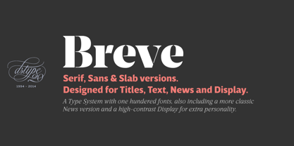 Breve was designed for use in editorial projects. Simple but with enough personality to stand by is own, in a quest for a more forceful and contemporary appearance. All the fonts in Breve superfamily, share the same exact structure, both in terms of anatomy and functionality. The Text versions provide a softer and warm feel to the typographic palette and is intended for use in much longer passages of text, while the Title versions are distinguished by non-descending letterforms, making the titles and headlines much more uniform and interesting. The News version is more classic, with ball terminals and classic proportions, while the Display is, somehow, the set of fonts we had to design: extra-black, ultra-contrasted, proud-display fonts.
 - Breve Slab Text by DSType,
$50.00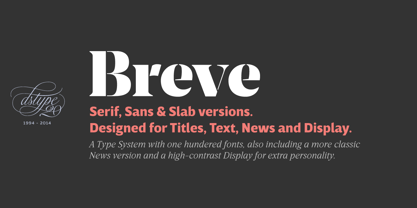 Breve was designed for use in editorial projects. Simple but with enough personality to stand by is own, in a quest for a more forceful and contemporary appearance. All the fonts in Breve superfamily, share the same exact structure, both in terms of anatomy and functionality. The Text versions provide a softer and warm feel to the typographic palette and is intended for use in much longer passages of text, while the Title versions are distinguished by non-descending letterforms, making the titles and headlines much more uniform and interesting. The News version is more classic, with ball terminals and classic proportions, while the Display is, somehow, the set of fonts we had to design: extra-black, ultra-contrasted, proud-display fonts.
 - Breve Sans Title by DSType,
$50.00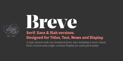 Breve was designed for use in editorial projects. Simple but with enough personality to stand by is own, in a quest for a more forceful and contemporary appearance. All the fonts in Breve superfamily, share the same exact structure, both in terms of anatomy and functionality. The Text versions provide a softer and warm feel to the typographic palette and is intended for use in much longer passages of text, while the Title versions are distinguished by non-descending letterforms, making the titles and headlines much more uniform and interesting. The News version is more classic, with ball terminals and classic proportions, while the Display is, somehow, the set of fonts we had to design: extra-black, ultra-contrasted, proud-display fonts.
 - Breve Display by DSType,
$50.00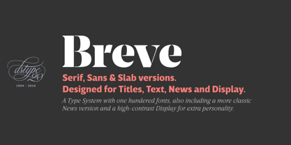 Breve was designed for use in editorial projects. Simple but with enough personality to stand by is own, in a quest for a more forceful and contemporary appearance. All the fonts in Breve superfamily, share the same exact structure, both in terms of anatomy and functionality. The Text versions provide a softer and warm feel to the typographic palette and is intended for use in much longer passages of text, while the Title versions are distinguished by non-descending letterforms, making the titles and headlines much more uniform and interesting. The News version is more classic, with ball terminals and classic proportions, while the Display is, somehow, the set of fonts we had to design: extra-black, ultra-contrasted, proud-display fonts.
 - Breve Slab Title by DSType,
$50.00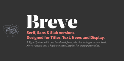 Breve was designed for use in editorial projects. Simple but with enough personality to stand by is own, in a quest for a more forceful and contemporary appearance. All the fonts in Breve superfamily, share the same exact structure, both in terms of anatomy and functionality. The Text versions provide a softer and warm feel to the typographic palette and is intended for use in much longer passages of text, while the Title versions are distinguished by non-descending letterforms, making the titles and headlines much more uniform and interesting. The News version is more classic, with ball terminals and classic proportions, while the Display is, somehow, the set of fonts we had to design: extra-black, ultra-contrasted, proud-display fonts.
 - Stoutface - Personal use only

- Paddy Wagon NF by Nick's Fonts,
$10.00The typeface which inspired this offering was originally called "Chaucer", not because it is typical of lettering of Chaucer’s time (which it is not) but, more likely, because it’s pretty funny, even if the humor is low. Another purveyor of low humor, Mack Sennett and his Keystone Kops, suggested this version’s name. Both versions of this font include the complete Unicode Latin 1252 and Central European 1250 character sets. - ZRex - Unknown license

- Rusty Frozee - Personal use only

- Jatina Script - Personal use only

- Kidie Monster - Personal use only

- beachsunshine - Personal use only

- Cartoo Nature - Personal use only

- St37k - 100% free

- Lyrics Movement - Personal use only

- PENCIL STENCIL - Personal use only

- Cienfuegos - Personal use only

- Ozone - Unknown license

- Maternellecolor creuse - Unknown license

- Reprise Script - Unknown license


