5,770 search results
(0.029 seconds)
- Cocomat Pro by Zetafonts,
$39.00 Cocomat has been designed by Francesco Canovaro and Debora Manetti as a development of the Coco Gothic typeface system created by Cosimo Lorenzo Pancini. It shares with all the other subfamilies in the Coco Gothic system a geometric skeleton with open, more humanistic proportions, a sans serif design with slightly rounded corners and low contrast proportions, without optical compensation on the horizontal lines, resulting in a quasi-inverted contrast look in the boldest weights. What differentiates Cocomat from the other subfamilies in Coco Gothic are some slight design touches in the uppercase letters, with a vertical unbalancing reminiscent of art deco design, notably evident in uppercase "E", "A","F","P" and "R" - while lowercase letters have been given some optical compensation on the stems, like in "n","m", "p" and "q". These design choices, evoking the second and third decade of the last century (Cocomat is also referred as Coco 1920 in the Coco Gothic Family) all give Cocomat a slight vintage feeling, making it a perfect choice every time you need to add a period vibe or an historical flair to your design, like in food or luxury branding. The typeface, first published in 2014, has been completely redesigned by the original authors in 2019 as Cocomat PRO to include eight extra weights (thin, medium, black and heavy in both roman and italic form), extra open type features (including alternate forms, positional numerals), and extra glyphs making Cocomat cover over two hundred languages using latin, cyrillic and greek alphabets.
 - Agatha by Underground,
$25.00 2015 First Prize TipoType award. Agatha is a new typeface for titles and short texts in big sizes. It can be use both in editorial publishing and brand design. From gothic geometric bases, the letters resemble the Nordic style in order to be more feminine, rhythmical and vertical. The two versions, Regular & Outline, let the designer choose between two contrasts: one heavy version that emphasize the rhythm and a lighter one that intensifies the subtlety. The third version, Blossom, combines light and color with ornaments that highlight the style. The three fonts have in addition a ligature set and some decorative glyphs that increase the possibilities of use.
 - Agatha by TipoType,
$25.00 2015 First Prize TipoType award. Agatha is a new typeface for titles and short texts in big sizes. It can be use both in editorial publishing and brand design. From gothic geometric bases, the letters resemble the Nordic style in order to be more feminine, rhythmical and vertical. The two versions, Regular & Outline, let the designer choose between two contrasts: one heavy version that emphasize the rhythm and a lighter one that intensifies the subtlety. The third version, Blossom, combines light and color with ornaments that highlight the style. The three fonts have in addition a ligature set and some decorative glyphs that increase the possibilities of use.
 - Leothric by Intellecta Design,
$24.90 a gothic family
 - Hulk by Bogusky 2,
$20.00Ultra heavy - Commodore JNL by Jeff Levine,
$29.00 Commodore JNL and Commodore Oblique JNL are based somewhat on the Clarendon family of typefaces that were popular in the 1800s and used on many of the broadsides and notices printed with wood type. The extra-wide design of this font limits the amount of text that a headline can handle effectively, but when applied sparingly it commands attention and sells the message.
 - A bite - Personal use only

- Marvelouz DSG - Unknown license

- Lifetime Font - Personal use only

- Hostetler Kapitalen by Intellecta Design,
$9.00a mixed gothic font - Black by Intellecta Design,
$16.90a gothic bold typeface - Xtera by Bogusky 2,
$20.00Heavy contemporary font - A Bebedera - Personal use only

- Blonde Fraktur by ParaType,
$30.00 Blonde Fraktur is a free interpretation of the Gothic theme in Cyrillic. The font is neither Fraktur nor any other Gothic script from the formal point of view, but it makes text look like Gothic script, no matter which language is used. Blonde Fraktur was written with a quill by Alexandra Korolkova and prepared in digital form by Alexandra Pushkova. The font contains a set of alternatives and swashed variations. It suits well for advertising of beer, sausages, pubs and other places where Gothic scripts are commonly used.
 - Gotische Frame by Intellecta Design,
$9.00a gothic drop caps typeface - Tudor New by Bogusky 2,
$20.00Thick and thin gothic font - Archive Black Title by Archive Type,
$19.95Heavy blackletter display typeface. - Pinocchio - Unknown license

- Xpress by Wiescher Design,
$12.00 »XPress« is a very distinct, expressive, typical new Sans. »XPress« is my new Sans-Serif that impresses – especially in small sizes – with its outstanding readability. Seven precisely calibrated weights from »Thin« to »Heavy« and its corresponding italics make this font-family universally usable. »XPress« got its bearings from the fabulous American »Gothic« fonts of the twenties of last century. Modern, present day elements, high lowercase letters and infinitesimal elegant slight curves in start- and end strokes make the font family not only great for body copy, but also very useful in advertising. »XPress« ist eine individuelle, expressive, typische neue Sans. »XPress« ist meine neue Serifenlose die – speziell in kleinen Schriftgraden – durch aussergewöhnliche Lesbarkeit auffällt. Sieben präzise aufeinander abgestimmte Schnitte von »Thin« bis »Heavy« und dazu passende Kursive machen die Schriftfamilie vielseitig einsatzfähig. »XPress« orientiert sich bewusst an den grossen amerikanischen Groteskschriften der zwanziger Jahre des letzten Jahrhunderts. Durch moderne Formelemente, große Mittellängen und unendlich leichte, elegante An- und Abstriche ist die Schrift jedoch nicht nur als Textschrift, sondern auch im gesamten Bereich der Werbung vielseitig einsetzbar.
 - Smoothing by Hanzel Space,
$25.00 Smoothing is a stylish modern calligraphic font in an original handwriting style. It's perfect for branding, wedding invitations and cards, and maybe for red wine labels. Smoothing includes a full set of beautiful upper and lower case letters, numbers, a wide variety of punctuation marks and 46 ligatures. All lowercase letters include initial and final strokes, giving a realistic handwritten style. What did you get, honey? Full Set of standard alphabet and punctuation Extra set of ending swashed lowercase Handwritten ligatures Thanks so much for checking out my shop! Happy creating! Cheers! Hanief - Hanzel Space
 - Sackers Roman by Monotype,
$29.99Sackers Roman is an engraver, all-capitals family for invitations and stationery. The letters have strong contrast between thin and thick strokes. See also Sackers Gothic, Sackers Square Gothic, Sackers Script, and Sackers Classic Roman. - Sackers Solid Antique Roman by Monotype,
$29.99Sackers Roman is an engraver, all-capitals family for invitations and stationery. The letters have strong contrast between thin and thick strokes. See also Sackers Gothic, Sackers Square Gothic, Sackers Script, and Sackers Classic Roman. - Sackers Script by Monotype,
$40.99Sackers Roman is an engraver, all-capitals family for invitations and stationery. The letters have strong contrast between thin and thick strokes. See also Sackers Gothic, Sackers Square Gothic, Sackers Script, and Sackers Classic Roman. - Sackers Classic Roman by Monotype,
$29.99Sackers Roman is an engraver, all-capitals family for invitations and stationery. The letters have strong contrast between thin and thick strokes. See also Sackers Gothic, Sackers Square Gothic, Sackers Script, and Sackers Classic Roman. - Lopsickles by Ingrimayne Type,
$7.00 Lopsickles is a family in which the letters are based on lopsided, distorted ellipses. The family has four sets of letters that are combined in six different ways, yielding six fonts. Four of these fonts (styles AB, Ad, Bc, and cd) use the OpenType feature Contextual Alternatives (calt) to alternate letter sets so that top-heavy characters alternate with bottom-heavy characters. The spacing in these fonts is designed for alternating characters and will result in overlap if the characters do not alternate. The other two styles (Ac and Bd) are spaced normally. Style Ac contains the two character sets that are top heavy and style Bd has the two character sets that are bottom heavy. The Ac and Bd fonts have italics and backslanted styles that may be useful to suggest speed. Each of these ten fonts has an inset style designed to be used in a layer above the base font. This layering can be used to give the effect of hollow letters or to add a colored interior. Lopsickles joins several other alternating-characters families in the IngrimayneType library including Snuggels, CloseTogether, and Caltic, but is visually very different from them. It is a strange, unusual family that will get noticed.
 - Serif Medium - Unknown license

- Ruthless AOE by Astigmatic,
$19.95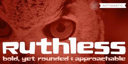 A plush and heavy unicase font.
 - Voussoir by Sylvestre Studios,
$25.00Voussoir, the perfect heavy display font. - Flyer by Linotype,
$40.99The Flyer font family consists of two very heavy condensed sans serif faces, Black Condensed and Extra Black Condensed. Excellent for headlines or packaging, Flyer font is geometric and quite similar to Tempo Heavy Condensed. - PL Modern by Monotype,
$29.99PL Modern Heavy Condensed is based on a design by R.H. Middleton (1936). It has Bodoni-style letterforms, typical of Modern Serif faces. Use the PL Modern Heavy Condensed font for headlines in narrow settings. - Zawlbuk by Richard Khuptong,
$20.00 Zawlbuk is a type inspired by Blackletter (sometimes black letter), also known as Gothic script, Gothic minuscule, or Textura. The Letters are drawn using a flat nib pen on a paper, scanned and drawn into a vector format.
 - Myteri Tattoo PERSONAL USE ONLY - Personal use only

- Friday13 - Unknown license

- Burton's Nightmare - Unknown license

- elektrogothik - Unknown license

- Fette Trump-Deutsch - Unknown license

- Ye Old Shire - Unknown license

- Front Page Pro by Jonahfonts,
$45.00 A heavy slab face for many applications.
 - Elefont Emboss by Emboss,
$13.45 Designed to be fat, loud and heavy.
 - Adso by Alfab,
$55.00 Adso was born out of a research that studied the possibility of reintroducing Gothic writing in our contemporary world. Inspired by Textura, Adso was decidedly freed of all those little details that make Blackletter faces appear foreign or even displeasing to the contemporary reader’s eyes. Nevertheless, the basic features of Gothic color were preserved: verticality, modularity, and darkness. Adso is a gothic font for today’s age, highly readable and open to all fields of expression.


