10,000 search results
(0.069 seconds)
- Special Forces by Typodermic,
$11.95 Special Forces is the commanding slab serif headline typeface that will put some backbone into your message. Its efficient and rugged letterforms will give your words the strength they need to succeed in any mission. With its robust slab serifs, this typeface means business. You won’t find any fancy curves or delicate strokes here—this font is built to withstand the toughest of conditions. Special Forces is ready to take on any challenge, just like our brave soldiers in the field. But this font isn’t just tough—it also commands authority. When you use Special Forces, your message will have the power of a commanding officer. Whether you’re calling your troops to action or announcing a new campaign, this typeface will give your words the weight they deserve. And the best part? Special Forces comes in both regular and oblique styles, so you can choose the right level of intensity for your message. So don’t settle for a weak font that won’t get the job done. Choose Special Forces and take your design to the front lines. Most Latin-based European writing systems are supported, including the following languages. Afaan Oromo, Afar, Afrikaans, Albanian, Alsatian, Aromanian, Aymara, Bashkir (Latin), Basque, Belarusian (Latin), Bemba, Bikol, Bosnian, Breton, Cape Verdean, Creole, Catalan, Cebuano, Chamorro, Chavacano, Chichewa, Crimean Tatar (Latin), Croatian, Czech, Danish, Dawan, Dholuo, Dutch, English, Estonian, Faroese, Fijian, Filipino, Finnish, French, Frisian, Friulian, Gagauz (Latin), Galician, Ganda, Genoese, German, Greenlandic, Guadeloupean Creole, Haitian Creole, Hawaiian, Hiligaynon, Hungarian, Icelandic, Ilocano, Indonesian, Irish, Italian, Jamaican, Kaqchikel, Karakalpak (Latin), Kashubian, Kikongo, Kinyarwanda, Kirundi, Kurdish (Latin), Latvian, Lithuanian, Lombard, Low Saxon, Luxembourgish, Maasai, Makhuwa, Malay, Maltese, Māori, Moldovan, Montenegrin, Ndebele, Neapolitan, Norwegian, Novial, Occitan, Ossetian (Latin), Papiamento, Piedmontese, Polish, Portuguese, Quechua, Rarotongan, Romanian, Romansh, Sami, Sango, Saramaccan, Sardinian, Scottish Gaelic, Serbian (Latin), Shona, Sicilian, Silesian, Slovak, Slovenian, Somali, Sorbian, Sotho, Spanish, Swahili, Swazi, Swedish, Tagalog, Tahitian, Tetum, Tongan, Tshiluba, Tsonga, Tswana, Tumbuka, Turkish, Turkmen (Latin), Tuvaluan, Uzbek (Latin), Venetian, Vepsian, Võro, Walloon, Waray-Waray, Wayuu, Welsh, Wolof, Xhosa, Yapese, Zapotec Zulu and Zuni.
 - The Eighty-Eight font crafted by Woodcutter Manero bursts with a distinct character that makes it stand out in the expansive universe of typography. Woodcutter Manero has a reputation for creating fo...
- ABC Basisschrift by Elsner+Flake,
$35.00 During the last ten years of his life, Hans Eduard Meier (dec. July 17, 2014), together with Max Schläpfer, developed an innovative concept of a new Swiss Schulschrift (handwriting script for schools) called ABC Basisschrift®. His life’s work is crowned by the fact that now, since the fall of 2014, and beginning in Lucerne, this new didactic will replace the old Schnürlischrift in Switzerland. In contrast with the Schnürlischrift, the idea is to guide a child in three steps to learning a personal handwriting. ABC Schule 1 is for the first grade, ABC 2 starts to introduce the first connections and ABC 4 Ligaturen is designed with many ligatures to serve as a good example for handwriting. ABC Schule is also available with ruling and for visually impaired students.This version of the Basisschrift®, available from here, is the original version by Hans Meier.
 - Steak by Sudtipos,
$59.00 Here I am, once again digging up 60-year sign lettering and trying to reconcile it with the typography of my own time. The truth is I've had this particular Alf Becker alphabet in my sights for a few years now. But in the typical way chaos shuffles the days, Buffet Script and Whomp won the battle for my attentions way back when, then Storefront beat the odds by a nose a couple of years ago. Nevertheless, revisiting Alf Becker’s work is always a breath of fresh air for me, not to mention the ego boost I get from confirming that I can still hack my way through the challenges, which is something I think people ask themselves about more often as they get older. You can never tell what may influence your work, or in this case remind you to dig it out of dust drawers and finally mould it into one of your own experiences. On my recent visits to the States and Canada, I noticed that quite a few high-end steak houses try their best to recreate an urban American 1930s atmosphere. This is quite evident in their menus, wall art, lighting, music, and so on. The ambience says your money is well spent here, because your food was originally choice-cut by a butcher who wears a suit, cooked by a chef who may be your neighbour 20 minutes from downtown, and delivered by a waitress who can do the Charleston when the lights dim and who just wouldn't mind laughing with you over drinks at the bar later. So Steak is just that, a face for menus and wall art in those places that see themselves in the kind of jazzy, noirish world where one-liners rule and exclamation points are part of a foreign language. As is usual with my lettering-inspired faces, there is very little left of the original Alf Becker alphabet. Of course, the challenges present in bringing typographic functionality to what is essentially pure hand lettering gives the spirit of the original art a hell of a rollercoaster ride. But I think that spirit survived the adventure, and may in fact be even somewhat magnified here. This font is over 850 glyphs. It’s loaded with ligatures, swashes, ending forms, alternates, ascender and descender variations, and extended Latin language support. Steak comes in 3 versions. According to your taste you can choose Barbecue, Braised or Smoked. It’s up to you!
 - LOL! - Personal use only

- DuerersMinuskeln, a typeface created by Manfred Klein, is a fascinating blend of historical artistry and modern design principles. Manfred Klein, known for his vast portfolio of unique and varied fon...
- Augent by Slide Shoot,
$17.00 Augent Sans Serif is a balanced, smooth, elegant and stylish sans serif font. He has a beautiful character. It fits perfectly with invitation card designs, company logos, movie titles, movie names, business cards, book titles, brand names and various other designs. Augent Sans Serif is a subtle serif font that exudes sophistication and elegance. Its stylish alternations and ligatures make this font the perfect partner for any project.
 - Savattera by Prioritype,
$18.00 Introducing a new script font with a beautiful, uniquely elegant and very charming look, you can click it and can be used in your projects such as wedding invitations, quotes, creative posts, clothing product packaging, promotions, video preview images, logos and much more to explore. because it has many cool variations. As a picture you can see the preview above. Features: -Uppercase -Lowercase -Numeral -Punctuation -Multilingual -Alternate -Ligature -Swash Thanks.
 - Nimba by Pedroglifos,
$12.00 Inspired by the magic in the clouds, this part paintbrush, part san serif, Nimba is a hybrid display typeface that brings swiftness and joy to any project. Ideal for projects that require a sans type without sacrificing personality. This family contains true italic members, providing a stronger sense of motion and speed. Elegant, yet Vivid, this typeface will make your project stand out from the sans dominated design world.
 - Stara by Yukita Creative,
$14.00 Stara Sans Serif Font is a sans serif font that combines simplicity with elegance. With its clean design and balanced proportions, this font gives off a modern and professional feel. Each letter is carefully designed to ensure optimal clarity and legibility. Stara Sans Serif Font is suitable for use in various design projects, such as logos, titles, paragraphs and digital displays, with its ability to give a fresh and elegant look.
 - Under Terror by Sarid Ezra,
$15.00 Under Terror is a rough handwritten font with creepy vibes that will suitable for your next halloween poster. You can use this font for any project especially horror movie poster. With unique lowercase and uppercase, you can combine both to get more handwritten looks. You can access the underline from ligatures, just type underline + number(1-6) in the middle of the text. For example: TeR_2roR. This font also support multilingual.
 - Tamword by Prioritype,
$18.00 Introducing a new script font with a bold and clear style. Yes you can use this font in your projects and make it even more classy. It can be applied to logos, video previews, crafts, apparel products, packaging, photographer watermarks, and any of your other awesome projects. for an overview you can see some of the previews above. Features: -Uppercase -Lowercase -Numeral -Punctuation -Multilingual -Alternate -Ligature -Swash Thanks.
 - Lubaline by Lián Types,
$39.00 Who haven't heard the phrase that ‘any past time was better’?. Although I sometimes find this phrase a little too pessimistic (because I try to think that the best is yet to come), it may be true regarding my passion, typography. I'm too young (29) unfortunately, and this means I did not have the pleasure of being contemporary with maybe the man who has influenced my work the most (1). The man that showed that letters are more than just letters to be read. Herb Lubalin (1918-1981), also called sometimes as ‘the rule basher’ (2), smashed the taboos and sacred rules of type design and gave it personality. He rejected the functionalist philosophy of europeans in favor of an eclectic and exuberant style. To him, letters were not merely vessels of form, they were objects of meaning. (3). Nowadays, when looking at his portfolio, who dares to deny that the term ‘typography’ and ‘beauty’ may go hand-in-hand without any problem? Ed Benguiat, one of Herb’s partners, still likes making jokes with the phrase “screw legibility, type should be beautiful” and what I understand of this is not to forget the rules, but to know and break them carefully. In an era of pure eclecticism, we, the lovers of flourishes and swashes, can't do nothing but admire all the legacy that Lubalin, this wonderful type-guru, left. My font Lubaline read as “the line of Lubalin” is my humble tribute to him. Those who know his work, may see the influences easily like in his ‘Beards’ (1976) and ‘The Sound of Music’ (1965) posters; the art-deco forms in many of his amazing logos and practically in all his creations where letters seem to be alive just like you and me. I really hope that the future finds me still learning more and more about type-design and letterforms, and like him, always willing to make innovations in my field: Because letters are not just letters to be read. NOTES (1) These are some of my fonts in which some of Lubalin’s influences can be seen (in order of creation): Reina, Aire, Erotica, String, Beatle, Heroe, Selfie, Model, Seventies, and many others that are still in progress. (2) (3) Steven Heller. Herb Lubalin: Rule Basher. U&lc (1998) http://www.printmag.com/imprint/my-favorite-lubalin/
 - The D3 Labyrinthism katakana font, created by Kat Rakos, stands as a unique and mesmerizing addition to the typographic landscape. Its design is heavily influenced by the intricate and complex pathwa...
- Apla Clare by Hooper Type,
$9.00 Apla Clare comes from the love of my wife.. She's 'Simply' Clare. It's a straihght forward sans, but with a little bit of play, and a friendliness that ensures it moves away from sterile, serious sans. PLease enjoy!
 - ITC Busorama by ITC,
$40.99Part of the first typeface release package from ITC in 1970, Busorama melds Art Deco and 70s flower-power into a delightful sans serif design. Designed by Tom Carnase, this three-weight sans serif family still turns heads. - Nouveau To Go JNL by Jeff Levine,
$29.00 Nouveau To Go JNL is the digital version of the hand lettered title found on the 1915 sheet music for the song "Don't Bite the Hand That's Feeding You", and is available in both regular and oblique versions.
 - Springtime Romance by Crumphand,
$20.00 Hello, introducing the new hand made fonts "Springtime Romance" Springtime Romance is a great hand made font. Made by marker, make your design looks stunning. What's Inside The Font ? Uppercase Lowercase Symbols Numerals European Multilinguals Thank You, Regards.
 - Bisalir by Aga Silva,
$24.99 Bisalir is a beautiful display font, so you can create beautiful headings or signature looks. Open type features 1000+ glyphs including stylistic alternates so you can fine tune your creations (this option works well also for other languages)
 - Ahoy Amigo by Konstantine Studio,
$10.00 Say hello to Ahoy Amigo! A couple of all caps and script brush hand lettering font. Fully stroked by human hand with the authentic traditional handmade vibes to catch up your vintage crafted branding feels. Absolute perfectly imperfect.
 - Candy Night by FadeLine Studio,
$15.00 Introducing CANDY NIGHT! A Hand Drawn slab serif font! Made by hand to provide a natural, unique and modern style. This font is carefully designed to maintain the balance of each letter. Very easy and convenient to use.
 - Sango by Katatrad,
$29.00 Sango is a monospaced Sans Serif family with the closed forms — a normal sans and rounded version in 6 weights. This typeface is ideally suited for publication, corporate identity, branding, wayfinding as well as web and screen design.
 - The "Rose Tattoo" font, crafted by Billy Argel, is a striking and ornamental script that embodies a unique blend of elegance and rebellion. This font stands out due to its intricate designs and the s...
- Neue Frutiger Paneuropean by Linotype,
$79.00During planning for the new Roissy Charles de Gaulle airport in Paris at the beginning of the 1970s, it was determined that the airport's signage system had to include the clearest and most legible lettering possible. The development of all signage was put into the hands of Adrian Frutiger and his studio. The team carried out their task so effectively that a huge demand for their typeface soon arose from customers who wanted to employ it in other signage systems, and in printed materials as well. The Frutiger® typeface not only established new standards for signage, but also for a range of other areas in which a clear and legible design would be required, especially for small point sizes and bread-and-butter type. The typeface family that which emerged as a result of this demand was added into the Linotype library as "Frutiger" in 1977. Frutiger Next, created in 1999, is a further development of Frutiger, not necessarily a rethinking of the design itself. It was based on a new concept, the most obvious visual characteristics of which is the larger x-height, as well as a more pronounced ascender height and descender depth for lower case letters in relation to capitals. This new design created a balanced image and included considerably narrower letterspacing. Frutiger Next meets the demand for a space-saving, modern humanist sans. 2009's Neue Frutiger is a rethink of the 1977 Frutiger family, now revised and improved by Akira Kobayashi in close collaboration with Adrian Frutiger. Despite the various changes, this "New Frutiger" still fits perfectly with the original Frutiger family, and serves to harmoniously enhance the weights and styles already in existence. The perfect mix, guaranteed Neue Frutiger has the same character height as Frutiger. As a result of this, already existing Frutiger styles can be mixed with Neue Frutiger where necessary. Likewise, Neue Frutiger is perfect for use alongside Frutiger Serif. Newly added are the "Neue Frutiger 1450" weights. Especially for the requirements of the newly released German DIN 1450 norm we have built together with Adrian Frutiger specific weights of the Neue Frutiger. The lowercase l" is curved at the baseline to better differentiate between the cap "I", additionally the number "0" has a dot inside to better differentiate between the cap "O", and the number "1" is now a serifed 1. The font contains additionally the origin letterforms from the regular Neue Frutiger font which can be accessed through an Opentype feature." - Neue Frutiger Cyrillic by Linotype,
$89.00During planning for the new Roissy Charles de Gaulle airport in Paris at the beginning of the 1970s, it was determined that the airport's signage system had to include the clearest and most legible lettering possible. The development of all signage was put into the hands of Adrian Frutiger and his studio. The team carried out their task so effectively that a huge demand for their typeface soon arose from customers who wanted to employ it in other signage systems, and in printed materials as well. The Frutiger® typeface not only established new standards for signage, but also for a range of other areas in which a clear and legible design would be required, especially for small point sizes and bread-and-butter type. The typeface family that which emerged as a result of this demand was added into the Linotype library as "Frutiger" in 1977. Frutiger Next, created in 1999, is a further development of Frutiger, not necessarily a rethinking of the design itself. It was based on a new concept, the most obvious visual characteristics of which is the larger x-height, as well as a more pronounced ascender height and descender depth for lower case letters in relation to capitals. This new design created a balanced image and included considerably narrower letterspacing. Frutiger Next meets the demand for a space-saving, modern humanist sans. 2009's Neue Frutiger is a rethink of the 1977 Frutiger family, now revised and improved by Akira Kobayashi in close collaboration with Adrian Frutiger. Despite the various changes, this "New Frutiger" still fits perfectly with the original Frutiger family, and serves to harmoniously enhance the weights and styles already in existence. The perfect mix, guaranteed Neue Frutiger has the same character height as Frutiger. As a result of this, already existing Frutiger styles can be mixed with Neue Frutiger where necessary. Likewise, Neue Frutiger is perfect for use alongside Frutiger Serif. Newly added are the "Neue Frutiger 1450" weights. Especially for the requirements of the newly released German DIN 1450 norm we have built together with Adrian Frutiger specific weights of the Neue Frutiger. The lowercase l" is curved at the baseline to better differentiate between the cap "I", additionally the number "0" has a dot inside to better differentiate between the cap "O", and the number "1" is now a serifed 1. The font contains additionally the origin letterforms from the regular Neue Frutiger font which can be accessed through an Opentype feature." - Neue Frutiger 1450 by Linotype,
$71.99 During planning for the new Roissy Charles de Gaulle airport in Paris at the beginning of the 1970s, it was determined that the airport's signage system had to include the clearest and most legible lettering possible. The development of all signage was put into the hands of Adrian Frutiger and his studio. The team carried out their task so effectively that a huge demand for their typeface soon arose from customers who wanted to employ it in other signage systems, and in printed materials as well. The Frutiger® typeface not only established new standards for signage, but also for a range of other areas in which a clear and legible design would be required, especially for small point sizes and bread-and-butter type. The typeface family that which emerged as a result of this demand was added into the Linotype library as "Frutiger" in 1977. Frutiger Next, created in 1999, is a further development of Frutiger, not necessarily a rethinking of the design itself. It was based on a new concept, the most obvious visual characteristics of which is the larger x-height, as well as a more pronounced ascender height and descender depth for lower case letters in relation to capitals. This new design created a balanced image and included considerably narrower letterspacing. Frutiger Next meets the demand for a space-saving, modern humanist sans. 2009's Neue Frutiger is a rethink of the 1977 Frutiger family, now revised and improved by Akira Kobayashi in close collaboration with Adrian Frutiger. Despite the various changes, this "New Frutiger" still fits perfectly with the original Frutiger family, and serves to harmoniously enhance the weights and styles already in existence. The perfect mix, guaranteed Neue Frutiger has the same character height as Frutiger. As a result of this, already existing Frutiger styles can be mixed with Neue Frutiger where necessary. Likewise, Neue Frutiger is perfect for use alongside Frutiger Serif. Newly added are the "Neue Frutiger 1450" weights. Especially for the requirements of the newly released German DIN 1450 norm we have built together with Adrian Frutiger specific weights of the Neue Frutiger. The lowercase l" is curved at the baseline to better differentiate between the cap "I", additionally the number "0" has a dot inside to better differentiate between the cap "O", and the number "1" is now a serifed 1. The font contains additionally the origin letterforms from the regular Neue Frutiger font which can be accessed through an Opentype feature."
 - The Babylon Font, crafted by the talented Joss Astley, is a marvel in the world of typography that captures the spirit and elegance of ancient scripts while blending seamlessly into the modern aesthe...
- Bowling Script by Sudtipos,
$69.00 There is plenty of lyric and literature about looking over one's shoulder in contemplation. What would you have done differently if you knew then what you know now? This is the kind of question that comes out of nowhere. When it does and whether its context is personal or professional make very little difference. It's a question that can cause emotions to rise and passions to run hot. It can trigger priority shifts and identity crises. It's never easy to answer. Three years ago, I published a font called Semilla. My aim with that was to distill the work of Bentele, a lettering artist from early 1950s Germany. Picking such an obscure figure back then was my way of pondering the meaning and efficiency of objectivity in a world where real human events and existences are inevitably filtered through decades of unavoidably subjective written, printed and oral history. And maybe to pat myself on the back for surviving surprises mild and pleasant. Having been fortunate enough to follow my professional whims for quite some time now, I took another, longer look at my idea of distilling Bentele's work again. I suppose the concepts of established history and objectivity can become quite malleable when personal experience is added to the mix. I say that because there I was, three years later, second-guessing myself and opining that Bentele's work can be distilled differently, in a manner more suited to current cultural angles. So I embarked on that mission, and Bowling Script is the result. I realize that it's difficult to reconcile this soft and happy calligraphic outcome with the introspection I've blathered about so far, but it is what is. I guess even self-created first world problems need to be resolved somehow, and the resolution can happen in mysterious ways. Bowling Script is what people who like my work would expect from me. It's yet another script loaded with all kinds of alternation, swashing and over-the-top stuff. All of that is in here. These days I think I just do all that stuff without even blinking. But there are two additional twists. The more noticeable one is ornamental: The stroke endings in the main font are of the typical sharp and curly variety found in sign painting, while the other font complements that with ball endings, sometimes with an added-on-afterwards impression rather than an extension of the actual stroke. In the philosophical terms I was mumbling earlier, this is the equivalent of alternate realities in a world of historical reduxes that by their very nature can never properly translate original fact. The second twist has to do with the disruption of angular rhythm in calligraphic alphabets. Of course, this is the kind of lettering where the very concept of rhythm can be quite flexible, but it still counts for something, and experimenting with angular white space in a project of a very dense footprint was irresistible. After playing for a bit, I decided that it would interesting to include the option of using optically back-slanted forms in the fonts. Most scripts out there, including mine, have a rhythm sonically comparable to four-to-the-floor club beats. So the weirdly angled stuff here is your chance to do the occasional drumroll. Everyone knows we need one of those sometimes. Bowling Script and Bowling Script Balls fonts comes with 1600 characters and features extended Latin-based language support. There are also a basic version of both fonts without all the alternates and extra OpenType features. Bowling family ships in cross-platform OpenType format. We also want to present “Mute”, a visual essay narated by Tomás García and Valentín Muro, about digital life created specially to introduce Bowling Script.
 - Miso - 100% free

- La chata - 100% free

- M+ 1m - Unknown license

- Littler Serifada by Intellecta Design,
$21.90a bold sans serif family with many variants - Janda Christmas Doodles by Kimberly Geswein,
$5.00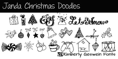 A variety of whimsical, hand-drawn Christmas doodles.
 - Soyombo by Letterhead Studio-VG,
$50.00 Geometric Sans for any use. Strong, modern, new.
 - LCT Picon by LCT,
$35.00 Big modern sans-serif family, for multiple use.
 - Flexy by AKTF,
$25.00 This is a sans serif version of Flexy.
 - Gnarlee by Gerald Gallo,
$20.00 Gnarlee is a casual hand-drawn serif font.
 - Grotesca Defragmentation by Intellecta Design,
$16.90a round sans serif with optical art effects - Wingbrush by Michael Browers,
$25.00Wingbrush is a whimsical, hand-drawn brush font. - Franklin Cascaes is a font that notably embodies a captivating blend of cultural heritage and artistic expression. Named after Franklin Cascaes (1908-1983), a celebrated Brazilian folklorist, artist,...


