7,329 search results (0.032 seconds)
  1. KR Come Monday - Unknown license
  2. Leitura by DSType, $26.00
    Leitura is part of Leitura Type System and was specially designed for editorial purposes. Includes small caps, ligatures, alternates and swashes.
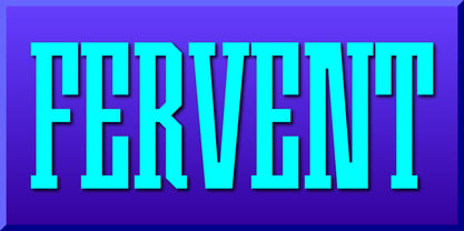
  3. Fervent by Gerald Gallo, $20.00
    Fervent is an all caps ultra condensed serif font. It is ideal for headlines, titles, branding, and small blocks of text.
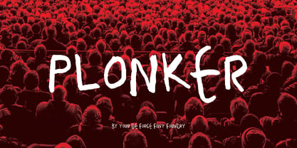
  4. Plonker by Tour De Force, $25.00
    Introducing all caps handwritten typeface named Plonker after Derek Trotter's famous "You plonker!" statement to Rodney at "Only Fools and Horses".
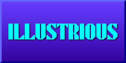
  5. Illustrious by Gerald Gallo, $20.00
    Illustrious is an all caps, bold, sans serif font. It is ideal for headlines, titles, branding, and small blocks of text.
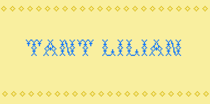
  6. Tant Lilian by Cercurius, $19.95
    A thin, very elegant caps-only cross-stitch font, based on an embroidery pattern from the end of the 19th century.
  7. Plain Script by ParaType, $25.00
    Designed at ParaType in 1995 by Tagir Safayev. Based on informal handwriting (caps-only). For use in advertising and display typography.
  8. Elongated Roman by Aboutype, $24.99
    An ultra light thins all caps Victorian design with a slight stroke contrast. Elongated Roman requires subjective display kerning and compensation.
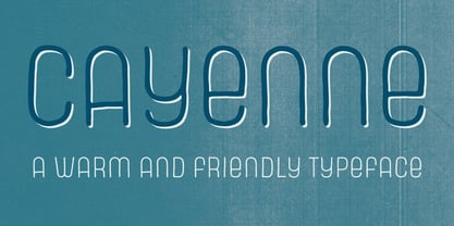
  9. Cayenne by Luxus, $25.00
    Cayenne is an all-caps hand-lettered font in three weights, two dotted versions and an outline and an inline font.
  10. Rewire by Atlantic Fonts, $26.00
    Although this font has the feel of quick all-caps draftsman's or carpenter's lettering, it also has a vintage signage look.
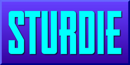
  11. Sturdie by Gerald Gallo, $20.00
    Sturdie is an all caps condensed sans serif font. It is ideal for headlines, titles, branding, and small blocks of text.
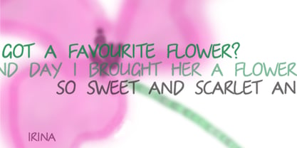
  12. Irina by ParaType, $25.00
    Designed at ParaType in 1995 by Tagir Safayev. Based on informal handwriting (caps-only). For use in advertising and display typography.
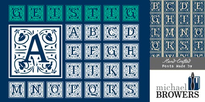
  13. Geistig by Michael Browers, $15.00
    Geistig is a set of 26 individual letter monogram designs. Geistig works great for monograms, drop caps, and unique display settings.
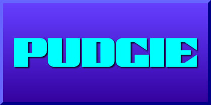
  14. Pudgie by Gerald Gallo, $20.00
    Pudgie is an all caps, bold, sans serif font. It is ideal for headlines, titles, branding, and small blocks of text.
  15. Katarine by Suitcase Type Foundry, $75.00
    From today's point of view Katarine has a rather unusual origin. Initially an all-caps display face, what was to become the Medium weight of the family was augmented with a lower case, then the character set was completed by adding all the missing glyphs. The next step was the creation of the Light and the Bold weights with matching Italics. This working method compromised the relationships between the characters across the different weights After some consideration the decision was made to start over and draw the complete family from scratch. This time the "conventional" process was followed — first the Light and Bold weights were designed. Those extremes were used to interpolate the Regular, Medium and Semibold weights. When compared to the original, the glyphs of the new fonts are slightly wider. The construction of the letters is sturdy, with an x-height that varies from the heaviest to the lightest weights. The relationship of the stem weight between the horizontal and vertical strokes is carefully balanced. Characters are open and firm; the italics have room to breathe. The original fonts included two sets of small caps — Small Caps and Petite Caps. However neither set were suited for emphasis, with the Small Caps being too tall and the Petite Caps too short. We decided to replace them both with one set of traditional small caps, slightly taller than the x-height, perfectly suited for emphasis in text usage. The original version of Katarine was partly incorporated into the new OpenType versions. Thus most of the original arrows, frames and boxes can be found in the new Katarine. Each individual weight now contains 830 glyphs, nine sets of numerals, small caps, numerous ligatures and fractions. An additional font named Numbers contains numerals in circles and squares, and is now augmented with accented caps and a number of terminal alternatives, which can easily be accessed through stylistic sets. We also added two extra variants, Experts Regular and Experts Black (in inverted form). Katarine Std preserves the solid construction and excellent legibility of the original family, but has now become a fully featured OpenType typeface. Katarine is suited for a broad range of applications, from simple layouts to intricate corporate systems. It is the typeface of choice where the cold, austere character of modern sans serifs are inappropriate, yet simple shapes and good legibility are required.
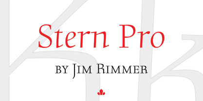
  16. Stern Pro by Canada Type, $49.95
    Originally released in 2008, Stern is the only typeface to be produced and marketed simultaneously in digital and metal. In the twenty-first century, no less. It is also the last typeface Jim Rimmer ever completed. The process he used for its design and manufacture is the stuff of legend, and can be seen in the Richard Kegler documentary, Making Faces: Metal Type in the 21st Century. The design is a delicate upright italic named in memory of Chris Stern, the late artist and printer from Washington State. In 2013, Canada Type remastered and expanded the design's offerings to a glyphset of over 1200 characters, updated programming. Now Stern Pro includes the following features: - Small caps. - Caps-to-small-caps functionality, useful for setting mid-height caps alongside lowercase. - Tall caps. - Historical forms. - A wide variety of alternates for both uppercase and lowercase letters. - Plenty of ligatures. - Seven types of numerals, enclosers, cojoiners and currency symbols. - Automatic fractions. - A complete set of lowercase ordinals, from a to z. - Case-sensitive forms. - Language support for Greek and over 50 Latin languages. 20% of this font's revenues will be donated to the Canada Type Scholarship Fund, supporting higher typography education in Canada.
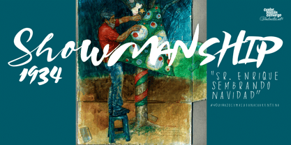
  17. Visible by Andinistas, $24.00
    Visible is a dynamic typeface family designed by CFCG @andinistas. Visible Script has narrow horizontal spacing between lowercase, while Visible Script 2 has generous and wide horizontal spacing. Mixing both styles you will achieve italic designs loaded with speed and strength to communicate aggressiveness, nervous and sanguine temperament. Visible Caps contains capital letters derived from the font's writing, but drawn aggressively and slanted 15 degrees to the right. This type of visual characteristic is typical of very fast and nervous writing that is performed with emotion without sacrificing harmony. a monolineal and condensed version is the Visible caps 2, allowing for significant horizontal space saving economies. Used Visible Caps 1 and 2, become much more than just an expressive and functional artistic tool. In short, by combining their expressive writing or Visible Caps & Script lettering styles, they make words and phrases appear to be written with a brush and ink-filled calligraphic strokes and with eye-catching qualities, their design is the perfect choice for distinctive headlines and brand identities. for music, movies, video games and more. A special thanks to the Venezuelan artist for his impressive illustrations @franciscomarin_artistaplastico ENJOY more than 1100 glyphs: + Visible Script: 398 glyphs + Visible Script2: 221 glyphs + Visible Caps: 222 glyphs + Visible Caps2: 298 glyphs
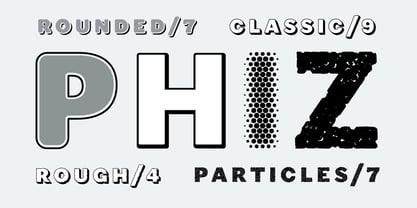
  18. Phiz by Shinntype, $29.00
    Phiz is a diverse suite of 28 decorative fonts based on Figgins Sans Extra Bold. Classic (10 fonts), Rounded (7 fonts), Rough (4 fonts) and Particles (7 fonts). The Rough and Particles styles emerge as a unique niche—neither imitating distressed printing (e.g. the “rusty” look), nor casual, hand-drawn styles. These type designs are conceived and executed as complex algorithmically-generated graphic procedures, in which repetitive elements have been artfully applied to the Sans capitals, and manually nuanced. As such they also differ substantially from textured glyph shapes that have been cut out from larger pattern fields, for the constituent particles are disposed in relation to the specific shape of each character they define. The caps-with-small-caps format was chosen for two reasons. Firstly, titling display usage is predominantly capitals, and secondly, rather like optical scaling, having the same resolution of texture available in two different “sizes” (upper and lower case) should prove useful in the hierarchy of page layout—not primarily for setting upper and lower case text as caps-with-small-capitals, although this is of course an option. All figures and major symbols (punctuation and currency) are provided in both cap and small cap height.
  19. PaddingtonSC - Unknown license
  20. KR Valentine Dings 2002 - Unknown license
  21. KR Holiday Frames 1 - Unknown license
  22. KR Beautiful Flowers 3 - Unknown license
  23. KR Beautiful Flowers 2 - Unknown license
  24. KR Belated St Patricks - Unknown license
  25. KR On The Farm - Unknown license
  26. KR Morning Must! - Unknown license
  27. KR Pick A Holiday - Unknown license
  28. KR Be Mine Forever - Unknown license
  29. Zaleski - Unknown license
  30. KR Julies Turtle Rescue - Unknown license
  31. KR Halloween Signs One - Unknown license
  32. KR Christmas Time 2 - Unknown license
  33. KR Floral Color Me - Unknown license
  34. KR Lots Of Hearts - Unknown license
  35. KR Trick Or Treat - Unknown license
  36. KR Christmas Dings Two - Unknown license
  37. KR Easter No 2 - Unknown license
  38. KR Ball N Chain - Unknown license
  39. KR Wings On High - Unknown license
  40. KR Pick A Pumpkin - Unknown license
Looking for more fonts? Check out our New, Sans, Script, Handwriting fonts or Categories
abstract fontscontact usprivacy policyweb font generator
Processing