988 search results
(0.035 seconds)
- Junglemania by TypeArt Foundry,
$45.00
- Glover by Fype Co,
$16.00
- Mondrongo by Intellecta Design,
$22.90 - 28 Days Later - Unknown license

- X-story by Anton Novik,
$22.75 - Quarterpound by Caput Mortuum,
$20.00
- Satron by Aah Yes,
$3.95 - Badoni by Chank,
$49.00 - Spektakel by PizzaDude.dk,
$15.00
- Cooperative by Hafontia,
$99.00
- Carbonara by Hanoded,
$20.00
- TrixieExtra - Unknown license

- Powderfinger Smudged - Unknown license

- Gothic Handtooled Bastarda by Intellecta Design,
$18.95 - Shake Your Head by PizzaDude.dk,
$20.00 - Bombastic by Michael Browers,
$25.00 - Elpiedra by Dharma Type,
$14.99
- Emoligons by Maulana Creative,
$15.00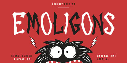
- BobTag by JOEBOB graphics,
$-
- Zitkid by PizzaDude.dk,
$15.00 - SavoryPaste by insigne,
$14.95 - Ugly Stick AOE by Astigmatic,
$19.95 - Doorkick by Bogstav,
$16.00
- Scratch SCF by Scholtz Fonts,
$15.00 - Demigrunge by Aah Yes,
$9.95 - Street Rush by Gleb Guralnyk,
$13.00
- Quirk by Wooden Type Fonts,
$15.00 - Sidkit MF by Masterfont,
$59.00
- Capture it - 100% free

- Sharp Stroke by Kaer,
$15.00
- Demented Avenger by Phat Phonts,
$20.00 - Jaguarundi by Dharma Type,
$9.99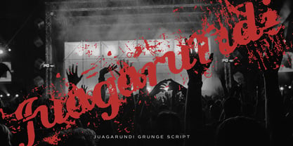
- Rust Bucket by BA Graphics,
$45.00
- Nerve Agent - Personal use only

- Deslucida - Personal use only

- Brutal Tooth - Personal use only

- Faith Collapsing - Personal use only

- Hawaii Lover - Personal use only

- CGM Locust Resistance - Unknown license

- Sketch Rockwell - Unknown license


