8,657 search results
(0.021 seconds)
- Bombastic by Michael Browers,
$25.00Bombastic is a distressed grunge font developed by Michael Browers. - Elpiedra by Dharma Type,
$14.99 Nothing ventured, nothing gained. Smokey and rough textured grunge font.
 - Emoligons by Maulana Creative,
$15.00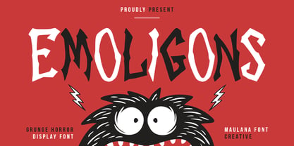 Emoligons grunge horror display font. Bold stroke, fun character with a bit of ligatures and alternates. To give you an extra creative work. Emoligons grunge horror display font support multilingual more than 100+ language. This font is good for logo design, Social media, Movie Titles, Books Titles, a short text even a long text letter and good for your secondary text font with script or serif. Make a stunning work with Emoligons grunge horror display font. Cheers, Maulana Creative
 - Ongunkan Sidetic by Runic World Tamgacı,
$49.99 The Sidetic language is a member of the extinct Anatolian branch of the Indo-European language family known from legends of coins dating to the period of approximately the 5th to 3rd centuries BCE found in Side at the Pamphylian coast, and two Greek–Sidetic bilingual inscriptions from the 3rd and 2nd centuries BCE respectively. The Greek historian Arrian in his Anabasis Alexandri (mid-2nd century CE) mentions the existence of a peculiar indigenous language in the city of Side. Sidetic was probably closely related to Lydian, Carian and Lycian. The Sidetic script is an alphabet of the Anatolian group. It has about 25 letters, only a few of which are clearly derived from Greek. Consensus is growing that the script has essentially been deciphered.
 - Bad Coma - Personal use only

- Bloody - Unknown license

- HoMicIDE EFfeCt - Unknown license

- Savia Shadow - Personal use only

- VTC-RoughedUp - Personal use only

- Castorgate - Messed - Unknown license

- Bad Films - Unknown license

- Black Eye Nue - Unknown license

- Upheaval TT BRK - Unknown license

- Airliner JNL by Jeff Levine,
$29.00Airliner JNL is based on hand-lettering found on a promotional postcard for Kitty Davis' Airliner - a popular Miami Beach night spot of the 1940s. All of the usual things that make hand-lettering endearing can be found in the letter shapes of this font. - Hannah and Clay by loryn ipsum,
$14.00 HANNAH & CLAY | handwritten serif font After the love that MILK & CLAY received, I thought I would make a serif version for all you serif typeface lovers out there. It is the handwritten version of one of my favourite fonts 'hannah hannah'. I absolutely love how this turned out and the unpolished warm feeling this font has. It feels very high-end, but still approachable, inviting and grounded because of its soft edges and human feel. I hope you love it as much as I do xx
 - Mattby Display by Paavola Type Studio,
$28.00 Stocky, beefy, dumpy, heavyset, husky, rotund, stubby, thick-bodied, thickset and fun display font with lots of ligatures, stylistic alternates and other features.
 - LTC Bixler Ornaments by Lanston Type Co.,
$24.95 LTC Bixler Ornaments One includes all designs found in the metal Bixler Type Handypacks #1–6 from P22 that were created using actual Lanston mats to cast these metal type sets. The 14 designs found in the metal type are presented in this digital version—each rotated and optimized to align easily and tightly for digital layouts.? LTC Bixler Ornaments Two incudes all designs found in the metal Bixler Type Handypacks #7–14 from P22 that were created using actual Lanston mats to cast these metal type sets. The 17 designs found in the metal type are presented in this digital version—each rotated and optimized to align easily and tightly for digital layouts.
 - Tropical Tourist JNL by Jeff Levine,
$29.00 A 1934 advertisement for the Roney Plaza Hotel at 23rd Street and Collins Avenue on Miami Beach yielded the inspiration for Tropical Tourist JNL. While this wonderful example of Art Deco lettering survived, sadly the original Roney was torn down around 1969 and replaced with a modern apartment house/condos bearing the same name.
 - JBP Pro by PizzaDude.dk,
$25.00 Wicked, cheeky and geeky! That's what went through my mind when updating this font. Originally made around year 2000, and now it comes in a restored and updated version. I cleaned up all curves and lines, added multilingual support and kerning. Based upon classic typefaces like Bodoni and Baskerville, but far more unpredictable and wild.
 - Ornata F by Wiescher Design,
$39.50 Ornata F is the sixth of a series of old ornaments that I am trying to save from oblivion. I am completely redesigning the ornaments from scratch. These ornaments have been designed around 1910, I could not find out by whom. This set is perfect to design flowery frames. Your digitizing typedesigning savior, Gert Wiescher
 - Poster Contoured JNL by Jeff Levine,
$29.00 Sheet music for a selection from the 1928 musical “New Moon” had the show’s title hand lettered in a bold sans serif that reflected the upcoming Art Deco movement, along with a contoured outline around the letters. This served as the model for Poster Contoured JNL, which is available in both regular and oblique versions.
 - onetrickTony by JOEBOB graphics,
$19.00 This handwritten font is the result of trying to write in a different way to what I'm used to: sometimes taking a left turn when going straight was the more obvious way. Or the other way around. The result was quite readable and it turned out that I could make surprisingly matching monographs with it.
 - Clarkson Script by Adam Fathony,
$15.00 Inspired by so many brush lettering around the trend last year, Clarkson Script was created with manual brush pen and refined in digital version. The Concept of Clarkson Script is combining the style of a feminine script and a masculine style to help other designer to create more easily digital lettering and other purpose.
 - Carlsbad by RMU,
$30.00 The Carlsbad font family is a bringing together of Regina Cursiv and Hansa Cursiv which both had been released by H. Berthold Messinglinienfabrik und Schriftgiesserei around 1895. Both these beautiful Art Nouveau italic fonts come with the following swash alternatives: D, E, G, H, K, S, T, h, k, m, n, s, and z.
 - FT Giorgio by Fenotype,
$19.95 FT Giorgio is based on a hand lettering in a movie poster La Dolce Vita by Giorgio Olivetti. FT Giorgio has class-based kerning and around 200 automatic interlock ligature pairs which gives your design a custom look. To use the ligatures you only need to write in CAPS and use an OpenType-aware application.
 - HT Cartoleria by Dharma Type,
$19.99 This font has a lovely roundish shape and gives us cute and relax impression. But because it is upright, it has a well-ordered atmosphere. Holiday Type Project offers retro hand drawing scripts. Inspired by retro script on shopfront lettering, wall paint advertisements in Italy around 1950s. Check out the script fonts from Holiday Type!
 - RM Sans by Ray Meadows,
$19.00 RM Sans has been designed to offer an useful but inexpensive family of 5 regular weights; 3 condensed weights; 5 outline weights and an 'eco' alternative. Due to the modular nature of this design there may be a slight lack of smoothness to the curves at very large point sizes (around 100 pt and above).
 - Euro Stencil JNL by Jeff Levine,
$29.00 An online photo gallery showcased a number of vintage and unique signs around Europe – mostly from Germany. One particular sign (“1818-Hoofdkant Spaarbank-1921”) was formed in metal and with stencil letters of a distinctive 1970s feel. This served as the model for Euro Stencil JNL, which is available in both regular and oblique versions.
 - Freak Mailer by RagamKata,
$12.00 Freak Mailers is a rounded combination font duo. Sans serif typeface with crazy Script Typeface . But make this font look unique. Freak Mailers clean classic and mindful , it combine in one font, use this font for anything beauty place for your logo, headline, cover book, magazine and many more.
 - Heft by Device,
$39.00 Heft is a heavy slab serif that packs a powerful punch. Available in square-cornered and rounded versions, each with italics, plus two distressed variants — an inky version that evokes the urgency of cheap hot-metal printing, and a worn, distressed version that suggests vintage woodtype or photocopied text.
 - HU Milksherbet KR by Heummdesign,
$25.00 This typeface was inspired by milk sherbet, which is enjoyed cold on a hot summer day. Rounded shapes and soft stroke endings make the typeface look cute. Heavy works great for headlines with its extra-heavy stroke weight and size, while Regular and Light are best for body text.
 - Alquitran Stencil by RodrigoTypo,
$45.00 Alquitran Stencil is a variant of Alquitran Pro. Alquitran stencil is specially designed for titles, with stencil effect.,Iin addition to Regular and Bold Alquitran Stencil also contains Rough and Rounded with additionally traces Extras (1-2) that are dingbats that support the text to look much more realistic.
 - Weekend Plans JNL by Jeff Levine,
$29.00 A piece of vintage British sheet music from 1941 entitled “That Lovely Week-End” featured the song’s name in a bold Art Deco sans serif with rounded edges. This lettering design is now the digital type face Weekend Plans JNL, which is available in both regular and oblique versions.
 - Outdoor Cafe JNL by Jeff Levine,
$29.00 The movie poster for the 1937 film “Cafe Metropole” served as the basis for Outdoor Cafe JNL, which is available in both regular and oblique versions. The extra bold, stylized letter forms with their rounded corners typify the wide variety of typographic styles the Art Deco period offered.
 - Digitalis by G-Type,
$46.00 Digitalis was created from a desire to make an original, æsthetically pleasing rounded typeface using the minimum of strokes. Each character has been reduced to only the most essential elements. Due to the contrast between the thick and thin strokes Digitalis is surprisingly legible when set as text.
 - HU Milksherbet by Heummdesign,
$15.00 This typeface was inspired by milk sherbet, which is enjoyed cold on a hot summer day. Rounded shapes and soft stroke endings make the typeface look cute. Heavy works great for headlines with its extra-heavy stroke weight and size, while Regular and Light are best for body text.
 - Karins Lombardy Caps by New Renaissance Fonts,
$10.00Karin's free reinterpretation of the early Renaissance Lombardic tradition, in two different versions. In the upper case the fill is blacker and has a straight pattern with diamond elements; in the lower case the fill is thinner with more white space and has a wavy pattern with rounded elements. - Chorxy by PizzaDude.dk,
$20.00 Crunchy and mildly rounded edges, mixed with an imaginative and romantic flair of elegance. Chorxy has got an almost steady x-height, mixed with various jumpy letters, slightly crazy, yet legible! Comes with fi and fl ligatures. You will need to use OpenType supporting applications to use the autoligatures.
 - Gokil by Eotype,
$12.00 Gokil is an unique bold display font with rounded edges. You can use this font in retro, vintage, and hipster designs. This font is perfect for a variety of projects, such as branding, poster displays, logo designs, magazines, headlines, stickers, and more.This font also has alternate and ligature features.
 - Gusset by Pesotsky Victor,
$10.00 Gusset is a simple modular font. It was created for headlines and posters. It creates a dense and interesting texture in the text set. Simple rounded curves contrast with "wedges". Gusset supportsBasic Latin, Cyrillic and more than 100 languages all together. The font was designed by Viktor Pesotsky.


