10,000 search results
(0.039 seconds)
- Kaptain Kurk - Unknown license

- Valdemar - Unknown license

- Dungeon - Unknown license

- Patrician™ - Unknown license

- Fatty - Unknown license

- PF Tempesta Seven Extended - Unknown license

- Diogenes - Unknown license

- Gemma by Homelessfonts,
$49.00 Homelessfonts is an initiative by the Arrels foundation to support, raise awareness and bring some dignity to the life of homeless people in Barcelona Spain. Each of the fonts was carefully digitized from the handwriting of different homeless people who agreed to participate in this initiative. Please Note: these fonts include only the latin alphabet; no accented characters, no numbers or punctuation. MyFonts is pleased to donate all revenue from the sales of Homelessfonts to the Arrels foundation in support of their mission to provide the homeless people in Barcelona with a path to independence with accommodations, food, social and health care. Gemma was born in Madrid 37 years ago. After spending many years in the capital, she decided to start over again and moved to Barcelona. A series of misfortunes and wrong decisions left her on the street. Gemma is a calm, emotional person who likes to take her time to do things and, if there’s one thing the street can offer, it’s time. The street lets you listen carefully, watch without being seen. Being in the street isn’t pleasant at all. Seeing people who’ve just showered go past makes you miss even more things that many take for granted. Breakfast, a clean smell, paying for a metro ticket. Being homeless is much more than having nowhere to sleep. Life in the street is hard, says Gemma, but she also sees the positive side. “It’s the best way to get to know human beings.” She likes to see the street as if it were a school. A school she has been in and out of for too long.
 - Eckhart by ROHH,
$29.00 Eckhart™ is a modern didone, high-contrast typeface designed to create elegant, original and expressive character. This versatile font family is delivered in four optical sizes, making it a complete type system for all kinds of use, from branding to setting paragraph text. It is equipped with ligatures, swashes and alternates to enrich design possibilities and make it very distinctive as a display typeface. Eckhart family features a very playful and energetic color font, giving broad new possibilities of display use, especially interesting for posters and magazines. Eckhart Color is delivered both as OTF color font as well as regular layered font in 6 layers - it helps to achieve maximum software compatibility and control over colors. Eckhart consists of 74 fonts in 4 optical sizes - 33 uprights and their corresponding true italics + color fonts. It has extended language support as well as broad number of OpenType features, such as case sensitive forms, standard and discretionary ligatures, stylistic sets, lining, oldstyle figures, slashed zero, fractions, superscript and subscript, ordinals, currencies and symbols. --- Color font - user information: Eckhart Color Folk - OTF color font format has pre-defined color palette. In order to change the colors, please convert the text to outlines. You need compatible software to use the OTF color file, such as Adobe Photoshop CC, Adobe Illustrator CC, Pixelmator, etc. Eckhart Color Layered fonts - use the fonts one on top of the other in the order the fonts are numbered. These are regular OTF files, they work in all professional graphic software and you can edit the color of each layer. For web use - please use the color fonts as graphics, because not all web browsers support them.
 - Hagrid by Zetafonts,
$39.00 Crypto-typography - the passion for unknown, weird and unusual character shapes - is a disease commonly affecting type designers. Cosimo Lorenzo Pancini has celebrated it in this typeface family, aptly named Hagrid after the half-blood giant with a passion for cryptozoology described by R. K. Rowling in her Harry Potter books. Extreme optical corrections, calligraphic counter-spaces, inverted contrast, over-the-top overshoots: all the inventions that abound in vernacular and experimental typography have been lovingly collected in this mongrel sans serif family, carefully balancing quirky solutions and solid grotesque design. Hagrid is a typeface designed for editorial & display use, bringing dynamism to the printed and digital page thanks to its extreme contrast and unique details. It has been developed in a range of six display weights ranging from the monolinear and more traditional thin to the expressive heavy weight. For better readability in small sizes and on the web, a companion text family has been developed, with a slightly different selection of weights, wider metrics, and fine adjustments to keep the dynamic expressivity of the design without sacrificing legibility. This is evident in the design of italics: while the display italics sport a cursive feel with calligraphic terminals to lowercase letters, the text design is more restrained, with a more classical geometric grotesque slanted look. Given the crypto-typographer love for foreign specimens of letters, special care has been put into making Hagrid ready for multilingual projects, giving it an extended character sets covering over two hundred languages that use Latin, Cyrillic and Arabic alphabets and adding a selected range of OpenType features to handle alternate forms and stylistic sets.
 - Mauritius by Canada Type,
$29.95 Ten years or so after his unique treatment of Garalde design with Trump Mediaeval, Georg Trump took on the transitional genre with Mauritius, which was to be his last typeface. He started working on it in 1965. The Stuttgart-based Weber foundry published a pamphlet previewing it under the name Barock-Antiqua in 1967, then announced the availability of the metal types (a roman, a bold and an italic) a year later. The global printing industry was already in third gear with cold type technology, so there weren't that many takers, and Weber closed its doors after more than 140 years in business. Subsequently, Trump’s swan song was unfairly overlooked by typography historians and practitioners. It never made it to film technology or scalable fonts. Thus, one of the most original text faces ever made, done by one of the most influential German type designers of the 20th century, was buried under decades of multiple technology shifts and fading records. The metal cuts of Mauritius seem to have been rushed in Weber’s desperation to stay afloat. So the only impressions left of the metal type, the sole records remaining of this design, show substantial problems. Some can be attributed to technological limitations, but some issues in colour, precision and fitting are also quite apparent, particularly in Mauritius Kursiv, the italic metal cut. This digital version is the result of obsessing over a great designer’s final type design effort, and trying to understand the reasons behind its vanishing from typography’s collective mind. While that understanding remains for the most part elusive, the creative and technical work done on these fonts produced very concrete results. All the apparent issues in the metal types were resolved, the design was expanded into a larger family of three weights and two widths, and plenty of 21st century bells and whistles were added. For the full background story, design analysis, details, features, specimens and print tests, consult the PDF available in the Gallery section of this page.
 - Bananas by Canada Type,
$30.00 In the history of 20th century graphic arts, the evolution of the informal sans serif has been a uniquely American phenomenon. The ongoing saga of this (still as popular as ever) sub-genre dates back to the maturity of the Industrial Age and early Hollywood film titling, runs through the prosperous times of interwar print publications, sees mass flourishing during the various media propagations of the film type era, and solidifies itself as arguably the most common design element in the latter years of the century. Fun, bouncy, playful, and highly exciting, the casual sans serif is now all over game packaging, film and animation titles, book covers, food boxes, concert posters, and pretty much everywhere design aims to induce excitement about a product or an event. The casual sans is the natural high pill of typesetting. We figured it was high time for the casual sans to adapt to 21st century technology, gain more versatility, and become as much fun to use as the emotions it triggers. So we’re quite excited to issue Bananas, a fun sans serif family in 6 weights and 3 widths that can be used anywhere your designer’s imagination can take you. Rather than being based on a single design, Bananas was sourced from multiple American film era faces, all from 1950s and 1960s, when the casual sans genre was at its popular peak. Headliners’ Catalina and its very similar cousin, Letter Graphics’ Carmel, served as initial study points. Then a few Dave West designs informed the design development and weighting process, before narrow and wide takes were sketched out and included in the family. The entire development process happened in a highly precise interpolative environment. All Bananas fonts come with a full glyph complement supporting the majority of Latin languages, as well as five sets of figures, automatic fractions, quite a few ligatures, biform/unicase shapes and other stylistic alternates.
 - Boule Plus by Ingo,
$33.00 CAPITALIZED, geometric, bold and round. If the typographer sees a font like that, it's enough to make his toes curl. But sometimes it just has to be that way. Geometrically constructed fonts do not necessarily have to be pointed and angular; It also works consistently around. And if I say it consistently, then in this case, that's done consistently. The basis for the BOULE is the circle. The letters are drawn with constant line width, the “corners“ and endings all have the same radius, the lines are all the same thickness. The BOULE consists only of capitals. There is only one difference in the use of uppercase and lowercase letters: in the uppercase letters, the round letters are circular, while the lowercase letters are narrow. The character set of the Boule contains all letters and accents to support the Western, Northern, Central and Eastern European languages with Latin alphabet. The BOULE is not only very fat, it also runs very tight; that is, the glyphs are very close to each other. To avoid "holes" due to unfortunate letter combinations, the BOULE contains ligatures for FT, ST, TT and TZ. There are also other versions of the font: BOULE Brillant on the one hand. In this version, simple highlights simulate a light incidence from the top right. These light edges give the font a decorative effect that makes it easy to think of wet sausages or balloons in some shapes. And finally the BOULE Contour. As the name implies, it is the outer contour of the letters, combined with a shadow at the bottom left. The name BOULE (French for ball) says it already: this font is globated. Therefore, it is also very suitable for all three-dimensional alienation effects. With simple light and shadow you can achieve a very convincing 3D effect with little effort.
 - Skullbats by Canada Type,
$24.95Patrick Griffin's sister is a really annoying individual sometimes. Not only is she into theater, but she thinks everyone else in the universe is into it as well. So once in a while tickets to local or provincial Shakespearean plays get delivered to the mailbox or dropped off on the living room's table. And once in a while the tickets just cannot be "lost" or ignored. Three or four times a year, Patrick must be subjected to Olde Englishe Speake, umbrella dresses and squeezetops, featherhats and men in leggings, rhyme and treason, mortality and immorality, drama inflicted by some mama, and it never ends. Last June it was Hamlet. Again. Someone's (wink wink) idea of a good time. There he goes, the Prince of Denmark, holding that skull with the tips of his fingers like it's an alien egg. Alas, poor Yorick! Yadda yadda boop-bop-a-loo-bop. And so the idea of a font made of skulls was born. And what can we possibly be but conduits for such abhorring ideas? Where be our gibes, our songs, our flashes of merriment? Skullbats has more skulls than you'll ever see in your lifetime. At least we hope so. Scary skulls, funny skulls, evil skulls, strange skulls, pixel skulls, fiery skulls, surprised skulls, happy skulls, sad skulls, cow skulls, sketched skulls, profiled skulls, light bulb skulls, cartoon skulls, techno skulls, alien skulls, expressionist skulls, pirate skulls, horned skulls, and skulls with whacky headgear. You name it, it's there. There's even a disco skull there for you. We lost count at 90 skulls, but there's a few more in there. For a complete showing of the skulls in the font, consult the image in the MyFonts gallery. Patrick's sister didn't turn out to be so bad after all. After making this font, he couldn't help but notice that her skull was a bit small compared to his. So now he takes every opportunity to remind her that the size of the cranium is relative to what it houses. Her upcoming halloween present will be a shirt with guess-what on it. Shirts, now there's putting Skullbats to good use! - odstemplik - 100% free

- bulkyRefuse Type - Unknown license

- Ruina One by RodrigoTypo,
$25.00 Ruina One is a Rough and distressed font, but at the same time very gestural. It is especially great for youth and child graphics, but can be applied in many other domains too. Ruina One contains various ligatures.
 - Konsteady by Stripes Studio,
$20.00 Konsteady a new very attractive brushed font with a natural, detailed and perfect texture. Additional Konsteady Underlines. Konsteady is perfect for branding projects, logos, product packaging, posters, invitations, greeting cards, news, blogs, everything including personal charm and more.
 - Expanse by Alfareaniy,
$500.00 Expanse is a retro futuristic typeface. The font has a bold and big vibe and mixes sharp and round corners, kind of like the very old sci-fi movie titles. Expanse includes uppercase multilingual letters, numbers and punctuation.
 - Viva Maria by Autographis,
$39.50 Viva Maria could have been used for that famous, hilarious movie by Louis Malle staring Brigitte Bardot and Jeanne Moreau. Maybe in a remake someone will use this very lively script in the credits and advertising material. Olé!
 - Gromer by Heyfonts,
$13.00 Gromer is an exsperimental font adaoted from a combined groovy font and graffiti that maks it’s unique character as Display Font,this font is very suitable to use as your project design such as graphic template or clothing
 - Beautiful Christmas Monogram by Yoga Letter,
$20.00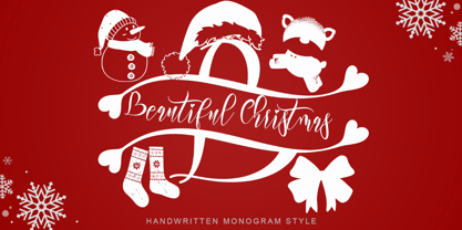 "Beautiful Christmas Monogram" is a beautiful and unique monogram font. This font is equipped with monograms, uppercase, lowercase, numerals, punctuation, and multilingual support. Very suitable for Christmas, winter, Christmas invitations, Christmas parties, Christmas ornaments, Christmas decorations, and others.
 - Novita by Autographis,
$39.50 Novita is a new something. This font is a new very elegant – extremely slanted – joining script with long ascenders and descenders. It is the fiancée of Novido which is the more elaborate male part of this font pair.
 - Hobenshaw by Letterara,
$10.00 Introducing a new hand drawn font carefully crafted with a personal charm. It is a hot font, perfect for a design that stands out even if it’s a logo or simply a stylish text over a background image.
 - Dhefentha by Yoga Letter,
$16.00 "Dhefentha" is a unique and elegant handwritten font. Equipped with uppercase letters, lowercase letters, numerals, punctuations, swash, titling, uppercase alternates, ligatures and multilingual support. This font is very suitable for Valentine's Day, wedding, engagement, Christmas, fall and others.
 - Brokenz by Almarkha Type,
$29.00 Introducing BROKENZ – Bold Sans Condensed fonts with 4 styles with strong and challenging nuances. very suitable for the title, typography, clothes, magazines, brochures, packaging and much more for your design needs, making your designs more modern and professional
 - Anchorage by Otto Maurer,
$19.00 Anchorage is a maritime linear Font with Anchor Graphics in the Caps. This Font is for all Sailors and Captains all over the world. It comes in many styles and with a graphic Font full of maritime graphics.
 - All Pro JNL by Jeff Levine,
$29.00All Pro JNL is a sports font embellished with stars and stripes and is perfect for team banners, sportswear and sports-oriented ads. The font contains alphabet, numerals and the most basic of punctuation with very little kerning. - Farragut JNL by Jeff Levine,
$29.00An unusual take on Art Deco "streamlined" alphabets is found in Farragut JNL from Jeff Levine. Over-extended serifs on some letters and elongated horizontal strokes on others make for a new approach to a traditional lettering style. - Shikatta by Grezline Studio,
$12.00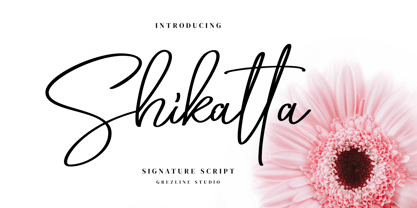 Shikatta is a beauty signature script font crafted very carefully. Shikatta is perfect use for a logo for branding, typography design, product packaging, invitation, quotes, t-shirt design, label poster, special events and anything that need handwriting taste.
 - Metalworker JNL by Jeff Levine,
$29.00Metalworker JNL is Jeff Levine's take on a perennial favorite originally known as Eagle, but available under different names over the years. This bold, clean Art Deco font was the basis for Jeff's star-studded National Spirit JNL. - Tagline by Robert Petrick,
$19.95 Tagline is a Fun, Bold casual font that was born from the New York graffiti style. Good for all your entertainment projects. Though "Tagline" is radical in style it's still very readable and calls attention to your message.
 - Nort Mono by ATK Studio,
$15.00 Nort Mono™ is a tech-monospaced typeface with inktrap experiment and diagonal edges by Atk Studio. Created for tech display poster, informational video display, ads, and more. Come with single weight. This font covers over 67 languages.
 - PIXymbols Patchwork by Page Studio Graphics,
$25.00A collection of traditional American patchwork quilt motifs in a decorative font package. Over 80 designs, to be used as free-standing illustrations, in borders, or as an overall pattern. Several designs will work together into a pattern. - Suredog by Fontmill Foundry,
$20.00One year old Suredog font. Affectionate with print and good with other sans but will probably chase a serif. Suredog is truly deserving of a loving home for the rest of her life. Please give Suredog a chance. - Cheesegum by PizzaDude.dk,
$20.00 Cheesegum is super legible even at very small sizes. If you use Cheesegum at larger sizes, you can see the delightful crucnhy edges! Kinda like roasted cheese! The crunchier, the lovelier! :) Just go ahead and eat some Cheesegum!!!
 - Conture Script by Mans Greback,
$59.00 Conture Script is a classic script typeface with a thin contour. This high-quality font is drawn and created by Måns Grebäck during 2017. With its hundreds of glyphs, Conture Script supports a very wide range of languages.
 - Akhilona by Yoga Letter,
$16.00 "Akhilona" is a very elegant and aesthetic handwritten brush font. This font is equipped with uppercase, lowercase, numerals, punctuation, and multilingual support. It is suitable for weddings, engagements, birthdays, photography, back to school, Christmas, parties, invitations, and others.
 - Sereno by Robert Corseanschi,
$19.99 This font family includes six very unique font styles & weights. The font styles are applicable for any type of graphic design - web, print, motion graphics, etc. and perfect for t-shirts and other items like posters and logos.
 - Spoongky by Juliawan90,
$30.00 Introducing of our new product the name is Spoongky a Horror Font, Spoongky inspired by Bouncy horror style with a fun theme very good for horror, scary, spooky and halloween theme design. FEATURES : Uppercase Lowercase Number Punctuation Multilingual


