10,000 search results
(0.032 seconds)
- Mikhael Handwritten by Letterara,
$16.00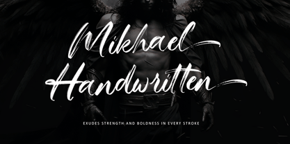 Introducing Mikhael Handwritten, an authentic brush script font that brings a raw and energetic vibe to your designs. With its dynamic strokes and natural brush texture, this font is crafted to make a bold statement in logos, posters, packaging, and various design projects. Its striking appearance and smooth flow make it an ideal choice for conveying a strong and stylish impression. PUA encoding ensures effortless access to all the expressive glyphs. Elevate your projects with Mikhael Handwritten, a font that effortlessly infuses vigor and character into your creative endeavors.
 - Double Tracker by Hanzel Space,
$25.00 Double Tracker is an inspiration for a font with paint strokes so that it has a texture that seems natural, done with an original ink stroke process.. The strong and sturdy design makes it ideal for eye-catching headlines, branding, packaging, magazines, sports, logos, and more. Happy Creating! Hanzel Studio
 - Let's Go Green by Atom,
$15.00 Let's Go Green is a natural, organic, casual, uneven touch font! Made naturally using brush strokes with ink on paper, giving a very unique and distinctive impression. It is ideal for logos, quotes, print media, product packaging, merchandise, advertising, social media and your design projects. Let's Go Green comes as a single font that is packed with OpenType Features. It contains the complete set of lowercase & uppercase letters, various punctuation marks, numbers, and multilingual and ligature support. Thanks for using this font! Happy Design :)
 - Fuller Brush NF by Nick's Fonts,
$10.00A snappy single-stroke alphabet from The New Lone Pine ABC of Showcard and Ticketwriting, which Aussie author C. Milnes suggested should be executed with a well-loaded brush, provided the inspiration for this loose, lilting retro script. Its condensed letterforms and tight spacing allow for larger headlines than most brush scripts, and its bouncing baseline adds an extra dollop of visual fun. The PC Postscript, Truetype and Opentype versions contain the complete Latin language character set (Unicode 1252) plus Central European (Unicode 1250) languages as well. - Koi by Talbot Type,
$19.50 Koi is a highly original, outline display font. Each character is represented by a single continuous line to create a fluid and rhythmic look. The result is something of a hybrid, sitting somewhere between an outline and an inline style, and with an asymmetrical look — something quite rare in a typeface. Many of the characters look like ready made logotypes. Further customisation is easily achieved by extending the end strokes of characters, possibly aligning them and joining them to others to create bespoke arrangements.
 - Qirate Mono by Fateh.Lab,
$20.00 Qirate Mono is a type of monospace font released by Fateh.Lab in 2020. This is good news for you graphic designers around the world. This font combines strong modern and minimalist style, perfect for those of you who have a young passion in designing ideas. Qirate Mono is full of unique characteristics. This font is available in single weight and style.
 - Brawl - Unknown license

- Rexlia Free - Unknown license

- Strasua - Unknown license

- Janson Text by Linotype,
$29.99 The Janson font was based on the matrices made for the typeface in the 17th century. It originated from the Dutch typeface designer Anton Janson and was cut by Nicholas Kis. The strong main strokes and fine hair strokes were influenced by the art of copper engraving. In 1983, Prof. Horst Heiderhoff led the expansion of the Janson into a font family with various stroke contrasts and gave it the name Janson Text.
 - Midnight Hour - Personal use only

- Groundage by Mofr24,
$11.00 Groundage is a Gothic Blackletter font that offers three styles: Outline, Regular, and Shadow. With its bold and clean calligraphic strokes, this typeface boasts a modern-vintage look that exudes elegance and masculinity. Its Y2K-inspired design makes it perfect for stylish posters, marketing materials, logotypes, and headlines. Additionally, it is great for art and craft projects, y2k-streetwear designs, and much more. What sets Groundage apart from other Gothic Blackletter fonts is its unique combination of traditional and modern design elements. Its clean lines and bold strokes give it a contemporary feel while its Blackletter roots pay homage to its historical origins. Groundage also includes both Latin and Cyrillic character sets, making it a versatile option for a range of projects. This font pairs well with other modern-vintage fonts and looks great alongside sans-serif fonts for contrast. Its three styles allow for versatility in design and can be used for a variety of creative projects. Groundage was designed with the intention of creating a stylish, masculine font that could be used in a variety of contexts. Its Y2K-inspired design concept was chosen to evoke nostalgia while still feeling fresh and modern. The combination of traditional Blackletter elements with a contemporary twist creates a unique aesthetic that stands out from other fonts in its category. Groundage is not based on any historical design, but its Blackletter roots pay homage to centuries of typographical tradition. Its modern twist on the classic Gothic style creates a unique and versatile font that can be used in a range of creative projects.
 - YR Basma by Alrefaiy,
$20.00 YR Basma is a slab serif font that is renowned for its bold and distinctive appearance, which is designed to create a powerful impact. It is characterized by its strong and striking letterforms, with bold and thick strokes that give it an intense and impactful look. The font is also highly legible, with a focus on clear and easy-to-read letterforms that are meticulously crafted to balance visual weight and vertical alignment. YR Basma is ideal for a broad range of design projects that require a robust and striking visual presence, such as headlines, posters, packaging, and branding. It boasts a comprehensive set of glyphs, including both upper and lowercase letters, numerals, and symbols, making it highly versatile and adaptable to diverse design needs. YR Basma font offers a bold and commanding aesthetic, while maintaining excellent legibility and clarity of letterforms. Its powerful design makes it an excellent choice for various design projects where a strong and dominant visual presence is desired.
 - Zawlbuk by Richard Khuptong,
$20.00 Zawlbuk is a type inspired by Blackletter (sometimes black letter), also known as Gothic script, Gothic minuscule, or Textura. The Letters are drawn using a flat nib pen on a paper, scanned and drawn into a vector format.
 - Rigidica by Ryan Williamson,
$5.00 Rigidica is a strict geometric type family. Often basic geometry is lost in the stroke contrast of a letter. This type family is an attempt to retain this basic geometry even within the stoke contrast of a letter.
 - Myteri Tattoo PERSONAL USE ONLY - Personal use only

- Friday13 - Unknown license

- Burton's Nightmare - Unknown license

- elektrogothik - Unknown license

- Fette Trump-Deutsch - Unknown license

- Ye Old Shire - Unknown license

- Jalo by BRtype,
$19.00 Jalo is a playful font. Every single letter has own personality.
 - Piccadilly by ITC,
$29.99Christopher Matthews originally drew Piccadilly for Letraset in 1973. Piccadilly is a decorative, all caps display typeface with a high degree of stroke contrast. All of Piccadilly's letterforms are made up of a single, curvy line. The thick" elements of each letter are five lives, while thin elements are made from one or two. In order for all of this detail to be clear, Piccadilly should be used in large point sizes, i.e., from 36-point on upward. Piccadilly's style is reminiscent of both the Art Deco and Disco eras." - Scape by Reserves,
$39.99 Scape is a precisely drawn, contemporary stencil face built from a single weight rounded end stroke. The fine, linear rounded forms create a subtle contrast to the raw utilitarian nature of the stenciled characters. Extremely versatile, Scape is highly legible due to it’s upright, consistently balanced sans letterforms. Stylistically, it exemplifies refinement and clarity with an distinct edge. Features include: Precision kerning Expanded ligature set Alternate characters (O, _, ®) Alternate zero Extended language support (Latin-1 and Latin Extended-A) *Requires an application with OpenType and/or Unicode support.
 - Black Ravens by Arterfak Project,
$26.00 Introducing Black Ravens, a freestyle dry-brush font with a natural single brush. Black Raven's is a street urban font, youth theme, sporty, and masculine looks that visualize smooth strokes, and rough texture at the same time. This font is an all-caps font that perfects for displays, title, logos, packaging, craft, labels, T-shirt, hoodie, tote bag, posters, hats, stickers, quotes, and any advertising which needs energetic typography. Black Ravens equipped with 31 stylish ligatures, swashes, multilingual, and alternates characters that you can mix and match to get your own typographic design!
 - Dryer Grain by Patrick Dewenter,
$- This typeface is intended for use with single words or phrases at a large point size. Suggesting some sort of calligraphic inspiration, I sketched a couple of these letters while creating a logo concept and decided to make a complete alphabet. The stroke through the letterforms adds some interest and elegance, although I believe this typeface expresses a sort of vehement or serious character. This is my new, and first, typeface. I plan to create more in the future. If you use it for anything interesting, I'd love to see!
 - Madden by Typogama,
$19.00 Madden is a bold, single weight typeface designed for use in titles, editorial design, branding or any other setting that requires capturing attention. With a bold, rugged stroke, inspired by the wide brush used in hand made protest signs, this typeface exploits Opentype features to randomly replace letters set in a line of text, thereby simulating the erratic and irregular letterforms that could be create by a manual writing. Madden is designed to give you an expressive and impactful typeface that will grab attention and shout your message.
 - Havelock by XO Type Co,
$40.00 Four interchangeable all-caps typefaces, made specifically for designers to layer and play with. Here’s more at the designer’s site. It combines hard and soft, geometry and pattern. Layer and mix styles within a single word, retaining coherent visual tone. Havelock Solid operates as a background layer, Multiline sits nicely atop it, Inline frames Multiline’s center strokes, and Stencil lets details peek through. If you’re working with translucent color, the blending can be gorgeous. Please note, if you're also looking at Havelock Titling: both collections are included in Havelock Complete for a lower price.
 - Lazy Rock - Personal Use - Personal use only

- Taglio by Wilton Foundry,
$29.00 Taglio’s name is derived from intaglio, which means “incised carving” or “an impression from an engraving”. Indeed, Taglio looks like an incised engraving with a contemporary calligraphic interpretation. The down strokes start with a single horizontal line that curves into a dual vertical line and ends with the same single line at the base. The dual elongated strokes create a bold overall impression but is literally twice as sophisticated than if the two lines were solid. That was exactly the goal in creating this font. We managed to create a font that is distinctive, elegant, and crisp that is also intentionally stencilled for more flexibility. For instance, it is ideal for laser cutting signage. One of the unique features in using the capital glyphs is that they stack perfectly without losing legibility, primarily because of the slanted ends of the dual vertical lines - see the example “Miami Fashion Week” display ad. Taglio’s unusual style was carefully crafted to come to life at display sizes. It is therefore ideal for use in branding fashion, restaurants, buildings, packaging, museums, signage, etc. An ideal pairing font is our WERK family which can be seen on some of the display ads below. Taglio has a sparkling and sophisticated personality that will absolutely delight!
 - Actrocious by Ardyanatypes,
$20.00 Atrocious - Display Typeface exudes a Gothic aura that's both eerie and distinctive. Its captivating design adds an unparalleled artistic charm, evoking a strong air of mystery. This font is perfect for creating impressive visuals, with OpenType features and multilingual support for limitless self-expression. Ideal for captivating book titles, enhancing cinematic experiences, or infusing graphic designs with a unique touch.
 - Adso by Alfab,
$55.00 Adso was born out of a research that studied the possibility of reintroducing Gothic writing in our contemporary world. Inspired by Textura, Adso was decidedly freed of all those little details that make Blackletter faces appear foreign or even displeasing to the contemporary reader’s eyes. Nevertheless, the basic features of Gothic color were preserved: verticality, modularity, and darkness. Adso is a gothic font for today’s age, highly readable and open to all fields of expression.
 - Blaq by Resistenza,
$39.00 Inspired by Henry W. Troy, BLAQ is a new version of Trojan Text not available as font. Is an ornamental blackletter alphabet. Works great in headlines and other ‘masculine’ like design settings. The Victorian Gothic or Neo-Gothic is an architectural movement that began in the 1740s in England. Its popularity grew rapidly in the early nineteenth century. The revived Gothic style was not limited to architecture. We recommend to combine Blaq with: Turquoise Nautica
 - South Beach by BA Graphics,
$45.00A retro looking gothic with that "South Beach" look. - Key West by BA Graphics,
$45.00A sans serif casual gothic. Works for many applications. - Show Card Casual JNL by Jeff Levine,
$29.00 Alf Becker graced the pages of "Signs of the Times" magazine month after month for decades, presenting attractive and unusual hand lettered alphabets as inspiration for other sign painters and show card writers. From straightforward text faces to novelty ideas, Becker's talent as a master sign crafter was constant in his work. Show Card Casual JNL is one example of what is referred to as a "one stroke" alphabet (utilizing a single brush stroke in each direction to form the letter or number). Its casual look and playful charm allow for a message to be presented in an informal format that is pleasing to the eye. The type design is available in both regular and oblique versions. Special thanks to Tod Swormstedt of ST Publications for providing the reference material.
 - P22 Tyndale by IHOF,
$24.95Quill-formed roman/gothic with an olde-worlde flavor. Some background in the designer's own words: "A series of fonts came to mind which would be rooted in the medieval era -for me, a period of intense interest. Prior to Gutenberg's development of commercial printing with type on paper in the mid-1400s, books were still being written out by hand, on vellum. At that time, a Bible cost more than a common workman could hope to earn in his entire lifetime. Men like William Tyndale devoted their energies to translating the Scriptures for the benefit of ordinary people in their own language, and were burned to death at the stake for doing so. Those in authority correctly recognized a terminal threat to the fabric of feudal society, which revolved around the church. "This religious metamorphosis was reflected in letterforms: which, like buildings, reflect the mood of the period in which they take shape. The medieval era produced the Gothic cathedrals; their strong vertical emphasis was expressive of the vertical relationship then existing between man and God. The rich tracery to be seen in the interstices and vaulted ceilings typified the complex social dynamics of feudalism. Parallels could be clearly seen in Gothic type, with its vertical strokes and decorated capitals. Taken as a whole, Gothicism represented a mystical approach to life, filled with symbolism and imagery. To the common man, letters and words were like other sacred icons: too high for his own understanding, but belonging to God, and worthy of respect. "Roman type, soon adopted in preference to Gothic by contemporary printer-publishers (whose primary market was the scholarly class) represented a more democratic, urbane approach to life, where the words were merely the vehicle for the idea, and letters merely a necessary convenience for making words. The common man could read, consider and debate what was printed, without having the least reverence for the image. In fact, the less the medium interfered with the message, the better. The most successful typefaces were like the Roman legions of old; machine-like in their ordered functionality and anonymity. Meanwhile, Gutenberg's Gothic letterform, in which the greatest technological revolution of history had first been clothed, soon became relegated to a Germanic anachronism, limited to a declining sphere of influence. "An interesting Bible in my possession dating from 1610 perfectly illustrates this duality of function and form. The text is set in Gothic black-letter type, while the side-notes appear in Roman. Thus the complex pattern of the text retains the mystical, sacred quality of the hand-scripted manuscript (often rendered in Latin, which a cleric would read aloud to others), while the clear, open side-notes are designed to supplement a personal Bible study. "Tyndale is one of a series of fonts in process which explore the transition between Gothic and Roman forms. The hybrid letters have more of the idiosyncrasies of the pen (and thus, the human hand) about them, rather than the anonymity imbued by the engraving machine. They are an attempt to achieve the mystery and wonder of the Gothic era while retaining the legibility and clarity best revealed in the Roman form. "Reformers such as Tyndale were consumed with a passion to make the gospel available and understood to the masses of pilgrims who, in search of a religious experience, thronged into the soaring, gilded cathedrals. Centuries later, our need for communion with God remains the same, in spite of all our technology and sophistication. How can our finite minds, our human logic, comprehend the transcendent mystery of God's great sacrifice, his love beyond understanding? Tyndale suffered martyrdom that the Bible, through the medium of printing, might be brought to our hands, our hearts and our minds. It is a privilege for me to dedicate my typeface in his memory." - Racula by Typefactory,
$14.00 Racula is an fun, scary, and amazing gothic serif. It will add a unique and stunning look to your designs. It is perfect for fun scary games, children horror story book, logos, branding, advertising, Halloween projects, gothic designs, apparel, tattoos, and more!
 - P22 Latimer by IHOF,
$24.95 Latimer is one of a series exploring a fusion of Roman and Gothic forms. Characteristics of each genre can be seen: the fluid tapering serifs and rounded shapes of the Roman form, contrasted with the angular diamond and hexagonal shapes of Gothic.
 - Blacksmith JNL by Jeff Levine,
$29.00What started as an image of a single vintage brass stencil of the letter 'P' spotted in an online auction has turned into Blacksmith JNL. From that single letter Jeff Levine has created a complete Western stencil font, retaining the hand-made look of the original stencil piece.


