10,000 search results
(0.042 seconds)
- Batterlife by Ditatype,
$29.00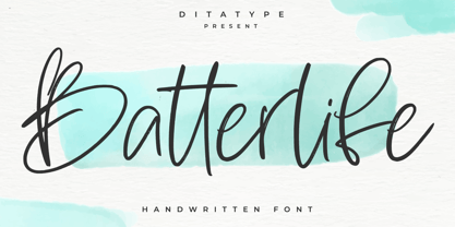 Batterlife is a lovely handwritten font. Made for any professional project branding that need a modern and attractive typeface. It is the best for logos, branding and quotes. Every letter has a unique and beautiful touch. Includes: Batterlife (OTF) Features: Beautiful Ligatures Multilingual Support PUA Encoded Numerals and Punctuation
 - Potato Peel by Ira Natasha,
$5.00 Potato Peel is a handwritten sans serif font. A new fresh handmade font with smooth edges. This font is support multi language and available in OTF file. This font will perfect for many different project ex: quotes, logo, blog header, poster, branding, fashion, apparel, letter, invitation, stationery, etc….
 - Canterbury Sans by Red Rooster Collection,
$45.00 Based on the Morris F. Benton for ATF in 1920, it was not completed for production until 1926. The serif version we released a few years ago was so popular, that we decided to design a complementary sans serif version in three weights, along with three corresponding Swash fonts.
 - Brasley by Nicolas Deslé,
$6.00 Here's Brasley, a geometric sans. Brasley is available in six weights - bold, semibold, medium, regular, light and thin - each with matching italics. It also includes contextual alternates, ligatures, fractions, arrows and shapes.
 - Gillray Pro by RMU,
$40.00 Based upon H. Broedel's Hogarth Script, Gillray Pro, an RMU design, comes with two weights: Light and Medium. This formal script font is ideal for invitations, diplomas, certificates, book titles, ads etc.
 - Albeit Grotesk Caps by Cloud9 Type Dept,
$40.00 Albeit Grotesk Caps is a graphic geometric all caps display font family of four weights (Light, Regular, Medium and Bold) with slightly exaggarated diacritics for better readability making it ideal for headlines.
 - Pekin by HiH,
$15.00 Pekin is an unusual design with an oriental flavor. It was originally designed by Ernst Lauschke and released by The Great Western Type Foundry of Chicago as “Dormer,” which is similar to the French verb ‘to sleep,’ not exactly a marketing triumph. Barnhart Bros. And Spindler (independently-operated subsidiary of ATF since 1911) bought Great Western in 1918. According to McGrew, AMERICAN METAL TYPEFACES of the TWENTIETH CENTURY, BB&S renamed the typeface prior printing their 1925 specimen book — guess they wanted something just a tad more exciting. Quirky, distinctive and fun. Pekin ML represents a major extension of the original release, with the following changes: 1. Added glyphs for the 1250 Central Europe, the 1252 Turkish and the 1257 Baltic Code Pages. Added glyphs to complete standard 1252 Western Europe Code Page. Special glyphs relocated and assigned Unicode codepoints, some in Private Use area. Total of 415 glyphs (compared to 218 glyphs in the original release). 2. 652 Kerning Pairs. Note: Ag, Aj and gj will cross unless kerned. Alternative A may also be used. 3. Added OpenType GSUB layout features: onum, salt, liga, dlig, hist, ornm and kern. 4. Revised vertical metrics for improved cross-platform line spacing. 5. Refined various glyph outlines, based on improved scans. 6. Added set of Tabular Numbers at cap height, based on original design; added Old-Style Numbers based on default design. 7. Added a bunch of alternative characters: 18 upper case letters, 10 lower case letters, 1 ampersand and 1 bullet. The alternate c is actually the original design, but I don't like it - easily confused with e. Alt E H M h m n r t are from the original design. I added the rest. 8. 7 Ligatures, 4 Ornaments, 18 Geometric Shapes, 6 Arrows and 12 Misc. Symbols. The zip package includes two versions of the font at no extra charge. There is an OTF version which is in Open PS (Post Script Type 1) format and a TTF version which is in Open TT (True Type)format. Use whichever works best for your applications.
 - Nightmare AOE - Unknown license

- BROKEN GHOST - Unknown license

- Asylum - Unknown license

- Huxley Alt by HiH,
$8.00 Huxley Alt is just that — an alternative to Huxley Vertical by ATF. It represents one of my earliest efforts. I liked the crispness of Huxley Vertical, but wanted a lowercase and with some modulation of the strokes as in Empire, also by ATF. Huxley Alt is the result. Highly condensed. Set it large or lose it. Huxley Alt is a bargain-priced font with 226 glyphs, covering the usual Western European accents (ref MS Code Page 1252). If you like the style, but would like more glyphs and/or a range of weights, may we suggest our Huxley Amore. Huxley Amore has 379 glyphs and covers the Eastern European, Baltic and Turkish code pages (1250, 1254 and 1257). We also offer Huxley Cyrillic in a single weight.
 - High Dreaming by Haksen,
$15.00 High Dreaming is a stylish modern and natural handwritten script font with casual chic flair. It is perfect for branding, wedding invites and cards, and maybe for red wine label. High Dreaming includes full set of gorgeous uppercase and lowercase letters, numerals, a large range of punctuation and ligatures. All lowercase letters of High Dreaming Regular include ending swashes, giving realistic hand-lettered style. What you get? You will get: High Dreaming OTF High Dreaming Alternate OTF In order to use the beautiful swashes, you need a program that supports OpenType features such as Adobe Illustrator CS, Adobe Photoshop CC, Adobe Indesign and Corel Draw. but if your software doesn't have Glyphs panel, you can install additional swashes font files: Thanks and have a great day, Haksen
 - Hercílio by Sea Types,
$25.00 Hercílio is a typographic family without condensed serif, modern and geometric inspired by the architectural forms of the Hercílio Luz Bridge in Florianopolis | Brazi Comprising eleven (11), weights of which ten (10) business are: Five weights Romans: Light, Normal, Regular, Medium and Bold Five Italics weights: Light, Normal, Regular, Medium and Bold And a weight (FREE) Hercílio Decorative Comprising 430 glyphs in each source, brings support for 56 languages (Latin and West, Central and East European) still has features Open Type, ligatures and tabular figures. http://www.cort9.com/wp-content/uploads/2016/05/Specimen_Hercilio.pdf
 - Klip Klop by Samuelstype,
$24.00 Designed by Hans Samuelson in 2023. With two weights and many variations Klip Klop offers a large set of characters for playful lettering. The flavouring is strong avant garde and the build is strict geometrical with even stroke thickness throughout. One unusual feature is that the bottom and top horizontal strokes are centered on the baseline and capital height. This renders the same optical size between the thin and the medium but different actual heights and baselines. Use it for Headlines or signage in any medium! Klip Klop!
 - Bandera Text by AndrijType,
$21.00 This serif typeface is a real workhorse. It is a modern tool for text design: extremely legible and well shaped. Bandera Text has six weights with original italics. It catches attention in headlines of posters and magazines or makes reading comfortable in plain texts. Don't forget to try Medium and Medium Italic faces for free. Bandera Text works well with Bandera (slab serif), Osnova (sans serif) and Bandera Display (contrast serif) fonts. Bandera is Spanish for ‘flag’. And Bandera is a symbol of Ukrainian fighting for freedom for many years.
 - Revans by Arterfak Project,
$15.00 Revans is a strong serif font with medium contrast. Inspired by the High Octane Rock genre and modern-classic fashion. Carefully designed with a short ascender to give a solid look, also the sharp serif makes the letters look more strong. Revans is a display-type which perfect for a headline, sub-headline, and short body text for a magazine, books, fashion, quotes, hipster t-shirt, signboard, logo, and etc . Available in 5 weights: Light, Normal - Medium - SemiBold and Bold, complete with the slant style. A great choice for a brave concept!
 - Bandera Text Cyrillic by AndrijType,
$21.00 This serif typeface is a real workhorse. It is a modern tool for text design: extremely legible and well shaped. Bandera Text Cyrillic has six weights with original italics. It catches attention in headlines of posters and magazines or makes reading comfortable in plain texts. Don't forget try Medium and Medium Italic faces for free. Bandera Text Cyrillic works well with Bandera Cyrillic (slab serif), Osnova Cyrillic (sans serif) and Bandera Display Cyrillic (contrast serif) fonts. Bandera is Spanish for ‘flag’. And Bandera is a symbol of Ukrainian fighting for freedom for many years.
 - Quincy CF by Connary Fagen,
$35.00 Quincy® CF's warm letterforms and medium contrast give any text a smooth, calming motion. Small variations and human touches add charm, with Quincy's boldest weights especially eloquent as large and medium display type. Quincy® CF pairs well with clean, text-friendly sans-serifs, such as Greycliff CF and Work Sans, or for even more contrast, try monospaced typefaces like Ellograph CF and Cartograph CF. All typefaces from Connary Fagen include free updates, including new features, and free technical support. Check out Greycliff® CF which pairs nicely with Quincy® CF.
 - Analogous Script by OldStudioo,
$17.00 Introducing Analogous Script is elegant calligraphy font with a classic style and a touch of elegance, inspired by the handwriting and ancient manuscripts. Carefully designed to work together in harmony that makes it very suitable for wedding media, book covers, greeting cards, logos, branding, business cards and certificates, even for any design work that requires a classic, formal or luxurious. Analogous script, an elegant, full-featured script font with tons of alternate characters and OpenType features. Hand-lettered with a heavy right slant. Specific OpenType features include contextual alternates, stylistic alternates, initial and final forms, multiple alternate glyphs for many letters (accessed through the glyphs panel), multilingual support (including multiple currency symbols), ligatures, standard numbers, and six ampersand styles. What's Included: Analogous script .OTF Alternate Character Map for swashes, alternates, etc. PUA Support Thanks!
 - Chaletliness by Madhaline Studio,
$19.00 Chaletliness is a script brush font that has its own uniqueness and characteristics from brush fonts, because it is handwritten manually. This font is carefully crafted with a modern touch. This font looks elegant, luxurious, natural and rustic. Chaletliness would perfect for photography, watermark, social media posts, advertisements, logos & branding, invitation, product designs, label, stationery, wedding designs, product packaging, special events or anything that need handwriting taste. Your download will include 2 font files; Chaletliness ~ A hand-made, all characters brush font which has a complete set of A-z characters. Chaletliness Swashes ~ A bonus set of 52 swashes. Simply select this font and type any A-Z & a-z character to create one of the bonus elements. All font files are provided in OTF font formats. Includes a range of multilingual support
 - Bethaine by Taznix Creative,
$19.00 Bethaine is font with a exclusive style and a touch of classic, inspired by the handwriting of ancient manuscripts. Carefully designed to work together in harmony that makes it very suitable for wedding media, book covers, greeting cards, logos, branding, business cards and certificates, even for any design work that requires a classic, formal or luxurious. Bethaine Typeface includes a full set of character A-Z, as well as multi-lingual support, currency figures, numerals, and punctuation. What's Included : Buonapati (OTF) Standard glyphs Ligature Works on PC & Mac Simple installations Accessible in the Adobe Illustrator, Adobe Photoshop, Adobe InDesign, even work on Microsoft Word. PUA Encoded Characters - Fully accessible without additional design software. Fonts include multilingual support for; ä ö ü Ä Ö Ü ß ¿ ¡ Hope you enjoy with our font! Taznix
 - Gandia by Jehoo Creative,
$25.00 Gandia is a true form of elegance and refinement. Curved corners give a soft yet bold impression. Inspired by the fast-growing vintage culture, this typeface can easily blend with modern retro design needs. With low contrast including the Cyrillic alphabet, it is very flexible to pair with other fonts. Gandia is perfect for various design needs such as magazines, posters, branding, clothes, quotes, web ui, social media posts, cover designs, Logo and many more. Comes with 8 Weights: Thin, Extralight, Light, Regular, Medium, Semibold, Bold, Extrabold. Equipped with attractive Opentype features Smallcaps, Discretionary Ligature vertical on Uppercase and Ss01, Ss02, Ligature on Lowercase and each font has more than 1300 glyph.
 - Benar by Twinletter,
$12.00 Benar is our newest san serif, and it has amazing fonts for your projects. This typeface is ideal for branding, advertising, posters, banners, packaging, headlines, magazines, websites, logo designs, banners, social media designs, and many other uses. Light, Regular, Medium, and Thick are the four available weights. It features a clean and beautiful aesthetic that can help your project appear more serene, and unique and grab the attention of the audience. of course, your various design projects will be perfect and extraordinary if you use this font because this font is equipped with a font family, both for titles and subtitles and sentence text, start using our fonts for your extraordinary projects.
 - ED Laurentsa by Emyself Design,
$9.00 Introducing - ED Laurentsa is a classic serif font family consisting of 9 Weights (Thin, ExtraLight, Light, Regular, Medium, Semibold, Bold, ExtraBold, and Black). Try DEMO Version : https://emyselfdesign.gumroad.com/l/pgtit ED Laurentsa has a classic minimalist look with a condensed style and has a wide variety from thin to black to suit your needs. This font is perfect for your design needs, such as logo design, branding, apparel, headings, web, etc. This font can also be easily combined with other fonts to create the perfect typography. Bold fonts are perfect for displays such as logos, or in-text headings. while the font with a thin style is suitable for covers, posters, or social media posts.
 - Eckhart by ROHH,
$29.00 Eckhart™ is a modern didone, high-contrast typeface designed to create elegant, original and expressive character. This versatile font family is delivered in four optical sizes, making it a complete type system for all kinds of use, from branding to setting paragraph text. It is equipped with ligatures, swashes and alternates to enrich design possibilities and make it very distinctive as a display typeface. Eckhart family features a very playful and energetic color font, giving broad new possibilities of display use, especially interesting for posters and magazines. Eckhart Color is delivered both as OTF color font as well as regular layered font in 6 layers - it helps to achieve maximum software compatibility and control over colors. Eckhart consists of 74 fonts in 4 optical sizes - 33 uprights and their corresponding true italics + color fonts. It has extended language support as well as broad number of OpenType features, such as case sensitive forms, standard and discretionary ligatures, stylistic sets, lining, oldstyle figures, slashed zero, fractions, superscript and subscript, ordinals, currencies and symbols. --- Color font - user information: Eckhart Color Folk - OTF color font format has pre-defined color palette. In order to change the colors, please convert the text to outlines. You need compatible software to use the OTF color file, such as Adobe Photoshop CC, Adobe Illustrator CC, Pixelmator, etc. Eckhart Color Layered fonts - use the fonts one on top of the other in the order the fonts are numbered. These are regular OTF files, they work in all professional graphic software and you can edit the color of each layer. For web use - please use the color fonts as graphics, because not all web browsers support them.
 - Bourton Hand by Kimmy Design,
$10.00 Bourton Hand is a new typeface by Kimmy Design. It’s the hand drawn version of Bourton and a sans-serif cousin to Burford. In addition to a new look, it boasts more layering options, stylistic alternatives, graphic extras and even comes with its own script font! Okay...so here’s everything you get with Bourton Hand: • 6 Base Layer Fonts (Base, Inline, Marquee, Stripes A, Stripes B, Stripes C, Sketch A, Sketch B) • 6 Top Layer Fonts (Base Drop, Dots, Line Light/Medium/Bold, Outline Light/Medium/Bold) • 6 Extrude Fonts (Extrude, Outline, Shadow, Extrude Outline) • 5 Drop Shadow Fonts + 5 solo styles (Drop Shadow, Drop Extrude, Drop Line, Drop Stripes A, Drop Stripes B) • 2 Line Fonts for secondary text (Line Medium, Line Bold) • Bourton Hand Script Light • Bourton Hand Script Bold • Bourton Hand Extras - Ornaments, banners, frames, borders, flags and line break • Bourton Hand Extras - Flourishes Happy Creating!
 - Skema Pro by Mint Type,
$40.00 Skema Pro is a versatile system of 6 serif typefaces - each bearing a distinct character and purpose. Together they form a huge superfamily of 84 fonts to fit any imaginable task. Skema Pro Livro is a low contrast, low x-height typeface with inclined axis. It is designed to work in books, where long ascenders and descenders along with increased line-spacing aid comfortable reading. Skema Pro Text has low contrast, medium x-height, and slightly tilted axis. Its neutrality along with modern feel makes it default choice for long texts of any nature. Skema Pro Omni features medium contrast, medium x-height, and slightly inclined axis. Being a more contrasted version of Skema Pro Text, it shares its intent of usage, however, creates a different texture with more formal look. Skema Pro News is a low contrast, large x-height typeface with vertical axis. Works best in newspapers and in screen applications. Skema Pro Title has medium contrast, large x-height, and vertical axis. Designed to work in larger text sizes, it offers contemporary detailing for pull-quotes and subheadings. Skema Pro Display is a typeface with high contrast, large x-height, and vertical axis. It shows its features in large text sizes, such as editorial headings.
 - Ransom - Unknown license

- Roz by Gaslight,
$25.00 Roz is clean geometric sans round by one side and sharp on the other side. It has three weights and corresponding italics. Roz is ideal for package design, headlines and other typographic mediums.
 - Grotesk Remix Monospace by bb-bureau,
$65.00 GroteskRemix monospace is the monospaced version of the GroteskRemix - Grotesk revisited, notably used for the (Latin) communication of Typojanchi 2019. It availabe in 3 different weights: light, regular and medium. Language: latin glyphs
 - Barbarian - 100% free

- La Flama y La Espina - Personal use only

- Cheshire Initials - Unknown license

- Old Copperfield - Personal use only

- PR8 London Ads - Unknown license

- Edhiron Asdhúriel v. 1.2 - Unknown license

- RunishMK - 100% free

- Troll Bait - Unknown license

- Serpentine by Image Club,
$29.99Dick Jensen (USA) designed Serpentine, is a contemporary-looking display font, for the Visual Graphics Corporation in 1972. With the rise of digital typesetting and desktop publishing, this typeface quickly became both popular and ubiquitous. This dynamic, wide, boxy design is identifiable via tiny triangular swellings at the stroke endings - what might be called semi-serifs. Serpentine is available in six different font styles: Light, Light Oblique, Medium, Medium Oblique, Bold, and Bold Oblique. Serpentine" is a greenish rock that sometimes resembles a serpent's skin, and is often used as a decorative stone in architecture. Though this font doesn't seem at all snaky or sinuous, it does have an architectural, stone-like solidity. The subtle, almost non-existent curves and semi-serifs keep it from being too stern or cold. Although the underlying strokes of each weight are similar, the six members of the Serpentine font family all present their own individual personalities. Serpentine Light lends itself well to text for onscreen displays, for instance, while the numbers from typeface's heavier weights are seen around the world on soccer jerseys! Additionally, the oblique styles convey a streamlined sense of speed, furthermore lending Serpentine well to sport and athletic applications (especially the faster, high-speed varieties). Because of its 1970s pedigree, Serpentine has come to be known as a genuine "retro" face. This makes the typeface even more appropriate for display usage, in applications such as logo design, magazine headlines, and party flyers. If you like Serpentine, check out the following similar fonts in the Linotype portfolio: Copperplate Gothic (similar serifs) Eurostile (similar width) Princetown (another "athletic" font) Insignia (similar "techno" feeling)" - Serpentine by Linotype,
$29.00Dick Jensen (USA) designed Serpentine, is a contemporary-looking display font, for the Visual Graphics Corporation in 1972. With the rise of digital typesetting and desktop publishing, this typeface quickly became both popular and ubiquitous. This dynamic, wide, boxy design is identifiable via tiny triangular swellings at the stroke endings - what might be called semi-serifs. Serpentine is available in six different font styles: Light, Light Oblique, Medium, Medium Oblique, Bold, and Bold Oblique. Serpentine" is a greenish rock that sometimes resembles a serpent's skin, and is often used as a decorative stone in architecture. Though this font doesn't seem at all snaky or sinuous, it does have an architectural, stone-like solidity. The subtle, almost non-existent curves and semi-serifs keep it from being too stern or cold. Although the underlying strokes of each weight are similar, the six members of the Serpentine font family all present their own individual personalities. Serpentine Light lends itself well to text for onscreen displays, for instance, while the numbers from typeface's heavier weights are seen around the world on soccer jerseys! Additionally, the oblique styles convey a streamlined sense of speed, furthermore lending Serpentine well to sport and athletic applications (especially the faster, high-speed varieties). Because of its 1970s pedigree, Serpentine has come to be known as a genuine "retro" face. This makes the typeface even more appropriate for display usage, in applications such as logo design, magazine headlines, and party flyers. If you like Serpentine, check out the following similar fonts in the Linotype portfolio: Copperplate Gothic (similar serifs) Eurostile (similar width) Princetown (another "athletic" font) Insignia (similar "techno" feeling)"


