10,000 search results
(0.023 seconds)
- Wilke Kursiv by Canada Type,
$24.95 Martin Wilke’s underrated yet influential deco classic from 1932 has both feet firmly planted in the high traditions of Western European calligraphy while carefully and subtly introducing some traits from the sweeping geometric/minimalist vision of the time. In a way, it was one of the representatives of the European anti-type typefaces of that era, when print media was searching for the elusive aesthetic balance between humanism and geometry. This typeface enjoyed some popularity in Germany for a few years, and went on to influence further type designs in Holland and Italy. After the second World War, the black hole that swallowed a big chunk of Europe’s print culture, new influences and technologies overtook the scene, and selective historical emphasis ensued, highlighting some of the era’s designs and overlooking others. Further selective picking in the digital era all but buried Wilke’s body of work - unfairly so, because he was just as important in German type history as Bernhard, Post, Schneidler, Tiemann and Trump. The original metal Wilke Kursiv came in one weight. This digital version goes a long way in expanding on that original offering. Now Wilke’s masterpiece comes in three weights, and with a full Pro treatment including swash caps, small capitals, five types of figures, automatic fractions, and plenty of other OpenType niceties. Each of the Wilke Kursiv Pro fonts comes with over 700 characters, and contains support for most Latin-based languages. Also available are three non-Pro fonts in each weight.
 - P22 Folk Art by P22 Type Foundry,
$24.95 Primarily based on the work of German settlers in Pennsylvania, this collection showcases a variety of needlework and folk art styles of the early United States. Produced in conjunction with the Philadelphia Museum of Art, this set is a digital recreation of homespun Americana.
 - Jugendstil Borders NF by Nick's Fonts,
$10.00 Here's a collection of Art-Noueveau-era border elements, gleaned from the pages of various German type foundry catalogs from the first decade of the twentieth century. Refer to the accompanying PDF guide for instructions on constructing twelve different, distinctive and elegant border sets.
 - CS Courthand by URW Type Foundry,
$39.99 CS are the initials of Carsten Strinkau, a young German graphic and type designer who studied in Hamburg. CS Courthand is based on 16 hundred century English monks handwriting. Text in CS Courthand looks like a pattern, like a text-carpet, but still readable.
 - Tropical Lake by Prioritype,
$19.00 Tropical Lake - Combination Font. Tropical Lake - Two Style In One Font. Beautiful letter combinations in one font that shortens your creative time. Perfect for branding, titles, logos, wedding invitations and more. Features: Uppercase, Lowercase, Numeral, Punctuation, Multilingual, Ligatures & PUA Encoded. Multilingual contained: Afrikaans, Albanian, Asu, Basque, Bemba, Bena, Breton, Catalan, Chiga, Cornish, Danish, Dutch, English, Estonian, Filipino, Finnish, French, Friulian, Galician, German, Gusii, Indonesian, Irish, Italian, Kabuverdianu, Kalenjin, Kinyarwanda, Luo, Luxembourgish, Luyia, Machame, Makhuwa-Meetto, Makonde, Malagasy, Manx, Morisyen, North Ndebele, Norwegian Bokmål, Norwegian Nynorsk, Nyankole, Oromo, Portuguese, Quechua, Romansh, Rombo, Rundi, Rwa, Samburu, Sango, Sangu, Scottish Gaelic, Sena, Shambala, Shona, Soga, Somali, Spanish, Swahili, Swedish, Swiss German, Taita, Teso, Uzbek (Latin), Volapük, Vunjo, Zulu. Thanks!
 - Grotesca Negra by MAC Rhino Fonts,
$59.00 Grotesca Negra is a charming sans serif with a flirt towards the Jugend era. Still its modern enough not to feel outdated. It is briefly inspired by a local typeface named Grotesca chupada negra, found in a Spanish edition of a type specimen book from the German Bauer type foundry. It has an angle on the horisontal strokes on many of the letters. It is one of many display face derived from book cover designs. Intended to work as a display typeface.
 - Klear by Ahmad Jamaludin,
$15.00 Introducing Klear - A typeface that's turning design conventions on its head! Inspired by the graceful flow of art nouveau, Klear is a perfect blend of quirkiness and elegance. Whether you're working on a formal project or something more avant-garde, Klear has you covered. With two styles to choose from - Regular and Outline, Klear gives your creativity a fresh canvas to shine What's Included? Klear Main File Regular and Outline Family Instructions (Access special characters, even in Cricut Design) Unique Letterforms Works on PC & Mac Simple Installations Accessible in Adobe Illustrator, Adobe Photoshop, Microsoft Word even Canva! PUA Encoded Characters. Fully accessible without additional design software. Language Support: Danish, English, Estonian, Filipino, Finnish, French, Friulian, Galician, German, Gusii, Indonesian, Irish, Italian, Luxembourgish, Norwegian Bokmål, Norwegian Nynorsk, Nyankole, Oromo, Portuguese, Romansh, Rombo, Spanish, Swedish, Swiss-German, Uzbek (Latin) Thank you Dharmas Studio
 - Sabon Georgian by Linotype,
$67.99The Sabon® Georgian design translates the original Sabon typeface into Georgian language. Its old style Latin-based design traits and proportions have been carefully and beautifully interpreted as Georgian script characters. In the early 1960s, a group of German master printers wanted a typeface family which would provide them with consistent and predictable results, whether it was used as machine or hand-set composition. They approached one of Germany’s most distinguished type designers, Jan Tschichold, to undertake the design task. The end result of the design commission is a typographic tour de force, and the face that establishes Tschichold’s reputation as a type designer. The completed design, released in 1966, not only solved the imposed design problem of the early 1960s, it is also an exceptionally beautiful and useful digital design. The Sabon® Georgian design further extends the range of this remarkable typeface - Bookkeeper JNL by Jeff Levine,
$29.00 Bookkeeper JNL is based on the lighter weight version of R. Hunter Middleton's 'Karnak', produced in 1936 for Ludlow. "Karnak" itself was based on the geometric slab-serif "Memphis", designed in 1929 by Dr. Rudolf Wolf and released originally by the Stempel Type Foundry of Germany. According to Wikipedia, "Karnak" "was named after the Karnak Temple Complex in Egypt, in reference to the fact that early slab serifs were often called "Egyptians" as an exoticism by nineteenth-century type founders." Available in both regular and oblique versions, Bookkeeper JNL serves well as both a headline and text type face.
 - Eckmann by Linotype,
$29.99The font Eckmann is named after its designer, Otto Eckmann, and appeared with the Klingspor font foundry in 1900. The influence of the Jugendstil is clear to see in the flowing floral contours of the letters. This font was made for larger point sizes, like on posters, and while relatively legible, it is not meant for smaller print. The font was often used in book titles and advertisements of the 19th century and today Eckmann is often used to suggest a feeling of nostalgia and is often found on the Jugendstil facades in Germany, Austria and Switzerland. - Woodpecker by profonts,
$41.99 Woodpecker is a self-confident, sturdy caps-only sans serif design imitating grained wood created and digitized by German type designer Ralph M. Unger for the profonts library. Woodpecker is perfectly suited for any graphic work around timber, lumber, prperty markets, carpenter, furniture and so on.
 - Lichtspiele by Typocalypse,
$29.00 Cinemas from the early 20th century are called “Lichtspiele” in Germany. “Lichtspiele” transports you back to a time where neon lights and marquee letters decorated cinema façades. Of the five styles, three have two versions of italics — the left-leaning italic evokes looking up from lower-left, the right-leaning italic is as if we are looking from lower-right. Display is the basic style, while Neon is inspired by the old neon letters found outside cinemas. Try placing Neon Outline on top of Display or Neon to add another layer to your artwork. Neon 3D is a extruded version of Neon. The Screen Credits style is based on the notes — producers, cast, crew and so on — on movie posters. Get more out of life, go out to a movie.
 - Ongunkan Radloff Anglosaxon by Runic World Tamgacı,
$100.00 Vasili Vasilyevich Radlof or Wilhelm Radloff (Russian: Василий Васильевич Радлов; German: Wilhelm Radloff; 17 January 1837 - 12 May 1918) was a German-born Russian orientalist and founder of Turcology. Radloff is a German-born Russian Turcologist who researches the Turkish world from different perspectives, opens a new era in the history of Turkology by bringing them to light, and devoted 60 years of his 81-year life to these studies. He published his work known as Radloff's Atlas with a runic font specially developed for the Old Turkish Runic Alphabet. I made the Turkish Runic Font using Radloff's Atlas. I developed this Anglo Saxon Futhark font based on this font and adapted it to Anglo Saxon script.
 - Din Condensed by ParaType,
$30.00 Designed at ParaType (ParaGraph) in 1997 by Tagir Safayev. Based on a condensed style of DIN type family (Linotype Staff designers). That is a group of sans serif faces made to conform to the German Industrial Standard. Based on geometric style, they vary in width but not in weight. Light style was added in 2014 by Manvel Schmavonyan. Demi Bold style was added in 2020 by Isabella Chaeva.
 - Traveling _Typewriter - Unknown license

- Sequel Geo by OGJ Type Design,
$35.00 Sequel Geo is a geometric/neo-grotesque hybrid superfamily, influenced by formalized sans-serif typefaces from Germany and Swiss modernist type design—particularly Max Bill’s greek-styled lettering. 8 subfamilies and 120 individual fonts allow for a wide range of typographic expressions. Sequel Geo’s hallmark features, such as the circular “G” and punctuation, simple “t”, and two-story “a” turning one-story in bolder weights, persist throughout all styles. But it’s the formal and functional differences between subfamilies that let you really fine-tune your layouts. The three optical sizes of the core collection, “Body Text”, “Headline”, and “Display”, boast optimized spacing for the intended use. “Extended” packs some extra punch with 18 display-oriented styles. Finally, 48 “Graphic” styles in 4 subfamilies push to the Geometric side, replacing horizontal and vertical stroke endings with angular ones, simplifying letterforms. Sequel Geo is a journey through time and space. From 1920s Germany to 1950s Switzerland. All the while, its archetypal shapes are neutral yet confident, its appearance is classic.
 - Nootdorp by Garisman Studio,
$10.00 Welcome to Nootdorp, a Sans Serif! Inspired by modern sans serifs, the powerful typeface Nootdorp is born. The name comes from a place in Germany: Nootdorp. This font is versatile for branding, labels, packaging, logotypes, websites, headers, headlines, magazines, and more. Nootdorp comes with 3 styles: Regular, Italic, and Outline. So, very good for pairing the fonts! Features and advantages: - Simple Installation - Opentype Ligatures - PUA Encoded - Support for MAC and PC. Also for Adobe Illustrator, Corel Draw, Indesign or Photoshop - 23 Language Support: Afrikaans Albanian Catalan Croatian Czech Danish Dutch English Estonian Finnish French German Hungarian Icelandic Italian Norwegian Polish Portuguese Slovak Slovenian Spanisch Swedish Zulu
 - ITC Jeepers by ITC,
$29.99Designer Nick Curtis found the inspiration for this typeface on a 1920s poster for a German bookseller, by Berlin poster artist Paul Scheurich. ITC Jeepers retains the spontaneity and playfulness of Scheurich's original lettering and adds a few surprises of its own, one being the somewhat exclamatory ear on the lowercase "g". It was, in fact, the excited look of this particular character that gave rise to the font's name. Not to be outdone, the exclamation point takes on an even more startling demeanor. The monoweight, slab serif design has a friendly personality, perfect for headlines and other display uses. - The Schwabacher font, revitalized by Dieter Steffmann, is a captivating blend of history and artistry, standing as a tribute to the rich heritage of German typography. Originating from the 15th and 1...
- Deadwax by Prioritype,
$166.00 Deadwax - Death Metal Fonts This is it, the death metal font you are looking for with a brutal impression on each character. There are 3 styles where each letter is drawn one by one accompanied by loud music to get the feel. Very cool and suitable for design projects such as logos, clothing brands, posters, horror movies, album covers and many more and ready to be typed. Features: Uppercase, Lowercase, Numeral, Punctuation, Multilingual. Multilingual contained: Afrikaans, Albanian, Asu, Basque, Bemba, Bena, Breton, Catalan, Chiga, Cornish, Danish, Dutch, English, Estonian, Filipino, Finnish, French, Friulian, Galician, German, Gusii, Indonesian, Irish, Italian, Kabuverdianu, Kalenjin, Kinyarwanda, Luo, Luxembourgish, Luyia, Machame, Makhuwa-Meetto, Makonde, Malagasy, Manx, Morisyen, North Ndebele, Norwegian Bokmål, Norwegian Nynorsk, Nyankole, Oromo, Portuguese, Quechua, Romansh, Rombo, Rundi, Rwa, Samburu, Sango, Sangu, Scottish Gaelic, Sena, Shambala, Shona, Soga, Somali, Spanish, Swahili, Swedish, Swiss German, Taita, Teso, Uzbek (Latin), Volapük, Vunjo, Zulu. Thanks.
 - URW Grotesk by URW Type Foundry,
$102.99 URW Grotesk was designed exclusively for URW by Prof. Hermann Zapf in 1985. At the same time, Zapf designed URW Antiqua to go with URW Grotesk. At that time, we were working with a large German publishing house (Axel Springer) on type design solutions to replace certain of their newspaper fonts. Test pages of large German newspapers (e.g. Bildzeitung) were printed with URW Grotesk and URW Antiqua font families. For reasons not disclosed to us, the project was dropped and Springer never used URW Grotesk and URW Antiqua for that purpose. Anyway, Zapf finished his designs and URW produced both families. Zapf’s intention for the two typefaces was to design two highly legible, open and classical fonts that could be used for any kind of typography, especially books, newspapers, magazines, etc. However, we realized later on, that URW Grotesk is very well suited for multi media applications on screen.
 - URW Antiqua by URW Type Foundry,
$89.99 URW Grotesk was designed exclusively for URW by Prof. Hermann Zapf in 1985. At the same time, Zapf designed URW Antiqua to go with URW Grotesk. At that time, we were working with a large German publishing house (Axel Springer) on type design solutions to replace certain of their newspaper fonts. Test pages of large German newspapers (e.g. Bildzeitung) were printed with URW Grotesk and URW Antiqua font families. For reasons not disclosed to us, the project was dropped and Springer never used URW Grotesk and URW Antiqua for that purpose. Anyway, Zapf finished his designs and URW produced both families. Zapf's intention for the two typefaces was to design two highly legible, open and classical fonts that could be used for any kind of typography, especially books, newspapers, magazines, etc. However, we realized later on, that URW Grotesk is very well suited for multi media applications on screen.
 - Sparkling by Olivetype,
$18.00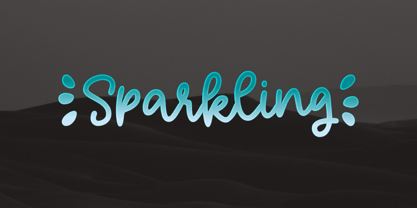 Sparkling is a relaxed, fashionable, and cute monoline script font. It looks great on a variety of designs, such as print design, stickers, wedding invitation, apparels, logos, and so on This font is supporting multi languages, which includes: Afrikaans Albanian Catalan Danish Dutch English Estonian Finnish French German Italian Norwegian Portuguese Spanish Swedish Zulu. You will get : Basic Latin A-Z, a-z, numbers, symbols, and punctuations. Accented Characters : ÀÁÂÃÄÅÆÇÈÉÊËÌÍÎÏÑÒÓÔÕÖØŒŠÙÚÛÜŸÝŽàáâãäåæçèéêëìíîïñòóôõöøœšùúûüýÿžß Thank you
 - Fledermaus by Hanoded,
$15.00 Fledermaus (meaning 'Bat' in German) was a cabaret theater from Vienna. The original Jugendstil decor was designed by Josef Hoffman and several posters, advertising performances, were designed by other members of the Vienna Workshop. Fledermaus font was based on a 1907 poster by Bertold Löffler. Since only a few glyphs were available, I designed the missing ones myself. The lower case consists of small caps and the font comes with extensive language support.
 - Barrlow by Epiclinez,
$18.00 Barrlow is an awesome and bolded script font that is incredibly versatile and will look great on any design or craft. So what's included: Basic Latin, numbers, symbols, punctuations, and ligatures Simple Installations: works on PC & Mac Multilingual Support includes Afrikaans Albanian Catalan Danish Dutch English Estonian Finnish French German Italian Norwegian Portuguese Spanish Swedish Zulu. Accented Characters : ÀÁÂÃÄÅÆÇÈÉÊËÌÍÎÏÑÒÓÔÕÖØŒŠÙÚÛÜŸÝŽàáâãäåæçèéêëìíîïñòóôõöøœšùúûüýÿžß Accessible in Adobe Illustrator, Adobe Photoshop, Adobe InDesign, even works on Microsoft Word PUA Encoded and fully accessible without additional design software Thank you! We hope you enjoy our font!
 - Lokomotiv by Hanoded,
$15.00 The 1930 Geneva Motor Show (Salon International De l'Automobile Et Du Cycle) showcased a lot of new cars, but one item in particular took my interest: the amazing art deco poster announcing the show. Lokomotiv font was based on this poster. It is a very deco-ish font, futuristic, angular, with bold squares, rounds and triangles. As I had to work with just a handful of glyphs, and needed to fill an entire font, I made up the missing ones myself. Lokomotiv, by the way, is German for Locomotive.
 - Makutha by Keristyper Studio,
$14.00 Makutha Script Font is an elegant script typeface. Designed primarily as a captivating handcrafted with style. This typeface is easy on an eyes font that excels at captivating headlines, or branding. Makutha Script Font multilingual support: Afrikaans, Albanian, Catalan, Danish, Dutch, English, Estonian, French, Finnish, German, Icelandic, Indonesian, Italian, Malay, Norwegian, Portuguese, Spanish, Swedish, Zulu, and many more. What’s Included : Web Fonts Standard & Multilingual glyphs Ligature Works on PC & Mac Simple installations Accessible in Adobe Illustrator, Adobe Photoshop, Adobe InDesign, and even work on Microsoft Word. Hope you enjoy our font!
 - Ongunkan Armanen Runes by Runic World Tamgacı,
$50.00 The Armanen runes (or Armanen Futharkh) are a series of 18 runes, closely based on the historical Younger Futhark, introduced by Austrian mysticist and Germanic revivalist Guido von List in his Das Geheimnis der Runen (English: "The Secret of the Runes"), published as a periodical article in 1906, and as a standalone publication in 1908. The name Armanen runes associates the runes with the postulated Armanen, whom von List saw as ancient Aryan priest-kings. The Armanen runes continue in use today in esotericism and in currents of Germanic neopaganism.
 - Partenkirchen NF by Nick's Fonts,
$10.00In Lewis F. Day’s 1910 classic, Alphabets Old and New, the author presented the inspiration for this typeface as an example of German monumental lettering, most likely to suggest not that the typeface was really big, but that it had been found on German monuments. Bold yet charming, the face takes its name from a picturesque village in the Bavarian Alps which was the ancestral home of the Gröbl line of Curtii forebears. Both versions of this font include the complete Latin 1252 and CE 1250 character sets, with localization for Romanian and Moldovan. - ITC Lennox by ITC,
$40.99ITC Lennox is the work of German designer Alexander Ruehl. Ruehl had long digitized typefaces for other designers and decided to give design a try himself. ITC Lennox is suitable for a wide variety of headlines uses, a sans serif display face with a modern feel yet based on classical elements. - Blattwerk by Volcano Type,
$39.00 The shapes of "Blattwerk" (german for leafage) are based on an abstract leaf. The geometrical sans serif font has several standard and decorative ligatures and will work best as a display typeface for logos, headlines and short texts. The individual letters can also be used to form symbols or patterns.
 - ITC Out of the Fridge by ITC,
$29.99ITC Out of the Fridge is the work of German designer Jochen Schuss. Its forms look as though they were scratched on rough paper with a pen. ITC Out of the Fridge is, in the designer's own words, fresh and cool", and works well where something modern yet "proper" is desired." - DIN Mittel EF by Elsner+Flake,
$35.00The typeface DIN Mittel, offered by Elsner+Flake, is based on the DIN 1451 used in Germany since 1931. The DIN 1451 which was primarily seen in the areas of technology and traffic had to adhere to the so-called DIN Norms. Variations of the DIN 1451 are also employed in Austria, Eastern Europe, Greece and the Near East. With its new release Elsner+Flake has expanded the DIN Mittel with the characters EuropaPlus and Cyrillic. - Wappenstein by Proportional Lime,
$9.99 The font Wappenstein was inspired by the carving on a memorial stone located in Paderborn, Germany. The stone was an Epitaph of the Brenkener family, and the carver is known as the “Meister des Brenkener Familienepitaphs”. The carving, dating to 1562, currently is curated by the Erzbischöfliches Diözesanmuseum in the city of Paderborn and was originally in the Brenkener Pfarr Kirche. A Wappenstein is a stone that contains a carving of the heraldic achievement of a person.
 - Franklin Gothic by Linotype,
$45.99Franklin Gothic was designed by Morris Fuller Benton for the American Type Founders Company in 1903-1912. Early types without serifs were known by the misnomer "gothic" in America ("grotesque" in Britain and "grotesk" in Germany). There were already many gothics in America in the early 1900s, but Benton was probably influenced by the popular German grotesks: Basic Commercial and Reform from D. Stempel AG. Franklin Gothic may have been named for Benjamin Franklin, though the design has no historical relationship to that famous early American printer and statesman. Benton was a prolific designer, and he designed several other sans serif fonts, including Alternate Gothic, Lightline Gothic and News Gothic. Recognizable aspects of Franklin Gothic include the two-story a and g, subtle stroke contrast, and the thinning of round strokes as they merge into stems. The type appears dark and monotone overall, giving it a robustly modern look. Franklin Gothic is still one of the most widely used sans serifs; it's a suitable choice for newspapers, advertising and posters. - Scoto Koberger Fraktur N9 by Intellecta Design,
$9.00a free digitization of ancient types of Ottaviano Scotus, from incunabula times, printed in Germany by Anton Koberger - Movie Script by Wiescher Design,
$39.50 Movie Script is the script that was used in German movie-brochures. Those were small four page leaflets with a lot of sepia-colored pictures about the movie one was about to see. Today those things are collectors items. The script was also used on those hand-painted posters above the cinema entrance. I cleaned up the old script and made it just a little bit more readable, but overall I left it as it was. Of course I added the necessary glyphs for today's world, like Euro and so on. When I was a kid, my grandfather gave me 1 German Mark and I could go to the movies matinee, that was around 10:30 in the morning, the entrance cost something like 60 Pfennig and the rest was for peanuts and a drink. Still today I love my grandfather for that, movies introduced the world to me (no TV then). Your grandfather-loving designer Gert Wiescher
 - Wastern by Say Studio,
$12.00 About the Product Introducing "Wastern" - A brand new bold display typeface with both modern and vintage curves. Modern or Vintage. If you are going Vintage Retro : Access your OpenType features to access the large selection of alternate letters and ligatures, select the letters you like from the large variety to get the vintage look you are after. Vary between a light and heavy vintage look based on how many letters you alter. Due to alternates , Wastern is a very versatile font, covering a wide range project types, from bold magazine imagery , to wedding invitations, to branding, poster design and so much more. What's you get? Wastern Italic Unique letterforms Works on PC & Mac Simple Installations Accessible in the Adobe Illustrator, Adobe Photoshop, Microsoft Word even work on Canva! PUA Encoded Characters Fully accessible without additional design software. Language Support : Danish, English, Finnish, French, German, Italian, Luxembourgish, Norwegian Portuguese, Spanish, Swedish, Swiss German. Let me know if you any question:) Have a wonderful Day Say Studio
 - Barlon by Flavortype,
$17.00 Barlon is a typefaces with a strong characteristic. The ideas are from Art Nouveau era, explore some of other art era and combining them into strong characteristic Barlon. The final fonts are looks Classic yet Modern, like what we do on the preview above, how the fonts can "stands" within your design. Software Requirements : fonts is supported with most software but for the OpenType features will only active when activated on the software. But still most of the software are supported like Adobe Product, Word, Excel, Apple Pages & Numbers, etc. Language Support : Afrikaans, Albanian, Asu, Basque, Bemba, Bena, Catalan, Chiga, Cornish, Danish, Dutch, English, Estonian, Faroese, Filipino, Finnish, French, Friulian, Galician, German, Gusii, Icelandic, Indonesian, Irish, Italian, Kabuverdianu, Kalenjin, Kinyarwanda, Low German, Luo, Luxembourgish, Luyia, Machame, Makhuwa-Meetto, Makonde, Malagasy, Malay, Manx, Morisyen, North Ndebele, Norwegian Bokmål, Norwegian Nynorsk, Nyankole, Oromo, Portuguese, Romansh, Rombo, Rundi, Rwa, Samburu, Sango, Sangu, Scottish Gaelic, Sena, Shambala, Shona, Soga, Somali, Spanish, Swahili, Swedish, Swiss German, Taita, Teso, Vunjo, Welsh, Western Frisian, Zulu
 - Kiester by Adam Fathony,
$23.00 Kiester, A Display Typefaces with Variable Weight. Kiester is a modern elegant variable font. Basically this is a Sans with a small touch of serif on every letters. A Simplicity yet very legible with various width and weight that you can explore, combine, create and help you designing something such as Poster, Headlines, Logotype, Branding, and etc. In a Total of 5 Style Font even more if you are using the Single Files Variable, you can slide the weight on the sweetest spot of Kiester. Language Support : Afrikaans, Albanian, Asu, Basque, Bemba, Bena, Catalan, Chiga, Cornish, Danish, Dutch, English, Estonian, Faroese, Filipino, Finnish, French, Friulian, Galician, Ganda, German, Greek, Gusii, Icelandic, Indonesian, Irish, Italian, Jola-Fonyi, Kabuverdianu, Kalenjin, Kinyarwanda, Low German, Luo, Luxembourgish, Luyia, Machame, Makhuwa-Meetto, Makonde, Malagasy, Malay, Manx, Morisyen, North Ndebele, Norwegian Bokmål, Norwegian Nynorsk, Nyankole, Oromo, Portuguese, Romansh, Rombo, Rundi, Rwa, Samburu, Sango, Sangu, Scottish Gaelic, Sena, Shambala, Shona, Soga, Somali, Spanish, Swahili, Swedish, Swiss German, Taita, Teso, Vunjo, Welsh, Western Frisian, Wolof, Zulu
